Today In Gloomy Charts
I’ve never been a huge fan of the adage “sell in May and go away”. The statement originated centuries ago in England, and the current logic arises from studies that show that November through April show the best returns of any six-month period. Last year, when selling in May proved to be a prudent move, we noted that it doesn’t tell you what to sell and where to go. Besides, a month is a relatively long period of time; when would be the best moment to make the proverbial sale?
For those of us who are invested in US index funds, “sell in May” would have been a mediocre strategy at best and a lousy one at worst. As I type this, the S&P 500 Index (SPX) is exactly unchanged at 4169.48.Zero, zilch, nada. The NASDAQ 100 (NDX) is of course the superstar, up about 7.5% for May right now.
There are two disappointing features embedded in that divergence, however. First is that much more money is indexed to SPX than NDX. But it also reveals just how much of this month’s market energy has been created by what we termed “The Magnificent Seven”.[i] Those stocks, Microsoft (MSFT), Apple (AAPL), NVIDIA (NVDA), Meta Platforms (META), Alphabet (GOOG, GOOGL), and Tesla (TSLA) comprise about 55% of NDX and 20% of SPX. A little back-of-the-envelope math should be sufficient to make it apparent the unchanged level of SPX would be a negative if it weren’t for those names.
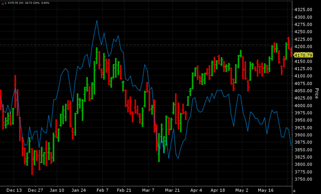
The divergence becomes apparent when we compare SPX to an equal-weighted measure of the S&P 500. The chart below compares SPX with RSP.IV over the past six months. Note how SPX has generally risen since mid-April while RSP.IV has fallen over that time:
6 Months, SPX (red/green daily bars), RSP.IV (blue line)
Source: Interactive Brokers
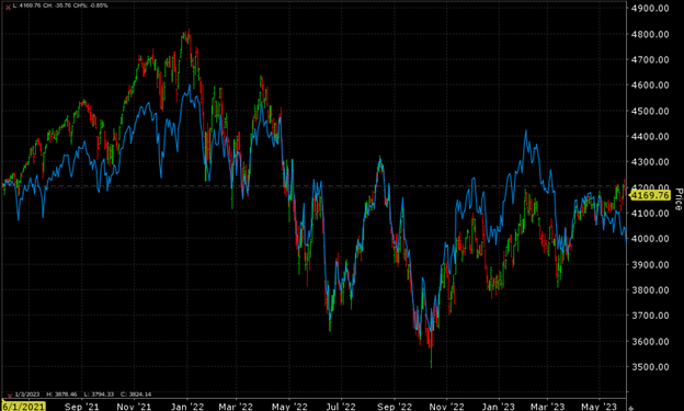
This sort of outright divergence is unusual. Over time, the two measures typically move in the same direction, with one or the other moving faster. We show two years of history below, but the pattern is quite similar (though less visible) over longer timeframes.
2 Years, SPX (red/green daily bars), RSP.IV (blue line)
Source: Interactive Brokers
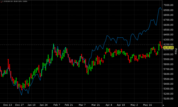
When we compare NDX to an equal weighted version, NDXE, we don’t see an outright divergence, but it is quite clear that the market capitalization version is a solid outperformer:
6 Months, NDXE (red/green daily bars), NDX (blue line)
Source: Interactive Brokers
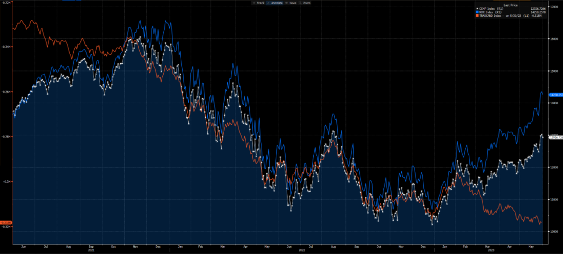
The larger issue with NDX is that the recent rally is that the Advance-Decline line for the NASDAQ exchange completely fails to confirm the recent move. We see in the graph below that the A/D line has been generally falling since early February, even as NDX, and to a lesser extent the NASDAQ Composite Index (CCMP) have been trending upward:
2 Years, NDX (blue), NASDAQ Composite (white), NASDAQ Cumulative Advances-Declines (red)
(Click on image to enlarge)
Source: Bloomberg
Notice the left side of the graph above. We that see a similar divergence began in the summer of 2021, leading up to the eventual NDX peak in November of that year and through its topping pattern that persisted through early January 2022. It was a negative harbinger, but it took months to fully resolve itself. I discussed this topic during a television appearance yesterday, fully noting that while various market anomalies like major divergences and parabolic moves tend to resolve themselves eventually, the timing is nearly impossible to predict.
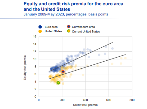
Finally, a chart from across the ocean caught my eye this morning. The European Central Bank (ECB) published a financial stability review this morning. Among the various charts and data points, this one stood out:
Source: European Central Bank
The green circle indicates that by the ECB’s calculations[ii], the equity risk premium for the US is about the lowest it has been since the end of the global financial crisis. The level for the EU is also around long-term lows, but there are many more observations of similarly low risk premia. It is also considerably above the US’ level. The bottom line, equity investors are willing to be compensated for their risk by the lowest levels in the last decade-plus.
None of what we presented today means that stocks are destined to plunge imminently, but there is no shortage of yellow flags waving among the green numbers that have dominated many traders’ screens this month.
[i] We unveiled the term in an article on May 24th. Yesterday I saw some articles crediting the term to another analyst. I think we came first, but it was parallel evolution either way.
[ii] The ECB defines their calculations thusly: equity risk premia are calculated as the five-year CAPE yield for the EURO STOXX (euro area) and S&P 500 (United States) less the five-year real (inflation swap-adjusted) government bond yield (German for the euro area); credit risk premia are calculated as the option-adjusted spread for BBB-rated corporate bonds with a residual maturity of 5-7 years. “Current” refers to the date 23 May 2023.
More By This Author:
AI Is Worth The Hype If Everyone Believes It
It’s Nvidia’s World, We’re Just Living (And Investing) In It
Lots Of Rhyming History Out There
Disclosure: The analysis in this material is provided for information only and is not and should not be construed as an offer to sell or the solicitation of an offer to buy any security. To the ...
more


