

Image Source: Pexels
As attributed to Paul Samuelson. So, with trepidation, I show the SP500 and CAPE over the last half-decade:
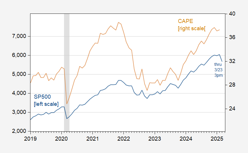
Figure 1: SP500 (blue, left scale), CAPE (tan, right scale). NBER defined peak-to-trough recession dates shaded gray. Source: Shiller, NBER.
Even including today's rebound, the SP500 looks like a substantial decline.
And what are movements in the SP500 associated with (in addition to interest rates, VIX):
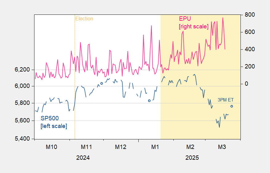
Figure 2: SP500 close (blue, left log scale), EPU (pink, right scale). Source: FRED, policyuncertainty.com.
More By This Author:
FT-Booth Macro Survey On GDP Growth Vs. Nowcasts, And Recession Start-DatesFT-Booth March Survey And The FOMC SEP: GDP’s Trajectory
Business Cycle Indicators NBER And Alternative, And GDPNow


Comments
Log in or sign up to join the conversation.