
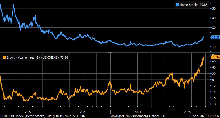
Meme stocks are highly speculative stocks, heavily traded by retail traders, and characterized at times by rapid price surges and equally sharp declines. The extreme volatility is often the result of social media platforms such as Reddit’s WallStreetBets pushing these stocks. Among the most noteworthy meme stocks of the last few years have been GameStop and AMC. While significant volatility can be fascinating for those on the sidelines, meme stock activity can still be a valuable tool for investors. Simply, meme stock returns are a gauge of risk-taking behaviors. Often, speculative trading, like significant volume in meme stocks, is greatest at market peaks. This was true as recently as 2021. More importantly, the tops of 1929 and 1999 were hallmarked by incredibly speculative trading.
UBS maintains a basket or index of meme stocks, comprising approximately 15-20 stocks based on criteria such as popularity driven by online networks, social media buzz, and high short interest. While UBS does not publicly disclose the entire composition of its meme index in detail, recent financial news reports highlight several key components. They are as follows: TLRY, OPEN, KSS, GPRO, NIO, BYND, and DNUT
The graph below illustrates that the meme index has generally performed poorly since reaching its peak in late 2021. However, since the start of the year, it has risen 73% or about five times that of the S&P 500! In other words, animal spirits are running hot in the markets.
What To Watch Today
Earnings
(Click on image to enlarge)

Economy
(Click on image to enlarge)

Market Trading Update
Yesterday, we discussed the robust retail buying that continues to push the market higher. As we noted, momentum is tricky to stop, but critically, it always does. It is just the timing of the event that is most important.
Currently, analysts are finding an increasing number of rationalizations to be bullish, and not just for the next quarter. As Yahoo Finance pointed out yesterday:
“But the impacts of tariffs are still unfurling. And the Fed’s latest easing came with additional risks and uncertainty. Central bankers aren’t just battling pricing pressures but the real prospect of rising unemployment — not to mention incursions against their own independence. The reasons to be careful are also piling up.
Part of understanding why market optimism seems to be winning out — despite the factors weighing against it — is the timeline experts and investors are using to derive their optimism. It isn’t just the muscular corporate results expected for the rest of the year that are powering lofty expectations. Projected returns for 2026 and even 2027 are driving the growth story too, with AI efficiencies and a more dovish Fed boosting corporate fundamentals.”
That forward outlook for earnings growth underpins the entire narrative, but it is also a massive risk given the historic unpredictability of future earnings growth. If earnings slow down for any reason, the biggest risk to investors is a repricing of forward valuations. As shown, CAPE (the cyclically adjusted P/E ratio) is trading near 40x earnings, which is the highest level since the internet bubble.
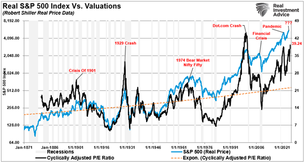
For the S&P to maintain its estimated earnings multiple, the index would need to grow its earnings 13.4% next year and another 15% in 2027.
That’s not impossible, but if economic growth slows, multiples will be at risk given the historic correlation between earnings and economic growth.
As Yahoo notes:
“That’s not to say that we’re on the verge of an epic sell-off. The math is more suggestive than prophetic. But it does prompt people interested in the stock market to consider what it would take to keep the party going.”
Something to think about as you manage your portfolio today.
Looking Beneath The Covers Of The Major Indexes
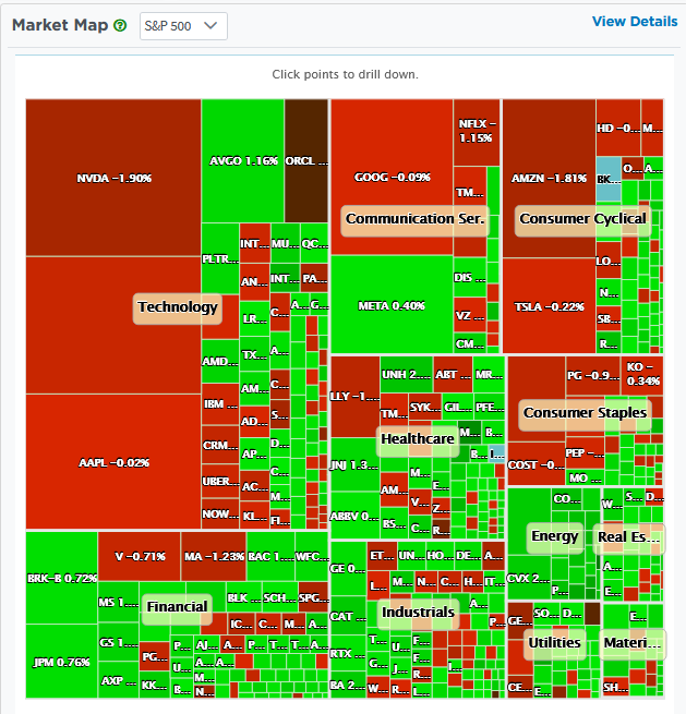
Recently, there have been significant divergences between the daily changes of major indexes and those of various stock categorizations. SimpleVisor makes it easy to understand the divergences. We present three graphics below showing market activity from midday Tuesday.
The first graphic, the Market Map, shows that the largest stocks by market cap (biggest boxes) were down on the day, while many of the smaller stocks were up. At the time we took the screenshot, the S&P 500 was down slightly.
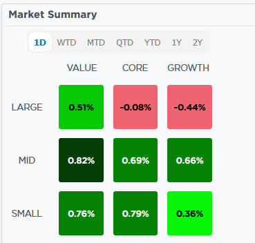
The second graphic further confirms what the Market Map is showing. Large-cap growth stocks were down by nearly half a percentage point, but large-cap value stocks were up by half a percentage point. Furthermore, note that small-cap stocks, both growth, core, and value, were performing well.
The last graphic displays the performance of various stock factors. We reset the timeframe for one day to align with the first two graphics. Not surprisingly, large-cap growth is performing the worst, while small and mid-cap stocks are among the best performers.

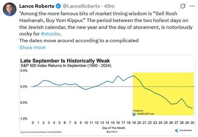
Tweet of the Day
More By This Author:
Equity Fund Outflows Plummet: Blip Or Warning?Size Matters: Can The Largest Stocks Continue To Lead?
Markets: Bullish Vs. Bearish Case


Comments
Log in or sign up to join the conversation.