
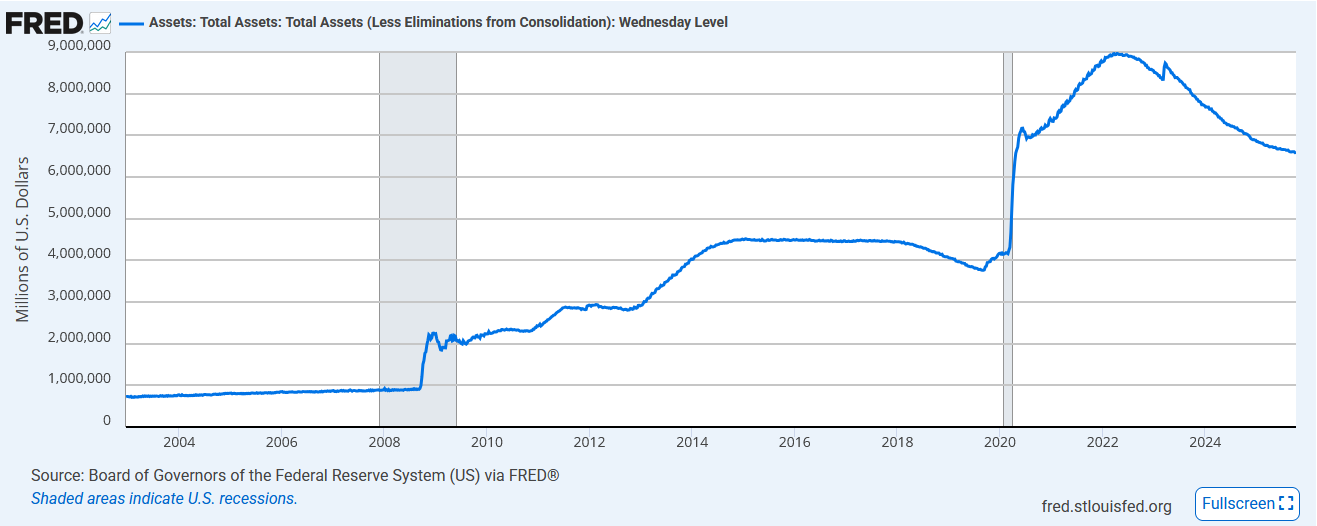
Chairman Powell spoke on Tuesday, addressing several topics. Of note was the following quote: “We may be approaching the end of our balance sheet contraction in the coming months.” The market interpretation is that QT is ending soon. As a reminder, QT, also known as quantitative tightening, has been in effect for over three years. Since starting QT, the Fed has shaved its holdings by nearly $3.5 trillion. The graph below shows that the Fed’s current holdings of Treasury, mortgage, and agency assets stand at approximately $6.6 billion, still more than 50% above pre-pandemic levels.
Powell made this somewhat surprising statement in a speech to the National Association of Business Economics in Philadelphia. To explain why QT could end, he pointed to the liquidity strains that emerged in the fall of 2019. At that time, short-term lending rates for some borrowers were spiking despite the borrowers having ample and pristine collateral to support the loan. The Fed feels they were late to address those liquidity strains. As a result, they cut rates by 0.75% despite a relatively strong economy. While Powell doesn’t claim to see similar problems, he is noticing some recent tightness in the lending markets. Not surprisingly, as we recently noted, Powell’s comments come as the Fed’s overnight reverse repo program balances are near zero, signifying the market no longer has excess reserves. So, is QT resulting in tighter market conditions? Powell must think so.
On the margin, ending QT is beneficial for the bond markets. In addition to absorbing higher-than-normal Treasury debt due to fiscal deficits, the market is also having to absorb about $40 billion monthly due to the Fed’s shrinking balance sheet. Of the $40 billion, $5 billion is in US Treasuries, and the remaining $35 billion is in mortgage-backed securities.
What To Watch Today
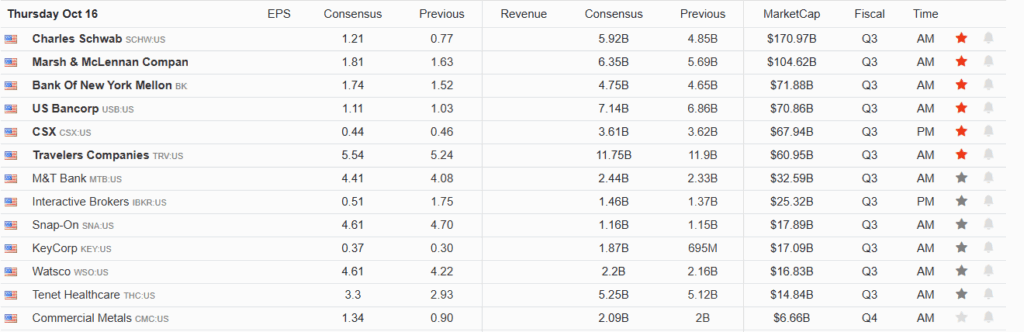
Earnings
(Click on image to enlarge)
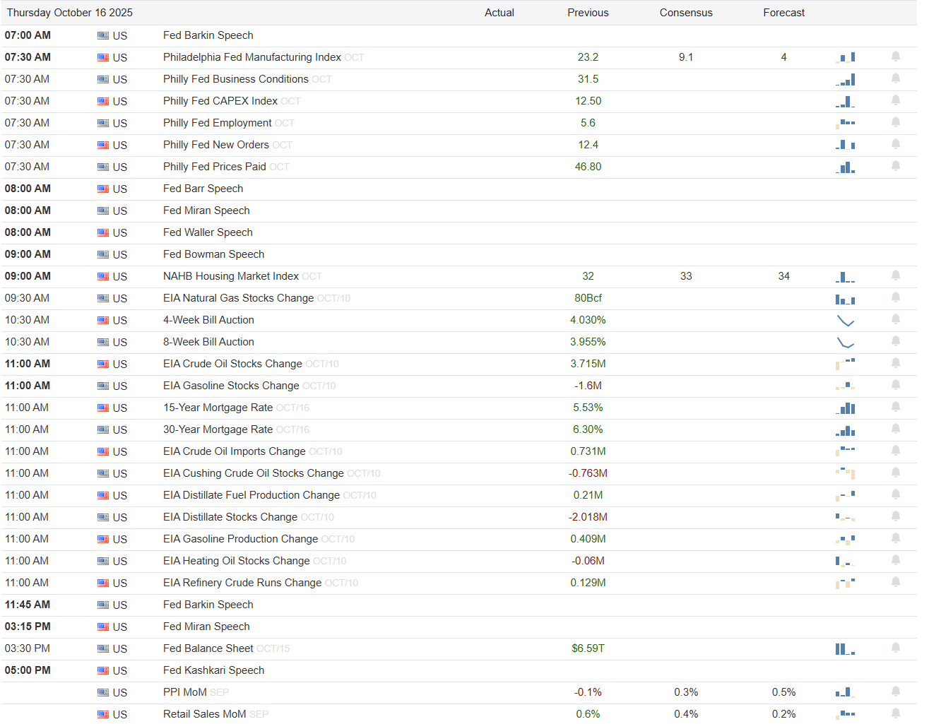
Economy
(Click on image to enlarge)
Market Trading Update
Yesterday, we discussed that the technical backdrop of the market had shifted as the break of the 20-DMA brought the focus to the 50-DMA. As we noted yesterday:
“Should the market fail to regain the 20-DMA, the risk of further consolidative or corrective action increases. As shown, the 50-DMA is key support for now, but the 100 and 200-DMA are the next critical supports should the market break down from here. Notably, the MACD has triggered a sell signal, and relative strength is still correcting previous excesses.”
Yesterday, the market struggled to reclaim the 20-DMA, which it successfully did by the end of the day, but it wasn’t pretty. I would remain a bit cautious about declaring the “bull market remains intact” until we see some follow-through. Yesterday’s action was very weak, and volume weakened. Furthermore, the MACD remains on a clear signal, and other technical measures also show weakness.
(Click on image to enlarge)

While the overall backdrop remains bullish, I would like to see the market firm up and breadth broaden somewhat. Asset prices remain stretched in multiple markets as speculative frenzy remains rampant. Furthermore, the market “feels” like it wants to do a “rug pull” as investor complacency remains relatively elevated. While that may not happen, prudence seems to be the best advice here, particularly when “buying the dips.”: Focus on strong balance sheets, reduce speculative risk, and don’t forget to take profits in grossly extended assets.
Let’s see how the market ends this week.
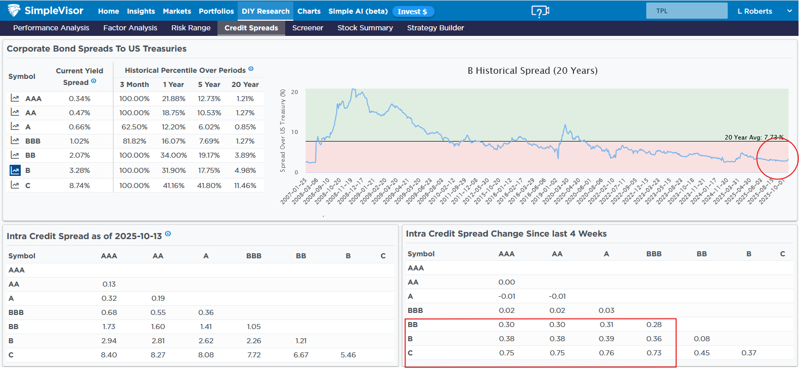
Some Distress In The Junk Credit Markets
The graphic below from SimpleVisor tracks corporate credit yield spreads. Even if you are not a corporate bond investor, corporate credit spreads (vs US Treasuries) can be a good leading indicator of the equity markets. Tight, or low, spreads indicate bullish sentiment in corporate bonds and often the stock market. Widening, or higher, spreads indicate some credit concerns that can leak into the stock market. The SimpleVisor page below helps us track whether spreads are tightening or widening.
Of note, the lower right-hand box shows that the yields on junk bonds (less than BBB) have widened over the last four weeks versus investment grade bonds (BBB or higher). While the amount of widening, when quoted in basis points, may seem decent, the graph in the top right corner shows that the spread widening is barely perceptible in a longer-term context. We will continue to track the recent widening. A continuation within junk bonds and, importantly, in lower-rated investment-grade bonds would be more concerning.
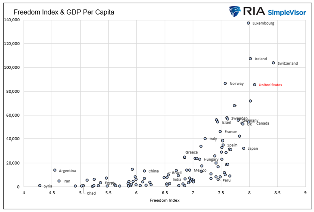
Capitalism: The Road To Wealth And Happiness
The graph below presents another opportunity to revisit how capitalism and the economic freedom it entails lead to prosperity.
The scatter plot below shows the intersection of The Fraser Institute’s Economic Freedom Index with per capita GDP for 102 of the largest economies. Before analyzing the graph and what it implies for capitalism, let’s gain a better understanding of its X-axis—the Economic Freedom Index.
Tweet of the Day
More By This Author:
Dollar Correlation: Implications For Foreign Stock IndexesThe AltCoin Liquidity Bloodbath
ChatGPT Gives Financial Advice On Volatile Markets


Comments
Log in or sign up to join the conversation.