
Back To The Macro Basics
"Where are we in the business cycle?" is a question macroeconomists often are asked by investors. On the face of it, it is a reasonable question. The macroeconomic backdrop is an important input variable for key asset al- location decisions such as whether to be over-or underweight stocks relative to bonds, sector rotation, not to mention FX, and credit positions. The question invites the idea that economic ex- pensions are on the clock. They are in the sense that their average length is a question of a relatively simple empirical exercise. But a classic truism still remains. "Economic expansions don't die of old age, they're killed by economic policy", a phrase I have adapted from the U.S. version ending with the idea that economic expansions usually are killed by the Fed.
Another factor is that economic indicators often go through several mini-cycles even as the overall expansion remains uninterrupted. It isn't always easy to judge whether such shifts mark the end of an expansion or the start of a new one. This, in turn, raises the question of how to define an expansion in the first place, or more specifically, how to define its end.
Is a recession two consecutive quarters of contraction in GDP, should we relate the definition to employment too, or does the NBER, or any other institute decide? I'll ignore all these questions in what follows, focusing instead on the economic data and what they do.
I'll be using OECD's leading indicators. They form one of the largest, and publicly available, data sets of monthly economic indicators, standardized across countries. I'll focus on the amplitude-adjusted indices.
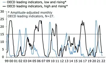
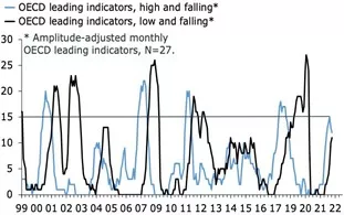
At any point in time, leading indicators are characterized by one of four distinct phases. They can be high and rising, high and falling, low and rising, and low and falling. The high-low distinction refers to whether the leading index is above or under its long-run average, and the rising-falling distinction refers to whether the index is up or down on a six-month basis. This latter category obviously can take on several forms, though I'd argue that a three-month, six-month, or 12-month change are the three most obvious representations. I have gone for the middle ground.
These four categories lead to some broad, and fairly obvious, interpretations. The economic expansion will be at its strongest when leading indicators are high-and-rising and at its nadir when they are low and falling. Crucially, the transitions between the phases, mainly via high- and-falling and low-and-rising, are what matters to investors and economists. I will attempt to illuminate this point below, by analyzing what these data tell us about the global economy now
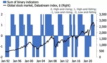
The two charts below group the numbers in a way that makes it possible to identify different regimes. The first combines the two indices for high-and-falling and low-and-falling. The second plots are low- and-rising and high-and rising. We are currently in an environment where leading indicators are falling, with a looming transition from high- and-falling, to low-and-falling. The number of countries with high-and-falling peaked at 15 in January but is now falling. It will soon be surpassed by countries with low-and-falling leading indicators, signifying a cyclical low in global business cycle conditions.
fig. 01 / No longer rising - fig. 02 / Headed for a nadir?
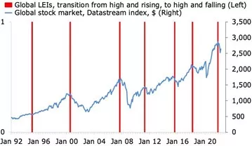
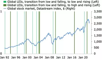
Russia's invasion of Ukraine, and the associated hit to sentiment and further lift in inflation, undoubtedly have tilted the scale towards this position. But in hindsight, it seems as if the global economy crossed a significant threshold in November last year when leading indicators made a transition from high-and-rising to high-and-falling. By then, the reopen- ing momentum had faded, and the Omicron wave was threatening a setback. More importantly, however, markets and policymakers were slowly but surely waking up to the fact that what they believed to be transitory inflation was in fact of a more sustained bout of accelerating increases in prices. The two charts above suggest that this particular transition is one that investors would do well in keeping an eye on. The first chart shows that the shift from high-and-rising to high-and-falling leading indicators occurred in advance of most of the major drawdown in equities since the beginning of the 2002s.
fig. 03 / One to watch for investors… - fig. 04 / …For 3-6m, at least
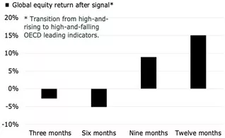
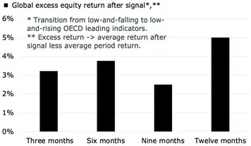
The second chart confirms this quantitatively. On average, global equities sold off by around 3% and 5% on a three-month and six-month basis, respectively, after such a transition. The ratio of negative to positive returns for these two periods is 6-to-3 and 6-to-2, respectively. At present, equities were down just over 5% three months after the transition, and are on track for an 8- to-10% fall on a six-month basis, in both cases worse than the average.
Looking ahead nine-to-12 months, the data suggest that equities, on average, resume their customary up-trend after a shift from high and rising to high and falling. This, in turn, suggests that the worst is now over for equities, from a strict perspective of this macro-signal.
This transition, however, also occurred ahead of the major slowdowns and bear markets in 2001/02 and 2008. In other words, the transition from a situation where leading indicators are high-and-rising to high-and-falling occurs both in advance of major downturns and more contained corrections. It is not easy to distinguish these two in real-time.
The flip side to the analysis above is to investigate whether investors should also be watching transitions at the nadir of the business cycle, more specifically from low- and-falling to low-and rising, and from low-and-falling to high-and-rising. The first chart below plots these two transitions in the same way as above, with the global equity index, since 1992.
This chart looks a lot less tidy than the one above, but a closer look at the data suggests that it has some value, after all. The second chart below shows that a transition from low-to-falling to low- and rising is followed by ex- cess equity returns on a 12- month basis, to the tune of 2-to-5%. For investors with the option to alter broad-based equity allocations within such a timeframe, this seems like a decent macro input for when to be over- weight equities.
The extensions for this framework are endless. The two most obvious ones are the creation of a single indicator, which captures all the four states of leading indicators, and the relationship between the signals above and the cycle in economic activity. Attempting to establish a link between the different stages of leading indicators and the relative performance of equity sectors is another interesting extension. This, incidentally, is a study that has been tried many times, as I will hopefully have time to discuss it in one of my future posts.
fig. 05 / A signal to buy equities? - fig. 06 / In some cases, yes
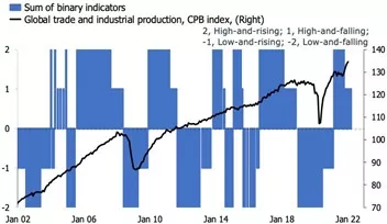
The final four charts provide an attempt to cover the first two extensions noted above, albeit superficially. The first two plot the transition from high-and-rising to high-and-falling alongside the level and growth in global industrial production and trade. I have also attempted to combine the four transitions into one index. I am not sure that I am entirely happy with this representation. I will look further into this in the future.
For now, I have hopefully managed to breathe a bit of life into a classic tool for economic forecasters and macro-investors; how to read the state of the world according to the state of leading indicators. Some- times, it is good to go back to the basics.
fig. 07 / Not a sign of a downturn… - fig. 08 / …but maybe a slowdown
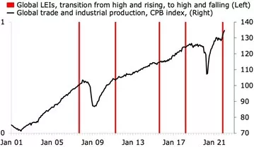
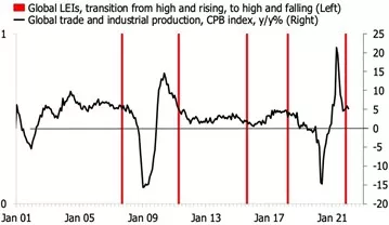
fig. 09 / States to guide equity investors… - fig. 10 / …and economists?
Disclosure: None


