

Image Source: Pixabay
The JOLTS survey parses the jobs market on a monthly basis more thoroughly than the headline employment numbers in the jobs report. In July, it painted a picture of what looks like pretty relentless deterioration.
The theme for three of the four data series I track was the same: job openings, hires, and quits, all had their lowest or second lowest readings since the start of 2021. In the case of the “second worst” hires and quits numbers, it was only because last month’s numbers were even lower.
Specifically, job openings (blue in the graph below), a soft statistic that is polluted by imaginary, permanent, and trolling listings, declined 227,000 to 7.623 million. Actual hires (red) rose 273,000 to 5.521 million (vs. a pre-pandemic peak of 6.0 million). Voluntary quits (gold) rose 63,000 to 3.277 million. In the below graph, they are all normed to a level of 100 as of just before the pandemic:

Both hires and quits are significantly below their immediate pre-pandemic readings, by -7.9% and -5.4% respectively.
To put them in a wider historical context the below graph shows all three series from their inception in 2001. But because the US population has grown almost 20% since then, I divide by the prime age population over the same time. I have also normed the current values to the zero line to better show the historical comparison:
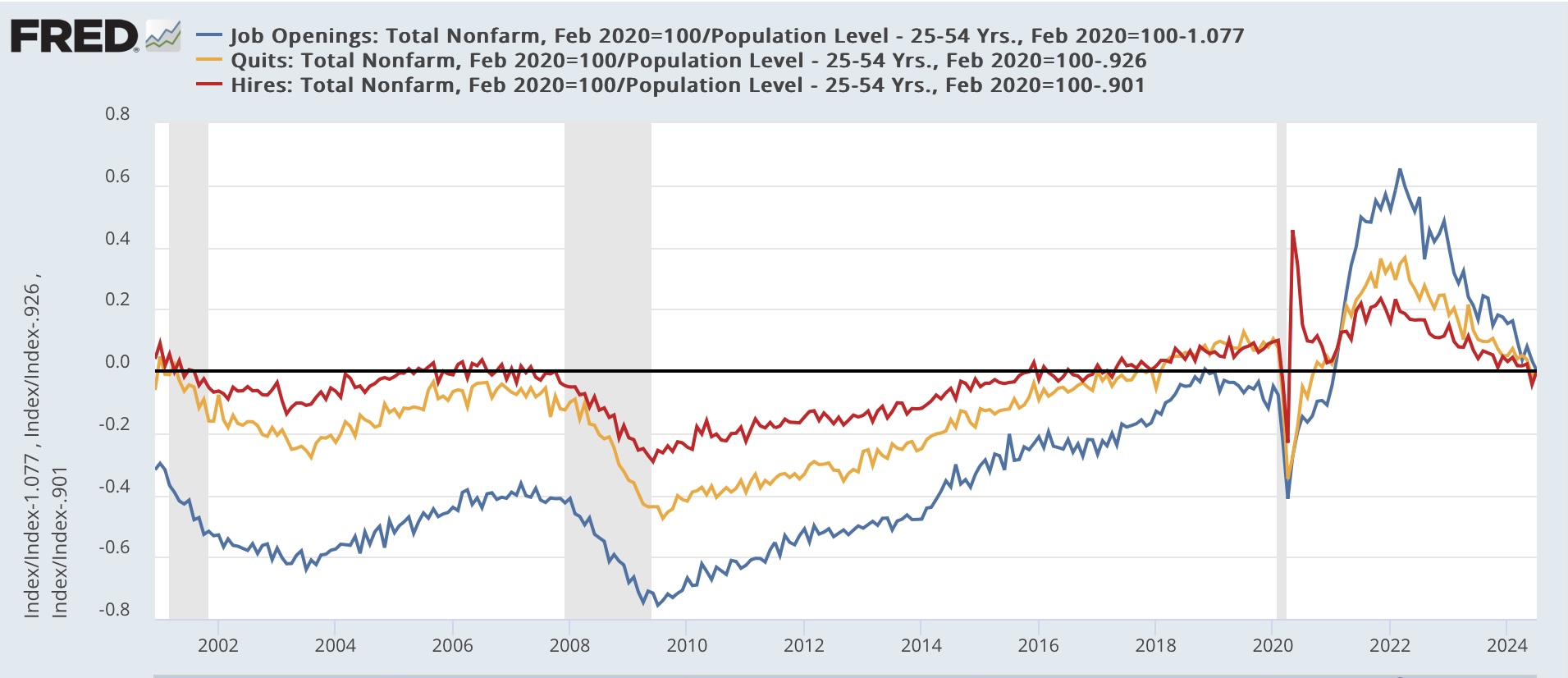
On the one hand, hires, even on a population adjusted basis, are better than almost any time before the pandemic except 2005-06 and 2017-19. But note they are also at a level equivalent to during the 2001 recession. Quits are better than at any time before the pandemic except for just before the 2001 recession and 2018-19. This suggests to me that the real, “hard data” jobs market is still positive, and not weak by historical standards. It’s just not as strong as we have become accustomed to over the past several years.
Meanwhile, layoffs and discharges increased to their highest level since late 2020 except for several months in early 2023:

The above graph also shows the monthly average of initial jobless claims (red). It appears that layoffs and discharges did pick up the post-pandemic seasonality shown in the summer increase during May through July.
Finally, the quits rate (blue in the graph below) has a record of being a leading indicator for YoY wage gains (red). For over half a year the quits rate had stabilized. That has no longer been the case in the past two months, as it also is at its lowest point since late 2020:

As you can see above, this forecasts continued deceleration in nominal wage gains, down to 3.5% YoY or even lower in the coming months. Unless consumer inflation moderates further as well, this will put some financial pressure on ordinary workers (not a negative, just significantly less positive).
More By This Author:
Manufacturing And Construction Together Suggest Weak But Still Expanding Leading SectorsFor Labor Day: 4 Measures Of Worker Wage Growth
July Personal Income And Spending


Comments
Log in or sign up to join the conversation.