
This analysis takes the BLS inflation data and recalculates the percentage changes at the category level to get unrounded numbers. The total number ties to the BLS, but it gives more detail at the granular level.
February CPI
Below is the inflation data that has been taken from the BLS. After bottoming in October of last year at 0.08%, the monthly number has moved back up to .45%, which is the second-highest reading since January 2023. Energy, Shelter, and Transportation are the main culprits as shown below.
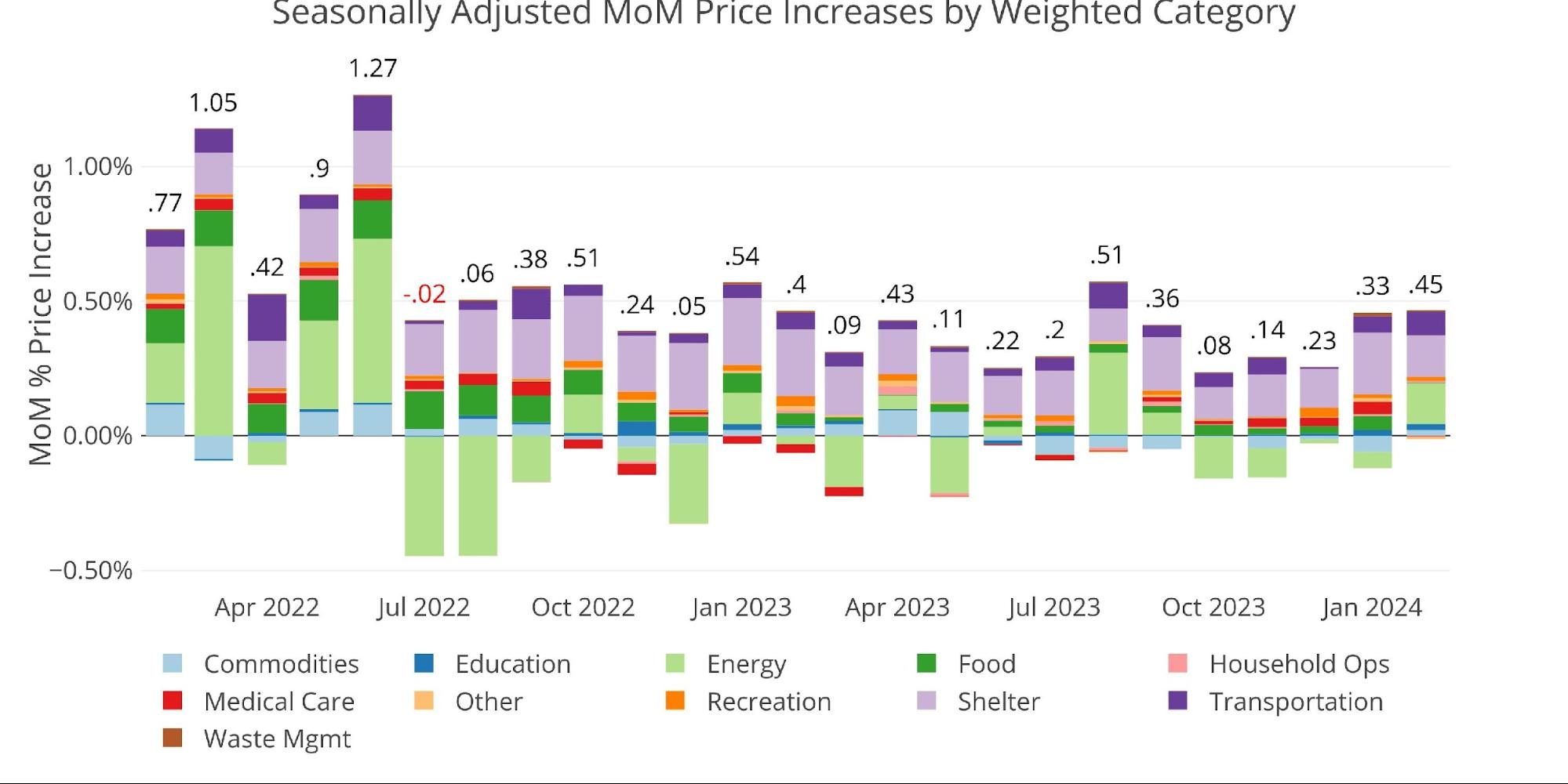
Figure: 1 Month Over Month Inflation
The YoY CPI has been near the low 3% range since June of last year. If you look at the chart below, you can see that the picture is not great. Back in 2022, the main driver was Energy and Commodities (e.g., used cars). While those are not pushing the CPI anymore, Energy could come back in a big way. Back in June 2022, Energy represented 3% of the 9.1% increase. If that were to repeat in Energy, the CPI would be coming in north of 6%.
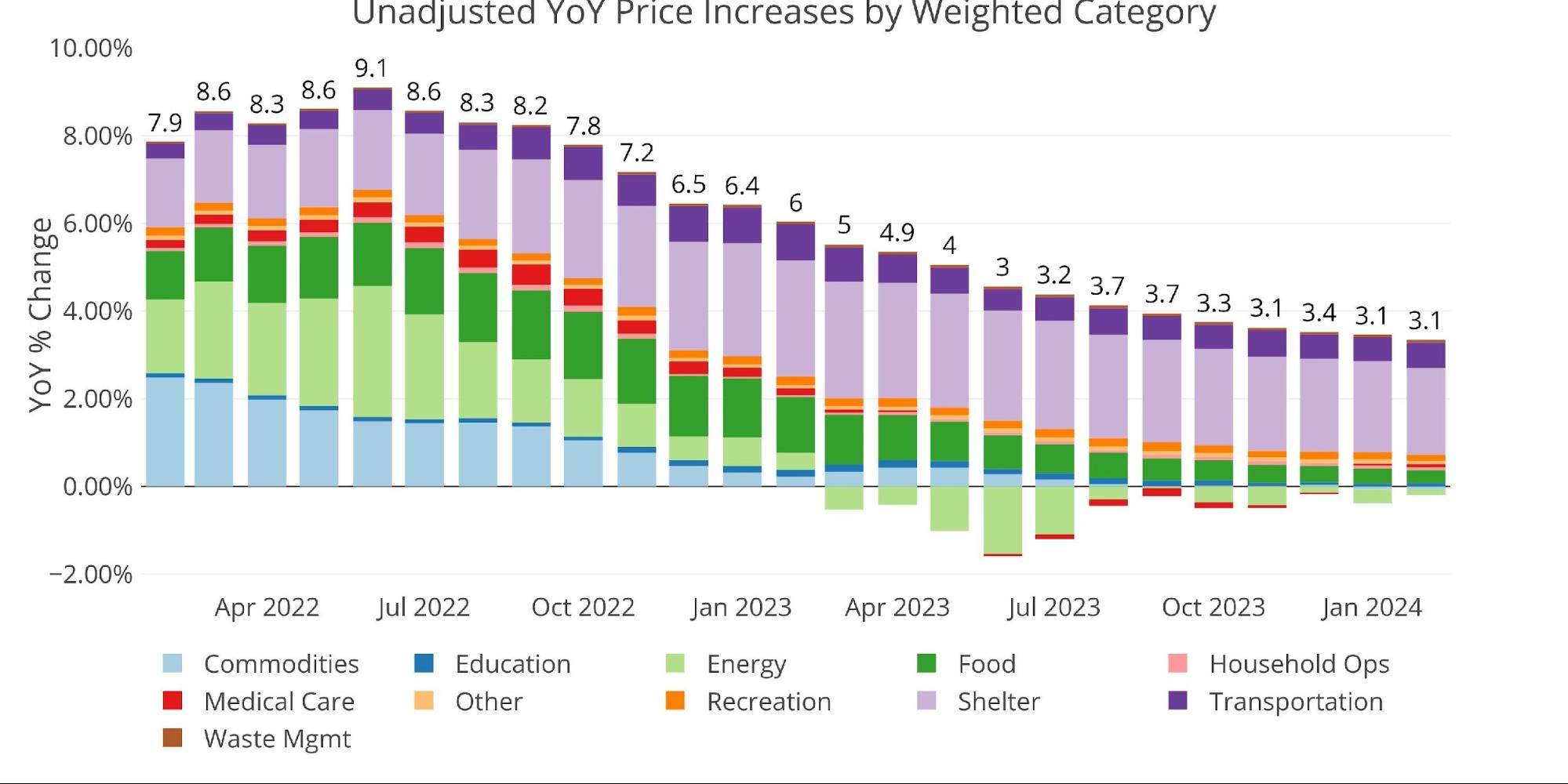
Figure: 2 Year Over Year Inflation
Unfortunately, in the most recent month, Energy is the main driver. If this trend were to continue, the CPI would give some pretty bad prints in the months ahead.
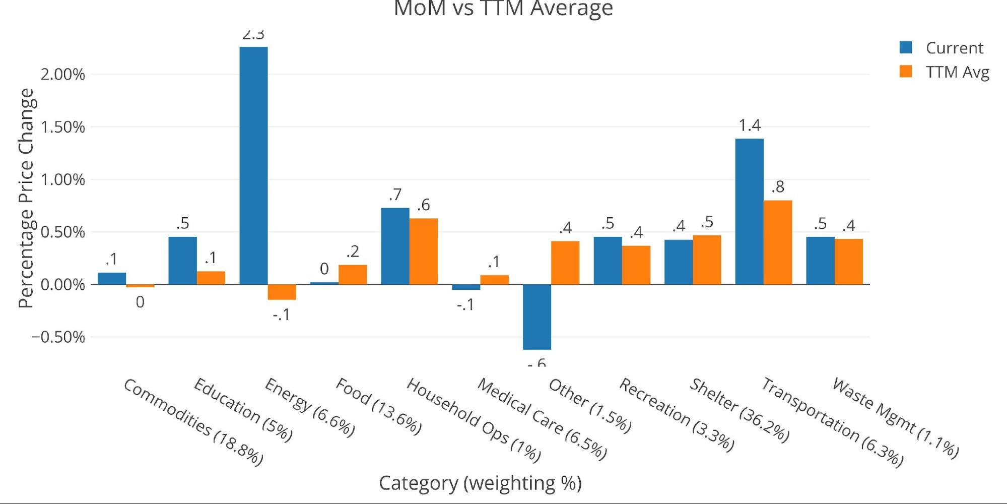
Figure: 3 MoM vs TTM
The table below gives a more detailed breakdown of the numbers. It shows the actual figures reported by the BLS side by side with the recalculated and unrounded numbers. The weighted column shows the contribution each value makes to the aggregated number. Details can be found on the BLS Website.
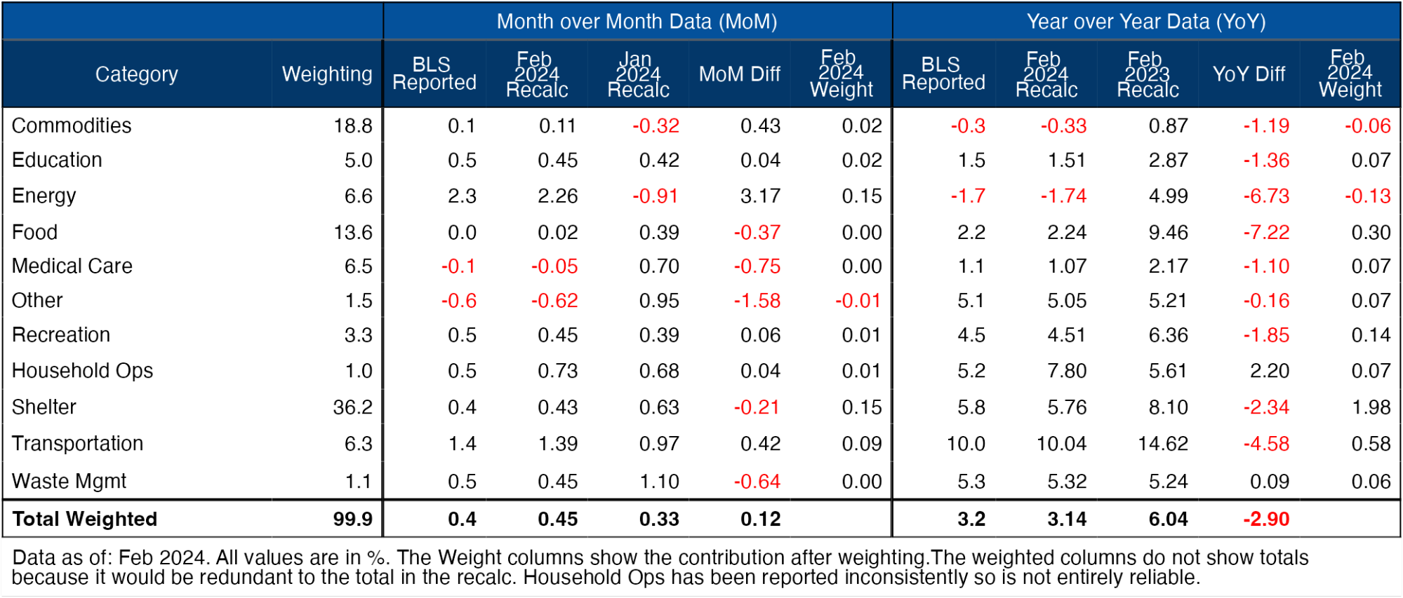
Figure: 4 Inflation Detail
Looking at the Fed Numbers
The Fed uses a different category methodology than the BLS, but the total number ties. Below is the number as reported by the Fed. According to the Fed categories, 5 of 8 categories are above the 12-month trend.
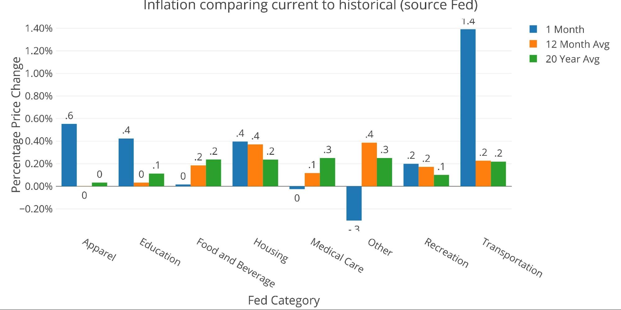
Figure: 5 Current vs History
Historical Perspective
Below is a much longer view of inflation and interest rates from the Fed and BLS (at the aggregate level, the data is the same).
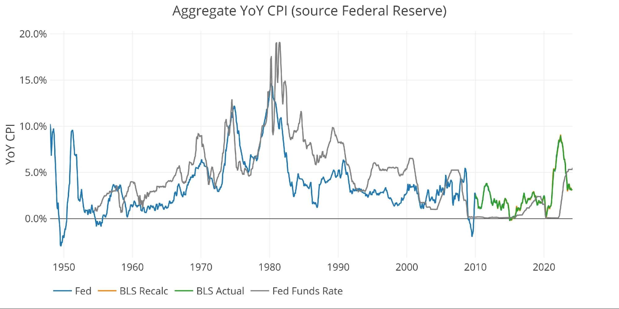
Figure: 6 Fed CPI
The BLS categorical data can be seen below. Again, this does not look like a wave that is ready to drop to 3% anytime soon. It looks more like a drop before another increase.
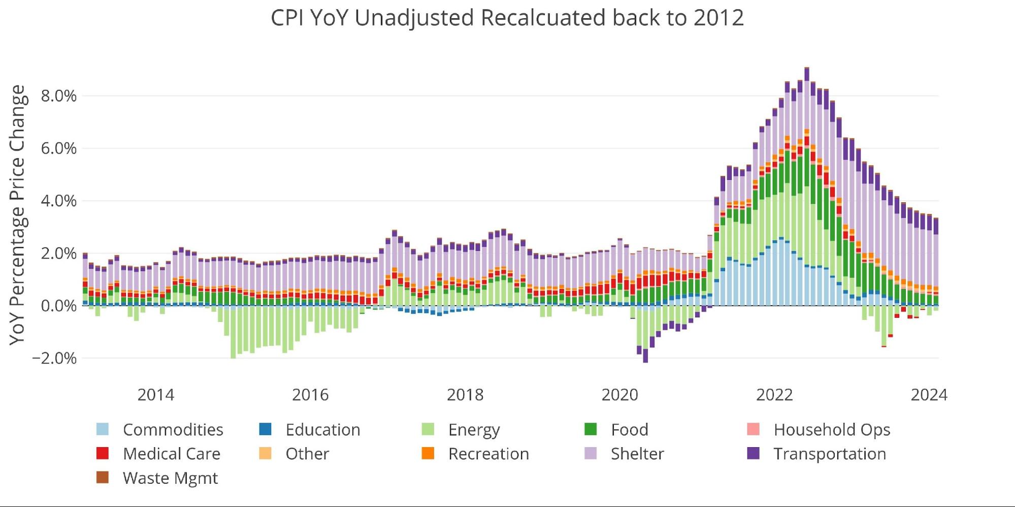
Figure: 7 Historical CPI
More By This Author:
Gold Reaches New All-Time High$1 Trillion Per 100 Days: Is This The Year The Debt Bubble Explodes?
Jobs: Massive Revisions And Household Survey Tell The Real Story
Comments
Log in or sign up to join the conversation.