
The analysis below covers the Employment picture released on the first Friday of every month. While most of the attention goes to the headline number, it can be helpful to look at the details, revisions, and other reports to get a better gauge of what is really going on.
Current Trends
The BLS reported a gain of 275k jobs. While this did beat expectations, there are three important caveats. First, January was revised down from 353k jobs to 229k, a drop of more than 35%. Second, the Household Survey actually reported a loss of -184k. This is 3 months in a row where the Household Survey has come in well under the Headline Report. Third, the unemployment rate jumped while labor force participation remained unchanged which only further discredits the headline number.
(Click on image to enlarge)
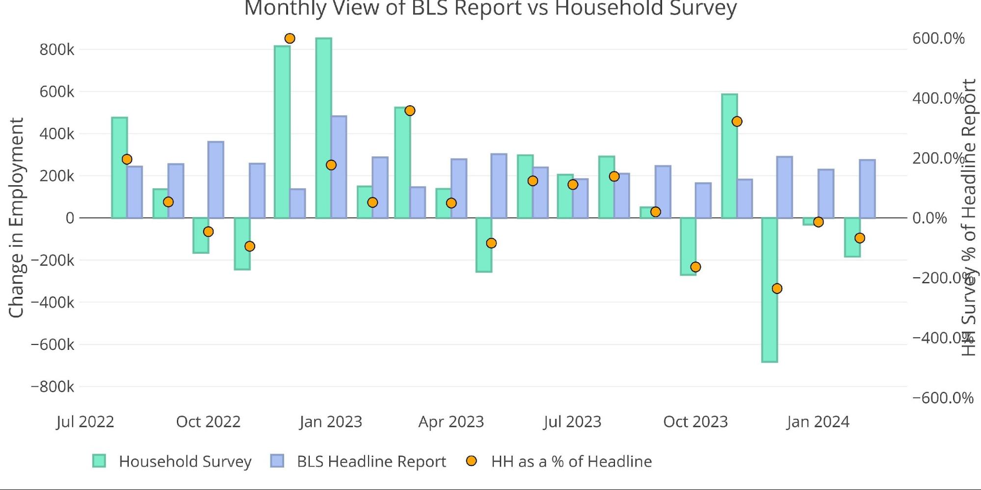
Figure: 1 Primary Report vs Household Survey – Monthly
On an annual basis, the Household survey has been moving further from the BLS Report. This has been a consistent trend since 2018 with 2024 showing a dramatic deviation.
(Click on image to enlarge)
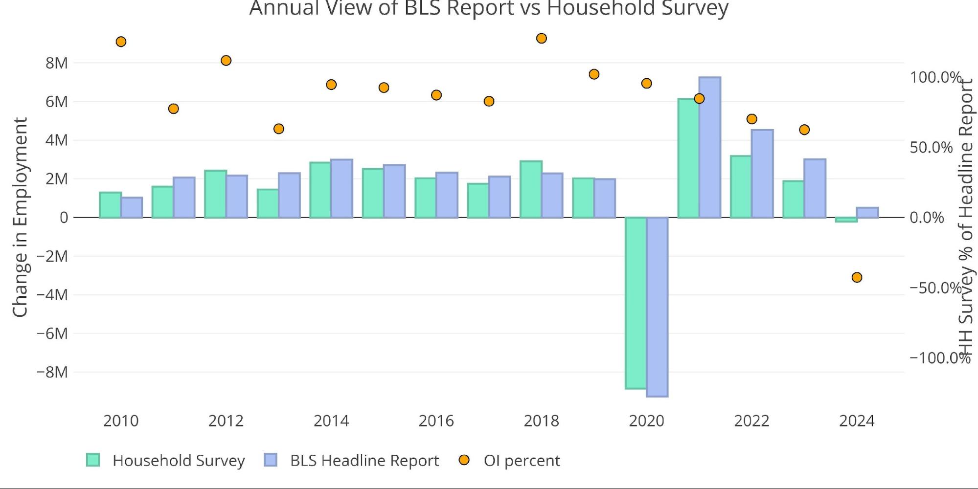
Figure: 2 Primary Report vs Household Survey – Annual
The BLS also publishes the data behind their Birth/Death assumptions (formation of new business). In February, the BLS assumed that 151k jobs were created by new businesses being started.
(Click on image to enlarge)
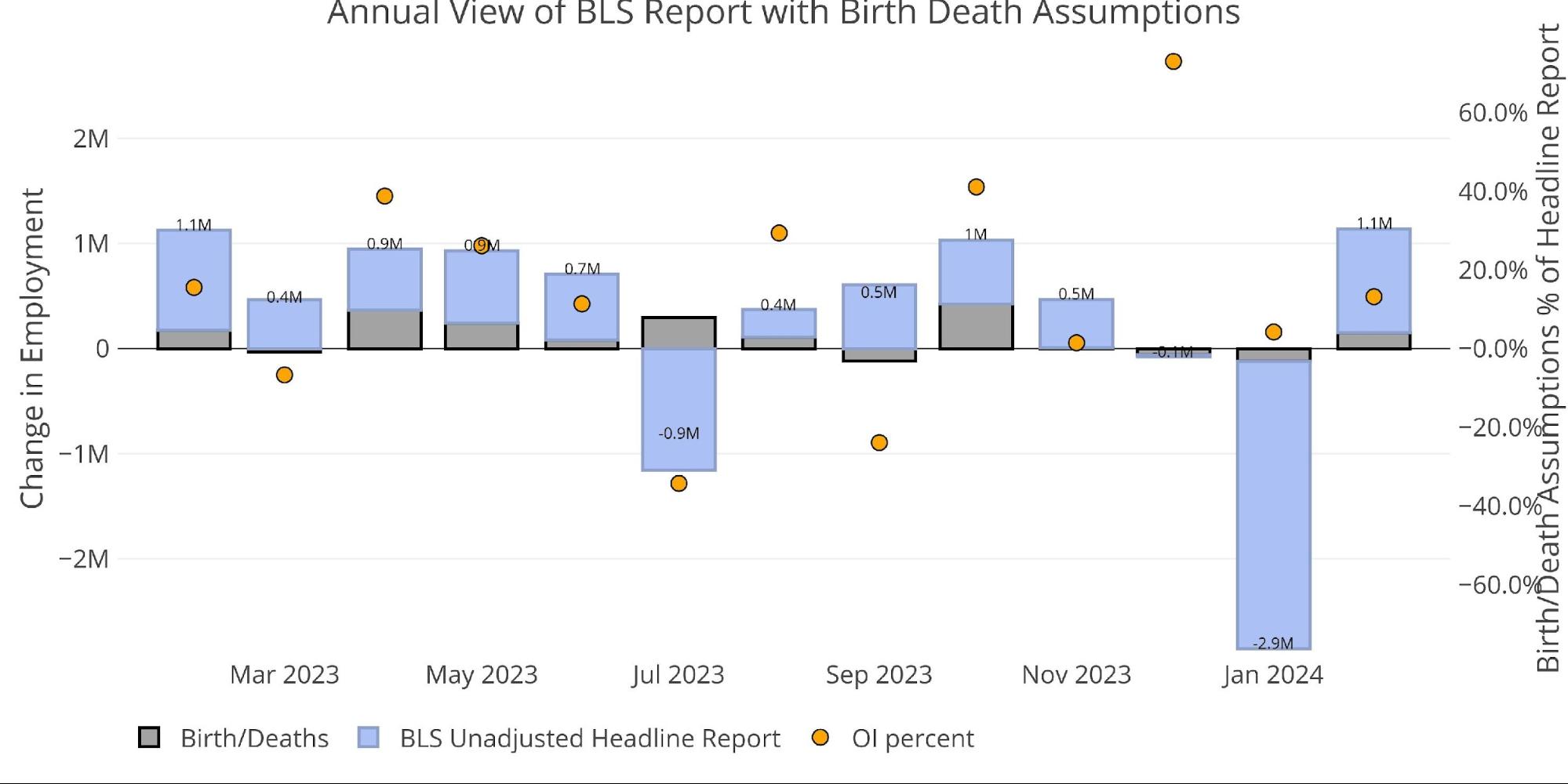
Figure: 3 Primary Unadjusted Report With Birth Death Assumptions – Monthly
Digging Into the Report
The 275k jobs surprised to the upside but may have still been considered a miss by the market given the massive revision in January. Additionally, the unemployment rate has hit the highest level in at least 2 years.
(Click on image to enlarge)
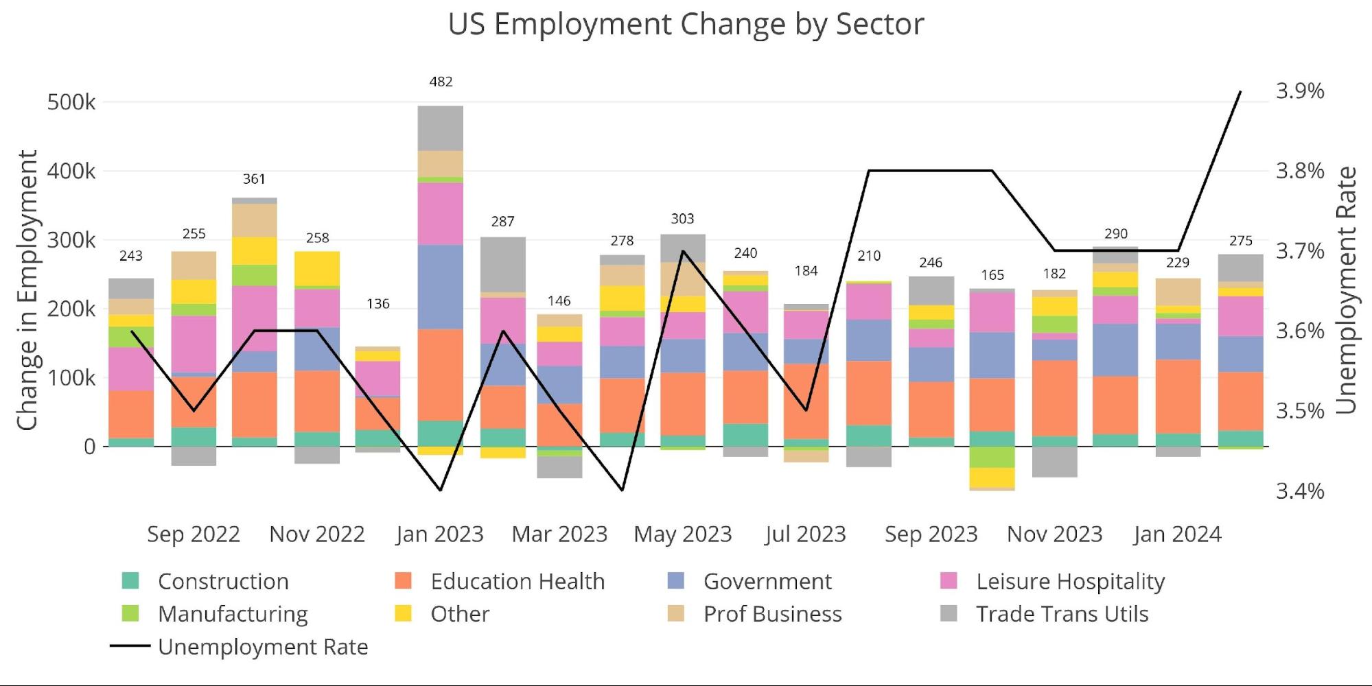
Figure: 4 Change by sector
The number of multiple job holders dropped this month, but the trend is still up.
(Click on image to enlarge)
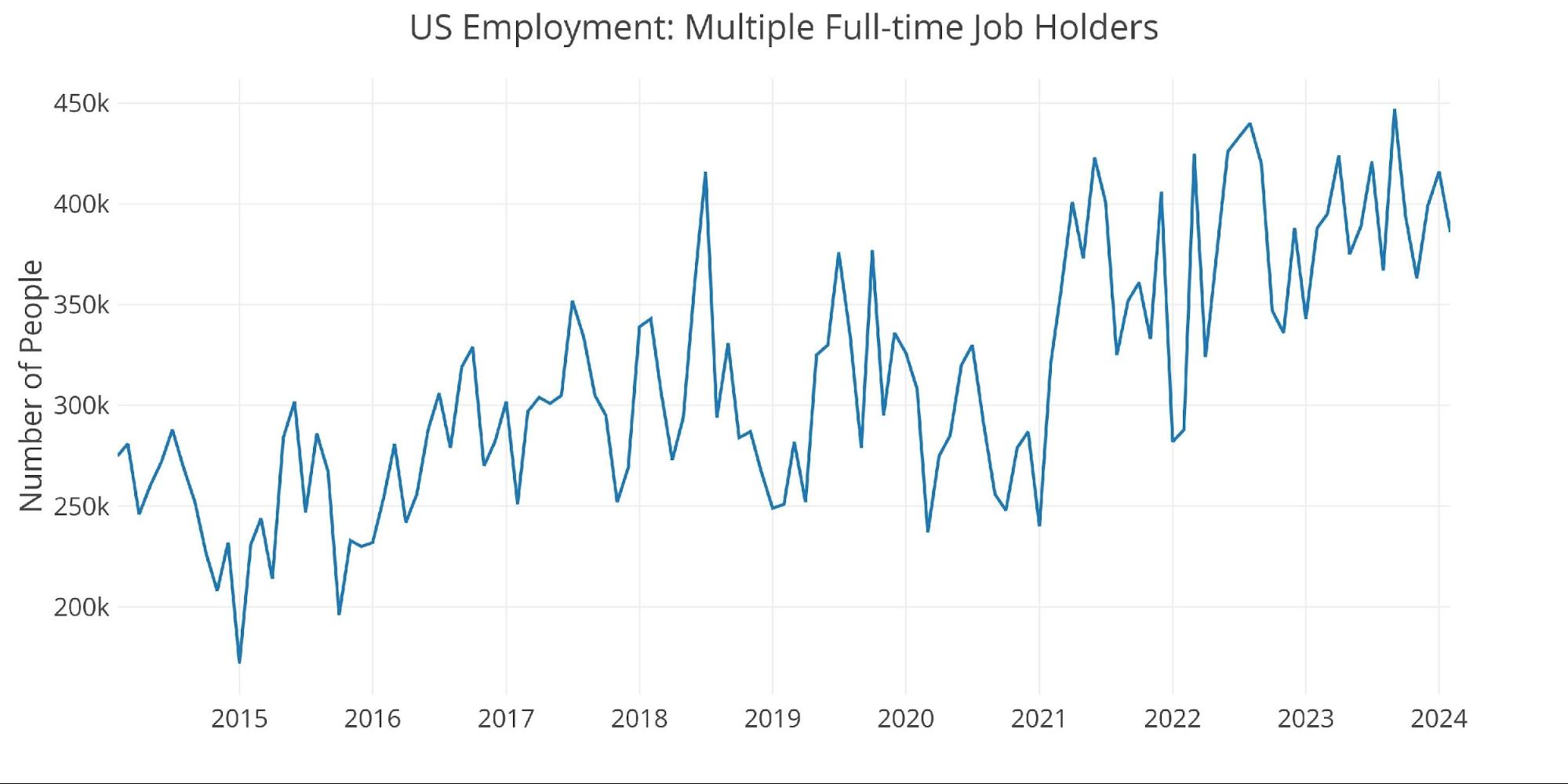
Figure: 5 Multiple Full-Time Employees
Jobs by Category
A number of categories saw some large gains, with Manufacturing showing the lone decline.
(Click on image to enlarge)
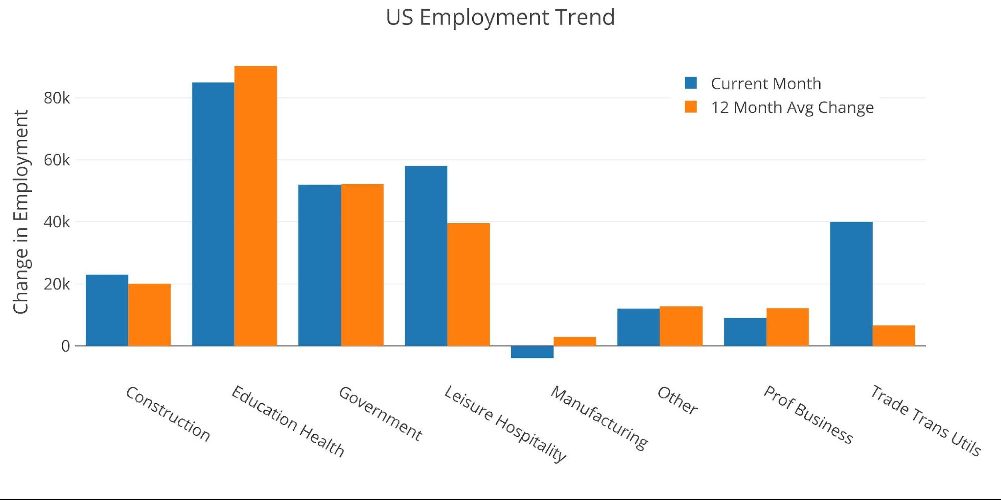
Figure: 6 Current vs TTM
The table below shows a detailed breakdown of the numbers.
(Click on image to enlarge)
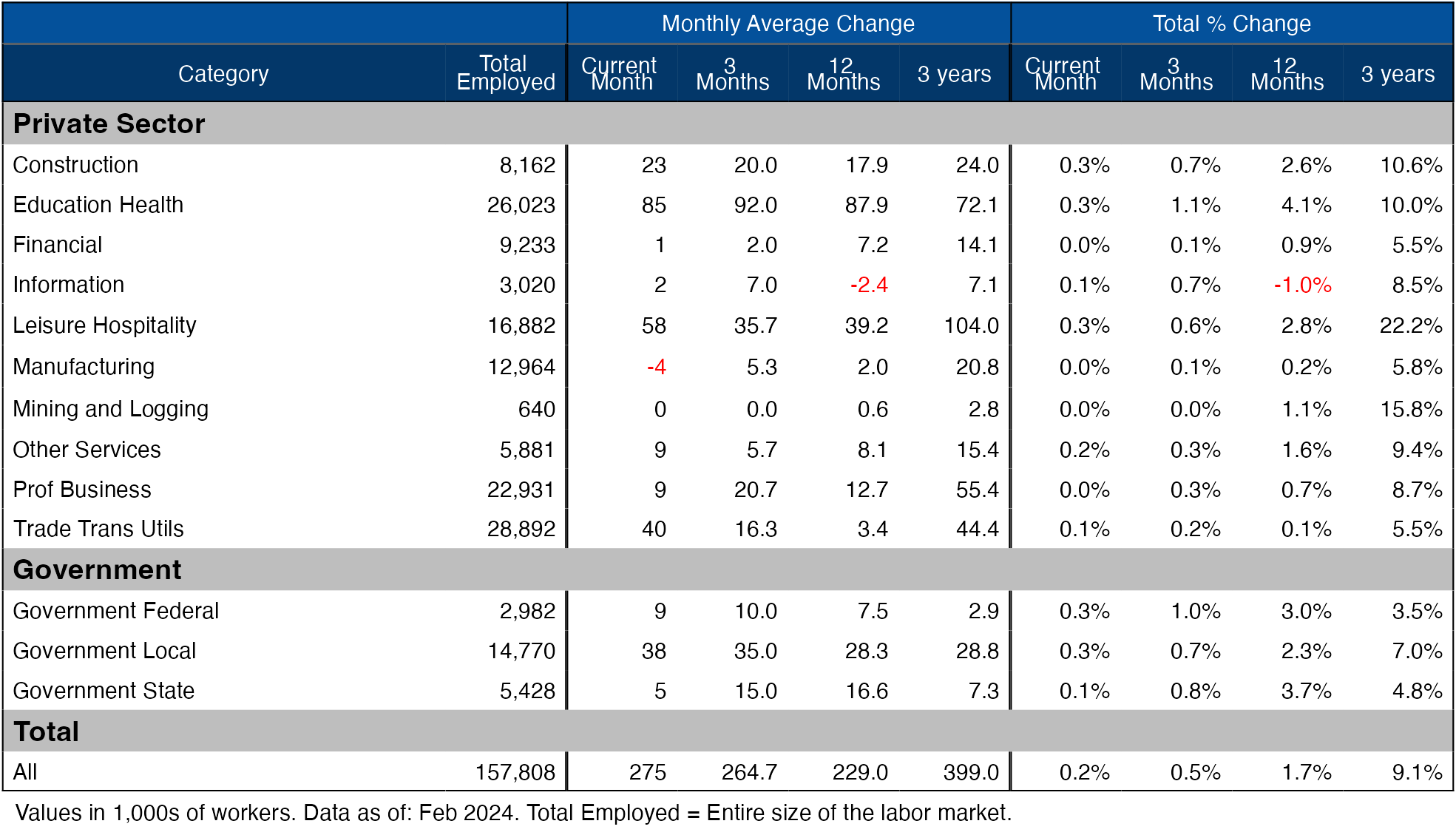
Figure: 7 Labor Market Detail
Revisions
Over the last three months, the data has been revised down by an average of 22.3k per month.
(Click on image to enlarge)
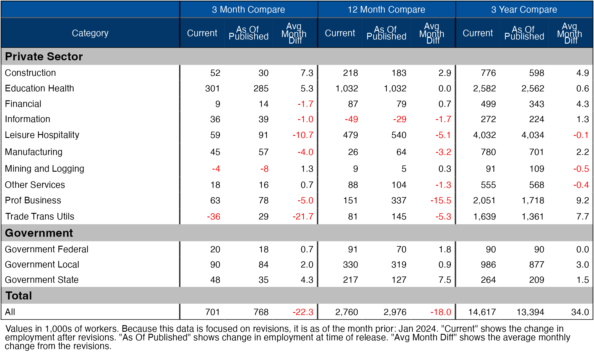
Figure: 8 Revisions
Historical Perspective
The chart below shows data going back to 1955.
(Click on image to enlarge)
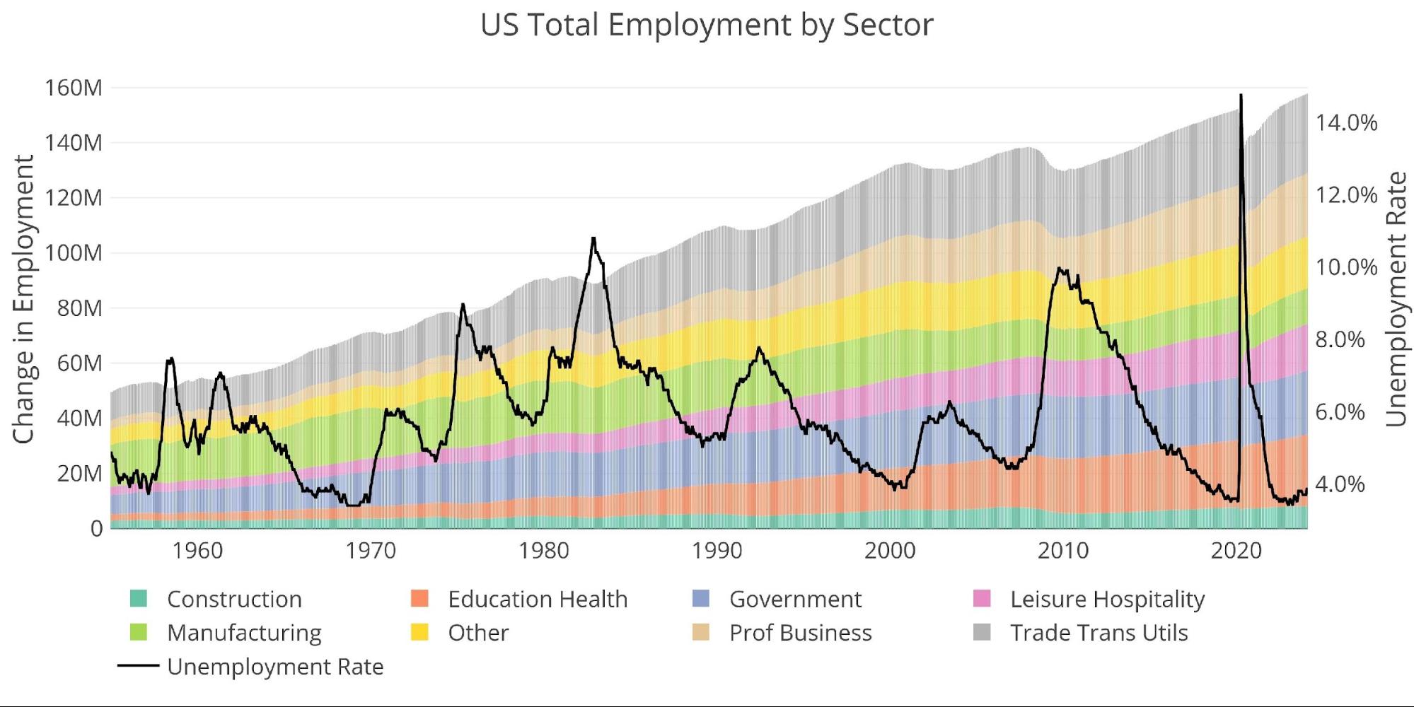
Figure: 9 Historical Labor Market
The labor force participation rate is still well below the highs before the Global Financial Crisis. This month it stayed steady at 62.5% which means the jump in the unemployment rate cannot be explained by people joining the labor market. This further discredits the Headline Report.
(Click on image to enlarge)
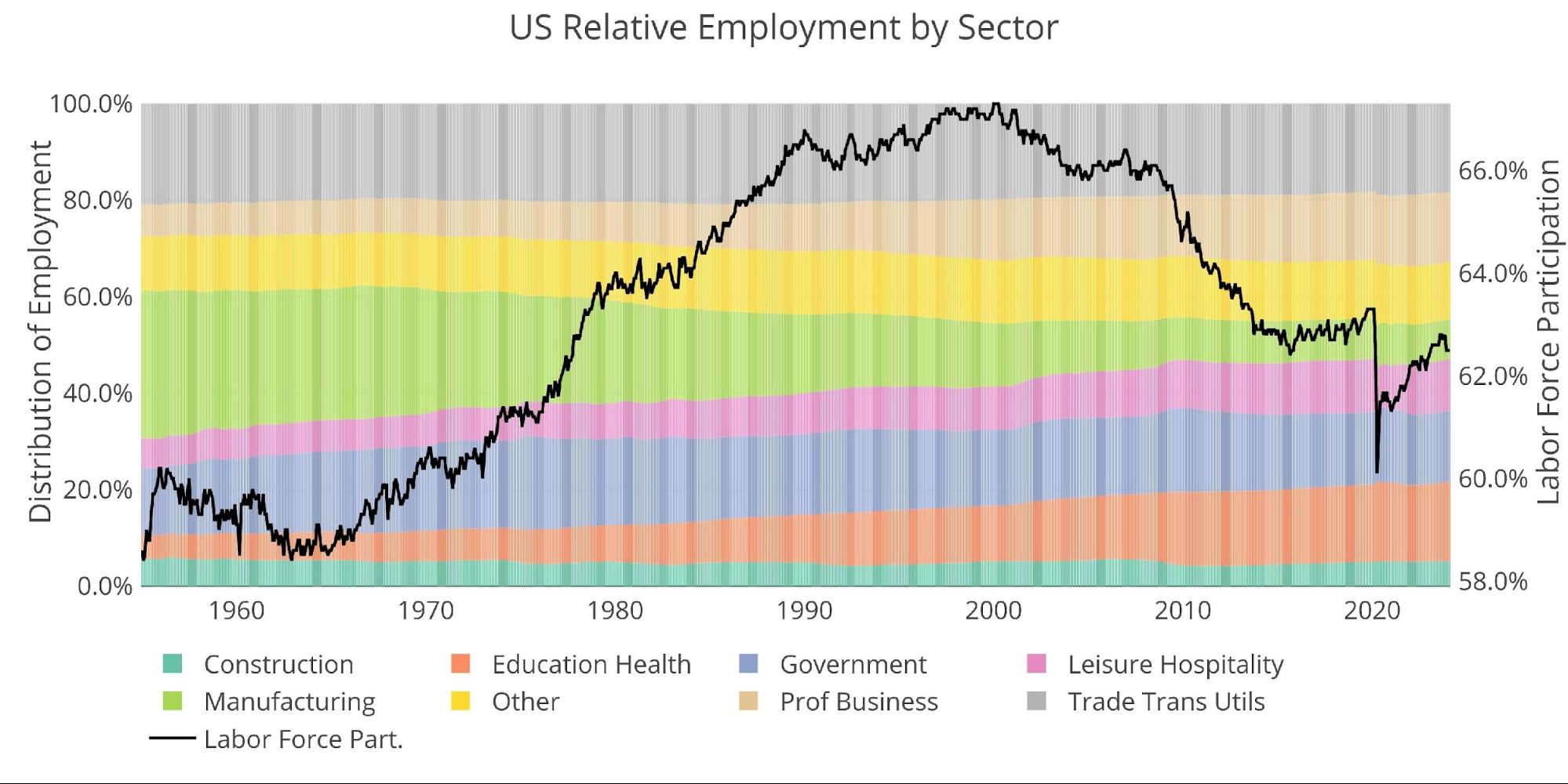
Figure: 10 Labor Market Distribution
Data Source: https://fred.stlouisfed.org/series/PAYEMS and also series CIVPART
Data Updated: Monthly on first Friday of the month
Last Updated: Feb 2024
Interactive charts and graphs can always be found on the Exploring Finance dashboard: https://exploringfinance.shinyapps.io/USDebt/
More By This Author:
Ron Paul: Fed’s “Dollar Destruction” And Moral CrisisFed Balance Sheet Shrinks By Smallest Amount In A Year
Gold Gains, Bitcoin Blasts Off


Comments
Log in or sign up to join the conversation.