
Image Source: Unsplash
Stock market indices have staged a rally over the last few sessions following a three-week decline. Health indicators are starting to improve. I’m continuing to scan and noticing that stocks I’m watching are performing quite well overall. Therefore, I’m willing take quality trades when I see them. Over the last couple of weeks I was also doing this, but with reduced position sizes.
How the Market Indexes are Doing
I look at 4 different US indices because they each tell a different story about overall stock market health. The stock market is healthiest—and swing trading stocks on the long side is most profitable—when all these indexes are in uptrends. Here’s what each of the 4 indices represents:
- Nasdaq 100 – Tech stocks.
- S&P 500 – Large US companies.
- NYSE Composite – A wide array of stocks, varying in size and industry.
- Russell 2000 – Smaller companies.
2 Canadian stock indices are also included. The Composite tracks larger companies, while the Venture tracks very small companies.
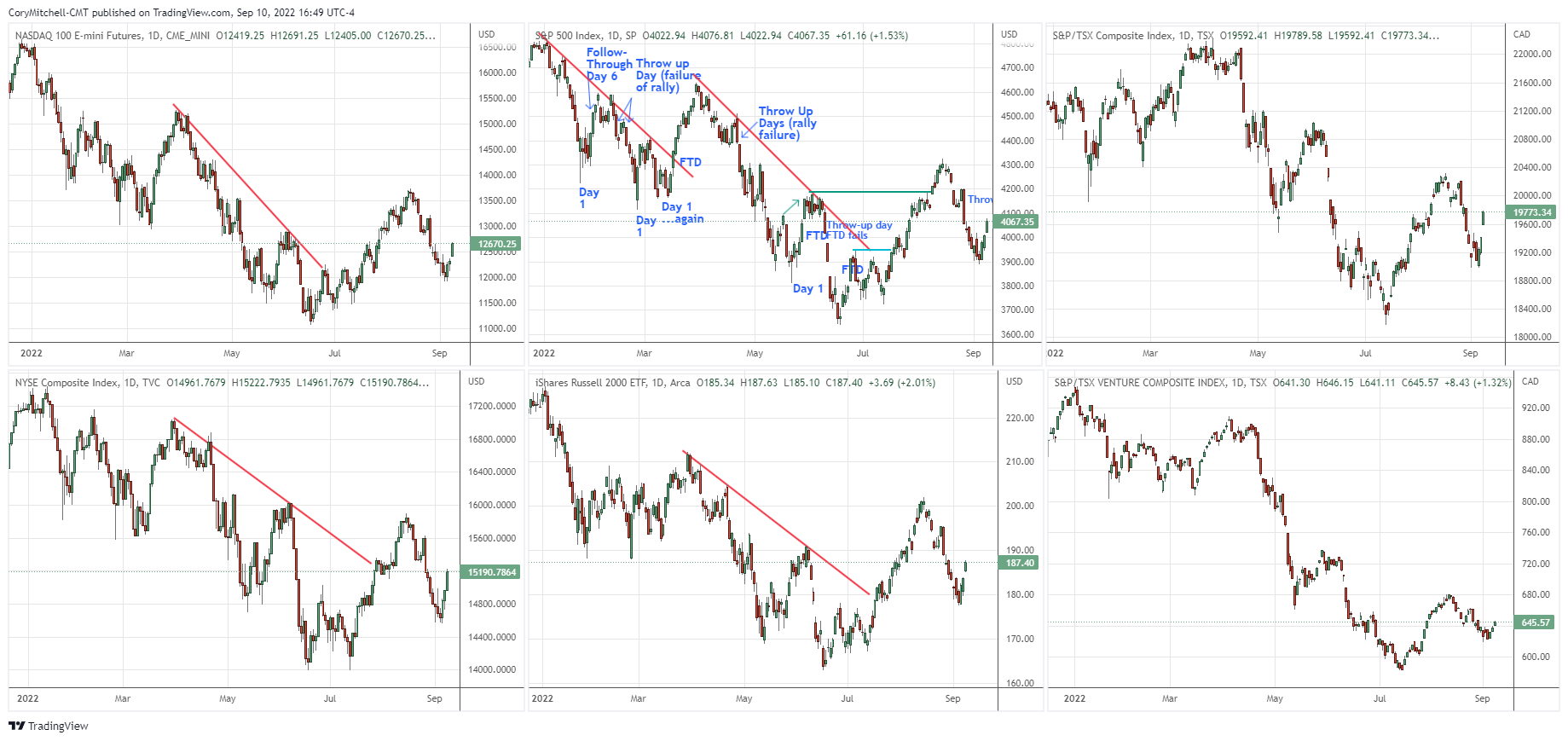
Charts are provided by TradingView – these are charts I personally use.
The July and early August rally indicated an uptrend could be underway. The major US indices (except for the NYSE Composite) made a higher swing high relative to early June. We then had a pullback followed by the indices moving up.
Overall, the charts give me more of a long bias, but I’m really looking for the price to continue moving higher and then seeing how the next pullback acts. If the pullback is quick and the price starts moving quickly higher again, that is obviously more bullish than if the next pullback sees another sharp decline.
In this light, I am willing to take trades, but I’m still being a little conservative with position sizes. I’m taking smaller positions than I usually do until I see more confirmation that we are starting a short-term uptrend, which helps indicate a longer-term uptrend is underway.
I don’t trade the indices, I trade individual stocks which typically have much better-looking charts (at least to me) than the indices. But I like trading with the wind at my back. Right now, it is slightly at my back. When I start to see more bullish action in the indices, then I know I have a howling wind behind me and I am inclined to buy aggressively. Hopefully that day is coming very soon.
State of the Market Health Indicators
The following chart shows the market health indicators I track. They tell me the condition of the stock market overall, and whether it’s a good time to swing trade individual stocks.

The market health indicators appear to be poor, yet some are more optimistic.
- 63% of S&P 500 stocks are above their respective 50-day moving averages. 52% of all US stocks are above their respective 50-day moving averages. It’s generally much easier to swing trade profitably (on the long side) when more stocks are above their 50-day averages. When this indicator is below 50%, it tends to signal sideways movement or a downtrend for most stocks/indexes. This indicator is good and looks to be improving.
- Volume was relevant on June 24 when it increased with the 3% price rise to create a follow-through day. A big drop on high volume on Aug. 26 is what I call a throw-up day. This often signals a further short-term decline - which has already unfolded.
- The dark blue bars are the daily percentage movement of the S&P 500. Big moves are associated with downtrends and turning points. Small values are associated with an uptrend. Values of -2 are a warning sign anytime they occur. There was a more-than-3% drop on Aug. 26. This indicator is poor, but it does appear to be stabilizing.
- The blue line is the cumulative NYSE Advance-Decline Line. It moved above its early April high before the S&P 500 moved above its April high. That is a bullish divergence and signals that the S&P 500 is likely to reach the April high before a new low. The indicator also stayed above July 26 levels, while the S&P 500 fell below its July 26 level. This indicator is decent.
- The blue columns are NYSE up volume divided by NYSE total volume. It tracks buying and selling enthusiasm. There was a 90% upside day on Sept. 9 (manually calculated, the indicator just provides an estimate). This is a good indicator.
- The ultimate indicator is how many quality setups there are and how trades are working. I have continued to take trades over the last couple weeks with reduced position sizes. Overall, they are doing very well. I have primarily been taking trades in strong stocks based on the TATR strategy.
Sectors on the Move
Last week was a good one for the stock market, with all the sectors bouncing. Energy has been the only sector in the green over the last month. Over the last three months, consumer cyclicals, industrials, healthcare, and technology have been the top performing (non-defensive) sectors.
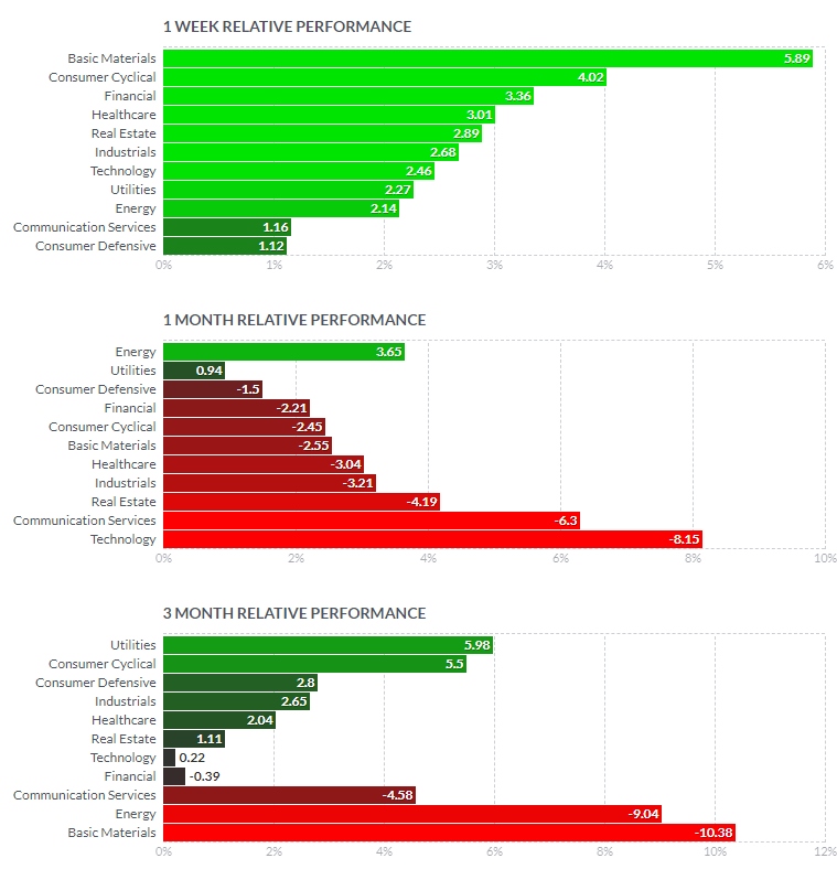
Sector performance provided by Finviz.
What I’m Doing Right Now
I’m scanning and taking stock swing trades when I get setups. But as mentioned, I am still taking smaller position sizes than usual.
More By This Author:
Swing Trading Stock Watchlist for Week of September 12Swing Trading Stock Market Outlook for the Week of September 12
Swing Trading Stock Watchlist For The Week Of Sept. 6


Comments
Log in or sign up to join the conversation.