
Is There Value In Small Cap Value Vs. Large Cap Growth
The graph below, making the rounds on social media, serves as evidence from many market pundits that the significant outperformance of large cap growth stocks versus small cap value stocks is due for an imminent reversal. While their predictions may prove correct, it is a grossly flawed argument if it’s based on the graph.
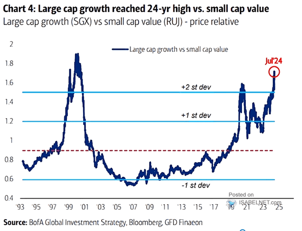
The graph charts the price of a portfolio of large cap growth stocks divided by the price of a portfolio of small cap value stocks. The relationship, or price ratio, is currently over two standard deviations above its 30-year average. The graph alludes that the average price ratio is also a fair value. Such an assumption is ridiculous.
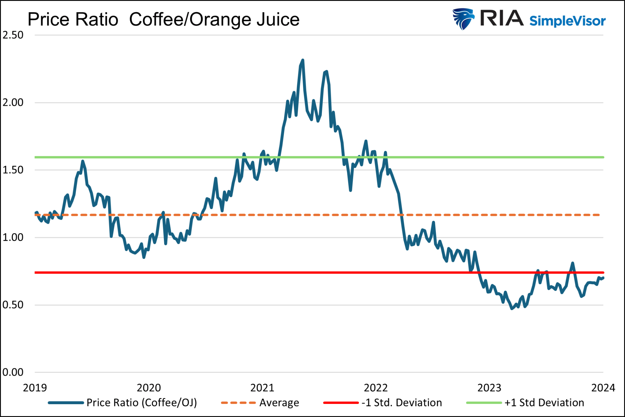
Orange Juice and Coffee
Just as large cap growth and small cap value stocks are stocks, orange juice and coffee are types of drinks. Should the price of coffee relative to orange juice be constant? Probably not.
They may move similarly up and down with food commodity prices or other broad macro factors. However, their long-term price relationship depends on their individual supply and demand curves. Assuming coffee prices are cheap compared to orange juice prices based solely on the graph below is erroneous.
Defining Large Cap Growth and Small Cap Value
Like coffee and orange juice, small cap value stocks differ vastly from large cap growth stocks.
One of the most critical factors explaining the performance differences between small cap value and large cap growth stocks is the sector in which the companies operate, and the earnings growth associated with each industry.
To better appreciate the differences between the two stock factors, we use two popular ETFs.
- IVW is the iShares S&P 500 Large Cap Growth ETF. Its top five holdings, accounting for about 45% of the ETF, are Microsoft (12.30%), Apple (12.10%), Nvidia (11.40%), Amazon (4.20%), and Meta (4.20%). The combined market caps of those five stocks sum up to $13 trillion. That is quite impressive, considering it represents over 10% of the total size of global stock markets and a quarter of the U.S. stock markets.
- IJS is the iShares S&P 600 Small Cap 600 Value ETF. Its top five holdings, accounting for less than 5% of the ETF, are Robert Half (1.05%), Comerica (1.04%), Mr. Cooper Group (0.88%), Organon (0.86%), and Lincoln National (0.86%). Their combined market caps total $31 billion, or the size of Archer Daniels Midland, the 273rd largest stock in the S&P 500.
Sector Breakdown
The following graph shows the stark differences in the sector contributions to IVW and IJS.
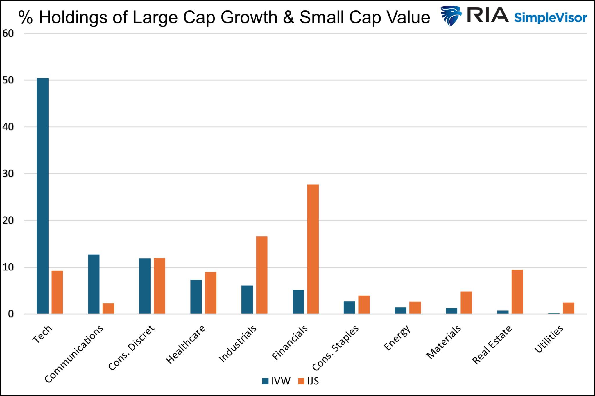
Technology stocks represent 50% of IVW, yet less than 10% of IJS. Conversely, Financials comprise 28% of IJS but only 5% of IVW. Utilities and Real Estate account for less than 1% of IVW in aggregate but are over 10% of IJS.
Each sector and its underlying companies have different earnings growth profiles. The technology sector tends to exhibit the highest earnings growth. Financials, utilities, and real estate often have more reliable but slower growth rates.
Earnings Matter
Ask yourself this:
Should an ETF consisting of companies growing earnings at a double-digit pace maintain a steady price relationship with an ETF of companies growing earnings at a much lesser growth rate?
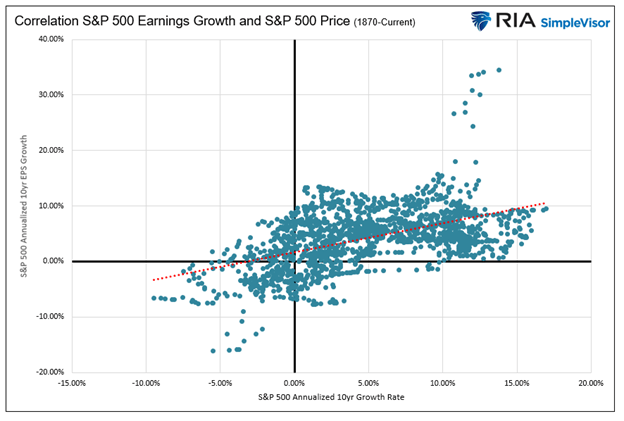
To answer the question, consider the scatter plot below. It charts the annualized ten-year S&P 500 price returns with annualized ten-year EPS growth rates. Note the trend line is upward-sloping, meaning that higher earnings growth begets higher stock prices and vice versa.
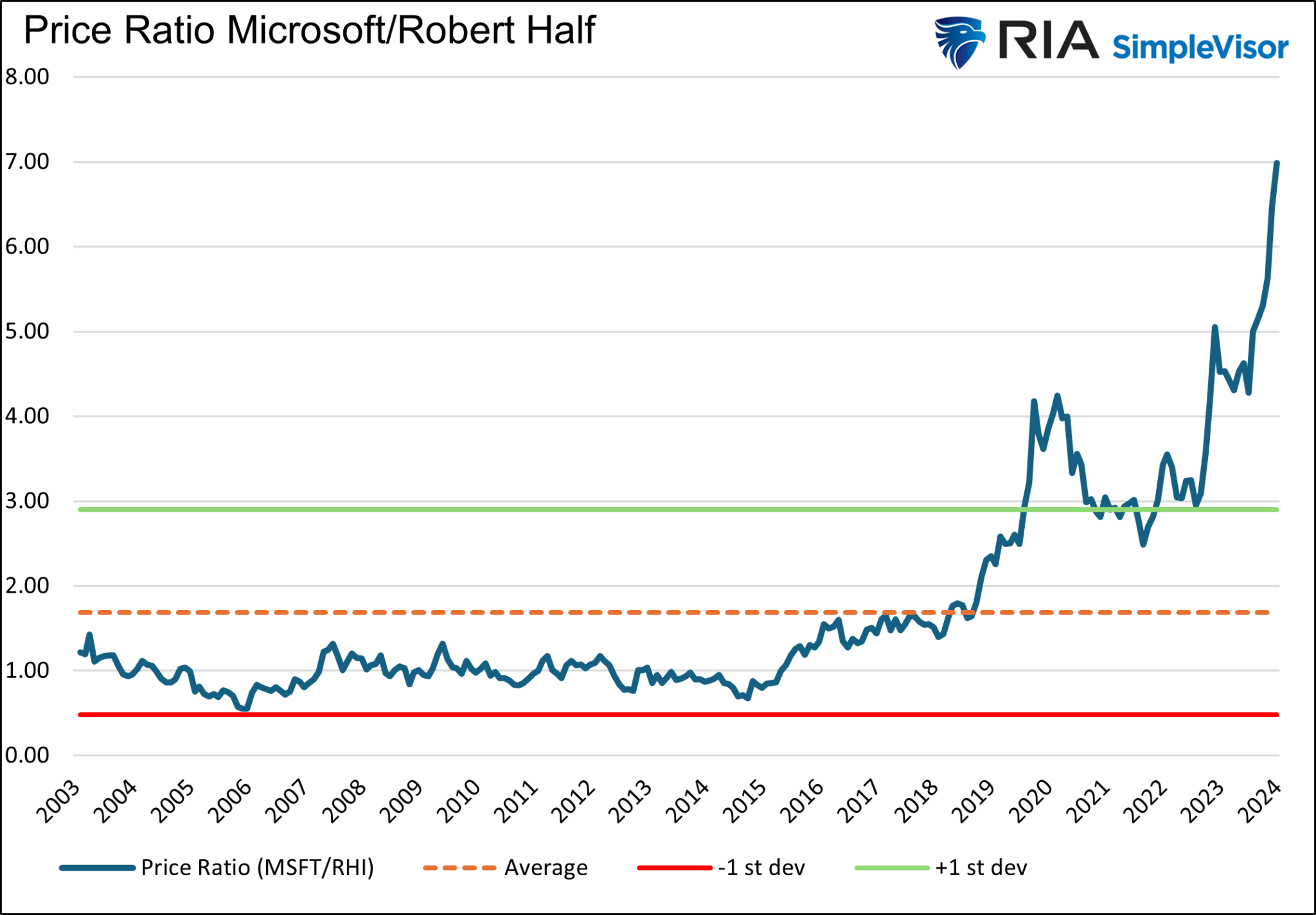
Microsoft and Robert Half
To better approximate the fair value of a pair of stocks, we run a similar analysis as the opening graph, but instead, we use the largest holding of IVW and IJS, Microsoft and Robert Half. The graph below shows that assuming the logic of the first graph is correct, Microsoft is significantly overvalued relative to Robert Half.
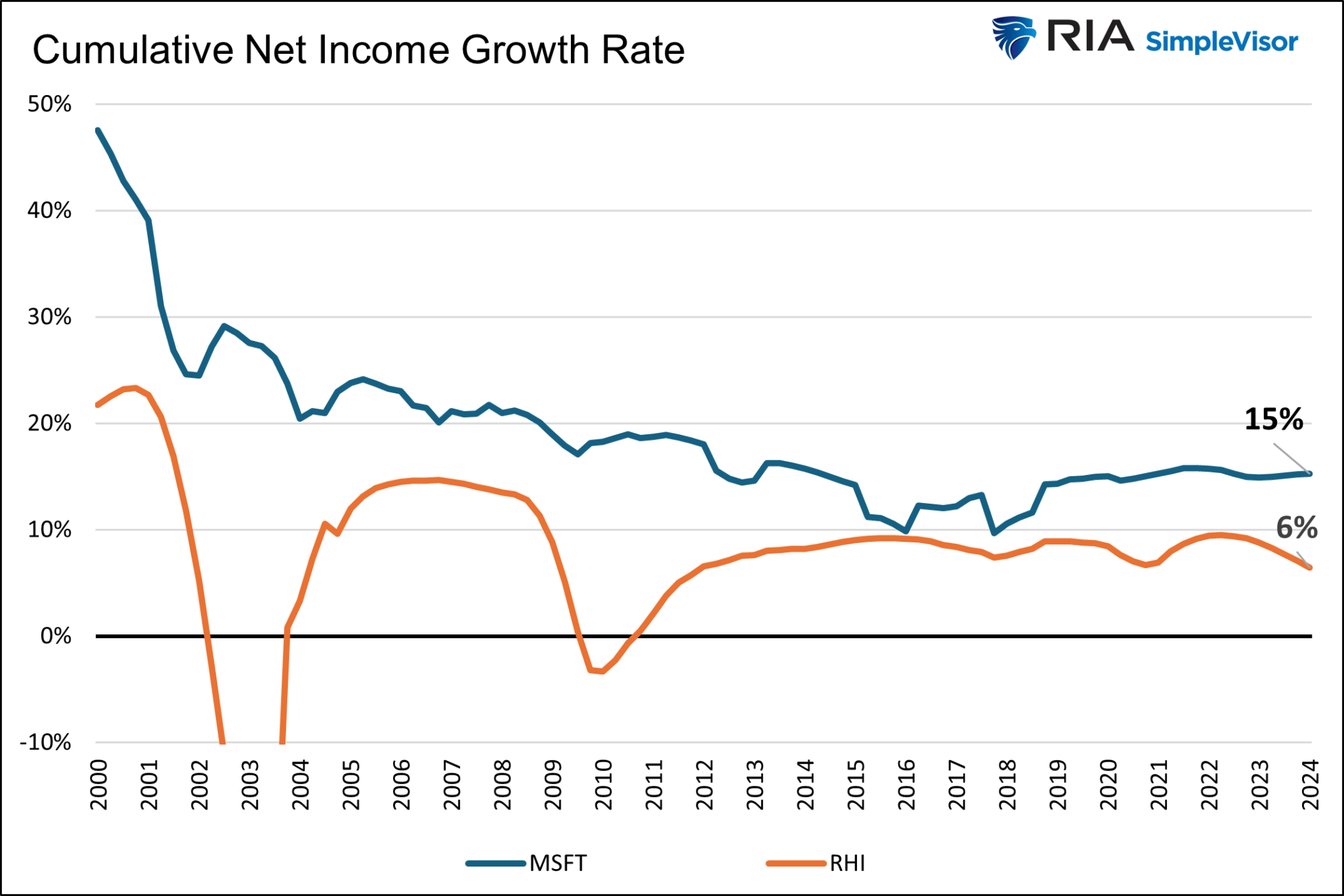
The following graph charts the cumulative net income growth rate of Microsoft and Robert Half. Since 2000, Microsoft has increased its net income at an annualized rate of 15%. Robert Half’s net income has grown at a 6% annualized rate.
The final graph using cumulative income growth puts the price ratio into a more realistic perspective.
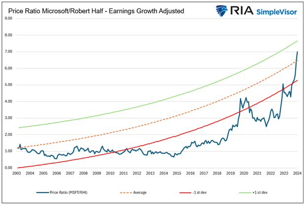
Instead of using the average price ratio, the graph takes the initial price ratio and adjusts it, as well as the standard deviations for the cumulative income growth difference. As we should expect, when adjusted for earnings, the average price ratio, or what some may deem fair value, grows over time. For the last 20 years, Microsoft is less than one standard deviation overvalued to Robert Half, not seven, as the average price ratio suggests.
We can debate where to start the trend line and what periods to use. Such assumptions will shift the “average” and standard deviation lines up or down. What’s not debatable is that a meaningful analysis of the price ratio of two stocks should not be based solely on prices.
ETFs Versus Stocks
The analysis above uses two companies. Over time, Microsoft’s earnings will slow, and it will no longer be considered a growth stock. At some point, the earnings growth of Microsoft and Robert Half may converge, and the fair value of the two may be much closer to a flat line.
However, our contention is with the opening graph comparing large cap growth stocks to small cap value stocks. Over time, stocks will be removed and added to both indexes to ensure they continue to reflect their goals. Unlike Microsoft and Robert Half, which may see their earnings growth differential shrink, the earnings growth differential of the ETFs is likely to remain much more consistent even as underlying stocks change in both indexes.
Buybacks
Buybacks are also a consideration. The largest companies buy back shares at much greater rates than smaller companies. Therefore, their EPS will grow faster, further justifying our use of earnings to determine fair value.
Summary
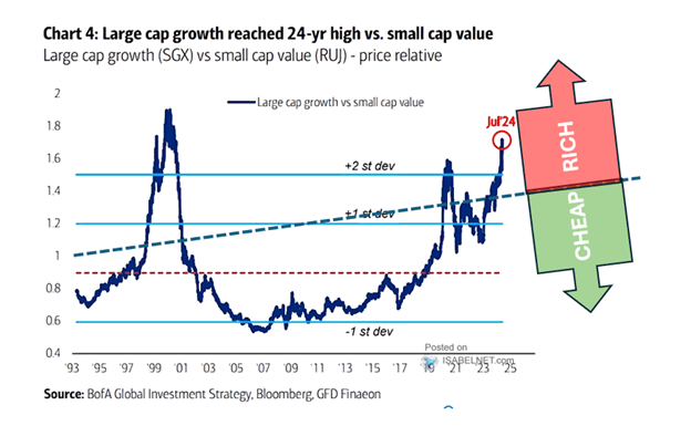
We end this article as we started it with the graph that spurred it. However, we cannot access long-term earnings data for a large cap growth or small cap value index. Accordingly, we cannot provide analysis as we did with Microsoft and Robert Half.
However, the graph below provides a much better approximation of the opportunity in small cap value stocks versus large cap growth ones.
The bottom line is that it is not nearly as enticing as the lead graph promises.
More By This Author:
Interest Rates Are Too High – Blame The Mythical R StarIrrational Exuberance Then And Now
Fiscal Dominance Is Here
Disclaimer: Click here to read the full disclaimer.


