IPO Death Cross
The past two years have seen an explosion in new equity issuance in terms of the number of deals, and especially in terms of the dollar value of those deals. As shown in the charts below, US average monthly issuance has been $23.83 billion over the past year. That is well above any point in the past few decades including the late 1990s. The actual number of stocks hitting the market has also set records this year, surpassing the 1990s peak.

While there has been a huge slug of new issuance, the performance of these names have been lackluster. The Renaissance IPO ETF (IPO) does not necessarily track every new name to hit the market, but it does act as a reasonably good proxy for the space.IPO reached an all-time high early in the year in February, but since then it has generally been rangebound fluctuating around its moving averages. Since the fall, and particularly in the past month and a half, the ETF has taken a significant leg lower.IPO has now fallen over 18% since the October 25th closing high taking out its moving averages in the process. Today, IPO is setting up for what is typically viewed as a negative technical pattern: the death cross (when a downward sloping 50-DMA falls below a downward sloping 200-DMA).

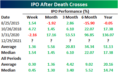
IPO does not have an extremely extensive history only going back to October 2013, and as such, there is only a small handful of prior examples of other death crosses without another instance in the prior three months. In the table below, we show those past instances. Albeit there is a small sample size, contrary to the name and pattern’s reputation, prior iron crosses have generally been followed by decent performance going forward.