
The Inflation Chart That Explains Everything
Guest Post by Nomura's Bilal Hafeez
One of the issues with aggregate data whether growth, income or prices is that it masks sectoral divergences beneath the headline. Think income inequality – what’s the point of income growth if it is all going to the 1%? That’s the challenge for many countries today. The other important one is price divergences, which we can update after yesterday’s US CPI release.
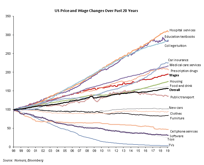
Over the past 20 years, US prices of goods and services has gone up by 56% while wages have gone up by 95%, which sounds quite good. However, when we look beneath the headline, we find that hospital services and college tuition have gone by a whopping 208% and 186%, respectively. This is much higher than wage growth, and shows that key services that enable people to move up the social ladder are being priced out of their reach. On the flip-side, the price of TVs, cellphone services and toys have collapsed, so people can at least distract themselves away from their social woes.
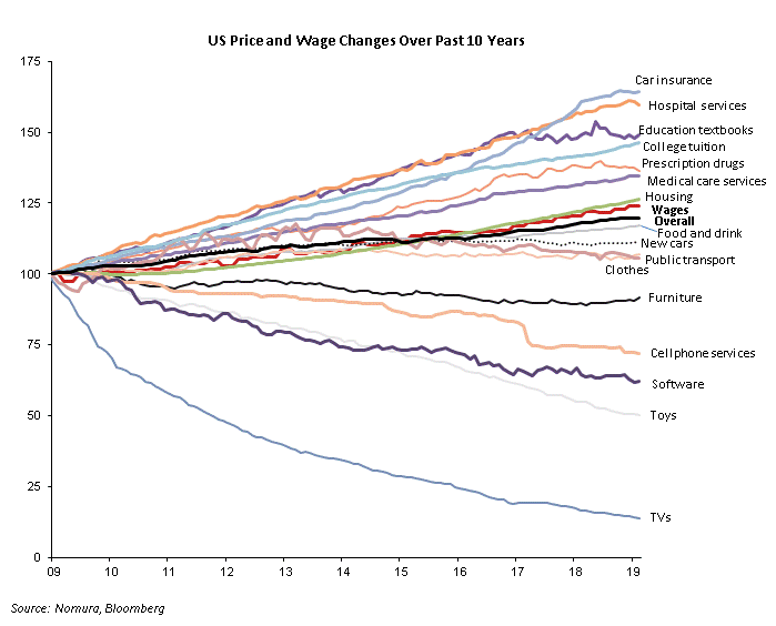
Looking at the same data over a more recent period (since 2009), we find a similar pattern with a few differences. The most glaring is that overall prices and wages have grown at roughly the same pace (20% and 24%, respectively), so real earnings are flat. Moreover, the medical costs and college tuition continue to outpace wage growth. The one bit of good news is that the pace of college tuition costs price growth vs earnings has narrowed. Worryingly housing costs have modestly outpaced wage growth unlike before. Toys and TV prices continue to fall though!
These price divergences have deeply political and economic consequences. College education allows people to get good jobs in a globalised and automated world, while everyone is confronted with medical care costs especially as they age.


