
Inflation – What Does It Look Like?
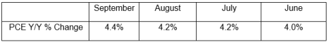
To many, inflation means a steady and continuous increase in prices. That is, we would expect to see a series of price increases in a sufficient number of goods and services that would serve to push up the measured price level consistently, month after month. For example, the PCE, the FOMC’s favored inflation measure, for the months of June–September shows the following increases:
Does this number characterize what is actually happening in the underlying data and what is being represented in the popular press or news media? Examination of the data that are input to the Bureau of Economic Analysis’s PCE price index shows little consistency in recent months in term of the pattern of component price increases and decreases. Below is a deeper dive into those data.
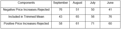
The Federal Reserve Bank of Dallas publishes its Trimmed Mean PCE inflation index each month with a lag. As part of that effort, it also provides the detailed changes in the prices of 177 categories of goods and services that make up the BEA’s PCE and are also used in the Bank’s Trimmed Mean. The Dallas methodology ranks the components according to their monthly increases and decreases and then uses an algorithm to throw out what are regarded as extreme and more noisy price movements. The first thing to note is that the number of components discarded, as well as those actually used to compute the trimmed mean, is quite variable from month to month, suggesting the lack of a sustained and consistent path for the individual components. The following table shows the number of components with the largest price declines that were rejected, the number of components in the actual Trimmed Mean PCE index, and the number of components with the largest price increases that were rejected. We can see that there were fewer components with price increases that were rejected in September than was the case in previous months but also more components with negative price movements that were rejected and a significant decline in the number of components included in the Trimmed Mean index.
This picture suggests that there is a lot of variability in price movements from month to month. The key questions are, how consistent have the price increases been from month to month, and how large have some of the price increases been among the rejected components?
One would think that in the case of those goods and services with high price increases that were eliminated from the Trimmed Mean for September, there would be a consistent pattern across the previous three months. However, of the 58 items excluded from the index with high prices in September, only 11 experienced price increases in all four months (June–Sept). Interestingly, these price increases were concentrated in just three categories – autos (3), food (3), and fuels (3); the remainder were for unrelated products and services. Furthermore, 18 components with large price increases in September actually had significant price declines in August and had been excluded from the August Trimmed Mean because of those large price declines.
On the other end of the spectrum, the component with the largest price decline was Air Transportation, which declined 71.5% on a year-over-year basis but in the previous three months had experienced increases of 92.4% in June, 139.3% in July, and 90.9% in August. Similar patterns can be observed in other components, with price declines that had been omitted from the Trimmed Mean.
While it may seem that the discussion has focused on the Trimmed Mean, this is not the case.The BEA data accessed through the FRB Dallas provides a convenient window to examine price dynamics that are behind the PCE. When we look at the detail, it is not the case that there is a consistent pattern month over month in the price movements across specific components. Just because the PCE index has shown inflation persisting at more than 4% for the past four months, it does not follow that we can conclude that all prices are moving in lockstep or even in the same direction from month to month. It is partly for this reason that it has been possible for the FOMC to infer that inflation is “transitory”; but just as it is possible to get lost in the detail, it is also important to pay attention to the aggregates. One conclusion we might draw from looking at the detail is that throwing out components from the PCE index can also throw out important information on inflation dynamics that may be driving PCE inflation. In particular, it would be especially interesting to know from an historical perspective if specific components of the PCE can provide leading indicators of where inflation may be going. As of right now, we don’t have the answer to that question, and it is important to recognize that even if such leading indicators based upon the past might exist, this does not mean that they will help us predict where inflation may be going as we exit the pandemic.
Disclaimer: The preceding was provided by Cumberland Advisors, Home Office: One Sarasota Tower, 2 N. Tamiami Trail, Suite 303, Sarasota, FL 34236; New Jersey Office: 614 Landis Ave, Vineland, NJ ...
more

