Did Government Employment Account For Most Of September’s Employment Gains?

Image Source: Pexels
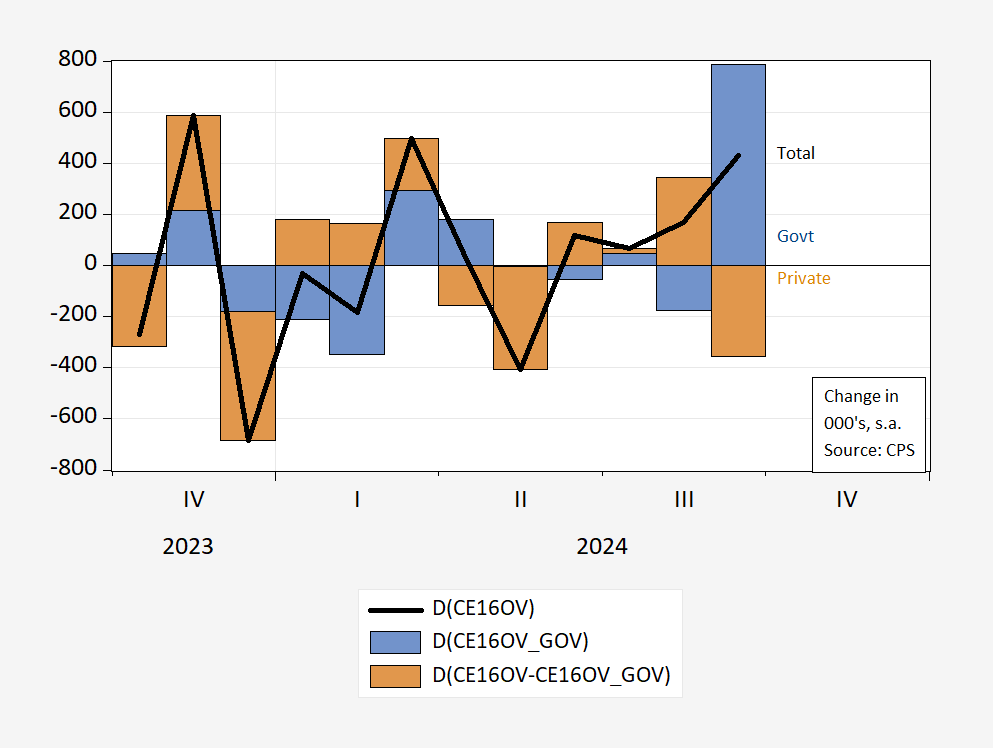
ZeroHedge and EJ Antoni assert yes, relying on the household series…
Figure 1: Total change in civilian employment (bold black), change attributable to government employment (blue bar), to private (tan bar). Source: BLS CPS, and author’s calculations.
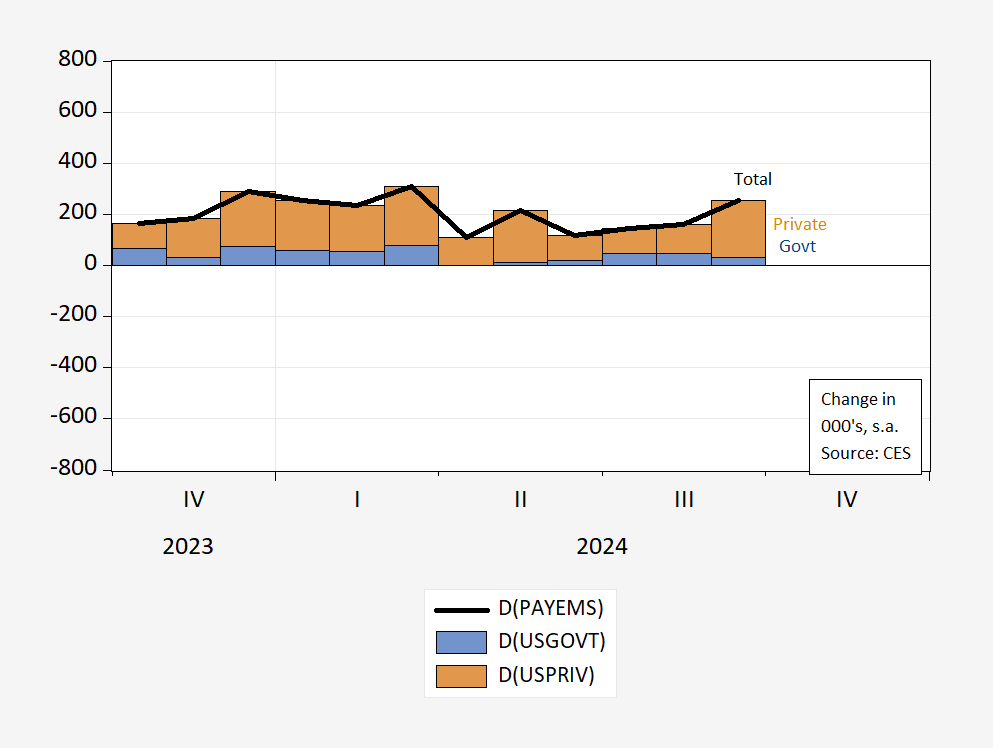
If it seems implausible that government employment should flip-flop between positive and negative values, then you might be excused. The household survey is useful for many things, but figuring out month-to-month changes in subcategories is not necessarily one of them. For instance, compare against the corresponding graph, using the establishment survey data.
Figure 2: Total change in civilian employment (bold black), change attributable to government employment (blue bar), to private (tan bar). Source: BLS CES, and author’s calculations.
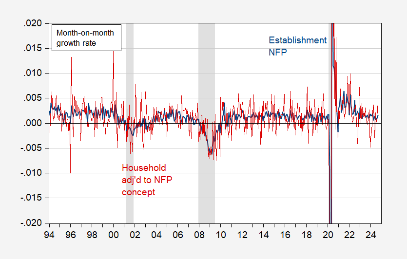
The household survey is well-acknowledged to be highly volatile, as shown in Figure 3:
Figure 3: First log difference of CES nonfarm payroll employment (blue), of CPS employment adjusted to nonfarm payroll concept (red). NBER defined peak-to-trough recession dates shaded gray. Source: BLS, NBER, and author’s calculations.
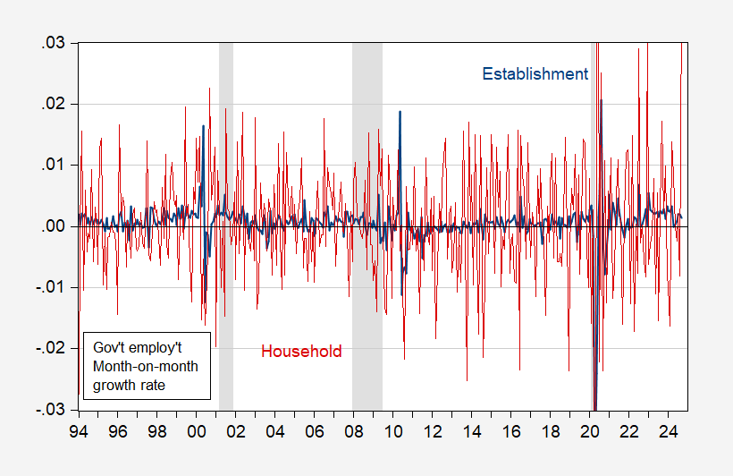
So too for government employment (in percent terms):
Figure 4: First log difference of CES government employment (blue), of CPS government employment (red). NBER defined peak-to-trough recession dates shaded gray. Source: BLS, NBER, and author’s calculations.
This is why ZeroHedge was forced to resort to using CPS data, and CES not-seasonally adjusted numbers. Wow.
More By This Author:
Business Cycle Indicators – With September EmploymentNFP Blowout
Nowcasting Private NFP Using ADP Data


