
Weekend Report… What’s Up In The Markets... Everything?
There is so much happening right now in many of the different areas of the markets, it’s hard to know where to begin. The commodities sector, which had been a in severe bear market since 2011 looks like it has turned the corner along with the precious metals stocks, since the first of the year. Most of the US stock markets are also looking pretty strong as well, especially if they can breakout above overhead resistance.
Lets get started by looking at the US dollar and several of the more important currencies of the world. I won’t go into a lot of detail as we just looked at them fairly recently. There are no real major changes but the $XJY, Japanese Yen, is trading back up to a very important trendline, which held resistance back in April of this year.
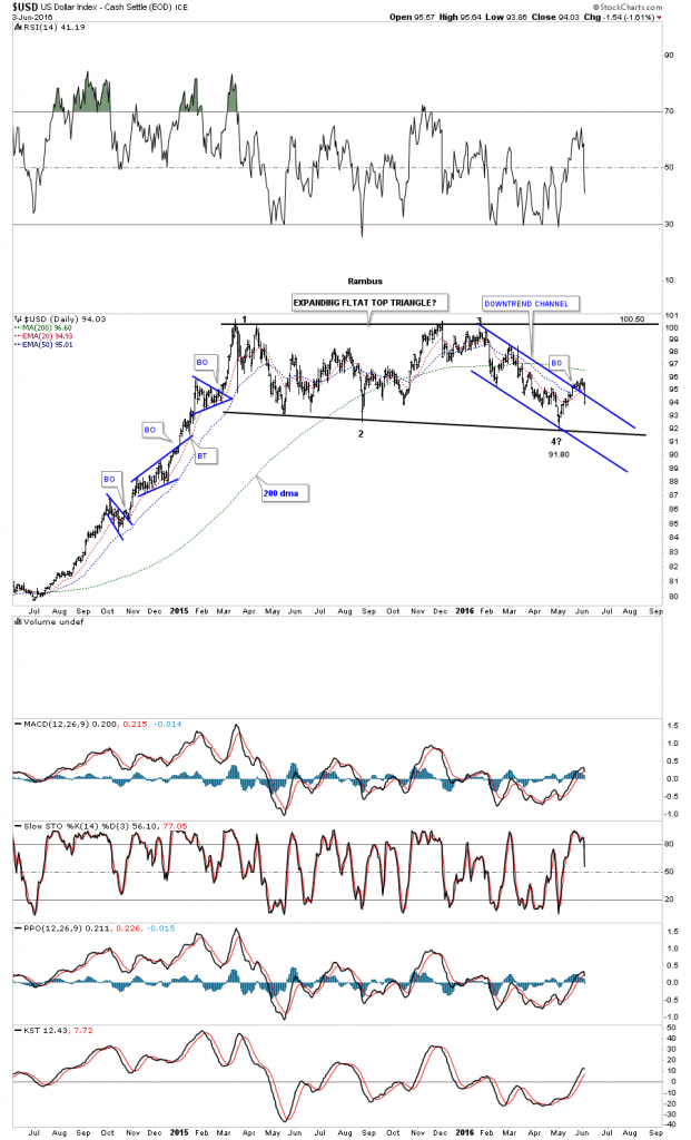
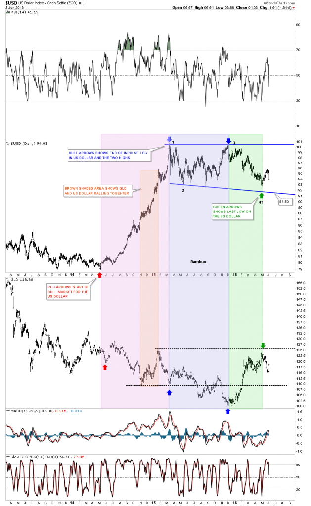
This first daily chart for the US dollar is one we are familiar with as it has been chopping sideways for about 15 months now, after a strong impulse move up. I’ve tweaked the bottom rail to the May low, which now gives us a flat top expanding triangle, which is still building out. You can see the price action from last Friday, broke back below the top rail of the blue downtrend channel negating that breakout for now. The US dollar is also trading below its three moving averages as well. The bottom rail of the possible expanding flat top triangle comes in around the 91.70 area, which will be critical support. If, and this is a big if, if the US dollar breaks below the bottom trendline it would setup a double top formation, which would be extremely beneficial to commodities and the PM sector.
The 30 year monthly chart for the US dollar shows the uptrend channel with the recent trading range building out at the top. The US dollar could break below the bottom rail of the trading range and find support on the bottom rail of the uptrend channel, and still be in a confirmed bull market. If that were to happen it would give commodities and the PM sector the green light to move much higher before a significant consolidation pattern begins to build out. First things first though, and that is, we have to see the bottom rail of the recent trading range broken to put this scenario in play.
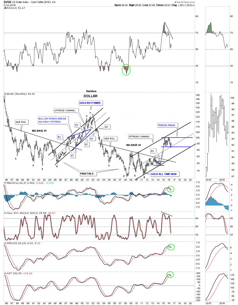
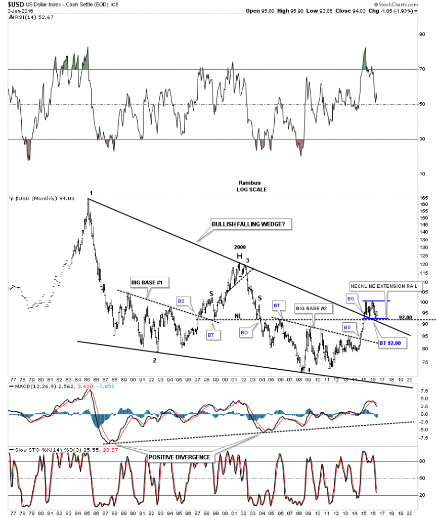
This long term monthly chart for the US dollar I’ve been showing you, while big base #2 was still maturing ,almost one year before the breakout. As you can see the big impulse move up and out of big base #2 took out two very important overhead resistance lines, which were the top rail of the 30 year black falling wedge, and the neckline extension rail that formed the big H&S top with the head forming at the 2001 high. There is also now the bottom rail of our latest trading range which is forming right on those other two trendlines. The confluence of support comes in around the 92 area.
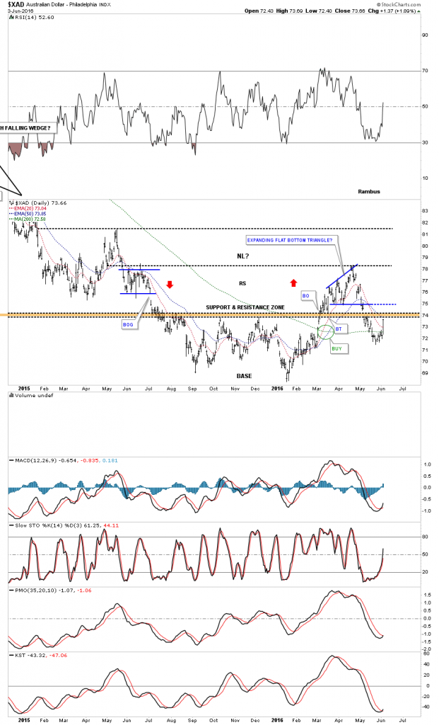
Now lets take a quick look at the $XAD, Australian dollar which shows its big move up last Friday to just beneath the brown shaded S&R zone. If it can breakout above the S&R zone, that would show some strength with the next area of resistance just above the bottom rail of the blue expanding flat bottom triangle, that formed just above the S&R zone.
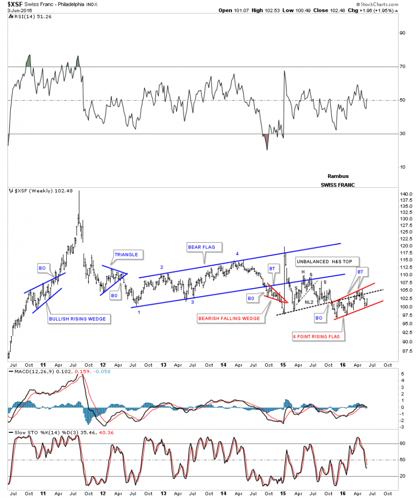
The weekly chart for the $XSF shows it bouncing off of the bottom red rail of the 6 point rising flag formation, which has been taking place since the Swiss Franc broke below the neckline of a H&S consolidation pattern last fall.
The $XEU has been building out an inverse looking trading range vs the US dollar. Since the last low at reversal point #3, the XEU has been building out a rising wedge formation inside of its blue horizontal trading range. Back in 2014 the XEU built out a black rising wedge, which showed up at the end of the consolidation phase, which began the near parabolic downtrend to the first reversal point in the blue trading range at the bottom of the chart.
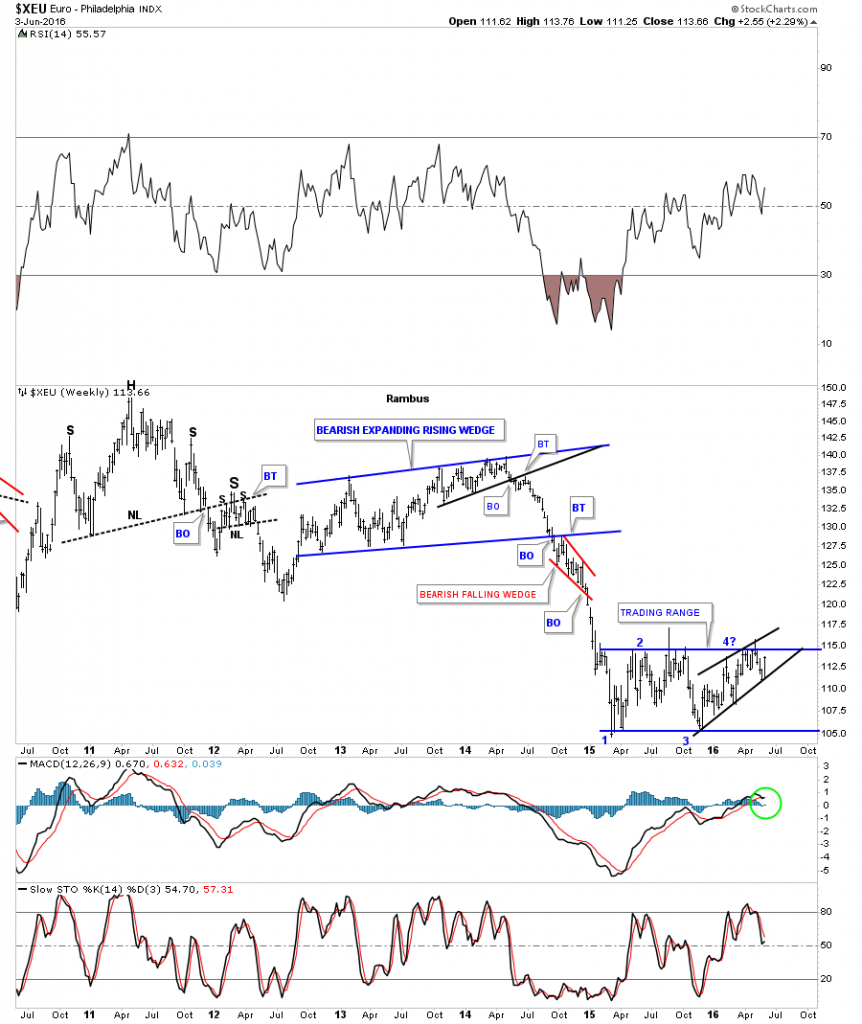
The last chart for the XEU shows the horizontal trading range building out just below the brown shaded support and resistance zone, ping ponging between two potential necklines.
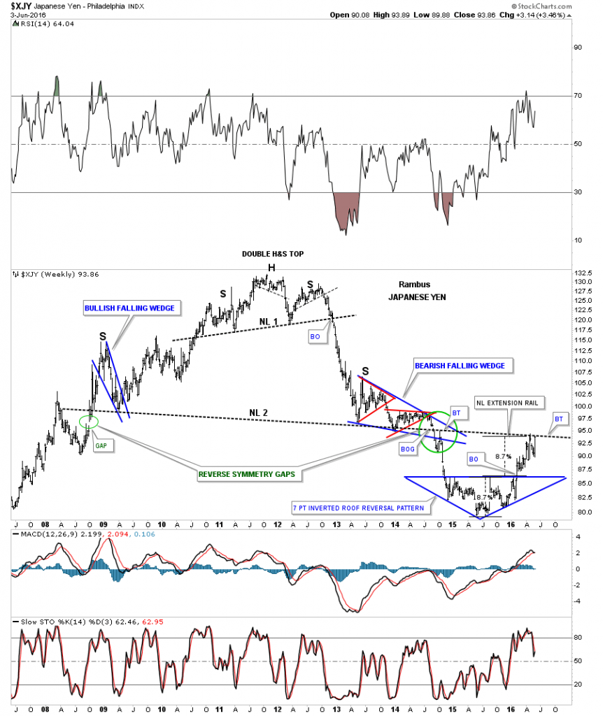
The last currency we’ll look at is the $XJY, Japanese Yen, that is backtesting the very important neckline, which formed its massive H&S top for the second time from below. If you follow the price action starting on the left hand side of the chart, you’ll see how it has interacted with that almost eight year neckline. That is one HOT trendline.
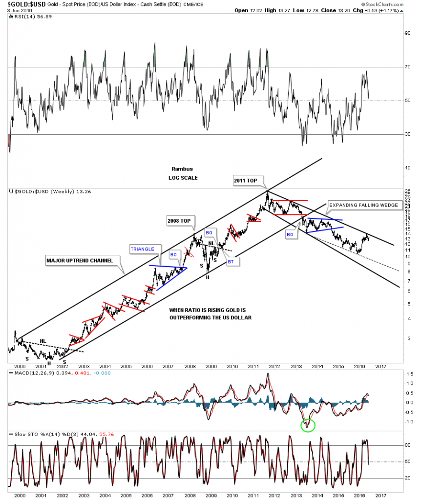
This next chart is a long term weekly look at the ratio chart which compares gold to the US dollar. During the bull market years it built out a very pretty parallel uptrend channel, which held until the big breakout in April of 2013. The bear market that began in 2011 has taken on the shape of an expanding downtrend channel. A big question will be answered when this ratio breaks out above the top rail of the expanding downtrend channel. As you can see the price action has just recently bounced down from the top rail, which is to be expected on the initial hit. Now we need to see the bulls come back in and take out that top rail to put the last nail in the coffin. I would then expect one last backtest from the top side to take place to complete the bear market in this ratio chart.
Below is a three year combo chart which has the US dollar on top and gld on the bottom. This chart compares the movement in the US dollar to gld or the other way around, if you prefer. The red arrows on the left side of the chart shows where the US dollar began its very strong impulse move up in 2014. The brown shaded area shows where both the US dollar and gold rose together for about four months or so. The blue arrows shows the trading range on the US dollar, which corresponds to the movements in gld below. As you can see gld had a negative divergence to the US dollar, at the third reversal point in the sideways trading range. When the US dollar rallied back up to the previous high, gold made a lower low. This chart shows the two can rally together for a time, but for the most part there is an inverse correlation which needs to be respected.
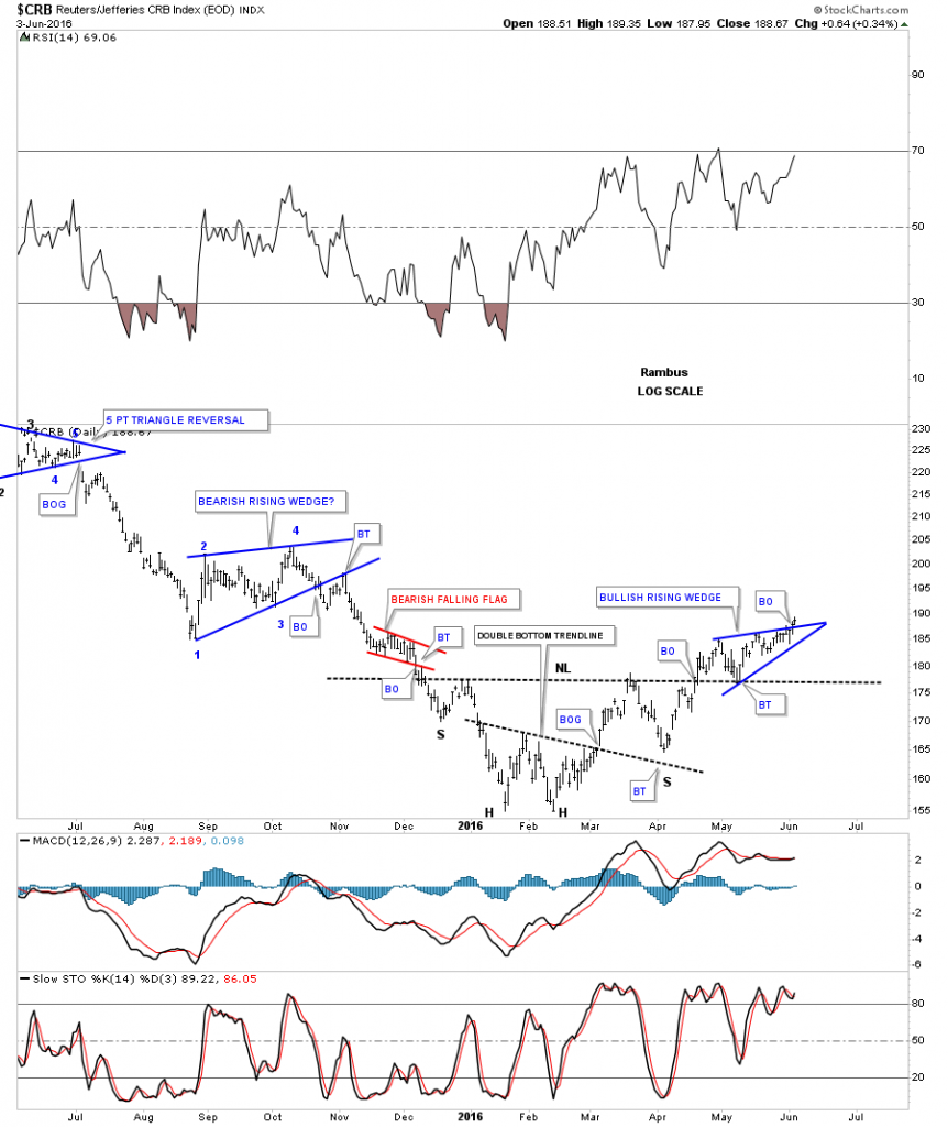
The next part of this Weekend Report I would like to show you the conundrum I see forming on many different commodities, and the PM complex vs the US dollar. As I have shown you most of the commodities and the PM complex topped out in 2011, and look to have bottomed out in January of this year. The Basic Materials sector is a good place to look at how some of the stocks that make up this index are performing, which may shed some light on the commodities complex in general. Before we look at the basic materials sector lets look at the CRB index, which has be around for a very long time.
The one year daily chart shows the CRB index making a double bottom as its bear market low which morphed into an inverse H&S bottom. The backtest to the neckline has taken about a month and has created a blue rising wedge, which looks to have broken out topside last Friday. If you compare the price action on the way down to the price action on the way up you can see the CRB index has been making a series of higher highs and higher lows since the January – February double bottom low.
This next long term daily chart shows the parabolic move down the CRB index made, which started at the last reversal point in the black triangle consolidation pattern. That last reversal point in the black triangle also marks the start of the US dollar’s near parabolic big impulse move up in 2014.
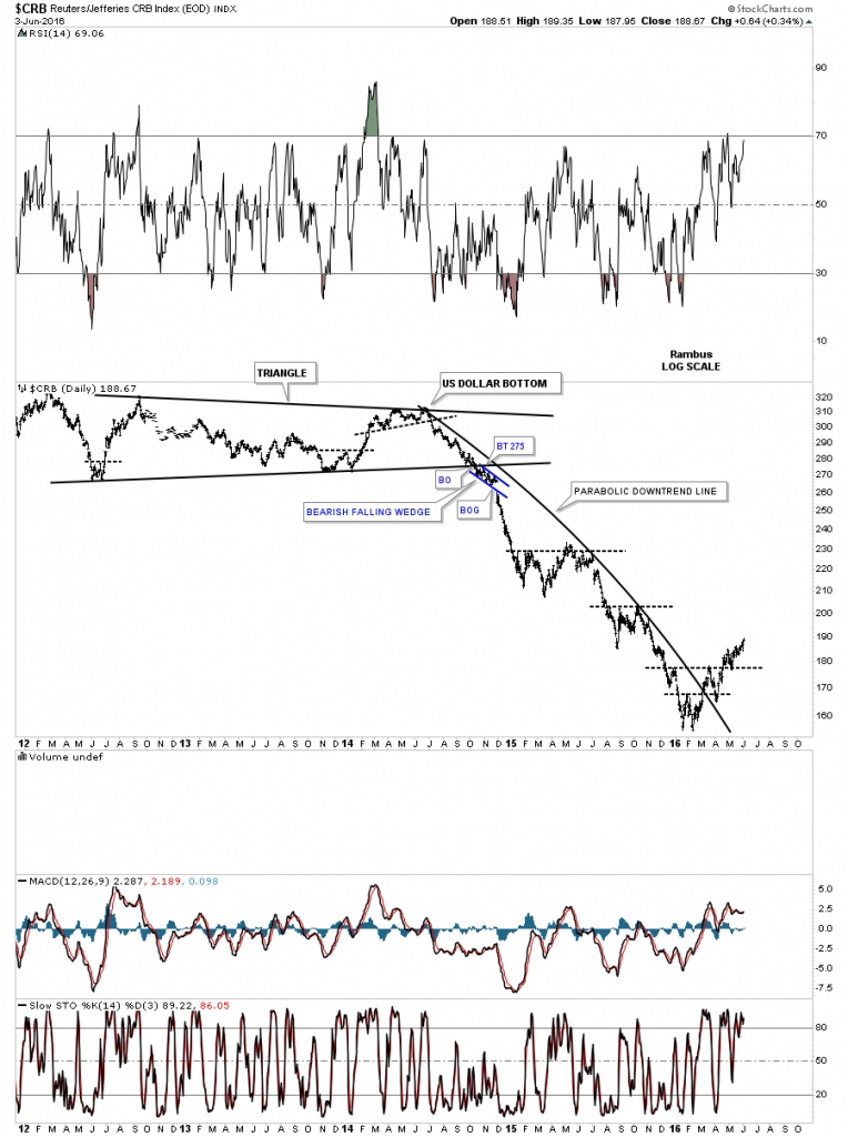
Below is the same chart as the one above but this one shows the consolidation patterns that formed on the way down and the inverse H&S bottom.
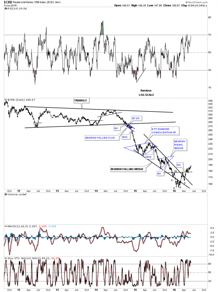
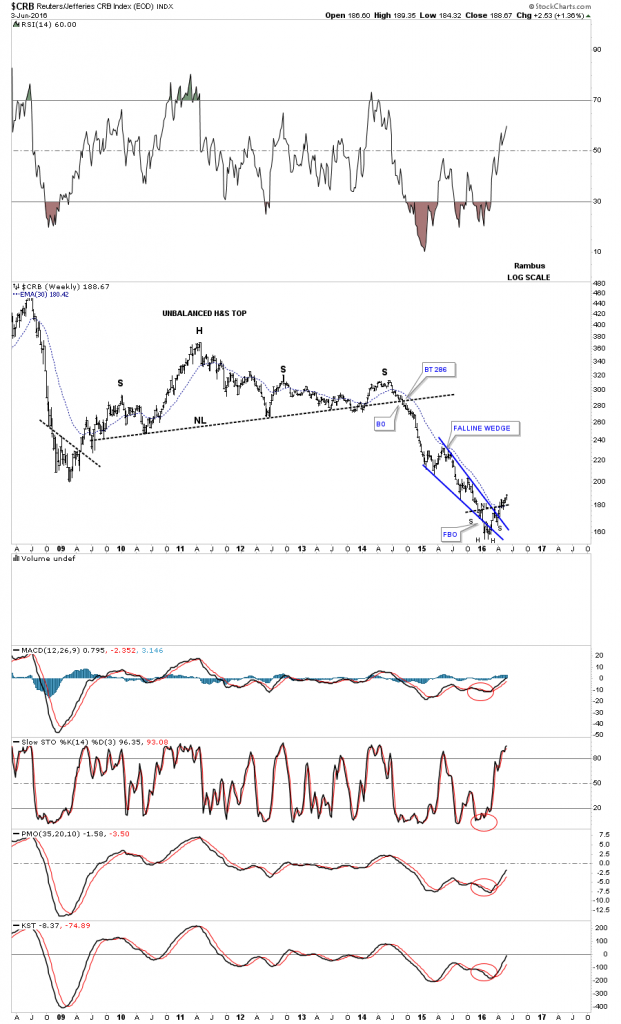
The weekly chart for the CRB index shows its massive H&S top, which compares pretty close to most of the PM stock indexes, and the bear market that ensued. You can see the blue falling wedge, which had a false breakout through the bottom rail ended up forming the double bottom, which is the head portion of the bigger inverse H&s bottom.
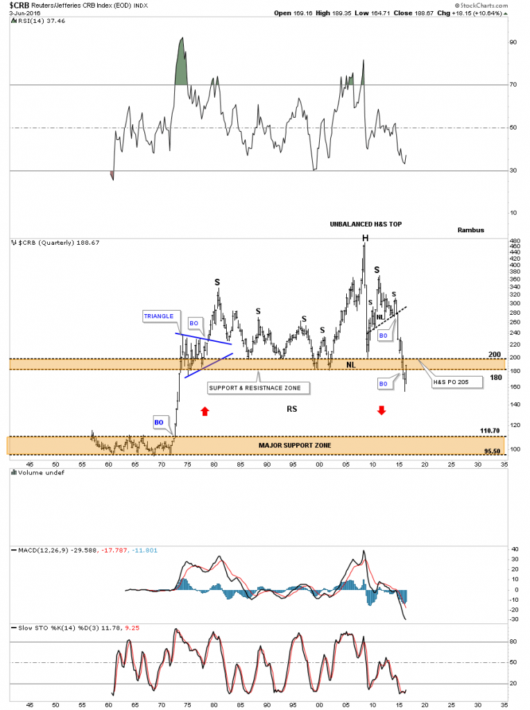
This last chart for the CRB index is a 60 year quarterly look that shows this index breaking below the massive brown shaded S&R zone last quarter. That low was a 42 two year low. As you can see the CRB index is rallying into the S&R zone at present. It would be nice to see this index start trading above the 200 area on a sustained basis to help confirm last quarters low is the bottom.
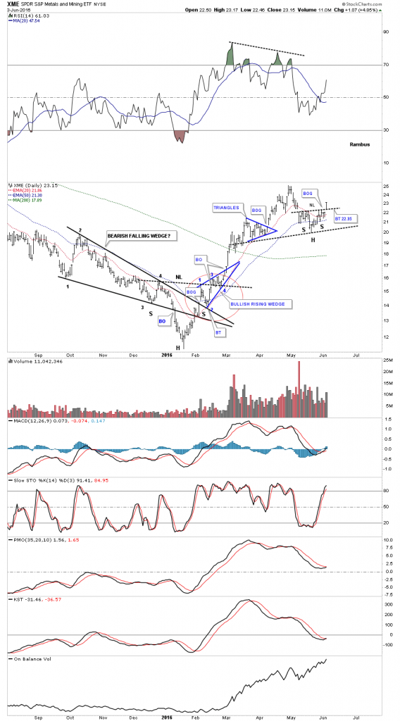
This next index, the XME metals and mining etf, did a good job of tracking the big impulse move up in the PM and commodities sectors this year. The last time we looked at this chart it was breaking out of the blue triangle and I showed you how well the Charology looked by the breaking out and backtesting of the different trendlines, as shown by the red circle. The XME has been trading sideways for awhile now but last Friday it looks like it may have gapped above a small neckline, which has formed this possible next important low. One to keep a close eye on.
Now lets look at the XLB, basic materials sector, which paints a good picture of how a lot of the different commodities are doing. What’s very important about this index is that there are a lot of really big cap stocks, that make up this index, we’ll look at in a minute. The daily chart below shows the double bottom and the backtest, which has been under way since the breakout in early April of this year. There is some nice symmetry taking place on each side of the double bottom hump, as shown by the two blue triangles that formed just below it at the 45 area.
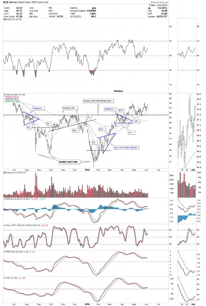
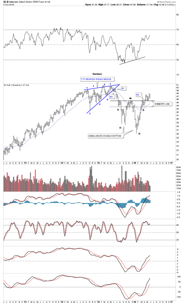
The long term weekly chart shows some nice symmetry taking place just below the double bottom hump, which I’ve labeled as a neckline because of the symmetry of the left and right shoulders. An unbalanced double bottom would be the correct name for this pattern though. The XLB has been in backtest mode for the last eight weeks now. Note that this index isn’t all that far away from its all time highs, that’s because a lot of the stocks that help make up this index are close to their all time highs.
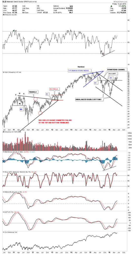
Below is another look at the weekly chart for the XLB, which shows the double bottom that formed at the low of the recent black parallel downtrend channel that began to develop at its all time highs made last year. So far so good.
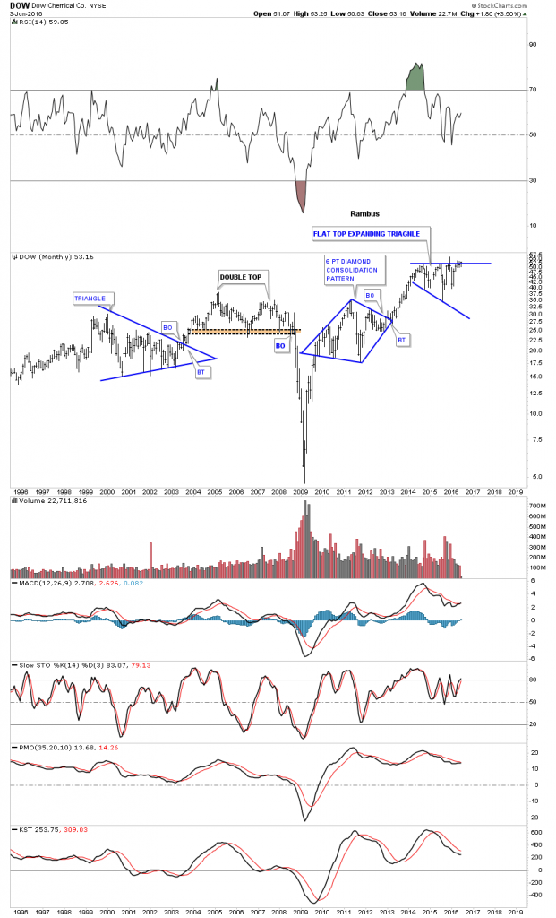
Now lets look at some stocks that make up the XLB and see what they’re showing. Many of these stocks have household names that you’ll recognize. This first chart is a monthly chart for DOW, Dow Chemical, which shows it’s trading right up to its all time highs.
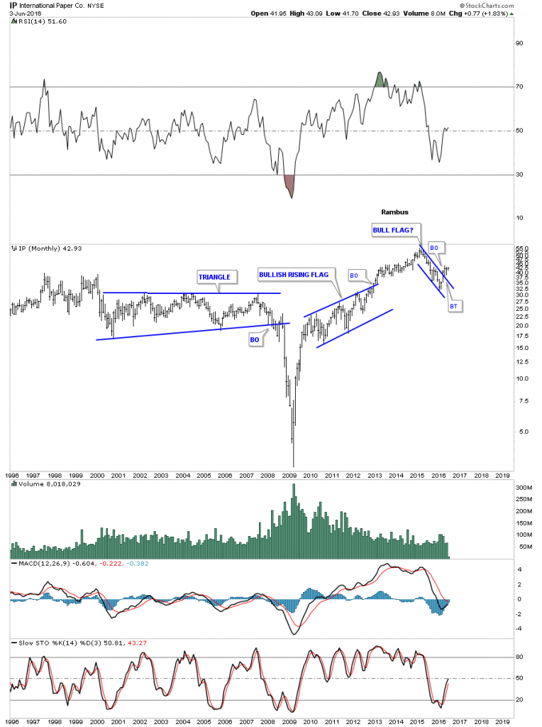
The monthly chart for IP, International Paper, shows it breaking out out of a one year bull flag several months ago.
On a monthly closing basis, DD DuPont, isn’t that far off from making new all time highs.
![]()
Looking at a 17 year monthly chart for MON Monsanto, we can see it’s building out a massive triangle consolidation pattern. Note the small double bottom at the possible fourth reversal point.
![]()
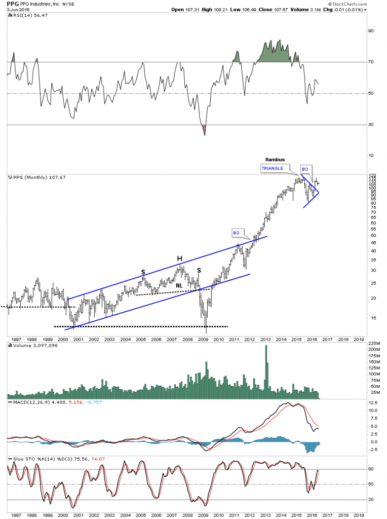
PPG looks like it has broken out of a blue triangle consolidation pattern, which has formed just below its all time high.
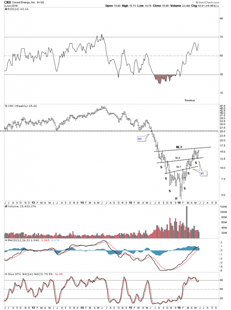
CNX, Consol Energy, was one of the weaker stocks in the XLB but it has come on strong off the recent low, and is now trading up to its first real area of resistance at the brown shaded S&R zone.
![]()
The weekly chart for CNX shows it is building out a multi inverse H&S bottom.
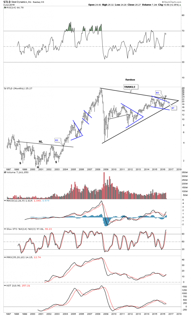
For whatever reasons some of the steel stocks are doing pretty good. The weekly chart for STLD, Steel Dynamics, shows it breaking out of a pretty big blue bullish falling wedge earlier this year.
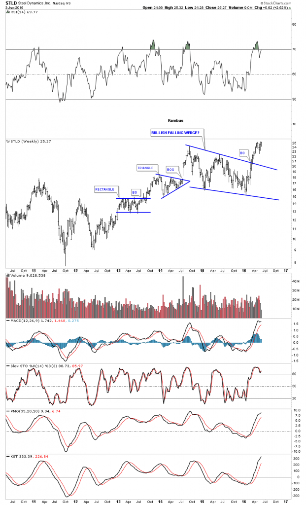
The long term monthly chart for STLD shows the breakout from the blue falling wedge on the chart above, was built just under the top rail of a multi year triangle consolidation pattern.
The monthly chart for NUE, Nucor, shows it too is trading up toward the top rail of a very large triangle.
![]()
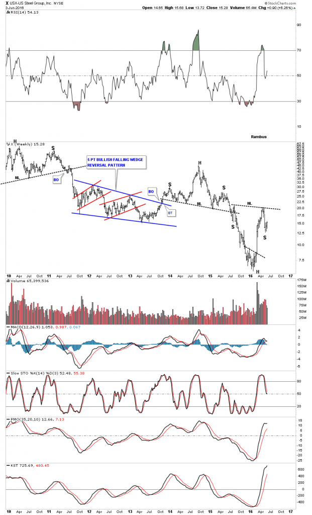
The weekly chart for X US Steel, shows it has been one of the weaker stocks in the steel sector, but it looks like it may be forming an inverse H&S bottom, which will be needed to watch.
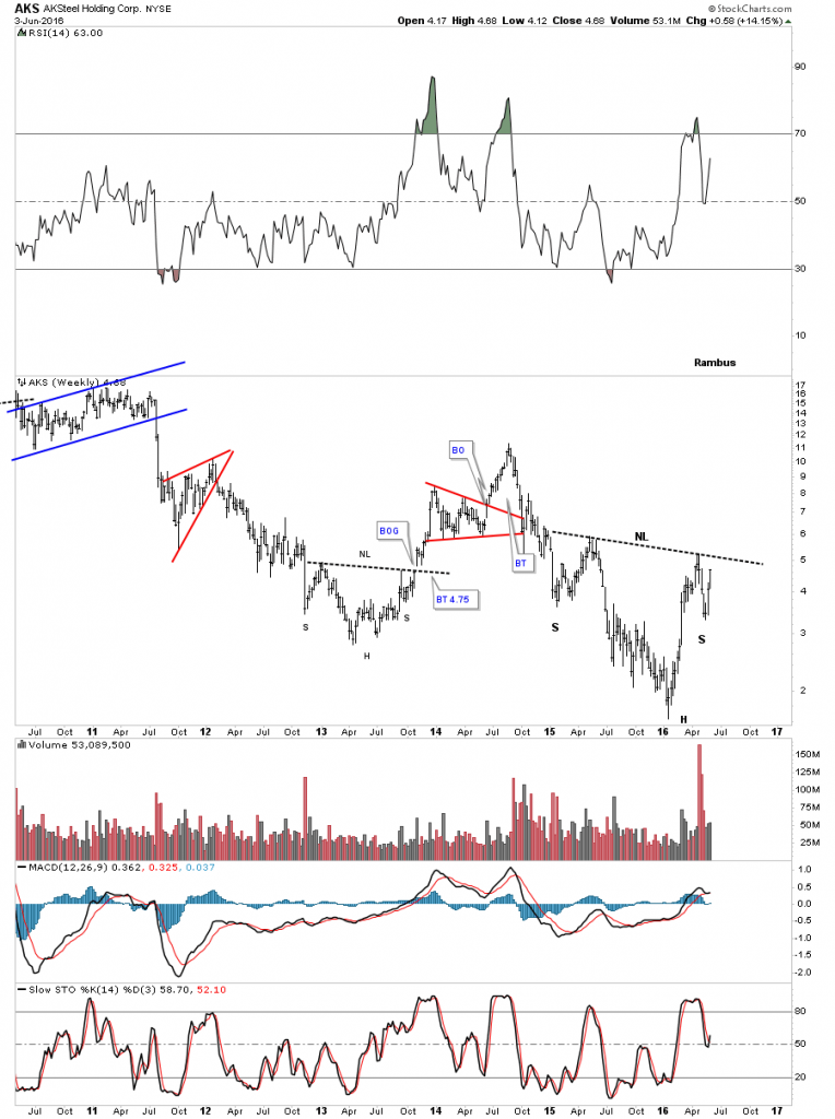
AKS, AK Steel Holdings, hasn’t set the world on fire yet but it looks like it may be forming an inverse H&S bottom.
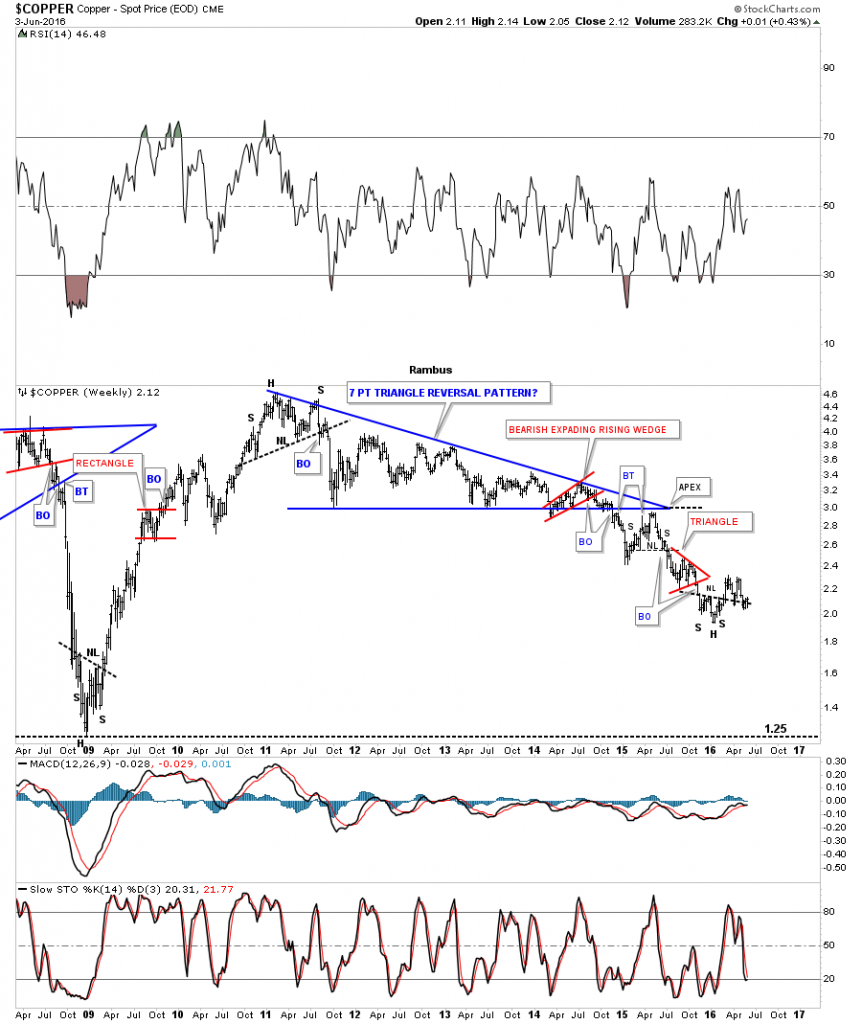
Copper still remains one of the weakest commodities, but it’s trying to build out an inverse H&S bottom.
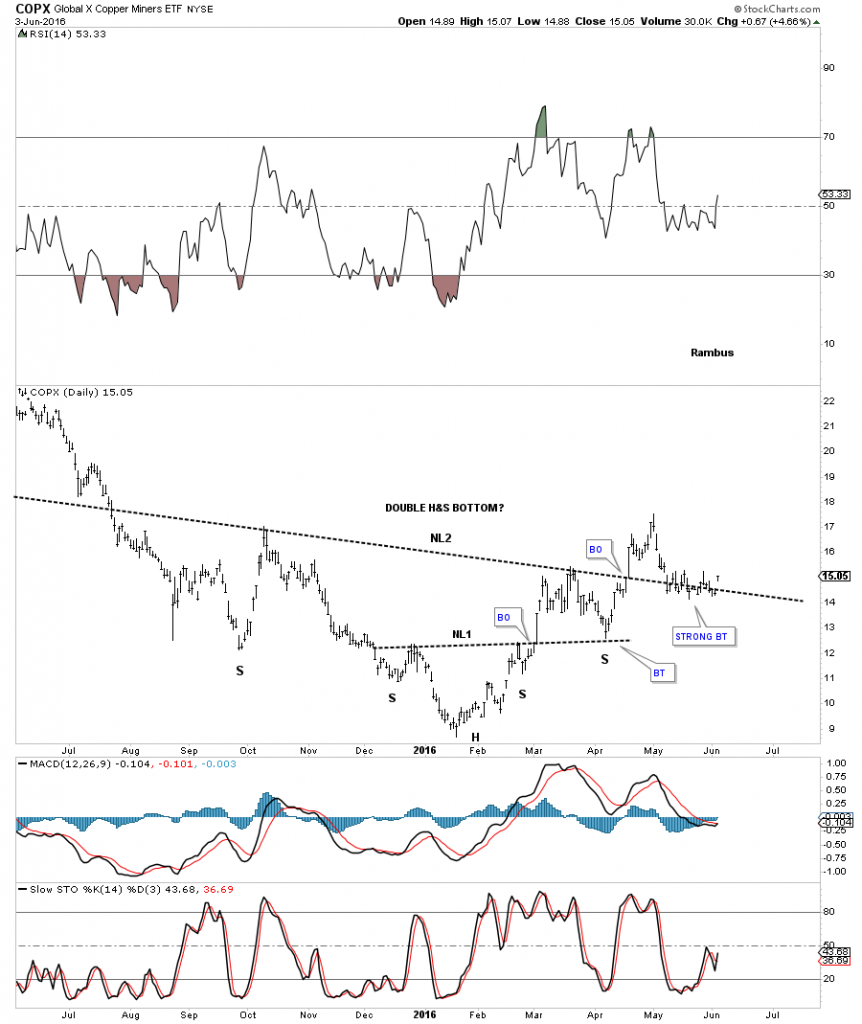
The daily chart for the COPX Global Copper Miners etf, has a similar pattern to copper as it’s trying to complete a double H&s bottom.
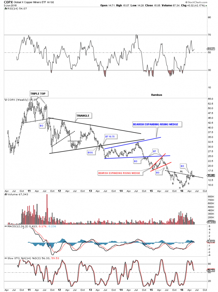
The long term weekly chart for COPX shows you where the inverse H&S bottom is forming. If there was ever a place to see an inverse H&S bottom this chart shows it.
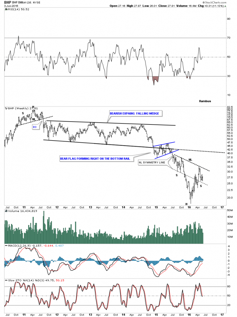
The weekly chart for BHP Billiton, one of the biggest miners on the planet, is attempting to build out an inverse H&S bottom, which has a strongly slanted neckline.
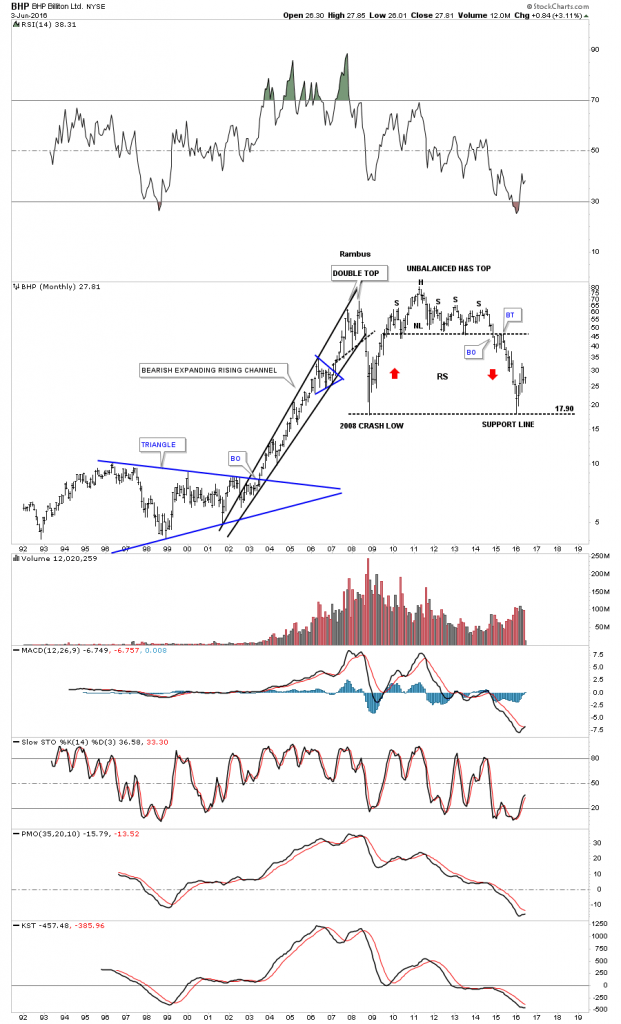
The long term monthly chart for BHP shows where the possible inverse H&S bottom, we looked at on the weekly chart above, is forming.
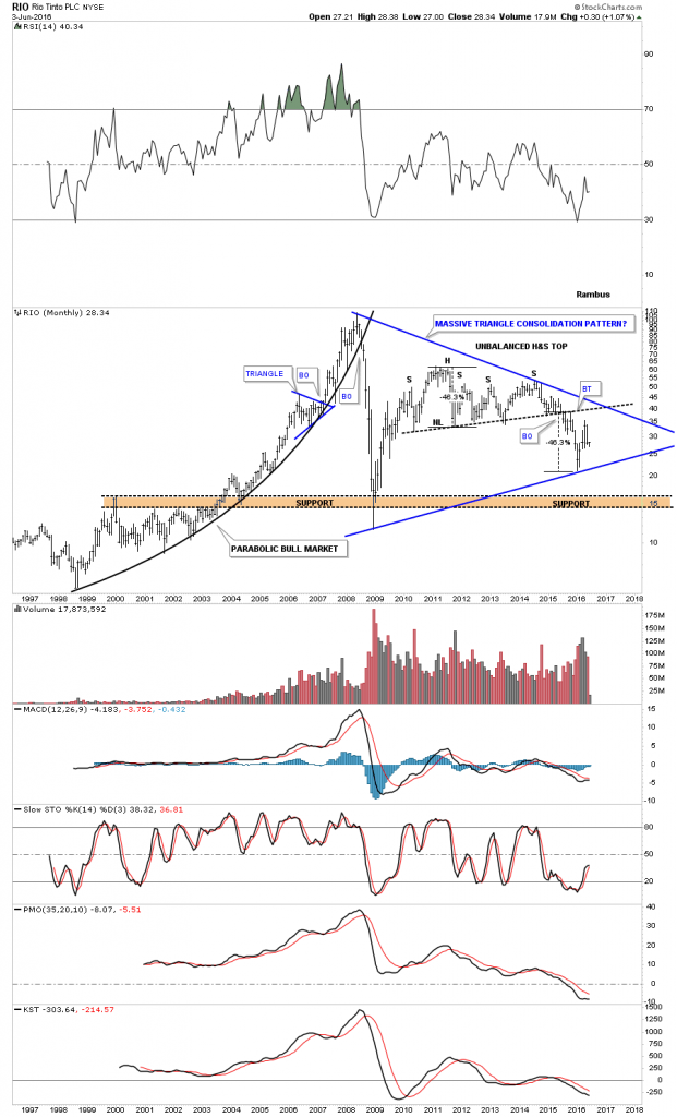
RIO, Rio Tinto, is another really big miner that reached its H&S consolidation pattern price objective earlier this year and maybe the fourth reversal point in a very large triangle.
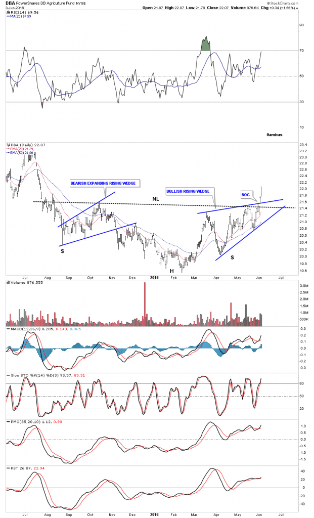
Lets look at a few other commodities related indexes which may shed some more light on this sector. Below is a daily chart for the DBA, Agricultural Fund, which shows its reversing symmetry back up after its hard bear market decline. Last week it broke out above the top rail of a blue rising wedge and the bigger neckline from its bear market bottom.
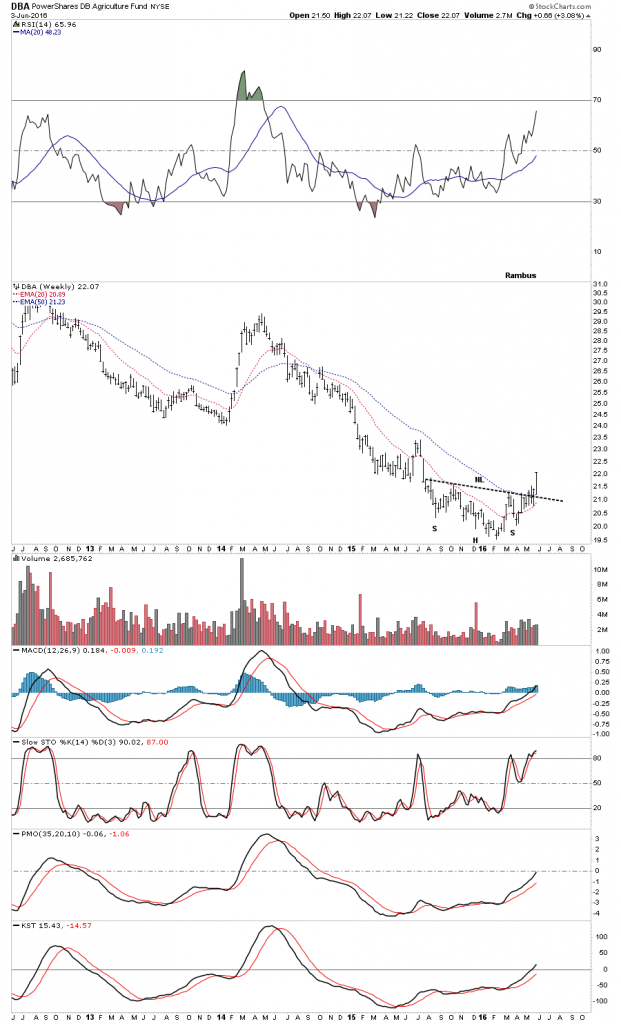
The DBA weekly chart.
The weekly chart for RJA shows us another inverse H&S bottom forming at the end of its mulit year bear market with a breakout last week.
![]()
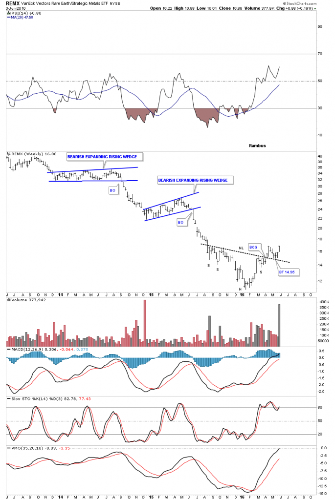
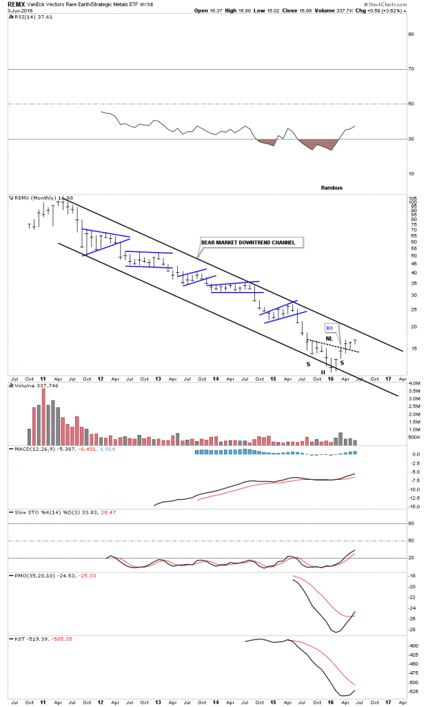
Another sector that is putting in an inverse H&S bottom is the REMX Rare Earth etf. Note the volume last week.
The monthly chart for REMX shows its whole lifespan is one giant downtrend channel. That old stock market expression, to buy low and sell high, I think applies to this sector.
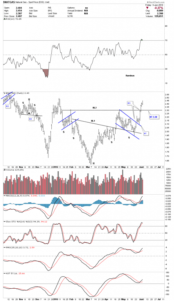
$NATGAS is starting to look interesting after its severe beating it took over the last couple of years. This daily chart shows a potential double inverse H&S bottom building out.
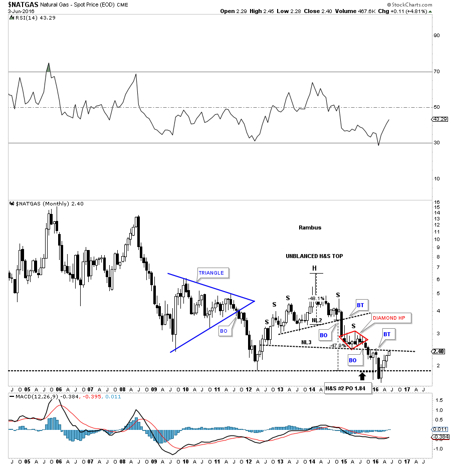
The monthly candlestick chart for $NATGAS shows it’s now trading back up to neckline # 2, which was made on the way down. This could offer some resistance initially, but if NATGAS can trade back over that important neckline, that would be an important development.
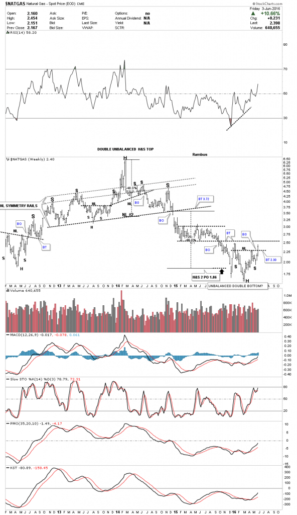
The weekly chart for NATGAS shows the H&S bottom we looked at on the daily chart as part of a possible unbalanced double bottom. We could see a ping pong move take place between the two black dashed trendlines.
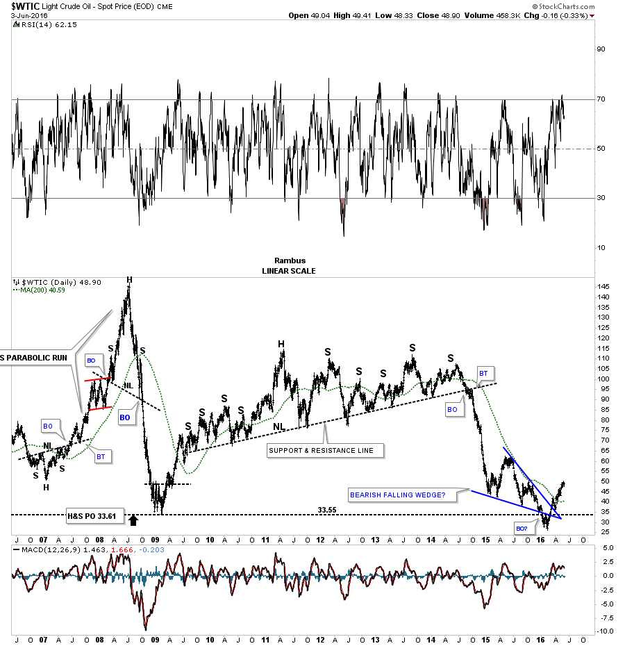
Lets wrap up this Weekend Report and look at a daily chart for, WTIC Oil Index. This long term daily chart goes all the way back to 2006 just befroe the parabolic rise to 147. That massive H&S consolidation pattern looks easy in hindsight but it took forever before if finally gave way to the downside, but when it did the impulse move down was pretty impressive. As you can see WTIC formed what looked like a bearish falling wedge at the bottom of the chart. It’s a little hard to see on this chart but the price action rallied back up through the apex of the falling wedge backtesting the top and bottom rails on the way back up.
So now you can see the conundrum I have with the precious metals stocks and commodities in general vs the US dollar. Maybe this time will be different and everything rallies together including the stock markets. I’m just going to go with each individual chart pattern and not try to get too cute in trying to figure out the how and why the commodities and the PM complex are doing what they’re doing.
There are a lot of charts in this Weekend Report that shows some potential bullish setups that you can use to your advantage. Just because I may not take the trade doesn’t mean it’s a bad trade. I can only follow so many stocks at one time and it’s easy to miss something. Right now my main focus is on the PM complex and the many different stock market indices. Lets see what tomorrow brings…
Disclosure: None.


