
Image Source: Pixabay
Silver is building up to breaking out above the key $50 level to new all-time highs, a major technical event that is expected to trigger a scorching short-covering rally that will be driven by a massive short squeeze that could trigger a “forcé majeure” event where delivery becomes impossible because there’s no silver on hand to deliver, as in “Sorry, we haven’t got any."
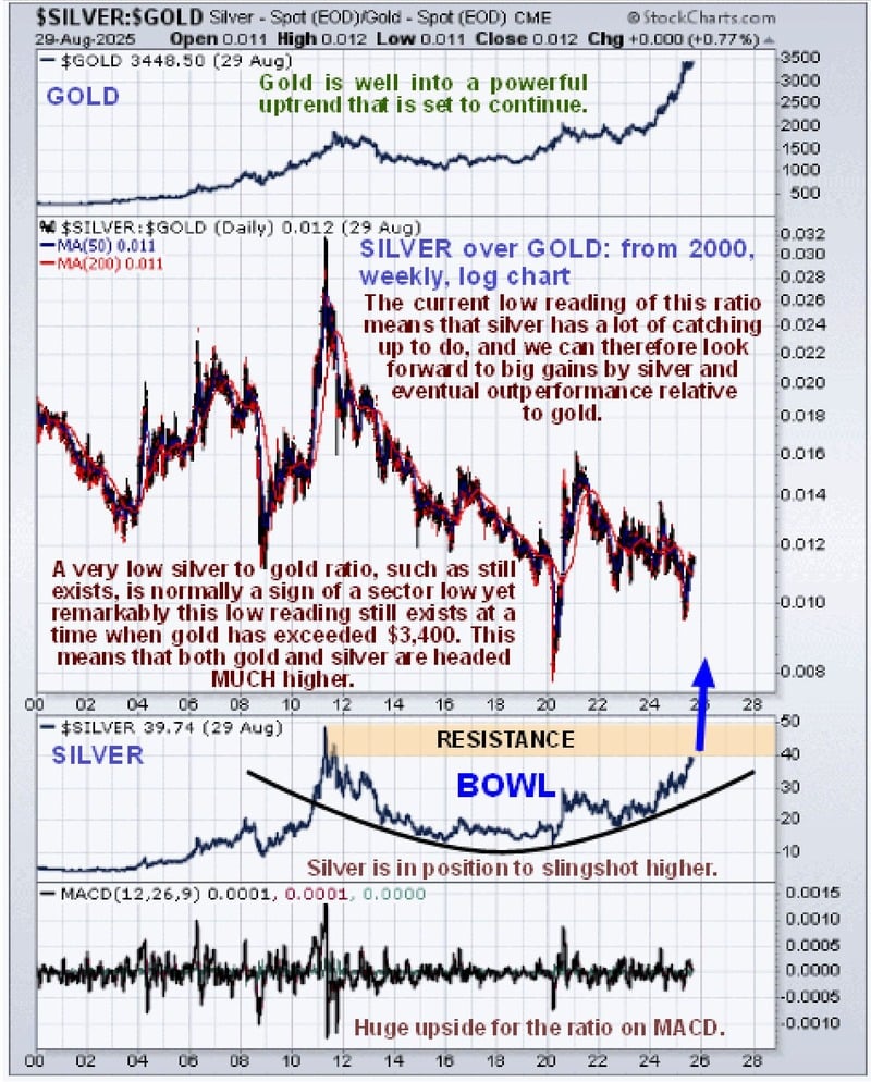
And silver is currently very undervalued relative to gold on a historical basis.
Let's go through the charts on which it quickly becomes clear that the bull case for silver is “iron clad”.
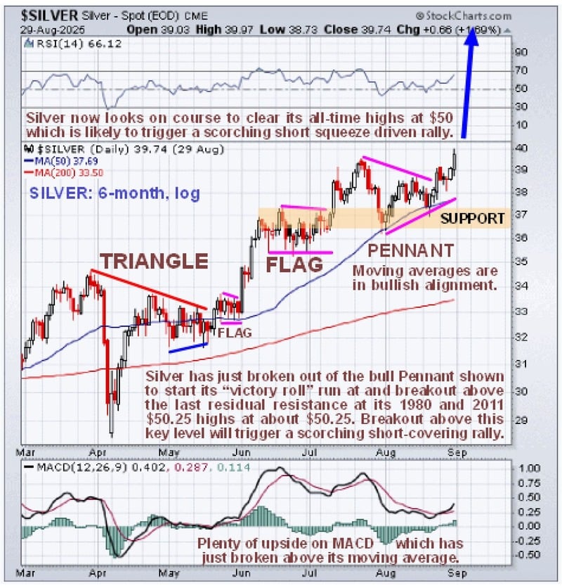
Starting with the 6-month silver chart, we see a picture that is entirely bullish, with silver advancing in a “staircase” pattern with its steady uptrend being punctuated by bull Flags and Pennants along the way.
And this is before it breaks out to new highs – after it does, and the short squeeze really bites. It is likely to ascend almost vertically and probably in a spectacular manner, leaving doubters standing on the platform gaping in disbelief, wondering what happened…
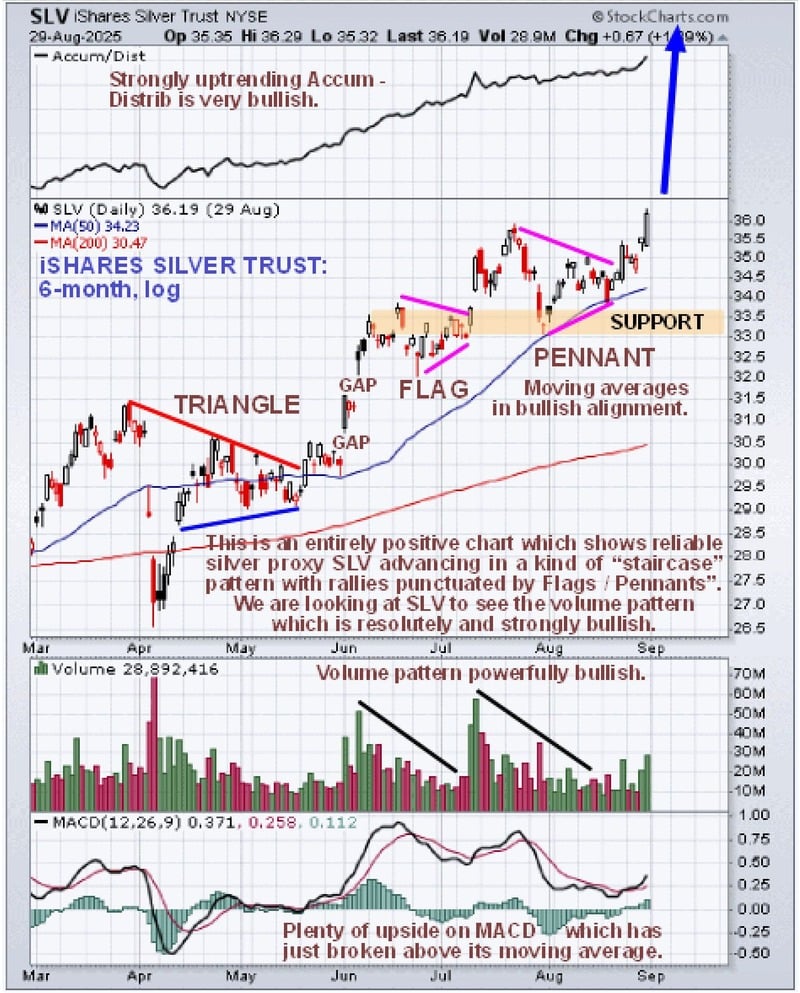
The Stockcharts silver chart above does not show volume, which we like to see along with volume indicators, but we can get around this obstacle by looking at a chart for reliable silver proxy, iShares Silver Trust, for the same 6-month time period.
The 6-month chart for SLV shows pretty much the same picture as the chart for silver itself, of course. In addition, we can see that the volume pattern is consistently strongly bullish, with robust volume on rallies that dies back as the price consolidates.
So most of this volume is upside volume, which is why the Accumulation line shown at the top of this chart has been climbing steadily and steeply. This is decidedly bullish and points to continued advance, and we see that upside volume has been building again as the price has broken out of and risen away from the latest Pennant.
The MACD is still not very overbought, which means that there is room for considerable further gains on this run and also implies that silver itself will break clear above $50 on this upleg.
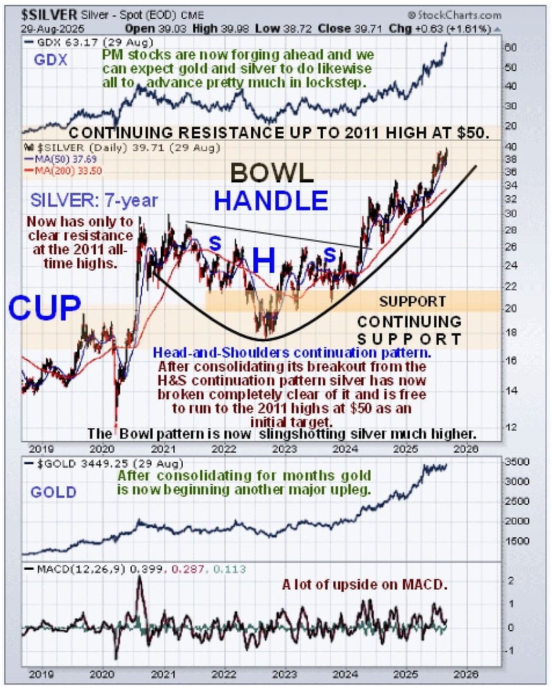
Zooming out via a 7-year chart enables us to see that the Handle of the giant Cup & Handle base pattern that formed from 2012 is itself made up of a Head-and-Shoulders continuation pattern. It formed above and within a giant Bowl pattern that is now driving the price higher at an accelerating rate towards a breakout above the 1980 and 2011 highs in the $50 area.
The fact that GDX and the XAU index have broken out to new all-time highs in recent weeks -- and that gold is starting higher again after months of consolidating -- should, of course, assist silver in breaking out to new highs.
On the long-term chart going all the way back to 2000, we can see how the early part of the giant Cup & Handle base that formed from about 2012 was a correction to the great 2000s bull market.
Here we see the last residual resistance up to the 2011 highs that, once cleared, should be followed by marked upside acceleration with silver receiving a lot of encouragement from gold, which has raced ahead last year and this year. We can see this towards the top of this chart and even more from panicking shorts.
Note that the great 2000s bull market is actually the right side of an enormous Cup that dates back to the 1980 high, which means that all of the action from the 2011 highs comprises the Handle of this gigantic Cup & Handle base.
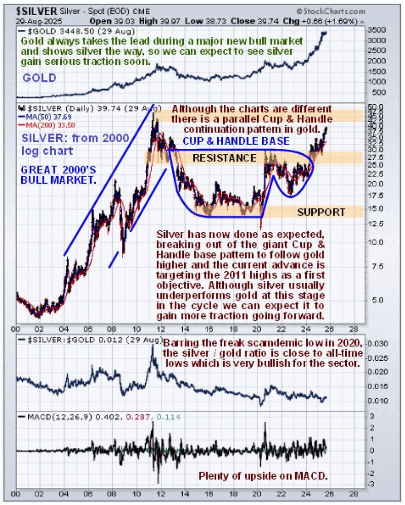
Lastly, it’s worth taking a look at the silver over gold ratio chart for the same time period, from 2000, which shows that despite gold’s big gains from early last year, this ratio is still at a low level.
That means that this sector bull market has much further to go. This sort of low reading means that there remains very little retail interest in the sector – this is very bullish for the sector and for silver in particular.
The rationale behind interpreting this chart is this: when there is a lot of speculative interest in the PM sector, investors favor silver over gold, because it has the capacity to make bigger percentage gains faster.
This is what we saw when the sector peaked in 2011, with silver hitting $50 in the late Spring of that year and gold topping out later in the year in September... which is why the silver over gold ratio hit a peak.
When, on the other hand, the silver over gold ratio is at a low level, it means that speculative interest in the sector is at a low ebb. Investors have no interest in it, which is very bullish as it means that there is the potential for it to go much higher.
This is what we saw at the ratio lows in 2003 before the sector headed much higher, at the lows of the 2008 broad market crash, which dragged the PMs down with it -- and at the time of the Covid Crash in the Spring of 2020, when we saw a freak low due to the orchestrated mass psychosis that existed at that time.
Conclusion: I believe we are right on the verge of a breakout by silver to new highs that will lead to an intense short squeeze and a dramatic ramp in the price of silver and all silver investments, e.g., silver ETFs and stocks.
The window for picking these up at reasonable prices is therefore closing fast.
More By This Author:
Is There Really A $12 Trillion Gold Deposit In Uganda?For First Time In Nearly 30 Years, Foreign Central Banks Hold More Gold Than U.S. Treasuries
Gold’s Parabolic Run, Silver’s Breakout, And The Fed’s Surrender To Inflation

Comments
Log in or sign up to join the conversation.