
Historical Examination Of The Dow Jones Dividend
The Dow Jones was down six points this week, effectively unchanged from last week’s close.
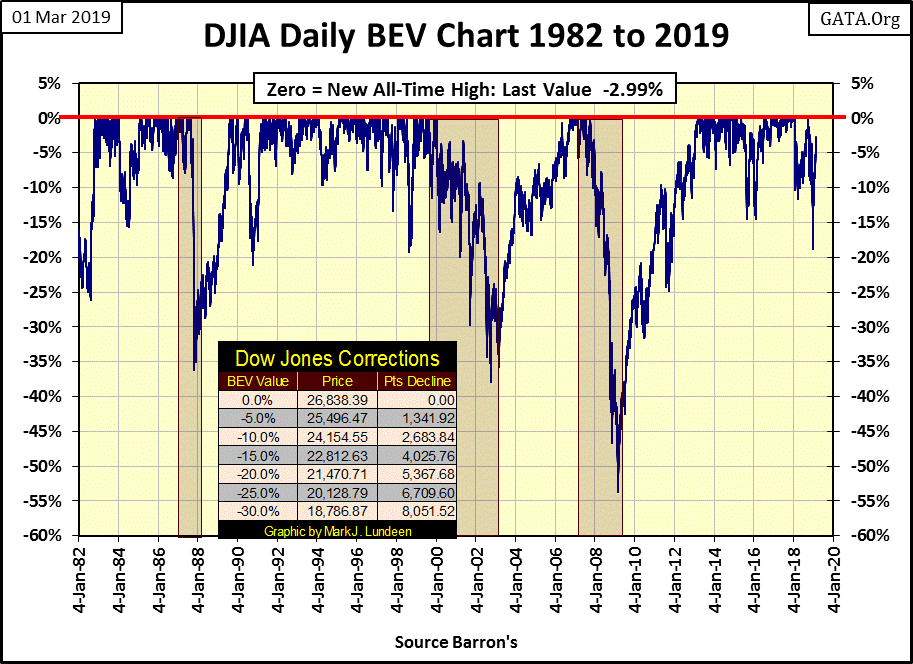
Below is the Dow Jones in daily bars. I circled this week’s data, and what little market action we saw this week. Be ye a bull or a bear; don’t get discouraged as there’s always next week.
Later in this article I’ve covered the history of the Dow Jones dividend yields and payouts. But as the stock market was very quiet this week, there isn’t much to comment on, so let’s move into gold.
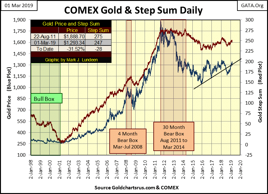
This week found gold below $1,300 for the first time since January 24. But it’s evident in its BEV chart below that the retracement so far is minimal.
Gold in its current post August 2011 bear market is a much different bear than it was from 1980 to 2001. At its deepest decline in December 2015 (-44.24%), gold had less downside than its correction low seen in August 1976 (-47.26%). This fact leads me to understand our current decline as more a correction within a bull market than a bear market. An incredibly frustrating correction, but a correction within a bull market nonetheless.
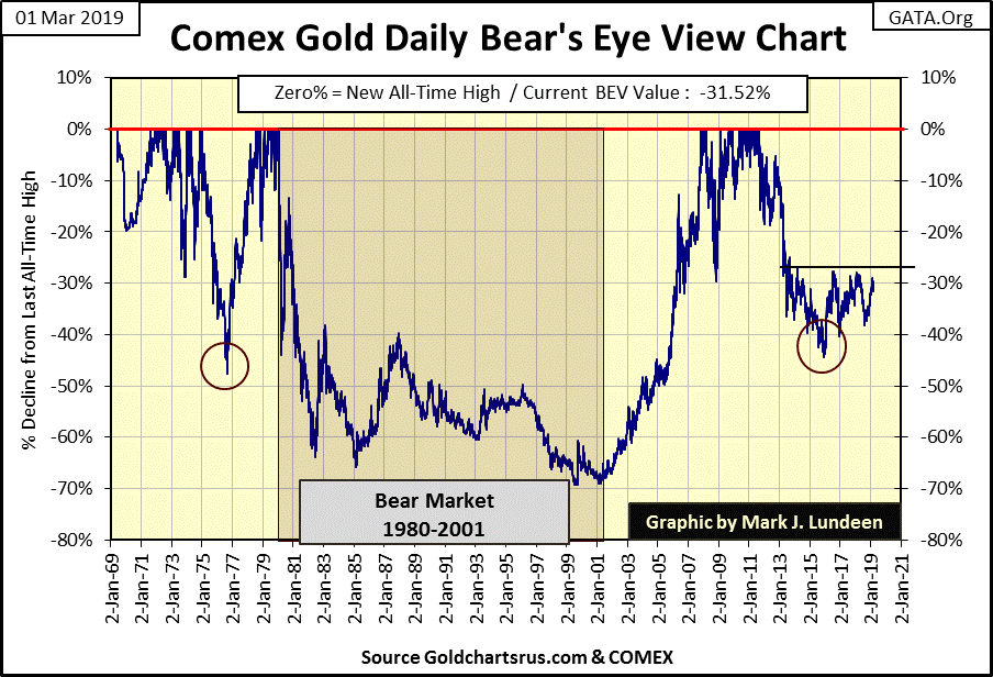
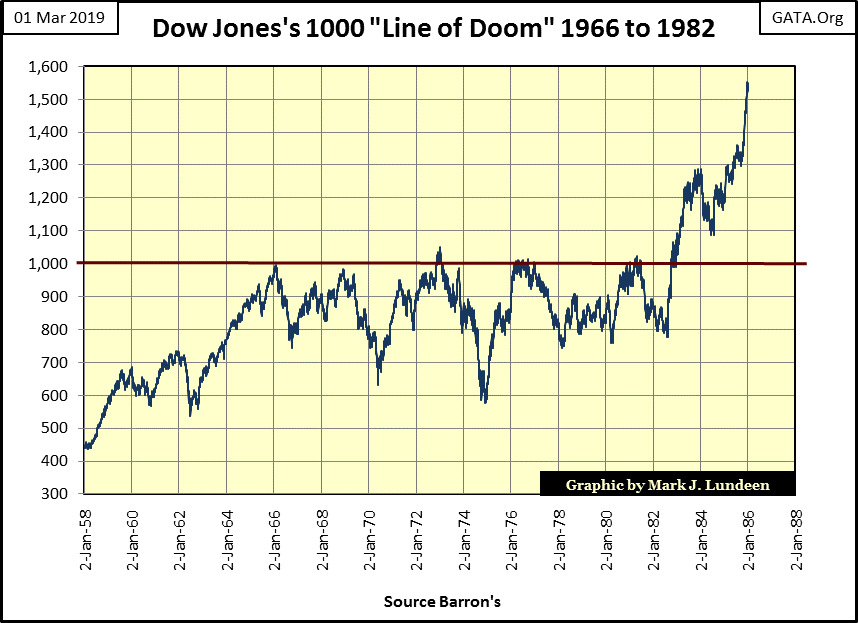
I’m also looking at the -27.5 BEV ($1366) line of resistance seen in the chart, when since 2013 this line has confounded all attempts by the bulls to break above, and stay above it. It reminds me of the Dow Jones from 1966 to 1982, where Dow Jones 1000 proved to be the line of doom for the bulls (chart below).
Five times the bulls attempted to get the Dow Jones to break above, and stay above 1000 during these sixteen years only to fail miserable on each attempt. When the Dow Jones finally did break above this line of resistance in October 1982, the ingrained bearishness of the market prevented most investors from believing what was happening before their very eyes; a new bull market had begun in the stock market.
For your information our bull market, with the occasional 40% market corrections since January 2000, is the same bull market seen beginning in 1982 below.
I had some comments last week on Craig Hemke’s revelation in the palladium market. One item I missed was an indexed chart for gold, silver, platinum and palladium. So, I thought this week’s market commentary would benefit from this chart as it’s very interesting, especially in light of the line of doom chart above.
It’s not just gold that’s currently burdened by a multi-year line of resistance; silver and platinum are too. But look at palladium below (Purple Plot); since last August it has been making new all-time highs for the past six months. It broke loose of the “policy makers” valuation control system, and I don’t think they can get palladium back in their box.
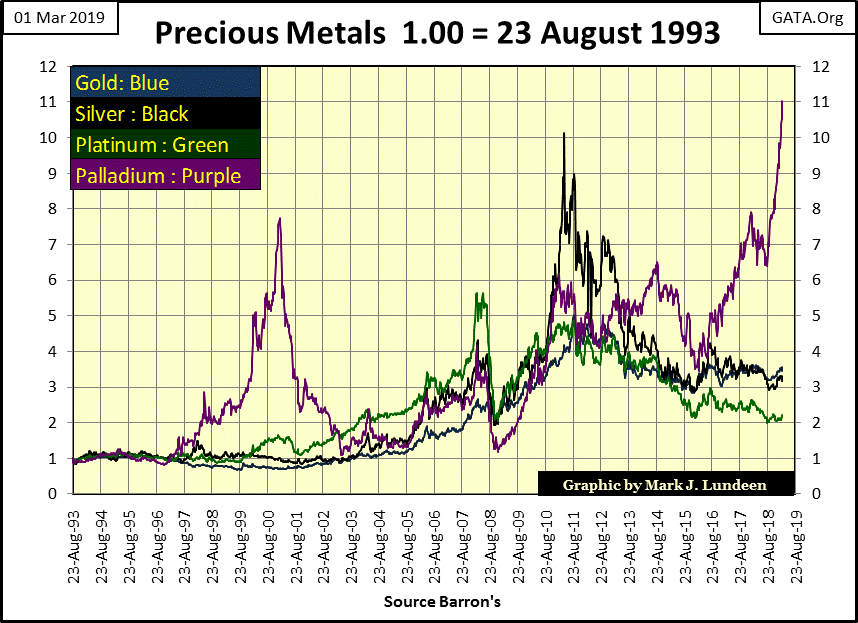
But they’re trying, as seen in the table below. The bears in the palladium market have promised to deliver 61.16 ounces of metal, metal that will never be delivered to the market for every ounce of palladium in COMEX storage.
The day is coming when the shorts (the sellers of paper palladium) in the palladium futures market are going to have to close their losing positions. To do so, they are going to have to buy long contracts in the futures market. What happens then may be a historic moonshot for the price of palladium.
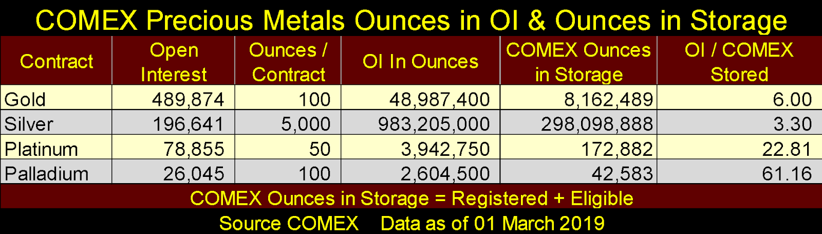
Considering the shorts in the palladium market are the same big banks and hedge funds that are now shorting gold and silver, a painful lesson in palladium may weaken their desire to participate rigging the gold and silver markets. Let’s pray that 2019 will prove to be a totally different year for gold and silver investors.
At the close of the week, gold and its step sum below still look positive. Yes gold was down $35 since last Friday, but advances in any market always include some declines, just as market declines always see some advances. What gold needs to do now is break above its line of resistance at $1366; that done we may see the price of gold also breaking free of the “policy makers”’ bearish machinations.
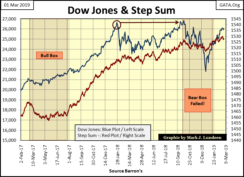
The Dow Jones and its step sum are looking good in the chart below. This week the Dow Jones closed only 2.99% from making a new all-time high. This gap between this week’s close and stock market history could easily be closed in the next few weeks; maybe next week.
What happens after that is the big question. I don’t expect the moonshot the Dow made in 1982-83, or the advance palladium has made since last August will prove to be the answer to this question.
I don’t know what the market capitalization for the NYSE and NASDAQ are, but after many decades of being inflated, they must be huge. To inflate these market valuations another 10%, or even another 5% above their current all-time highs will be very difficult.
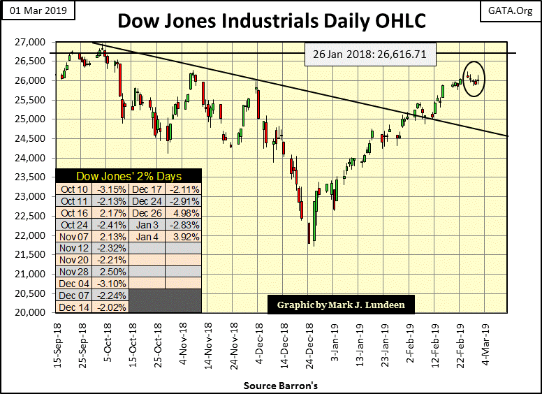
With its highs of January and October 2018, the Dow Jones has made a double top. I’m just speculating, but a giant bull market that’s been making history for the past thirty-seven years deserves to end in a dramatic fashion. A dramatic and rare triple top crowning this bull market would serve the purpose. Whether this happens or not is something we’ll all have to wait to see.
Gold and the Dow Jones step sum tables are generally bullish. Gold was down for the week. Looking at all that red for the past fifteen days one should not be surprised. But seeing the week close with a 15 count of -1 is actually a neutral indicator.

A step sum plot is only a single item A-D Line using the daily advances and declines in the Dow Jones or the price of gold as its input. The fact is during market advances there are about as many daily declines as advances, as with market declines there are about as many advances as declines.
Looking at their 15 counts, gold closed the week at -1 while the Dow Jones at +1. The 15 count’s legion below tells us that gold in the past 15 days saw 8 daily declines and 7 advances, while the Dow Jones saw 8 daily advances and 7 declines. In other words there isn’t much difference between a -1 and +1 in a 15 count. And that’s also pretty much true with the -3 and +3s in a step sum 15 count.

The 15 count becomes interesting when its values rise to 5 or more, with the (+/-) 9s to 15s being very rare and important short-term inflection points in the market. For example, a +9 or 11 indicates the market has seen a strong advance and is due for a pullback; a -9 or 11 indicates the market has seen a strong pullback and is due for a rebound.
But 9s or more in a step sum 15 count are very rare. Typically a market advances or declines with the majority of its step sum 15 counts between +3 and -3.
Two famous and long familiar American companies (Kraft & Heinz) were merged in 2015. As per the 2015 press release from Kraft-Heinz, the future couldn’t look brighter for these merged companies.
Four years later CNN reports a one day collapse of 27% for shares of Kraft-Heinz on February 22 on news of a 36% cut in its dividend, difficulties with debt service on its $31 billion long-term debt and an SEC investigation.
What happened here? That’s not hard to figure out; the “policy makers” made their “ample credit at very attractive rates” available without limit to the big financial houses on Wall Street. These big banks then pitched financial schemes to their captive corporations of the advantages of using said “ample credit at very attractive rates” to leverage their companies’ valuation in the stock market.
Some companies decided to use debt (at attractive rates) to fund their share buyback and dividend programs. For Kraft & Heinz, that meant a merger for these two companies in 2015. This fiasco, as well as General Electric’s of a few months ago, will ultimately prove to be the result of too much money, at rates far too low being injected into the financial system by the Federal Reserve.
The item that caught my attention with both Kraft-Heinz, and GE’s debt dilemmas, were how vulnerable their dividend payouts were. Kraft-Heinz reduced payouts by 36%. GE wanted to eliminate their dividend payout completely, but decided to cut it back to only $0.01 a share so shares of GE would continue to be eligible for purchase by money managers.
These companies have been in operation for over one hundred years. Companies that stood firm as others failed during the Great Depression. But in the coming years they may not survive Doctor Bernanke’s three bouts of quantitative easings and zero interest rate policy. They’ll have plenty of company before Mr. Bear is finished cleaning up Wall Street and the global financial system.
Speaking of dividend payouts, here’s a chart of the Dow Jones payouts since 1925. Before the 1929-32 crash, dividend payouts increased by 111% from October 1925 to April 1930 as the Federal Reserve System flooded Wall Street and the American economy with monetary inflation. However, good times funded by monetary inflation are short-lived. Note how dividend payouts for the Dow Jones were cut by 77.5% during the crash. A similar 77.5% reduction of today’s Dow Jones dividend payout would cut its cash payout from $577.78 to $130.

Dividends are a profit sharing program corporations have for their shareholders. In the early 1930s profits for business were hard to come by. Like the Post-Credit Crisis business boom, I suspect corporate America during the Roaring 1920's wasn’t afraid of leveraging the balance sheets with debt. How many of those disappearing dollars in dividend payouts seen above during the early 1930's didn’t actually disappear at all, but were re-routed to service debts taken on during the 1920's inflationary boom?
But dividends are more than just a source of cash flow from corporate America. Like income from a bond they also have a yield, an annual percentage rate of return for invested funds. But unlike bond income, dividends are not fixed income, as seen above.
Dow Jones’ dividend yields going back to 1925 provides a fascinating study of the stock market. From October 1925 to August 1987, investors could use these yields to time exits from overvalued markets (bull market tops) and re-entry points for undervalued markets (bear market bottoms). For sixty years this rule-of-thumb; sell when yields declined to 3%, and buy back when the Dow Jones yielded something over 6% was all an investor needed to know to profitably invest in the stock market.

Sadly, all this changed in August 1987 when Alan Greenspan became Chairman at the Federal Reserve. Greenspan became Fed Chairman with the Dow Jones yielding its lowest since 1925 (2.54%). After the huge gains seen in the Dow Jones since August 1982 (five year, 250% advance), it was time for a bear market ending with a Dow Jones dividend yield at or above 6%. But that didn’t happen.
Instead, Greenspan inflated a historic bubble in the stock market where in January 2000 the Dow Jones yielded an incredible 1.30% (see chart above). In doing this Greenspan and his fellow “policy makers” have decoupled the stock market from any objective measurement of value, a situation that continues today.
From 2002 to the present the yield for the Dow Jones has oscillated between 2% & 3%, with the exception for the 4.75% yield of March 9, 2009, at the bottom of the sub-prime mortgage bear market. This was the second deepest percentage decline in the Dow Jones since 1885, yet the yield for the Dow Jones only increased to 4.74%.
In 2008-09, had Doctor Bernanke not flooded the financial system with monetary inflation during his first QE, the Dow Jones would have fallen more than 54%, as its yield increased to something above 6%. As the Dow Jones payout at the time was $310.43, the traditional 6% yield found at bear market bottoms would have taken the Dow Jones down to 5,173, a 63% bear market decline. But who’s to say the bottom of the 2007-09 market decline would have stopped with a dividend yield of 6%, or Dow dividend payouts unaffected. This was a bear market that threatened to shut down the global banking system, something not seen since the early 1930's.
The table below is a model of the 2007-09 market decline using dividends from the Dow Jones’ October 9, 2007 market top to its bear market low of March 9, 2009. Those rows after the March 9, 2009 data illustrate possible bear market bottoms using dividend yields. These yields are well within the historic range (see chart above), and the Great Depression example which includes a 77% cut in dividend payout and its July 1932 yield of 10.38%.

Had Doctor Bernanke not reflated the financial markets with his three quantitative easings, the Dow Jones (my proxy for the broad stock market) could have seen all its gains since August 1982 wiped out. This was exactly what did happen during the Great Depression crash; valuations for the Dow Jones were deflated back to 1914 levels, all the way back to when the Federal Reserve began inflating the US money supply.
There are two methods for valuing the stock market. One is based on inflation, where the bulls study current market trends and project them on future valuations in the market. There is nothing wrong doing this; as long as the market is a bull market.
The other is based on dividends in the Dow Jones, the preferred method for the bears from 1925 to 1987, as seen in the above chart for the Dow Jones dividend yields. For sixty-two years the smart money would exit their bullish positions when the Dow Jones declined to 3%, and wouldn’t become bullish again until it once again yielded something above 6%. However, as noted above, that hasn’t worked since Alan Greenspan became Fed Chairman in August 1987.
But I’m assuming this decoupling of market valuations from their dividend fundamentals is only a temporary anomaly; an anomaly that has endured for the past thirty-seven years, but will ultimately prove to be a temporary anomaly nonetheless.
When will the Dow Jones and the broad stock market’s valuations once again be coupled to their dividend fundamentals? I can’t give a date when this will happen. However in the coming bear market, when the “policy makers” lose their grip on market valuations, I expect Mr. Bear will once again re-couple stock-market valuations to their dividend fundamentals. Learning exactly how overvalued the shares trading on the NYSE and NASDAQ has been since Alan Greenspan became Fed Chairman will be a brutal experience.
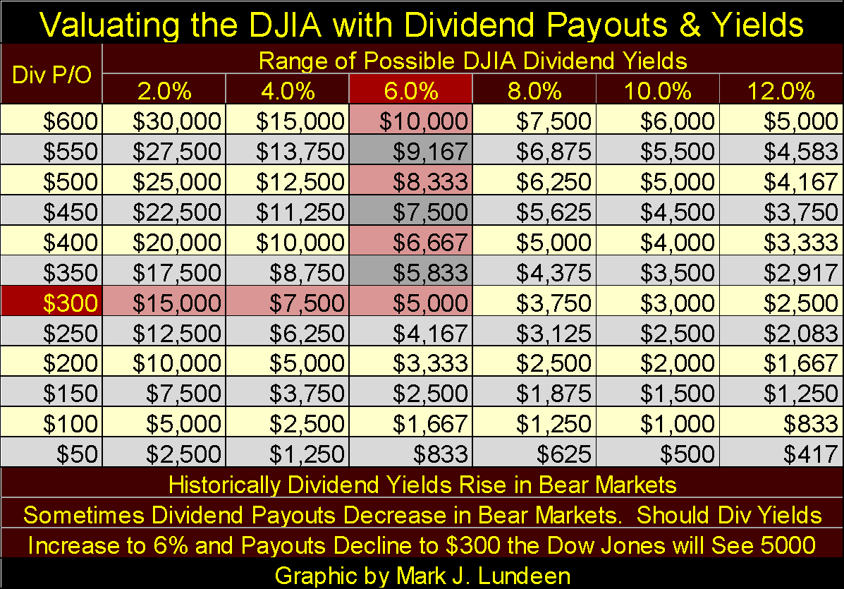
The table below gives Dow Jones valuations at the intersection of the listed Dividend payouts and yields. For example, at the close of this week the Dow Jones had a payout of $577.78, a 2.22% yield fixing the Dow Jones at 26,026. If in the coming stock market deflation the Dow Jones sees its payout reduced to $300, and its yield increase to 6%, the Dow Jones would see its valuation deflated to 5,000. That’s a whopping -81% market decline from its last all-time high of October 3 of last year (26,838), and an 81% bear market for the Dow Jones may be a future best case scenario.
A best case scenario? Well, this is what I’m thinking of: accounting is important. I don’t have all the specifics, but after the 9:11 attack came the Patriot Act that made Wall Street a bear-free zone in times of national emergencies. As I recall the Patriot Act also had some provisions in it that also denigrated accounting standards. This was certainly true during the 2007-09 credit crisis.
I’m not an accountant, but I doubt many people would question my assertion that accounting standards since the 195's have been compromised. Believing that to be true and looking at the earnings and dividend payouts for the Dow Jones below, I wonder just how solid these published values are?

In the X22 Report Spotlight on Harley Schlanger, Mr. Schlanger had some very interesting comments on the $13 trillion dollar global corporate bond market.
-
First is corporate debt in the bond market has doubled since 2008.
-
54% of these bonds are currently rated BBB or lower – near or rated as junk.
I believe it’s a safe assumption the thirty corporations included in the Dow Jones have all sold bonds. What isn’t a safe assumption is that all the thirty corporations listed above have their bonds rated as AAA investment grade.
As Mr. Schlanger noted in the above video, many companies now struggling to service their bonds' interest payments are very vulnerable to increases in bond yields. Here’s a chart plotting Barron’s Best and Intermediate Grade Bond Yields going back to 1934. Corporate bond yields bottomed a few years ago, yet are still at levels not seen since the early 1960's.
Here is a question whose answer could mean the difference between your investments being a success of failure in the years to come: Are corporate bond yields going to continue rising, or will they resume a decline that began in October 1981?
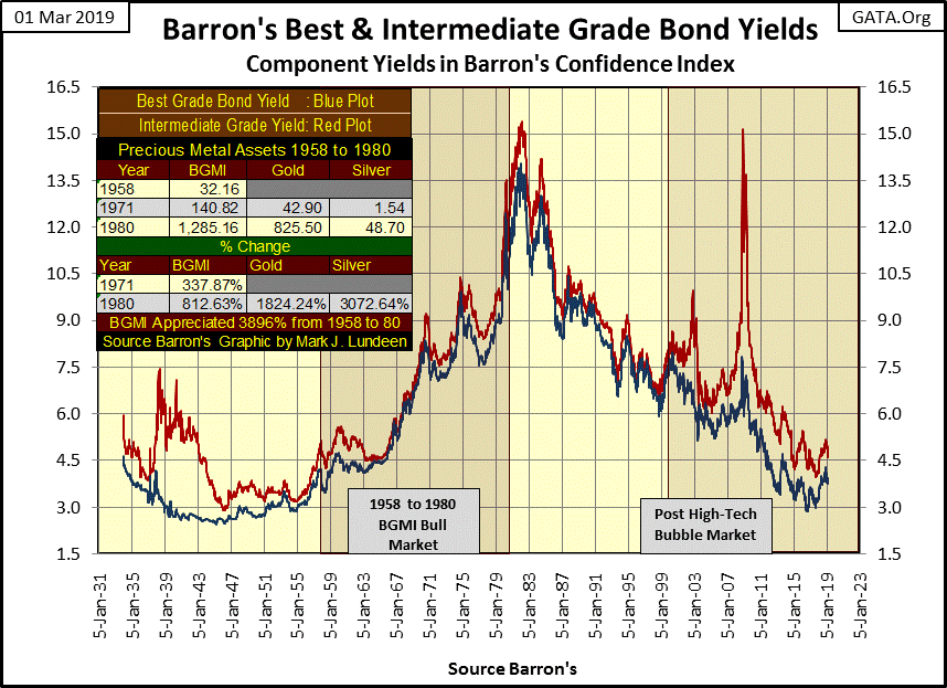
For myself I’m going to assume bond yields have bottom years ago, and have no place to go but up in the years to come. The inevitable outcome for this will be massive defaults in the corporate bond market – bankruptcy for those corporations who can’t pay their debts.
I’m also going to assume a good number of companies listed in the Dow Jones and the S&P 500 have burdened their balance sheets during the good times with more debt than can be serviced in the coming bad times.
The impact of this pending failure in the corporate bond market will be seen in the Dow Jones dividend payouts. For the past nine years, dividend payouts for the Dow Jones have only gone up (see chart above). Since February 2010 they have increased by 119%.
The Dow Jones itself can decline without seeing a decline it its dividend cash payouts; it happens all the time. However, as was the case in the early 1930's; seeing a 77% decline in payouts for the Dow Jones spoke volumes on the structural imbalances to corporate finance the boom years of the 1920's had fostered.
Keep an eye on the Dow Jones’ dividend payouts. When they begin to deflate you’ll see counter-party failure in the debt markets become a dominant financial media story, as gold and silver, assets with zero counter-party risks, soar to new all-time highs.
Disclosure: None.


