
Gold Makes A FATH - Stocks Take A Bath

We’ll explain Gold’s “FATH” in the next paragraph. But by now, we ought well be getting used to this.

Futures contacts — far and away the most liquid non-physical form of Gold trading purely by price — regularly “roll” from one expiry month to another, (but not consecutively), the current leap per this past Wednesday being from August to now volume-dominant December. And given this lengthy five months of storage et alia costs to hold your Gold for delivery in December — but at today’s price — Gold futures per this new “front month” pack a lot of premium, inclusive too of the conventional wisdom perception for future lower interest rates/higher Gold levels. Indeed assuming your having read last Monday’s “Prescient Commentary”, you already are aware that this time ’round Gold garnered +47 points of fresh December premium. So combine that with price having recorded an up week (even sans premium), and Gold thus made a “FATH”.
“Meaning, mmb?“
Meaning, Squire, — with such +47 points of December “front month” premium — Gold made a “FATH”: Faux All–Time High, per the so-called “continuous contract” indeed eclipsing the much sought milestone of 2500 toward trading as high as 2523 before settling out the week yesterday (Friday) at 2486. “‘Tis a beautiful thAng!”
‘Course, specific to this December contract, 2523 was not its All-Time High — hence the “Faux” pricing notion. (For those of you scoring at home, December’s contract high already was 2538 as traded on 17 July). But reaching up to 2523 this past week was fairly near.
Still, per the yellow metal’s “continuous contract” which is used for broad time frame analysis, here below we see the rightmost “FATH” along Gold’s weekly bars’ path:
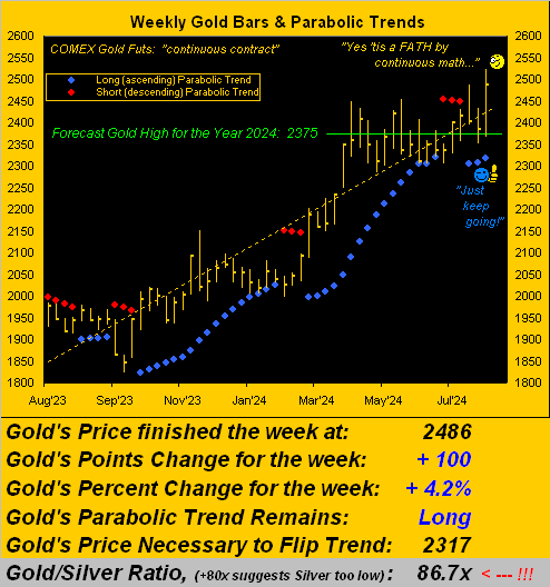
As therein noted, Gold’s weekly gain was a très cool +100 points, which includes the +47 points for December contract premium. But that does erode away a little each day. And even ex-premium, we’ll relish a weekly percentage gain of +2.2% every time. Further, the blue-dotted parabolic Long trend gained a bit of breathing room, the “flip-to-Short” price of 2317 now a comfy -169 points below today’s 2486 actual price.
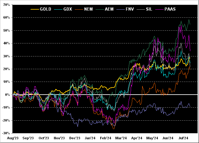
Thus it being month-end (plus a couple of days into August’s wend), ’tis time, too, for the key precious metals equities’ year-over-year view. So as below shown, leading the percentage track pack is Agnico Eagle Mines (AEM) +55%, followed by Pan American Silver (PAAS) +34%, Gold itself +29%, the VanEck Vectors Gold Miners exchange-traded fund (GDX) +25%, the Global X Silver Miners exchange-traded fund (SIL) +22%, Newmont (NEM) +19%, and yet Franco-Nevada (FNV) -10% post-Panamanian mining disruptions. Still, the chart exemplifies the increase from percentage leverage of the equities beyond Gold itself, certainly so from March-to-date:
Again, as ’tis just past month-end, here next we’ve the BEGOS Markets year-to-date standings. And oh does a “little” Gold premium go a long way, the yellow metal thus leading the list +20.0%. Were it not for the December contract premium, price would still be +17.7%, slotted in second spot just behind Sister Silver’s +19.4% performance. Either way, seeing the two precious metals atop the stack means they’re well in the black. And rounding out the podium in third spot is the S&P 500 +12.1% despite its sorely lacking substantive earnings support: our “live” price/earnings ratio is now 37.8x, a whopping +49% above its conception at 25.4x back in 2013. But such is life in this “Estimates are Everything Era”. To the table we go with a big “Thumbs Up” for Gold:
In fact, ’tis to laugh: with respect to the S&P’s taking a bit of a bath, recall this from last week’s missive? “…the Associated Press referred to the intra-week selling as a ‘wipeout’. Honestly … they … don’t know what a ‘wipeout’ is…” Well folks, the “somehow still surviving” CNN jumped on the same band wagon just this past week with (get ready): “Why the stock market is suddenly freaking out”. How’s that for journalistic professionalism? So the S&P’s weekly loss was -2.1%; (remember the first intra-day circuit breaker isn’t even instituted until -7%). Across the last 52 trading weeks (which for you WestPalmBeachers down there is since this time a year ago), the S&P 500 has actually recorded six worse weeks than that just past. “Who knew?” The FinMedia may be frantic over natural market pullback (remember that when stocks go down, so do viewership ratings); but we nonetheless offer this ad nauseam reprise: ““You ain’t seen nothing yet…”
– [BTO, ’74]).
Thus in seguing to that which very few are seeing, here is the Economic Barometer from one year ago-to-date along with the comparatively wee drop in the S&P. But as to the Econ Baro, of last week’s 15 incoming metrics, 11 were worse period-over-period, notably in the Payrolls arena:
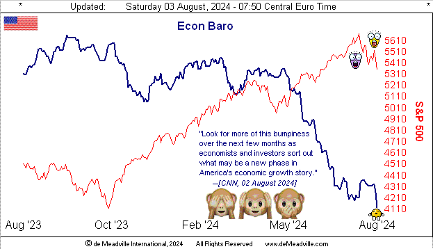
Given the recent months’ significant fallout in the Baro, we still remain somewhat flummoxed as to Gross Domestic Product (per the U.S. Bureau of Economic Analysis from the prior week) having advanced at an annualized +2.8% pace for Q2.
“But as you noted last time, it is an election year, eh mmb?“
So ’tis, Squire, but we’re really not supposed to go there, especially given the “Bureau” is purportedly politically-neutral. Still, there are two pending revisions to the number (respectively due 29 August and 26 September). But as we look into the current stance of Q3 — especially as the Baro leads — that next quarter’s GDP shall be interesting to see.
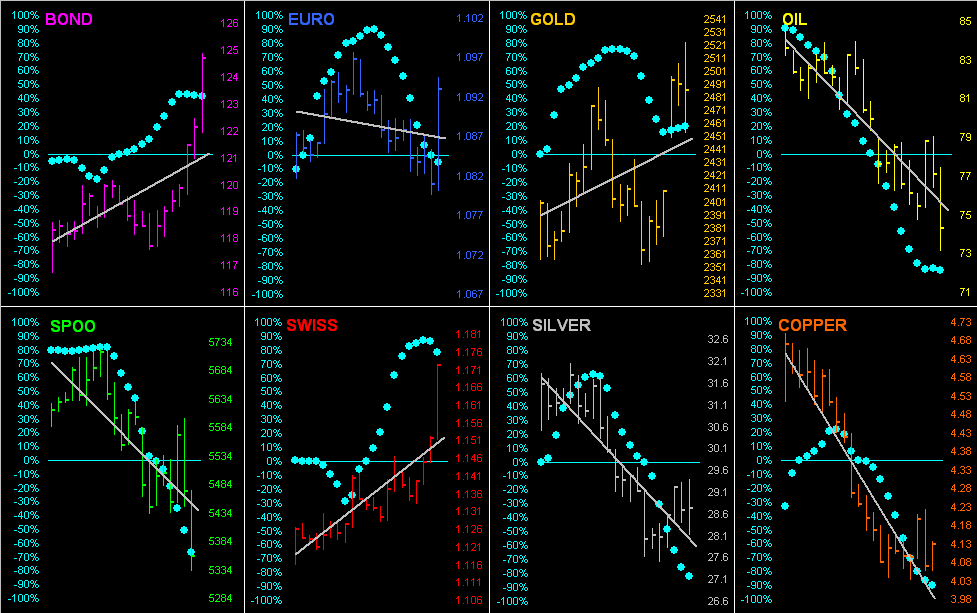
Meanwhile, let’s go ’round the horn for all eight BEGOS Markets across their last 21 trading days (one month) along with the “Baby Blues” which depict the consistency of the grey regression trendlines. Notice the three positive trendlines are for the “safe haven” components of the Bond, Swiss Franc and Gold, whilst the balance of the bunch are negative … as (obviously) is the aforeshown Econ Baro. And (hat-tip Dow Jones Newswires), a Federal Reserve yield-curve indicator suggests a 70% chance for economic recession. (Did we mention the Econ Baro leads? Why, indeed we did.) Here are the markets and their respective recent trends:
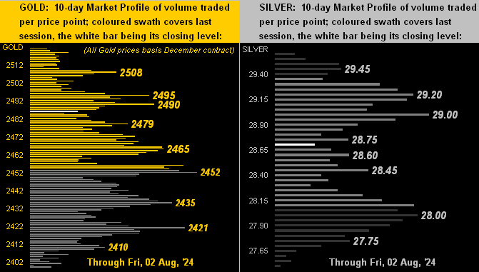
Next let’s go to the precious metals’ 10-day Market Profiles, their more dominantly traded prices as denoted for Gold (all December price-based) on the left and for Silver on the right. In both cases there’s comprehensive trading congestion throughout the Profiles:
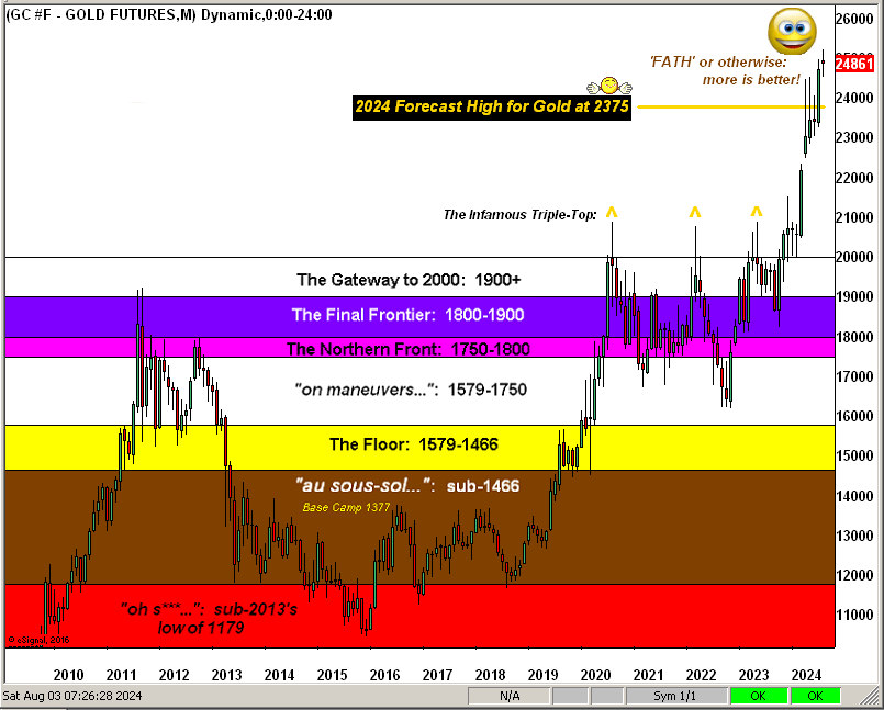
And of course as we glide into August, here is Gold’s structure by the “continuous contract” monthly bars for some 15 years. Therein again (per our opening) we’ve acknowledged the “FATH”, but ’tis not really an issue given Gold’s expected monthly trading range is presently 139 points. Thus the wee 15-point difference between the Faux All–Time High (2523) and true December All-Time High (2338) is immaterial. Still, “more is better”:
To close, let’s briefly revisit the S&P 500. Hysteria aside, the mighty Index (whilst fundamentally hyper-overvalued) is now seven consecutive trading days “textbook oversold”. More importantly, should you make a brief trip to the MoneyFlow page, last week’s selling stint was actually not as negative by monetary outflow as was the change in the Index itself. (We tend to notice little things like that, especially as they generally lead price).
That noted, keep thy eyes upon the precious metals: for “FATH” or otherwise … (as crooned Alpheus back in ’07) … Keep the Gold Faith!

Cheers!
…m…
More By This Author:
Gold Gets Gut-Punched … AgainAnother Gold Pop N’ Flop
Gold Gives Thanks As The Economy Tanks
Disclaimer: If ever a contributor needed a disclaimer, it's me. Indeed, your very presence here has already bound you in the Past, Present and Future to this disclaimer and to your acknowledging ...
more

