
33AD: The Year The House Of Maximus And Vibo Went Bust
This was a constructive week for the Dow Jones, up 1.49% in the BEV chart below. That doesn’t sound like much; but remember low volatility in the stock market is when the Dow Jones does the thing the bulls like most – advance towards new all-time highs.
A few more weeks of this and we’ll see the Dow Jones once again at the red BEV Zero line. But don’t be surprised if it doesn’t happen until later in the year. I don’t expect the Federal Reserve wants to ignite another feeding frenzy in the stock market; they have problems enough to cope with as it is.

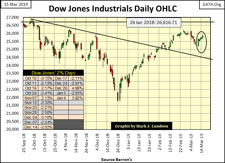
Looking at the Dow Jones’ daily bar chart below is also encouraging. Three weeks ago, the Dow Jones began a little correction in the big 20% market advance since the December 24 bottom. In the following week this was followed up with five consecutive down days. Just looking at the chart, I’d say the big 20% advance that began on December 24 has now been corrected, and the Dow Jones (my proxy for the broad market) is once again ready to advance towards new all-time highs.
And of the major indexes I follow, it’s not just the Dow Jones advancing, as seen in the table below. The BEV column displays how far these indices are from their last all-time highs. The Dow Jones Utility Average (#19) closed this week at a new all-time high. In the weeks and months to come, I expect the other indexes will follow.
The 24-Dec 18 column shows how far these indexes have advanced since the Dow Jones bottomed on December 24. Eleven of these indexes have advanced by 20% or more in the past three months – impressive.

For your information, I placed a line at 26,616 in the bar chart below as that was the last all-time high of January 26, 2018. Note the Dow’s last all-time high was seen below on October 3, 2018 (26,828). It cleared this January 18th level by only 212 points. Not only that, but the Dow Jones remained above this line for only two days. On a point chart these two tops gave the appearance of a very bearish classic double top.
The question I have is what if the Dow Jones once again makes a new all-time high? What then? Will it continue advancing towards 30,000, or will it find it impossible for it to break far above 27,000?
For a bull market that actually began in August 1982, thirty-seven years ago, this is a question always on my mind: when will the Dow Jones make its final all-time high? There are those who would say the 2007-09 credit-crisis bear market, a 54% market decline in the Dow Jones would have reset the clock on the Dow Jones, that the last ten years was a bull market into itself, unconnected to a market bottom occurring in 1982.
But I don’t believe that is the case at all. Look at the chart below plotting the Dow Jones since January 2, 1900. Up until 1950, the boom of the 1920's and the bust of the 1930's, an 89% market crash was clearly visible and very distinct on any chart plotting the Dow Jones. Now look at the second deepest Dow Jones percentage decline visible in the chart below.
The 2007-09 54% decline in the Dow Jones may still be clearly visible, but it’s not very distinct as being the second deepest percentage decline in the Dow Jones since 1885. Rather, it appears in the chart below as a normal correction within a huge bull market. Which I believe it to be in a monster of an inflationary bull market that can be tied to August 1971 (Red Star), when the US Treasury reneged on the Bretton Woods’ $35 gold peg, which unleased a flood of inflationary dollars into the economy and financial markets.

This is no small point. Assuming the financial markets of the past half century (post August 1971) are much the same as those before it, one’s understanding of what they see above will be completely different than for those who see this market advance as a function of the growth of money unchecked by gold and silver.
How far could the Dow Jones fall from these lofty heights? From September 1929 to July 1932 the Dow Jones declined 89%, deflating the Dow Jones back to where it was in 1914. The table below shows in 5% increments potential reductions in the Dow Jones’ valuations and point declines.

The history of monetary inflation’s impact on stock markets makes for grim reading. I’m thinking of France’s Mississippi Scheme and Britain’s South Sea’s Bubble of the early 18th century. The Roaring 1920's boom and the Great Depression Crash of the depressing 1930's deserve honorable mention in this roll call of booms and busts as it too was funded on monetary inflation flowing from a private bank, such as the Federal Reserve.
But economic problems resulting from fractional-reserve banking (expansion of credit by banks in excess of actual deposits) are an ancient one, as recorded by William Durant below
“The famous “panic” of 33 AD illustrates the development and complex interdependency of banks and commerce in the empire. Augustus had coined and spent money lavishly, on the theory that its increase circulation, low interest rates, and rising prices would stimulate business. They did; but as the process could not go on forever, a reaction set in as early as 10 BC, when this flush minting [of coins] ceased.
Tiberius rebounded to the opposite theory – the most economical economy is the best. He severely limited the government’s expenditures, sharply restricted new issues of currency, and horded 2.7 billion of sesterces in the Treasury. The resulting dearth of circulating medium was made worse by the drain of money eastward for luxuries.
Prices fell, interest rates rose, creditors foreclosed on debtors, debtors sued usurers and money lending almost ceased. The senate tried to check the export of capital by requiring a high percentage of every senator’s fortune to be invested in Italian land, senators thereupon called in loans and foreclosed on mortgages to raise cash, and the crisis rose.
When Senator Publius Spinther notified the bank of Balbus and Ollius that he must withdraw 30 million sesterces to comply with the new law, the firm announced its bankruptcy. At the same time the failure of an Alexandrian firm, Seuthes & Son – due to their loss of three ships laden with costly spices – and the collapse of the great dyeing firm of Malchus at Tyre, led to rumors that the Roman banking house of Maximus and Vibo would be broken by their extensive loans to these firms.
When its depositors began a “run” on this bank it shut its doors, and later on that day a larger bank, of the Brothers Pettius, also suspended payments. Almost simultaneously came news that great banking establishments had failed in Lyons, Carthage, Corinth, and Byzantium. One after another the banks of Rome closed. Money could be borrowed only at rates far above the legal limit.
Tiberius finally met the crisis by suspending the land-investment act and distributing 100 million sesterces to the banks, to be lent without interest for three years on the security of realty. Private lenders were thereby constrained to lower their interest rates, money [coins of gold and silver] came out of hiding, and confidence slowly returned.”
- William Durant; Caesar and Christ (pg 331-2), published in 1944
And all this without computers.
Let’s see how palladium has been doing. This week I thought I’d used a table which included other commodities and some stock indexes and measurements of monetary inflation such as CPI, PPI and CinC going back to the November 2016 presidential election (about 2.5 years). The non-commodity items I highlighted in red below.
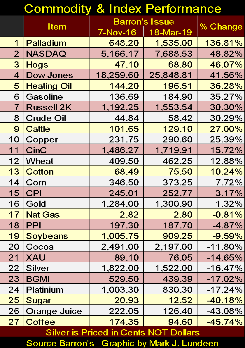
Palladium (#1 advancing by 137%) is clearly the top performer, far above the NASDAQ (#2 advancing by 49%) which is odd as no other precious metal asset listed in the table broke above #16 (gold @ 1.32%). The other precious metal assets are all down by double digit percentages (#21-24). There is something going on in the palladium market.
Something else that should be noted is how important commodities in energy and meats, unlike CPI and PPI, are up by double-digit percentages since November 2016. This is also true for Currency in Circulation (CinC). All this makes me question the validity of government statistics on inflation (#15 & 18) which the mainstream financial media is so fond of reporting to the public.
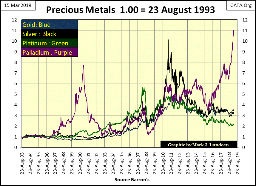
Here’s a chart plotting the indexed values of four precious metals. Question: is palladium going to fall down, or drag the other three metals up with it? I think the latter case is the more likely as 2019 progresses towards 2020.
But palladium has seen a big uncorrected advance since last August. Don’t be shocked if it should see a decline taking it down to 10 or even 9 in the chart below in the months to come.
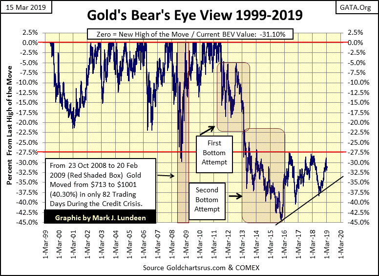
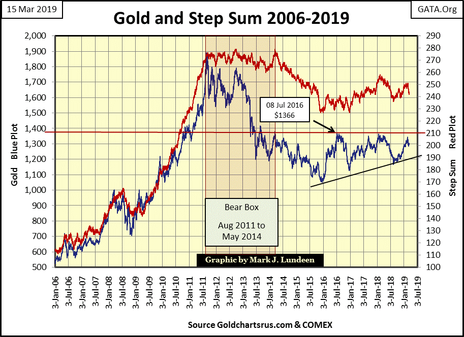
Moving on to gold’s Bear’s Eye View (BEV) chart below, which registers every new all-time high as a 0.0% (BEV Zero), and all other daily closes NOT a new all-time high as a negative percentage from its last all-time high, shows gold doing little since the beginning of the year. What I’m waiting for is for gold to take out its line of resistance seen at its BEV -27.5 level ($1360).
Since 2013 this line of resistance has stopped every advance in the price of gold. I have my fingers crossed that on the next attempt gold will slice through it like a hot knife through butter. After building a base for six years, it should.
Moving on to gold and its step sum below I can’t help but notice how these two plots advanced from late 2008 to August 2011. For the past few years the step sum for both gold and the Dow Jones have done little but run in place. One could be forgiven for believing this is typical of what to expect from a step sum. But on solid advances, and declines, a step sum can keep up with the price of gold or the Dow Jones.
It’s been almost eight years since gold’s step sum was charging uphill with the price of gold. After gold takes out its line of resistance at $1360, don’t be surprised should it do it again as gold once again advances toward new all-time highs.
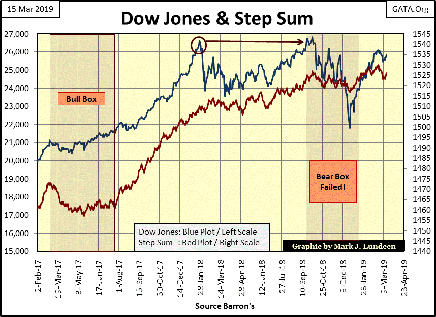
As for the Dow Jones step sum chart below, nothing new to report on from what I’ve said last week. But seeing an index and its step sum heading upward is always a bullish sign. However, after advancing for four decades, just how much more can the bulls expect from the Dow Jones?
As for which step sum chart is more attractive, I’d take gold’s chart above. From a step sum analysis perspective, for the bulls it’s perfect. We see a large advance in both plots from January 2006 to August 2011.
After gold saw its August 2011 top, gold began a four year, 45% correction, as its step sum (market sentiment) refused to accept the price of gold could do anything but advance. This refusal for market sentiment, as seen by gold’s step sum refusal to decline with the price of gold, resulted in a three year step sum bear box.
In May 2014 gold’s step sum was closed. In other words, gold’s step sum (market sentiment) began collapsing as the stubborn bulls in the gold market finally surrendered to Mr. Bear. Note this collapse in bullish market sentiment happened after the price of gold had already seen most of its correction decline.
From May 2014 to December 2015, gold entered into the final phase of this 45% market correction as its step sum continued collapsing. In December 2015, as the price of gold and its step sum hit their correction bottoms, I was receiving e-mail from regular readers warning me that if I continued recommending gold as an investment I would lose all credibility as a market commentator.
That had never happened to me before. But dramatic moments like this are what happens on hard bottoms. Now four years later, gold is getting ready to break above a six-year line of resistance at $1360 as its price and step sum plots rise together.
Will gold break above its $1360 line of doom? I guarantee you that someday it will, but someday may not be in 2019. But by examining gold’s step sum chart above, I can’t see how gold can remain below $1360 for very much longer.
Contrast that to the Dow Jones’ step sum below with a bull box in 2017 and a failed bear box in 2018. We may be seeing a historic topping formation in the stock market.
In gold’s step sum table below, are the makings of a technical bottom for gold. Since February 8th the step sum has declined by six steps. That’s a lot. Gold’s 15 count closed last week at a -5, indicting market sentiment in the gold market as fairly negative. Gold saw its 15 count at -7 at the close of every day this week, a big increase in bearish sentiment. Maybe we’ll see gold’s 15 count at a -9 next week, which would be excellent as far as I’m concerned, as it is from such psychologically depressed markets that major advances spring from.

The only thing lacking in the gold market is market volatility is still subdued, at levels not seen since 1999 (see chart below). My final thought on gold for this week is that technically, it’s looking darn good. But the last piece of the puzzle, which is when will gold make it’s move to new all-time highs, can be answered by seeing when daily volatility once again dramatically increases.
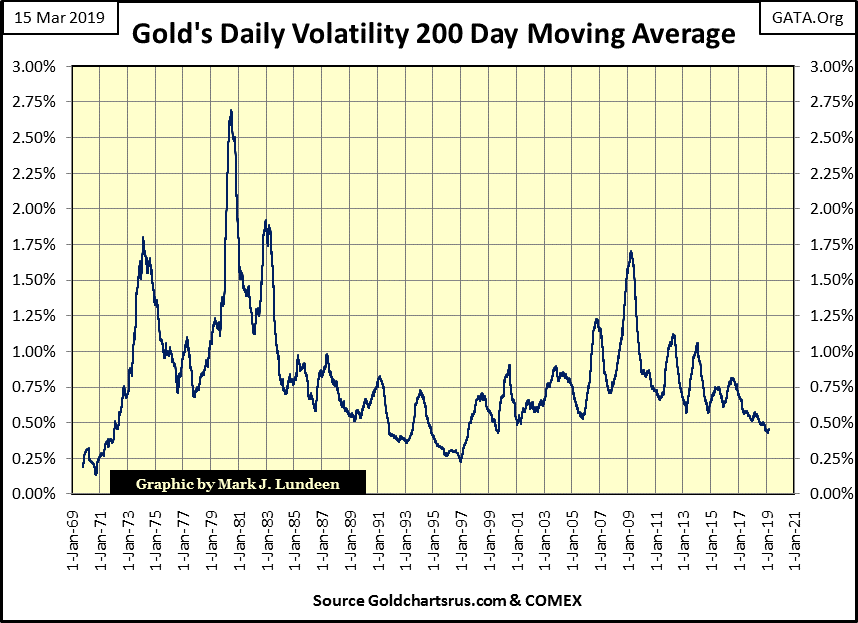
Gold’s last day of extreme market volatility (a 3% daily move in the price of gold) happened on October 4, 2016. That’s a long time ago, a long time where gold did little for its owners. When we once again see an increase in volatility in the gold markets, the price of gold, silver and their mining shares are going to demand attention by the financial media.
As for the Dow Jones’ step sum table, it’s boring. I’d rather look at silver’s step sum table below. In the twenty-five trading sessions since February 8th, silver traded in range from $16.00 on Feb 27th to $15.01 on March 14th. These closes had both occurred in the past 15 trading days, and are included in Friday’s 15 count of -7.
But on Wednesday and Thursday of last week the count was at a very bearish (bearish market sentiment) -9. I also noted that from Thursday’s close of $15.01 (15 count of -9), the bears failed to drive silver down into the $14 range. Instead on Friday silver was up closing at $15.34.
Now the bears may just drive silver below $15.00 in the next few weeks, but like gold, silver appears to be at or very close to an important bottom in the market.

However, as all professional commodity speculators are very aware of, “the trend is your friend”, and right now the trend in silver is down. But I’m not a speculator in COMEX futures contracts, or would I recommend my retail investors trade leveraged futures contracts in gold, silver or anything else.
All I’m saying is that looking at gold and silver’s step sums, both metals are at or approaching an important market bottom. This makes current prices in gold and silver very attractive for those who buy and hold the old monetary metals for the long term.
What’s the long term? Like for the rest of your life? Well unlike dollar based financial assets like stocks and bonds, that may be the case. I suspect that for the long term, ultimately the key for investing in gold and silver isn’t looking at their dollar valuation, but how many ounces of the metals one has physical control over.
With the Silver to Gold Ratio (SGR) closing the week at 85.21, or an ounce of gold could be exchanged for 5.33 pounds of silver, choosing silver over gold for retail investors in March 2019 is a wise decision.

The dollar is doomed. Unlike gold and silver which for thousands of years have retained their purchasing power, the dollar will soon join the roll call of ruined currencies that litter history.
Here is another quote from William Durant on the effects of China’s 10th century experiment with paper money.
"Such were the sources of that flood of paper money which, ever since, has alternatively accelerated and threatened the economic life of the world."
-William Durant: Our Oriental Heritage, (1935) pg 780
In time everyone will understand that Washington and Wall Street have destroyed the dollar as a financial market asset. This means a day is coming when a million dollars will be unable to find someone with an ounce of gold or silver willing to make the trade.
Does this sound too extreme?
Greg Hunter’s USAWatchdog.com has five informative interviews posted on it.
-
https://usawatchdog.com/recession-started-last-year-money-printing-coming-marc-faber/
-
https://usawatchdog.com/record-debt-everywhere-peter-schiff/
-
https://usawatchdog.com/massive-secret-money-printing-will-shoot-gold-higher-rob-kirby/
-
https://usawatchdog.com/federal-accounting-now-meaningless-frightening-catherine-austin-fitts/
-
https://usawatchdog.com/intractable-inflation-very-dangerous-new-paradigm-michael-pento/
These links offer over four hours of detailed economic and market analysis by very serious market experts. These people are not the typical “market experts” offered to the public by the MSM financial media. Take your time and listen to each as the truth is there, you only need the courage to believe it.
Disclosure: None.


