The Equity Market Outlook Until The First Half Of December 2020 Is Not A Pretty Sight, Liquidity-Wise
Summary
- It's apparent (at least to us) that the equity markets have done a seasonal cycle top, and equity markets and bond yields should fall until the first half of December.
- We have been trading the volatile Wave 2 of a declining five-wave sequence successfully; we could see the terminus of that large correction phase this (mid)week.
- Unfavorable seasonal liquidity patterns are teaming up with weak Q4 2020 GDP outlook and a new COVID-19 wave, to undercut the current bullish sentiment in the market.
- We expect great trades to the downside as from this coming week, if our analysis is correct. Given our outlook of a sharp bond yield decline, we may see the greatest shorting opportunities in RTY/YM indexes "value" set.
- But this seasonal bear cycle will likely be replaced by a rip-roaring initial bull phase which should reach a temporary apex in late Q1. This new bull market cycle may last until 2025.
It's apparent (at least to us) that the equity markets have done a seasonal cycle top, and equity markets and bond yields should fall until the first half of December.
At Predictive Analytic Models, we have anticipated and tracked that seasonal top in both yields and equities with great interest. We set forth our rationale for calling a seasonal market top in a series of reports from November 5 to the November 9 (the actual market top in equities) to the PAM community, and which has been duly published in our blog.
The rationalization is graphics-rich, presentation style. We suggest a close perusal of that earlier report, as there are nuances and details in that article, which we can not replicate here, due to editorial reasons. In effect, we are updating that presentation with updated graphics and new supporting rationale which have appeared since then.
Prelude to the November 9 market top
As we approached the actual market top, there was a huge divergence between the performance of bond yields and equities, primarily the "value" set (with the Russell 2000 and the Dow Jones Industrial Average as proxies) and to a lesser degree, with the S&P Comp Index and Nasdaq 100.
The large decline in yields, and the large gains in the "value" set as well as the tech and broad markets, were to us, precursor of a highly certain market reversal -- and it was.
The 10yr yield
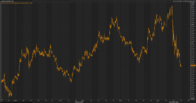
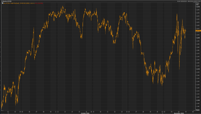
We said then (on November 5): " This equity market bull run is NOT sustainable. Moreover, RTYZ0, which benefits from rising yields comparative to other equity indexes approaches what had been effectively a triple top -- major technical resistance area coming up (see chart below).
The RTYZ0 futures
That certainty was conveyed to us by a numerical decomposition of both the SPX and 10Yr Yield, and the results juxtaposed with a similar decomposition of liquidity flows, and the data was synchronized to get the high-probability inflections points of both flows and risk assets (see chart below).
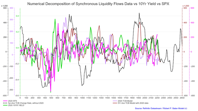
We do this kind of analysis routinely at PAM, and we and the community have always known that yields lead equities by several days (highly variable, but often by three days). The lagged correlation was so stark that it provides no ambiguous conclusions -- we were expecting a certain market top within two to three days.
Numerical decomposition is a very useful tool. You can spot intrinsic relationships (see chart above and below) -- although if you study the nominal values of SPX and 10Yr Yield, you may not spot the lagged relationship, which easily becomes apparent with a regression of the covariance (see chart below).
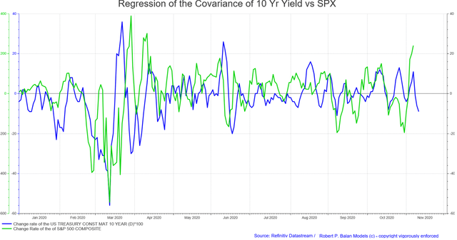
The study at that time told us that yes, yields are falling hard, while equities (SPX as proxy) are rising even harder, but equities will be cut down at the knees and will have to come down to earth -- it was just a matter of time. It was -- and fall they did.
The temporary variance in the normal positive yield-index correlation happens frequently, and yet I don't remember a single instance of the bond directional outlook losing to that of equities, and following the direction of the latter. And moreover, the negative covariance does not stay very long -- equities pivot to go the way of bond yields within a week of a divergence.
The bond yield-index relationship is so tight that when there are variances, trades can be crafted around that. In this case, the bond yield is the best equity market indicator that we, and the PAM community, have been using:
Where the bond yields go, equities will ((soon)) follow.
Markets topped out on November 9, so what comes next?
We presented other tools to the community so that they get a well-rounded feeling for the liquidity and technical environment. We have updated those charts to show recent market developments. One such technical tool is an RSI analysis, with a twist.
RSI Analysis and Aggregate Liquidity Index vs VIX and SPY
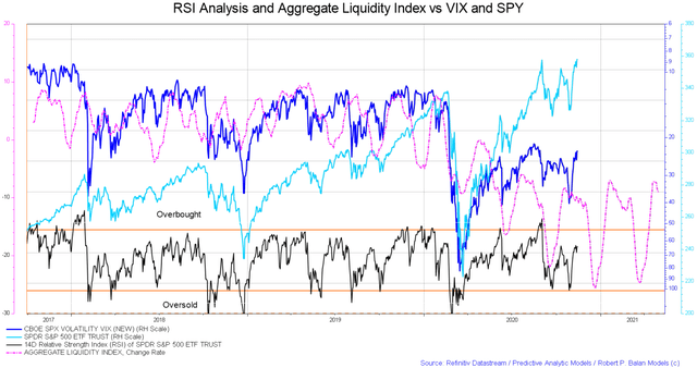
We've added the Aggregate Liquidity Index to a long term RSI study. The inflection point of the liquidity flows change rate projects the likely turning points of the market, volatility, and RSI -- it has been useful to PAM for many years. In most cases, the liquidity model predicts where RSI and the market/VIX bottom. The next major trough is sometime in December, probably by the middle of that month.
BTC Futures, Grayscale, Ethereum Classic vs PAM Liquidity, Ethereum Models, Gold, Nasdaq 100
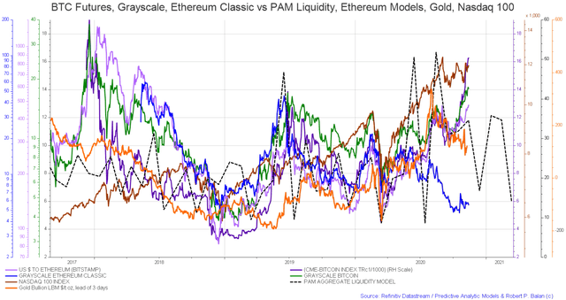
This chart/model has been very useful for me personally with my crypto holdings. The aggregate liquidity model index has had projected the likely inflection points of cryptos, which are primarily creation of excess liquidity in the system. That excess liquidity is about to disappear, and that would undercut bitcoin and grayscale.
Bitcoin is a good indicator of the stock market and gold because surfeit liquidity from the Fed and Treasury looks for outlets -- when that disappears, bitcoin goes down first, followed by equities and Gold. If cryptos again follow the liquidity lead, Bitcoin bottoms in December, as equities and Gold may likewise do.
Capital Inflows (Foreign+Domestic) Model, Government Debt, Federal Budget Outlays, GDP, SPX
Previously lower gov't expenditures magnifies the impact of falling capital inflows
US Fed gov't monthly budget outlays helped power the SPX with SOMA transactions (Fed balance sheet)
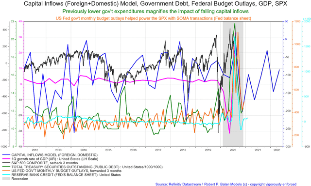
We have shown this long term outlook of ultimate liquidity flows at Seeking Alpha before -- the change rates of Capital Account flows into and out of the United States. These high level flows take a long time before they make visible impact on US growth, activity, and financial markets -- from 6 to 8 quarters. Gov't debt and budget outlays are very counter-cyclical, but follow the lead of the Capital Account flows.
The Fed and the US Treasury cut down on stimulus and deficit spending too soon.
The Treasury and Fed response after seeing a fantastic buildup of Q3 2020 growth rate was to cut down debt issuance (Treasury) and the credit balance sheet (the Fed). Debt proceeds were also hoarded by the US Treasury at its Fed account -- the Treasury Cash Balance (TCB), instead of distributing it to the US citizenry suffering from the impact of the COVID-19 pandemic.
That has deprived the economy of $1.571 trillion in spending power (see hoarded TCB in red line).
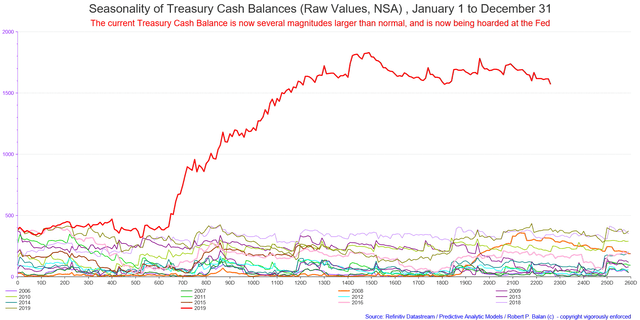
Those two actions will play a part in a collapse of Q4 2020 US GDP growth and prices of risk assets into December -- although long-term liquidity flows data has laid the foundation for such an event.
Given its linkages to these primary data, the stock market (which now lags liquidity and growth by a few months), should fall until December.
We also see that lingering growth weakness in our long-term Yield curve models.
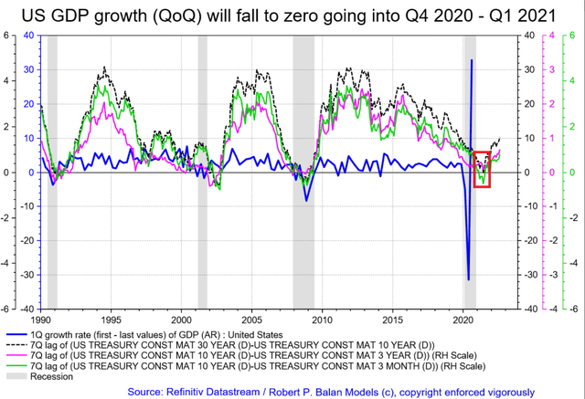
US GDP growth (QoQ) will fall to zero going into Q4 2020 - Q1 2021
There is indeed, corroboration from the evolution of the Atlanta Fed GDPNowcast real GDP estimate for Q4 2020
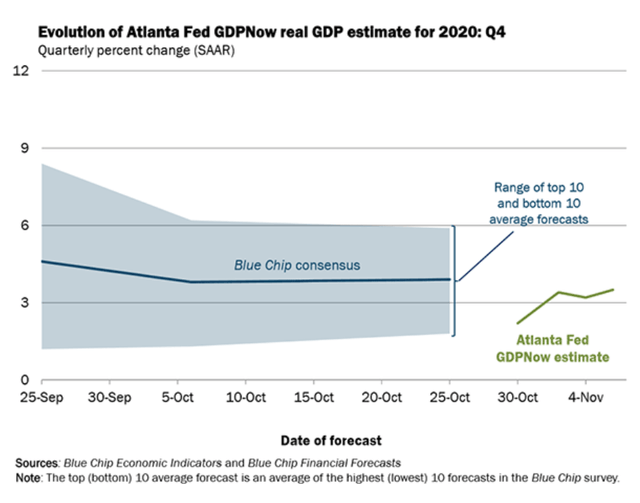
Q4 2020 GDP is now estimated at 3.5 pct (Nov 6) from 33.08 at end of September 2020.
That is a massive delta from Q3. That Q3 GDP was after all a mirage -- handiwork of the change rate. Unfortunately, that is what asset prices are keyed to. So it worked on the upside (from really really low levels), and now the change rate is working from really really high levels. That seems messy, but that is how the GDP formula works.
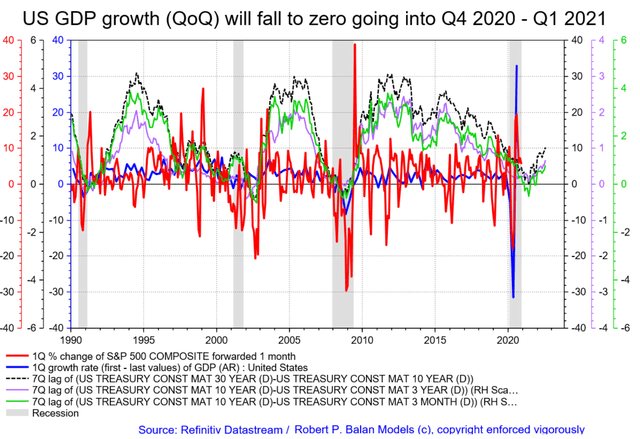
The Q/Q change in SPX is already showing you what to expect of GDP and of SPX itself). US Q4 GDP will be sharply lower. and the stock market and yields should gravitate lower appropriately.
The lead provided by Federal Budget Outlays, Treasury Debt Issuance over Treasury Cash Balance, Fed Balance Sheet
US Fed gov't monthly budget outlays set the levels of future SOMA transactions (the Fed balance sheet) and the Treasury Cash Balance
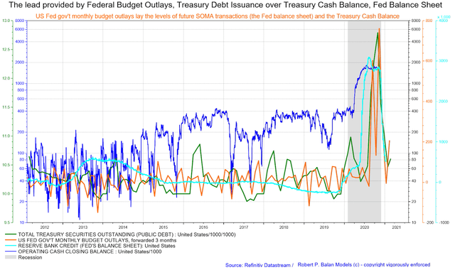
Note that Federal Budget Outlays lead Treasury Debt issuance by almost three months. Simply put, the Treasury spends what it does not have, and later pays it IOUs after selling debt. Think about its implications on liquidity flows. It is federal budget expenditures which calls the shots in liquidity flows, and the Fed's balance sheet (SOMA Transactions) mirror those expenditures after a short time lag.
In chart above, the sharp collapse in the change rate of Budget Outlays, and Debt Issuance means the TCB and SOMA Transactions will fall sharply over the next few weeks/months.
Remember that the Fed's Balance Sheet and the TCB are countercyclical as well, as these variables are consequences of the rise and flow of federal budget outflows and Treasury debt issuance.
What happens when the change rate of the Fed Balance Sheet falls?
If the Fed increases its balance sheet, banks reserves, asset prices rise, vice versa -- banks reserves and risk asset prices decline (see chart below).
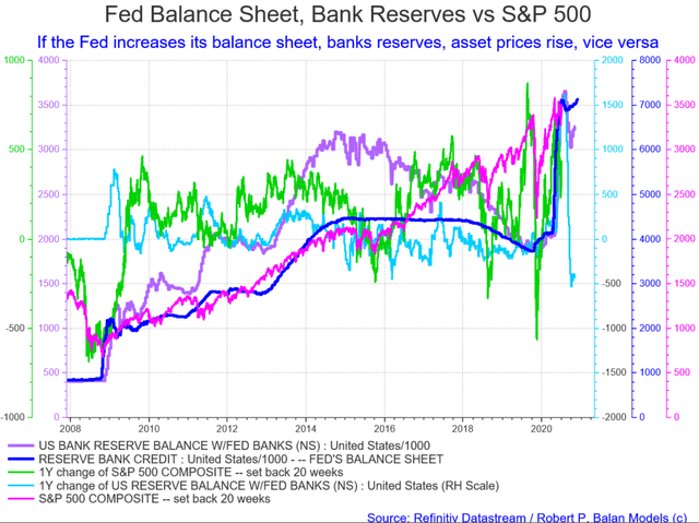
The slowing growth of the nominal Fed's balance sheet has caused a severe fall in Bank Reserves ((BR)), with the BRs' change rate plummeting precipitously.
A mini-seasonal liquidity drought exacerbates the premature cut in support from Fed and Treasury
That is certainly very bad news from systemic liquidity point of view. A mini-seasonal liquidity drought is just about to start and this double whammy should undercut equities and push down bond yields. This liquidity event has set the tone for equities and yields over the past several years during this period, and despite some changes in the pattern and levels of new deficit spending and the Fed's stimulus, the historical patterns seem to have reasserted.
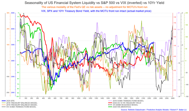
The historical data has had an amazing explanatory function over the recent changes in the 2020 SPX and 10yr yield. Even more amazing is that the decomposed properties of the 2020 liquidity variables are starting to match their five-year averages. Meaning, we can assume that 2020 data will perform similarly to its five year average, providing a long time lime of probably good forecasts, especially for the 10yr bond yield. That is seen in the two charts below.
Numerical Decomposition of Synchronous Liquidity Flows Data vs 10Yr Yield (2018/2019, 2019/2020)
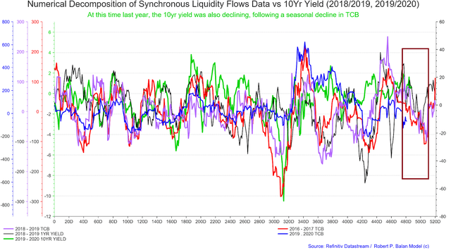
The same thing happened the year before that.
Numerical Decomposition of Synchronous Liquidity Flows Data vs 10Yr Yield (2017/2018, 2018/2019, 2019/2020)
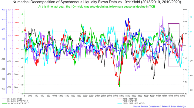
But the best template for a 10yr yield decline over the next few weeks may be seen in its 2015 performance, as shown by the chart below (chart provided by @ippy04, PAM's resident bond guru).
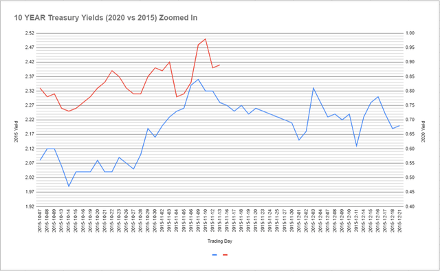
The downside targets for the various indexes and the 10yr yield were discussed in full and in greater detail in this PAM blog of November 13: Tracking The Terminus Of The Volatile Wave 2 Of Equities, As The 10Yr Yield Forms It's Own Wave 2 EWP Structure.
Strategies on how to trade the current counter-trend rallies in equities were discussed in an earlier blog report, on November 12: Trading The Volatile Wave 2, After A Seasonal Cycle Top In Equities, By Following The Lead Of The 10yr Yield.
We frequently update blog reports, which should be a reason to follow us.
The Fed, and global central banks, to the rescue
We are certain that risk assets (equities) will eventually respond to the deterioration of these liquidity variables, and will fall. This, on top of what looks to be certain "technical recession" in Q4 20202 / Q1 2021 time frame, may push the Fed to undertake another QE program early in the 2021 year. That is why we expect to see a humongous rally starting sometime in January. That rally maybe usher in another bull phase, which could last until 2025.
With another QE cycle, money supply will grow even more dramatically, the bond term premium will shoot upwards, and the long date yield curve and long bond yields should rise sharply.
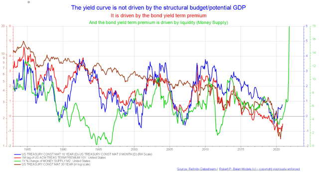
This inflection point should mark a cycle trough for risk assets and bond yields, and the subsequent rally should be sharp and maybe sustained until late Q1 2021. This is also being flagged by the recent changes in global Monetary Base (of the G5 central banks) shown in the chart below.
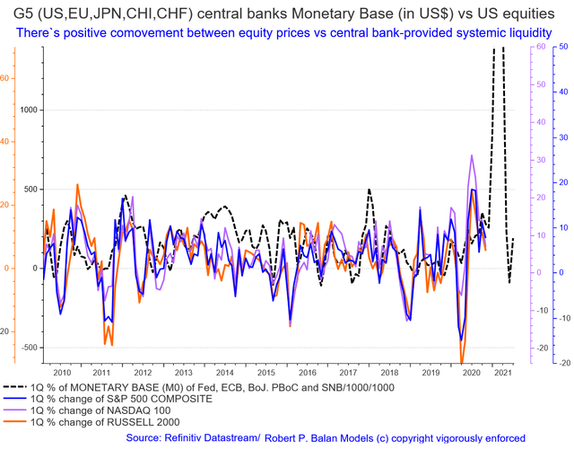
Note the sharp uptake and the as sharp subsequent downtick in the global Monetary Base proxy. So, even the G5 central banks also cut the QE stimulus lifeline too soon. But not to worry, the central bank cavalry will come to the rescue, sooner or later, likely sooner.
During the first TEN months of 2020, PAM delivered phenomenal real-dollar trading performance, the best at Seeking Alpha:
PAM's flagship more


Enjoyed this, thank you.
Welcome, and thanks for the kind thoughts Susan
Good stuff, you should write more frequently.
Yes, I was told that Carl. Busy making money, but will write more.