
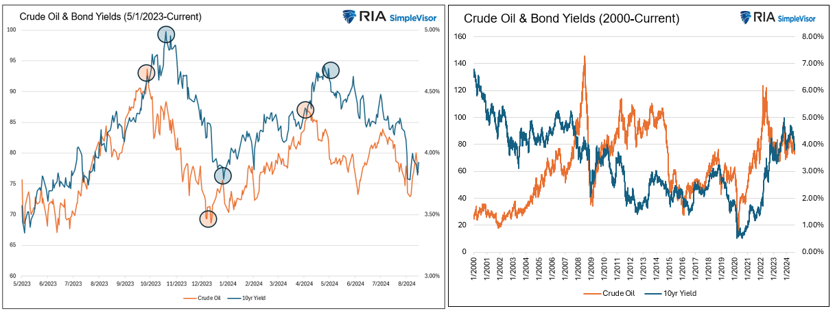
Over the last year or so, crude oil and ten-year U.S. Treasury bond yields have been highly correlated. The graph on the left shows how oil and bond yields have moved step for step with each other. However, as we highlight with circles, it’s worth noting that short-term trend changes in crude oil prices have led to bond yield trend changes by a couple of weeks. The graph on the right shows some historical periods where the two prices are correlated, such as 2015-2018. Conversely, there are plenty of periods with little correlation. The average 100-day correlation since May 2023 has been statistically robust at 0.60. Over the 25-year time frame graphed on the right, the correlation has been about half the recent rate (0.28).
Given the impact oil prices can have on economic activity, the long-term relationship with bond yields is not surprising. Assuming the relationship holds and oil prices continue to lead the way, bond traders should follow crude prices closely. Accordingly, the bullish case for oil is heightened hostilities in the Middle East and or a resurgence in economic growth. The bear case is essentially the opposite. A peace treaty in the Middle East would provide confidence that Iranian oil will continue to flow unabated. Second is the further weakening of economic activity in the U.S. and globally. To this point, economic activity in China is slowing rapidly. China consumes 13% of the world’s oil, second to the U.S., which accounts for 20%.
What To Watch Today
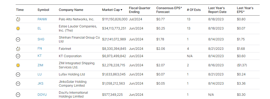
Earnings
Economy
- No notable economic releases
Market Trading Update
As noted last week, events like the “Yen Carry Trade” blow-up are temporary and rarely devolve into more extreme market corrections. However, there is always that risk, so we suggested rebalancing portfolio risk as needed. The good news is that the 5-10% correction we warned about in June and July has been completed, as we will discuss in a moment.
However, with that said, the rally from the lows of two weeks ago has been rapid and has some good and bad elements. Starting with the positive, the rally from the lows reversed the MACD “sell signal,” suggesting the bullish bias has returned. Furthermore, the rally cleared all-important resistance levels with ease. The 100, 50, and 20-DMAs were crossed quickly, leaving only recent all-time highs as important next resistance.
(Click on image to enlarge)
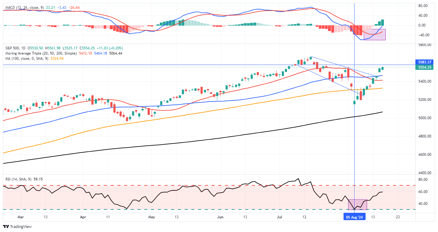
The only negative to the advance is that the previous oversold conditions have mostly been reversed. Such isn’t a major issue, but it suggests we will likely see a small pullback to retest support at the 50-DMA. Such will provide a better entry point to add exposure as needed.
Last week’s economic reports from PPI and CPI to retail sales helped boost the market’s confidence that while the economy is slowing down, it is not recessionary. A “soft landing,” if the Federal Reserve can navigate one, would suggest that stable economic growth rates could support current earnings estimates. However, as history suggests, such optimistic outlooks rarely come to fruition, but that is a challenge the markets will face later this year and into 2025.
Continue to manage risks, but the correction is over for now.
The Week Ahead
The Fed’s Jackson Hole symposium will be the highlight this week. The meeting, starting Tuesday, allows the Fed to discuss and debate their longer-term outlooks along with thoughts on current monetary policy. They often use this event to steer the public mindset regarding how they will or won’t change rates. Jerome Powell will address the symposium on Friday. We suspect the Fed will tell the market they plan to cut rates in September. However, more important will be any guidance on what they expect regarding the number of rate cuts and what data impacts their decision-making the most.
Other than Jackson Hole, it will be a quiet week with little economic data. The Fed will release its minutes from the July meeting, which may also provide some clues on future rate cuts.
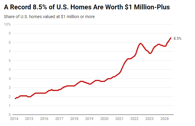
Million Dollar Homes On The Rise
In a recent housing market study, Redfin claims that 8.5% of U.S. homes are worth at least $1 million. That is the highest share of all time and quadruple the share of ten years ago. Furthermore, the rich are getting richer. Per Redfin:
Prices are rising even more for homes that are already expensive: The median sale price of U.S. luxury homes rose 9% year over year to a record $1.18 million in the second quarter. Prices of luxury homes rising has an outsized impact on the share of homes worth at least $1 million because a major portion of them have long been on the cusp of hitting the million-dollar mark, and just did.
One of the most critical factors behind rising home prices is the minimal supply of homes for sale. Redfin says the inventory of homes for sale has improved, but it is “still 30% below pre-pandemic levels because many homeowners are locked in by low rates.“
The article claims the share of million-dollar-plus homes rose in all but three of the most populated MSAs. Austin, Indianapolis, and Houston saw slight declines in large part because “rampant new construction in Texas has pushed up supply, putting a lid on price growth.” Despite a migration trend out of California, Redfin claims they are gaining the most million-dollar homes. In fact, nearly 60% of homes in Anaheim are worth at least one million dollars. Conversely, Detroit, Cleveland, Pittsburgh, and Kansas City have less than 1% of homes worth a million or more.
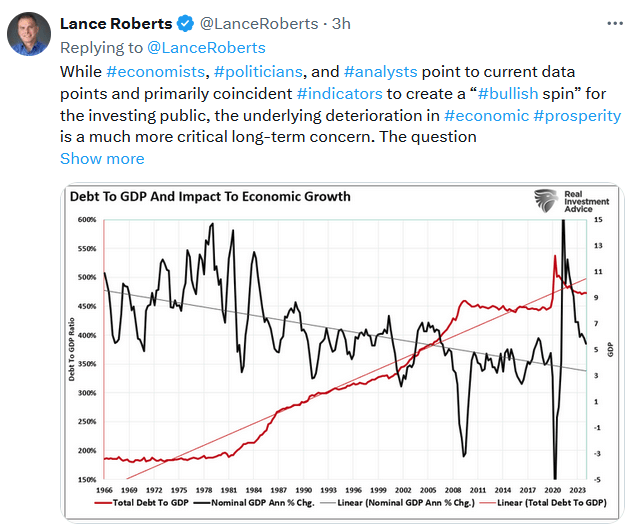
Tweet of the Day
More By This Author:
Buybacks End The Market CorrectionWalmart Gives Investors A Ray Of Hope
Economic Growth Myth & Why Socialism Is Rising


Comments
Log in or sign up to join the conversation.