Memory Inflation Warps Bond Yields
The Mayo Clinic defines Post Traumatic Stress Disorder, or PTSD, as “a mental health condition that’s caused by an extremely stressful or terrifying event — either being part of it or witnessing it.” Within the field of PTSD research is a concept called “memory inflation.” Memory inflation occurs when memories of traumatic events become more intense over time.
Memory inflation of past events amplifies one’s emotions and behaviors. As we will discuss, distress from recent price inflation is causing many investors to overly fear that a similar situation will reoccur.
Given the tight relationship between inflation and bond yields, memory inflation negatively affects bond prices. Additionally, memory inflation may prevent some investors from seeing an opportunity to profit from the distorted market views.
Apollo Management’s Chart Crime Amplifies Memory Inflation
The following graph from Apollo Management has been circulating in social media for nearly a year. We believe it keeps yesterday’s high inflation fresh in people’s minds and stokes memory inflation, which warps investors’ current view of inflation.
The graph insinuates that inflation is perfectly tracking the 1970s and 1980s. The graph prompted us to write a four-part article (ONE, TWO, THREE, and FOUR) explaining why the current environment vastly differs from the 1970s and 1980s. The series made a strong case that another round of inflation is not likely, barring an unpredictable black swan event.
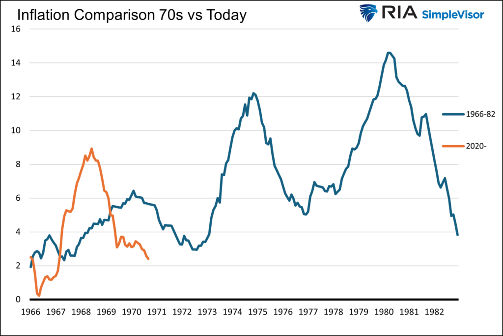
Within the article, we created a more accurate graphical comparison, as shown below, between the two periods and explained why the graph is deeply flawed. To wit:
First, the two vertical y-axis scales on Apollo’s graph are different. This makes it appear that the inflation rates of the 1970s and today are nearly identical.
Second, the horizontal axis doesn’t compare apples to apples. From 1960 to 1965 (not graphed), inflation fluctuated below 2% a year. In 1966, inflation started to increase consistently. In the modern time frame, the year 2020 is when the wheels for inflation were set into motion.
Therefore, the recent data for comparison should start in 2020, not six years prior, when there was little inflationary impulse. The graph below adjusts both axes and provides a better comparison.
Our graph below has been updated since it was initially published.
Inflation Rates Versus Price Levels
When most people discuss inflation, they talk about how the prices of many goods and services are much higher today than only a few years ago. For instance, “Dinner for my wife and I now runs close to $100; it used to be $50 or $60”, or “Can you believe a gallon of milk is now $6.” Those statements reflect the price differences between today and the past but do not reflect the recent rate of change. The difference may sound trivial, but it is substantial.
When discussing inflation, economists will note the annual or monthly rate of change and not the absolute price level. For instance, they may say, “The price of milk is only up 1.2% this past year.” Or “Used car prices are down 7.5% year over year.”
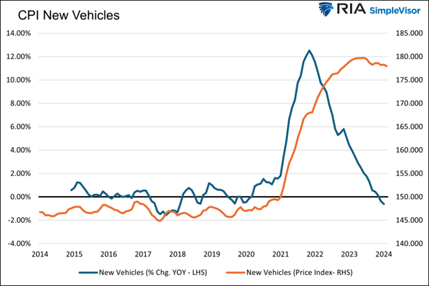
We elaborated on the stark difference in inflation views between economists and citizens in Why Economists and Citizens Have Different Inflation Realities. To help better appreciate the inflation perspective of economists and citizens, we shared the graph below and wrote the following:
Economists focus on the blue line, graphing the year-over-year change in new vehicle prices. Over the last year, the price index of new vehicles has decreased by .60%. Economists can say the cost of buying a new vehicle is in a deflationary state.
While the chart may warm the hearts of economists and the Fed, most individuals see the orange line, the CPI price index for new vehicles instead. It shows that new vehicle prices are up about 20% since the pandemic. Yes, they may have recently declined slightly, but today’s prices are nowhere close to where they were four years ago. In their minds, there is significant inflation in new vehicles.

Which statement is more stressful?
- A new car costs $55,000 compared to $35,000 a few years ago.
- The price of a new car is down 1% over the last year.
We venture to say every reader picked the first bullet point. Both statements can be correct. However, one statement induces stress and the other tranquility. As consumers, much higher prices for many goods and services are constant reminders of the high inflation. The recurring cues invoke memory inflation in all of us, except for the most committed economists.
Bond Investors Should Think Like Economists
Whether logical or not, memory inflation of inflation creates fear that another bout of inflation is coming. For bond investors, this can create an opportunity if you believe, as the Fed and we do, that inflation is heading back toward 2% and will likely stay there, barring an unforeseen event.
Today and throughout time, bond investors should always seek a yield that compensates them for inflation and credit risks. The higher the perceived risk, the greater the yield. We believe that the memory inflation of inflation subconsciously pushes many investors to demand higher bond yields. This condition will persist. However, assuming inflation continues to head toward or below the Fed’s 2% target, the fear will diminish over time. As it fades, bond yields will catch down to inflation rates.
From a bond investor standpoint, we need to appreciate what is truly going on with inflation now versus battling memory inflation of years past. When analyzing bonds, we must try to forget that cars now cost $60,000+ and milk is $5 a gallon. Instead, think like an economist and focus on the rate of change in inflation.
The Fed Also Has Memory Inflation
If you worry that your inflation worries will persist even as evidence strengthens that inflation is fading, you are not alone. The Fed also fosters the same problem.
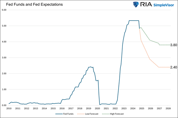
As of September, the Fed’s long-run GDP and PCE price forecasts are 1.80% and 2.00%, respectively. In 2019, before the pandemic, the Fed’s long-range forecast for GDP was 1.90% and PCE at 2.00%. In other words, growth prospects slipped slightly, and their inflation forecast is unchanged. However, despite virtually identical economic and inflation outlooks, the lowest long-range Fed Funds rate forecast for the 19 Feb members is 2.40%, well above the average Fed Funds rate in the post-finance crisis era.
Summary
Memory inflation of inflation results in bond yields trading above where they might have had the recent bout of inflation not occurred. It also results in a relatively conservative monetary policy.
Memory inflation will not disappear overnight, but as the distress of higher inflation ages, the bad memories will subside. Dare we say memory disinflation will kick in?
Historically, bond yields have a solid relationship with inflation and economic growth. When one considers that today’s economic fundamentals are not much different than before the pandemic, one may question why bond yields remain high. Some will blame the massive deficits or foreign selling of Treasury bonds. We think a lot of the yield premium rests on the shoulders of memory inflation and not the truest fundamental driver of yields, actual inflation.
More By This Author:
Amazon Is Challenging The Work From Home TrendSeasonality: Buy Signal And Investing Outcomes
Why Are Bond Yields Rising? Lets Ask The Oil Market
Disclaimer: Click here to read the full disclaimer.


