Improvement In A Shortened Trading Week
Image Source: Unsplash
The chart for the SPX continues to look good. Really good. The closing prices of the SPX have continued to break above previous highs. After such a strong run-up to new highs, you may be worried that prices are getting frothy at these heights.
Here is a look at the 21-day EMA that I discussed last week. This is the go-to stock indicator at Investors.com. In their view, essentially, while a stock or index maintains itself above this moving average, the trend is considered higher. Once there is a close below, it is time to be more cautious.
I also like the five-day trend in the lower panel. It seems helpful because it adds an extra certainty to the strength of the uptrend. If the SPX were above its 21-day EMA, but the five-day new high/low in the lower panel were in the red, I'd be getting cautious. At some point, I'm sure this will happen.
Last week, I mentioned that a major negative for this market was the lack of breadth, as shown by the weak number of stocks trading above their 200-day average. As of last Monday, breadth showed some enormous improvement, as the leading stocks were sold and the laggard stocks were bought.
Let's keep in mind that this chart has a way to go before it corrects the lack of market breadth. Also, note that the market set a new high in February, but this chart showed a serious negative divergence with the NYSE indicator well below its December high.
If I were forced to rely on only one chart to tell me whether to be in cash or in stocks, I would have to choose the following one. The US stock market is not going up without the participation of technology stocks. As of the time of writing, the prices of these two technology ETFs are pointing nicely upwards. This is a bullish indicator.
Here is another breadth chart that shows a negative divergence in the December-February periods. The SPX hit new highs (although barely), and the AD line was well below the December peak. That's negative for the general market, and so it shouldn't be a surprise that there was a serious sell-off in March.
And now? The new highs for the SPX are being matched beautifully by the new highs for the AD line. That's a confirming signal for the general market. This is another bullish indicator.
Here is a look at the PMO index that so nicely shows us the market's short-term trends. The PMO is at the high of its range, and it has been there for several days, which means it is time to be a bit more cautious and to start thinking about any risks that may exist in our accounts as well as where we might want to raise cash when the time comes.
Of course, looking at the previous uptrend in May, the PMO can stay at the high of its range for a lot longer than a few days. Then again, looking at March and January, the PMO can also reverse rapidly off its highs. What to do? In my opinion, it may be wise to prepare now, in advance.
The two major indexes have continued to close above their five-day averages. The first sign of a downtrend is a close under the five-day average.
There continues to be an increasing number of stocks trading above their 50-day averages, which is more confirmation of the uptrend.
The same goes for the bullish percents.
This junk bond ETF could not look any better, which is bullish for stocks.
Everything is looking rather bullish. What could go wrong? Well, when everything looks too good, then it means everyone is already fully invested. No one is left to buy. And so, the steam comes out of the rally.
The graph below tells us that it is too late to buy, and that now is the time to start getting cautious.
I have one last positive comment about the general market. We have entered the best month of the year for stock prices, and I don't think that is a minor consideration. But also remember that the three months following July are often the worst months for the general market.
Bottom Line
I'm about 80% invested in stocks. I don't think that I will be much of a buyer again until October. I want to let my winners run higher, but I'm now equally focused on preserving my profits.
Meanwhile, this longer-term indicator has worked well over the past couple of years.
The 30-year yield pulled back slightly from testing new high levels, but I'm pretty sure we'll get a new high for the 30-year in the months ahead. I'm not saying this is a bad thing, but it will get lots of attention from traders and investors who won't be happy about it.
It has been a very long wait, but this ETF that showed so much promise in 2021 may have finally bottomed out. I like this as a long shot.
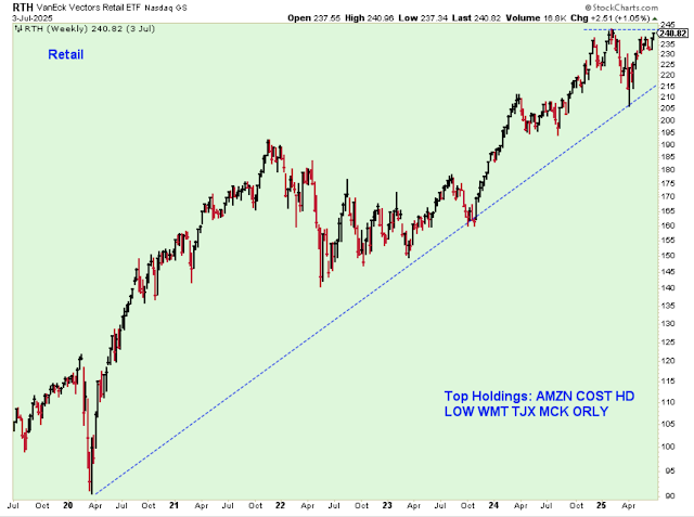
This retail ETF seems to be pressing against new highs. Strong retail is always a very good sign for the general market.
The financials broke out this past week. This is another bullish indicator.
Outlook Summary
- The short-term trend is up for stock prices as of June 26.
- The medium-term trend is neutral for Treasury bond prices.
More By This Author:
Negatives To Watch In A New Short-Term UptrendThe Short-Term Downtrend Continues As July Approaches
Calling A New Short-Term Downtrend
Disclaimer: I am not a registered investment advisor. I am a private investor and blogger. The comments below reflect my view of the market and indicate what I am doing with my own accounts. The ...
more


