
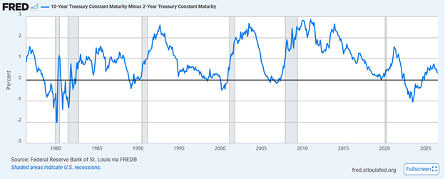
Some Wall Street pundits believe that the recent Fed rate cut makes its policy too accommodative, and they also argue that the Fed is creating a “Goldilocks” scenario for the stock market. To wit, we recently saw the following comment and graph on X, which suggests we are in the “Goldilocks zone.”
“Market is currently pricing in a Fed that will be too loose into an economy that really doesn’t need this pace of accommodation. This is the Goldilocks zone for risk assets. That’s the top right quadrant.”

Instead of guessing where the Fed’s policy falls on the restrictive to accommodative spectrum, as the graph above does, we thought it would be more useful to use actual data to create a similar graph.
Doing so will better inform us about whether the Fed’s current policy stance is appropriate. Importantly, from an investment perspective, this will help us determine if Goldilocks has arrived. Or, if policy is indeed restrictive, might the Fed pose a problem for stocks down the road?
Defining Policy: Accommodative And Restrictive
Accommodative monetary policy, such as lowering the Fed Funds rate, aims to stimulate economic growth by making credit cheaper and more accessible. Conversely, restrictive policies, such as increasing the Fed Funds rate, seek to slow down the economy by making credit more expensive and less accessible. The Fed can also adopt an accommodative stance through quantitative easing (QE) or tighten policy with quantitative tightening (QT).
When assessing Fed policy actions, it’s essential to recognize that just because the Fed’s recent cut in the Fed Funds rate makes policy more accommodative, it doesn’t mean its overall policy is accommodative, as many people seem to think. The same applies to restrictive actions.
To better gauge where policy lies on the accommodative to restrictive spectrum, it’s critical to compare the policy to current economic growth and inflation rates.
As we mentioned earlier, QE and QT can either stimulate or slow down economic activity. For this article’s purposes, we exclude them from the analysis. However, the Fed is implementing $22.5 billion of QT each month, which is inherently restrictive.
Is The Fed Accommodative or Restrictive?
To answer our question, we created a scatter plot, which is shown below.
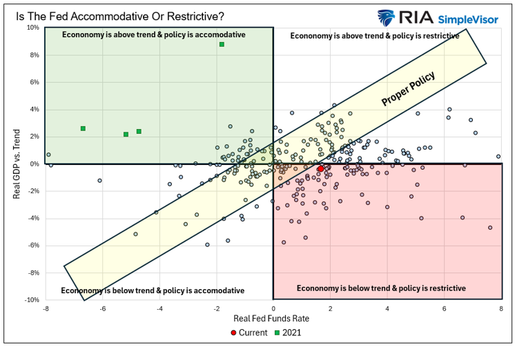
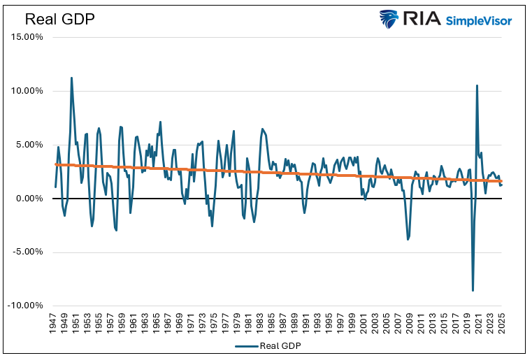
Each dot indicates the intersection of each quarterly GDP figure and the Fed Funds rate since 1954. The Y-axis represents the difference between GDP and its long-term trend, measuring the economy’s strength or weakness. The trend line, based on statistical regression and real GDP, is displayed below.
Similarly, we subtract the Fed Funds rate from the CPI to evaluate whether policy is accommodative or restrictive. The quadrant in which each dot falls helps us determine if monetary policy aligns with the current state of the economy, or if it is too loose or too tight.
The current environment is marked with the red dot. It indicates that the Fed Funds rate is 1.66% above CPI, making it restrictive. Additionally, economic growth is slightly below trend. The data imply that the Fed’s policy remains restrictive, even after the September rate cut.
To understand what a “Goldilocks” scenario really is, look at the four green boxes in the top left quadrant, which represent the four quarters of 2021. That year, the Fed Funds rate was significantly below the inflation rate, while GDP was also exceeding its trend.
Investors enjoyed the benefits of that Goldilocks period with a 30+% return on the S&P 500.
The yellow rectangle labeled “proper policy” is an estimate of a suitable policy under different economic conditions.
Returns By Quadrant
To explore how Fed policy might influence stock returns, we adjust the previous graph. We removed some labels, and in each quadrant, we display the three-month return statistics of the S&P 500. These statistics include:
- Average return- Average of all instances within the quadrant.
- Worst return – The lowest three-month return among all instances.
- Standard deviation- A gauge of volatility. The lower the better.
- Sharpe Ratio – Measures return per unit of risk. The higher, the better.
- Win% – The percentage of cases with positive returns.
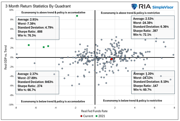
The top left quadrant (Goldilocks), which shows periods when the Fed is accommodative despite above-trend growth, delivers the best returns both in absolute terms and on a risk-adjusted basis. Notice that this quadrant’s Sharpe ratio exceeds twice that of the other three quadrants. Also, the worst outcome here is significantly lower than in the other quadrants.
The bottom right quadrant is where we are today. The dots in this quadrant indicate periods when the Fed is too restrictive despite economic growth being below trend. This is the worst-performing quadrant, with a significantly lower Sharpe ratio than the other quadrants.
We caution that our return analysis uses every instance in each quadrant. Many instances are clustered near the mid-point or what we consider as “proper policy.” Furthermore, numerous factors influence stock prices, none of which are included in this analysis. Therefore, the return analysis we provide may help set expectations for relative returns; however, it should be used in conjunction with fundamental and technical analysis.
Bottom Line
We could have approached this analysis in different ways. For example, we might want to use inflation expectations to calculate the real Fed Funds rate. Additionally, we could have included QE or QT in the Fed Funds rate to get a more complete view of Fed accommodation. To assess whether GDP is above or below trend, we could use the neutral rate (R*).
The point, however, is that what we have demonstrated and would demonstrate using the mentioned iterations is that the Fed’s policy remains restrictive based on inflation and economic activity.
Not surprisingly to us, Chairman Powell reaffirmed our belief multiple times during his last press conference. For example:
What we can say is this, that over the course of this year we’ve kept our policy at a restrictive level – and people have different views, but a clearly restrictive level, I would say.
Regarding the recent employment weakness and policy, “suggests we should be moving in the direction of neutral, and that’s what we did today.
More By This Author:
Valuations Are Extreme: Navigating A BubbleMomentum Strategies And Physics: Mass And Velocity Matter
UPS Is At Pandemic Lows: Value Or Value Trap?

Comments
Log in or sign up to join the conversation.