

From FRED: Employed full time: Median usual weekly real earnings: Wage and salary workers: 16 years and over (LES1252881600Q), graphed along the familiar average hourly earnings per hour, total private industry, ex-nonproduction, and supervisory workers, deflated by CPI:
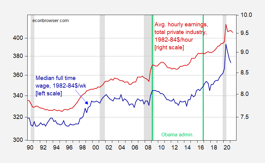
Figure 1: Median usual weekly real earnings per week: Wage and salary workers: 16 years and over, full time (blue, left log scale), and average hourly earnings per hour for total private industry (red, right log scale), both in 1982-84$, deflated using CPI. NBER defined recession dates shaded gray. Light green lines denote Obama administration. Source: BLS via FRED, NBER, and author’s calculations.
This graph is in response to JohnH‘s comment:
Where exactly does the BLS report median earnings in current dollars? SSA does this in a clear, straightforward format, albeit with a significant delay.
And if the BLS does not, why not? Isn’t the average American entitled to know how much the average Worker takes home on an hourly, weekly and annual basis? Aren’t people entitled to know from BLS that the average worker is barely making a living wage and can barely afford housing? It might help politicians focus.
Just reporting average earnings, which are 50% higher than the median , simply serves to obfuscate how the workforce is doing.
It took me 15 seconds (literally) to find and download the series. It took longer to import into EViews and then translate average hourly earnings into the quarterly frequency and plot than it took to find.
If you’re going to assert a vast conspiracy of elites trying to obfuscate and hide the data, then at least try to find a variable that is in fact not reported, and hard to create.

Comments
Log in or sign up to join the conversation.