


Learnings and conclusions from this week’s charts:
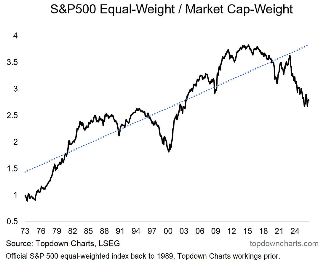
Overall, it’s a distinctly bullish looking environment (strong trend, strong breadth, good macro, buoyant confidence), with a few shadows to keep tabs on (risk of overconfidence, seasonality, stalling mega caps, rising rates). 1. S&P500 Equal vs Cap Weight: something has quietly been taking place in the background; the equal-weighted version of the S&P500 is starting to turn the corner vs the market cap weighted version (the normal/headline version). Most times this happened it was bearish…
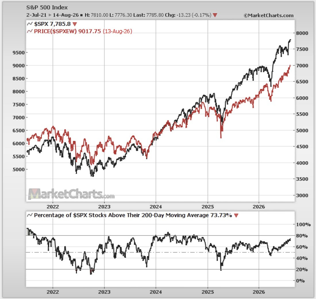
Source: Topdown Charts 2. Keep Calm & Bull On: but currently it’s a result of the mega caps (aka “Lag-7” [see chart 7 this week]) consolidating, and the rest of the market pushing higher. For instance, the SPXEW (equal-weighted S&P500) has been surging and 200-day moving average breadth has been trending consistently higher. This is bullish broadening.
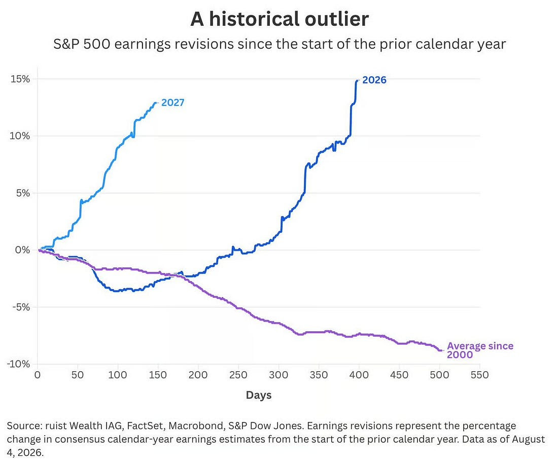
Source: MarketCharts.com 3. It’s the Earnings… while there are no doubt a few big hitters in the AI space skewing earnings expectations higher, the fact is analyst expectations for 2026/27 have been significantly and consistently improving. This bucks the historical trend since 2000 where earnings expectations tend to start high and fade lower as the year progresses. So it is an outlier.
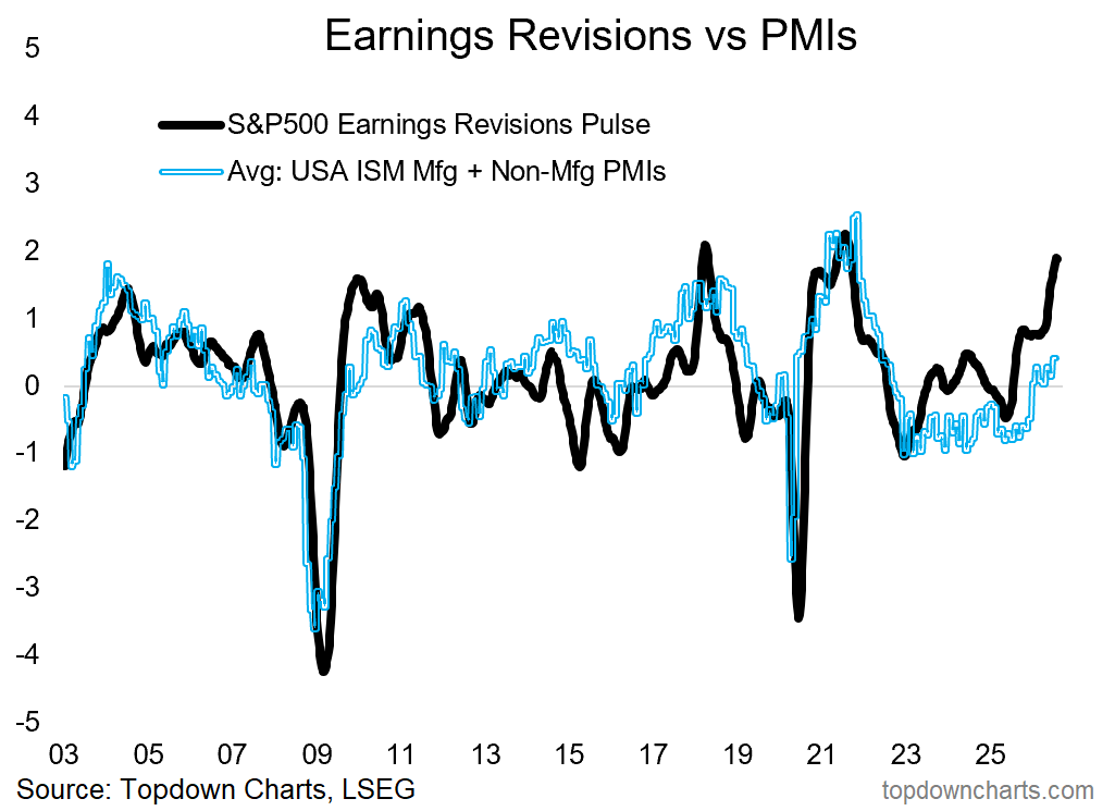
Source: @dailychartbook 4. Positive Macro: and for good reason, as highlighted last week, US macro is looking decent (e.g. credit managers and purchasing managers reporting improved conditions, unemployment rate at the lows), and this does line up with the optimism we’re seeing among Wall Street analysts.
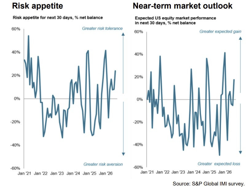
Source: Topdown Charts Professional 5. Investment Manager Survey: given buoyant macro/earnings and the bullish broadening, it’s no wonder that investment managers are feeling more optimistic on the US stockmarket outlook. Albeit, despite optimism on fundamentals, macro, and shareholder returns, the survey showed ongoing concerns about fiscal policy, central bank policy (rate hikes are coming), valuations, and the (geo)political environment.
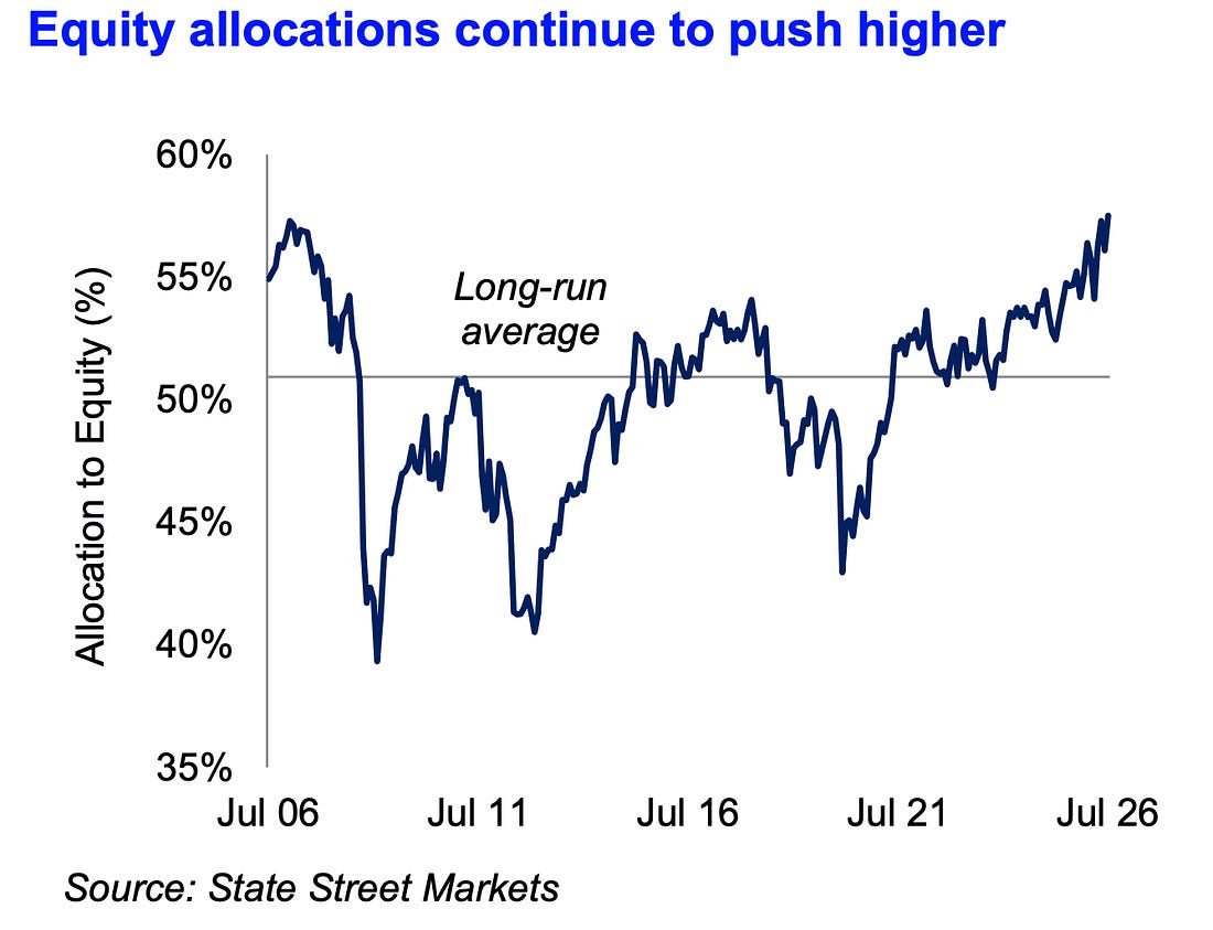
Source: S&P Global 6. Equity Allocations: thanks to a combination of rising stock prices and rising confidence (because asset allocators always have the option to rebalance, if market movements drift them higher that is effectively an active decision to maintain higher equity allocations) — equity allocations are up to pre-financial crisis levels.
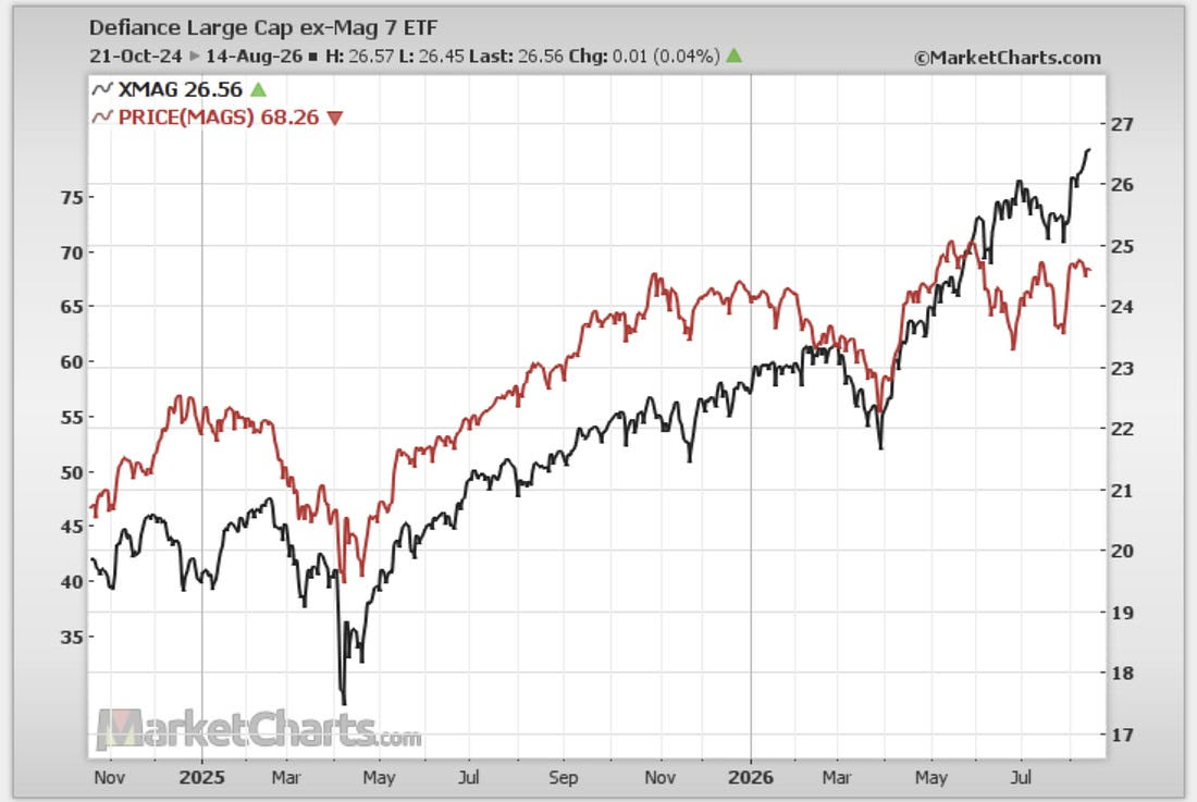
Source: State Street Markets via Daily Chartbook 7. Lag-7 Stalling Again: however, the Mag-7 (aka Lag-7), have yet to reclaim their May peak AND have stalled once again after an initial sharp rebound. As a reminder, these guys are still about a third of the index, so what happens with Mag-7 matters. XMAG
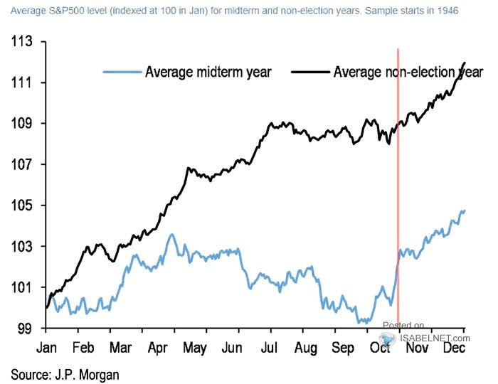
Source: MarketCharts.com 8. Seasonality: another cautionary point is seasonality is set to slide sharply softer from here into September. The upside though is during both mid-term years and non-election years you typically see a fairly strong Q4 rally.
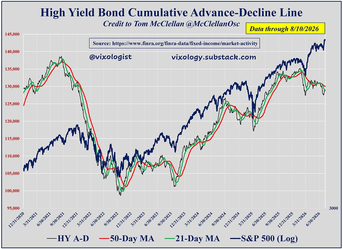
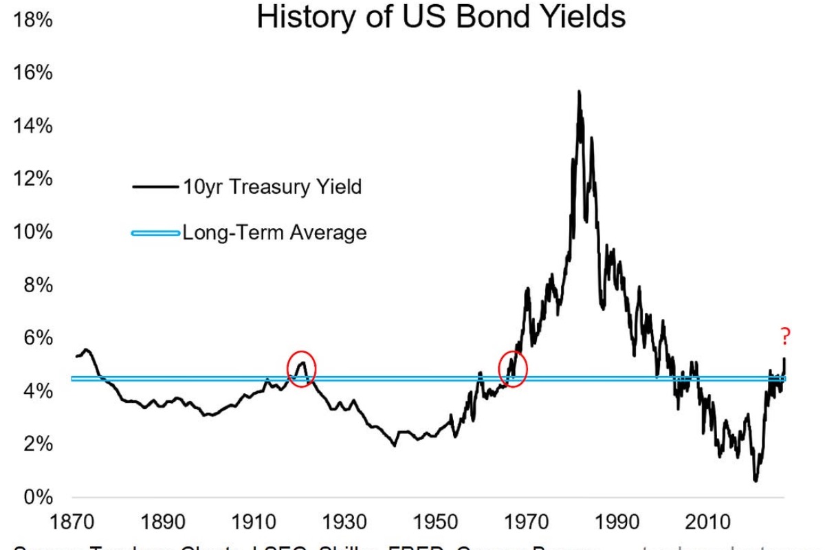
Source: @TheProfInvestor 9. Credit Warning? Another potential red flag is the downtrend in the junk bond market A-D line, which has forewarned of impending market volatility before. Albeit I’d say probably most of this is a reflection of duration (rising bond yields) vs credit difficulties (but then again, if bond yields move far and fast enough they can cause their own issues for macro and markets). So it’s overall a bullish looking environment, with a few shadows to keep tabs on.
Source: Credit Check — Vixology 10. Day Trader Doom: about 2/3rds (64%) of young men who engage in day trading reported feeling like a failure… that compares to just 30% for those who trade less than daily (maybe they are more long-term investors, or at least much less active). When you pair that with the point that most day traders lose money it turns out that day trading seems to be bad for your financial health AND your mental health. I would say for young folk and those earlier in the process, you’d probably be better off maximizing your income in your main thing, controlling costs, and being a (well-informed, rational and disciplined) active or semi-active investor with a timeframe of months-to-years, rather than trying to day-trade your way to financial freedom.
Source: @awealthofcs |

Portfolio Strategy Notes — US Banks (2 things)
These two charts are both interesting for dual reasons.
The first shows US banks extending their uptrend and breaking out to new highs. KBE
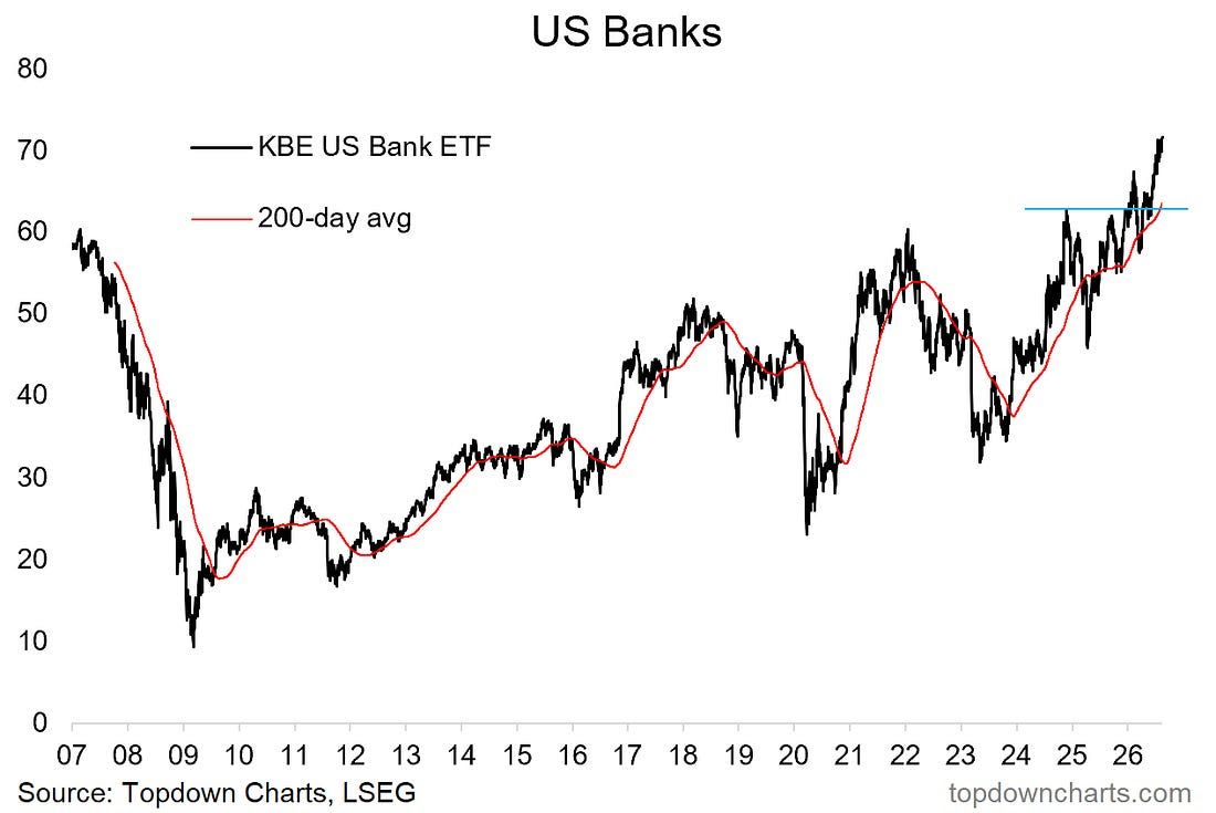 |
But it also shows how messy and confusing breakouts can be. The first breakout failed and even briefly breached the 200-day moving average, only to bounce back above resistance and then back again before finally leaving the launch pad.
The lesson: things don’t always go to plan even when they go to plan.
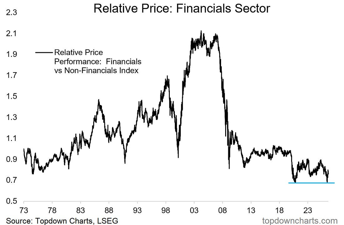
The second chart shows US financials’ relative performance line ticking up from a major long-term support after a long period of languishing.
 |
But step back and you see something else in this chart.
You see what was once a long-term winner, a market darling, an established uptrend meeting a major collapse in 2008 —and never recovering.
That kind of path from 2007 onwards would have been unthinkable during the 2000’s, you would have been ridiculed for suggesting it as a possibility. In the end, consensus got blindsided and bruised; partly because of lack of imagination.
The lesson: sometimes the unthinkable is simply a lack of imagination.

Comments
Log in or sign up to join the conversation.