


Learnings and conclusions from this week’s charts:
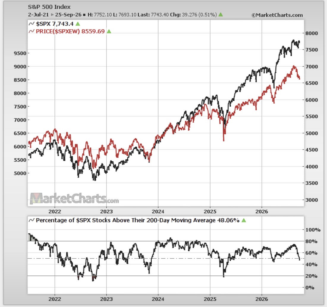
The stockmarket has undergone a “stealth correction”.
The equal-weighted S&P500 is down more than 5% off the peak.
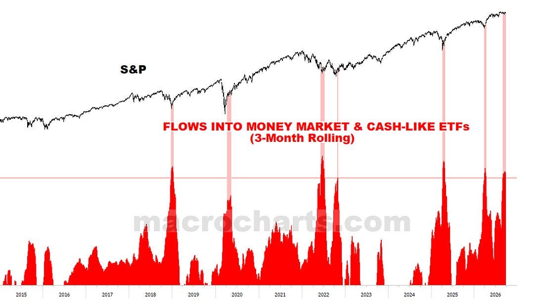
Breadth has been beaten down, and traders have been raising cash.
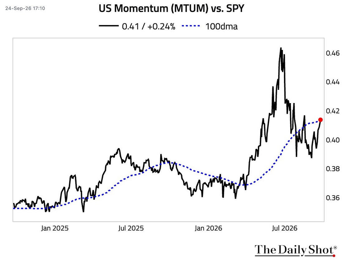
Momentum stocks regaining momentum, profit margins punching higher.
Valuations remain a concern with several metrics still historically elevated.
Overall, there are clear signs of a “stealth correction”, which may be just the sort of healthy reset the market needed before getting into a possible Q4 seasonal upswing. Yet there are a number of things to watch for on the risk side, as discussed…
Quick answer: The stock market has undergone a stealth correction. The cap-weighted S&P 500 has just been milling about, but the equal-weighted version has dropped just over 5% off the 13-Aug peak, and 200-day moving average breadth fell from the high-70s to just below 50%. It may be the healthy reset needed before a possible Q4 seasonal upswing.
1. Stealth Correction? While the headline market cap-weighted S&P500 has just been milling about, the equal-weighted version has dropped just over -5% off the 13-Aug peak. Breadth also paints a picture of market correction, with 200-day moving average breadth dropping from the high-70’s to just below 50%.
This is a classic stealth correction, on the surface headline index level it seems calm, under the surface there’s wreckage and weakness.
 |
Source: MarketCharts.com
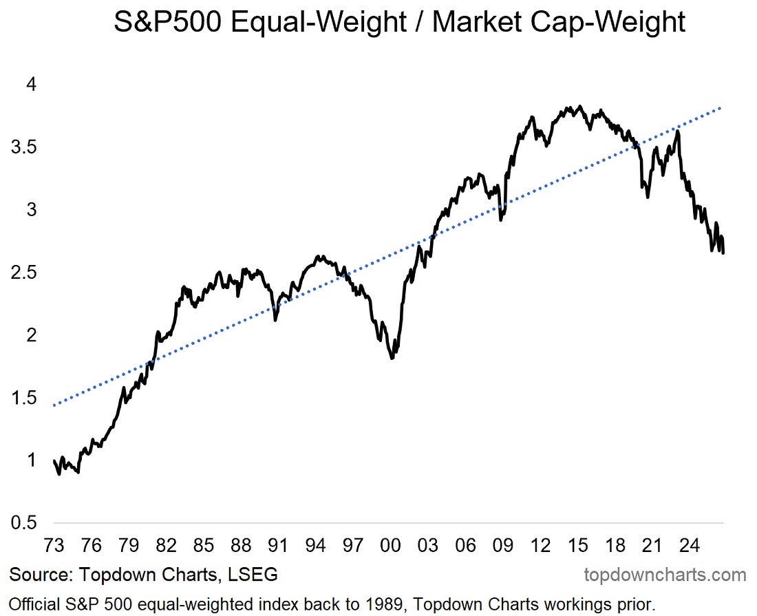
2. Equal-Weight vs Cap-Weight: with the relative weakness in the equal-weighted index, the equal vs cap weight relative performance line has made new 20+ year lows; extending the already stretched excursion from its long-term uptrend.
 |
Source: Topdown Charts Professional
3. Stealth Correction — Flows: back on the idea of a stealth correction, this chart brings another angle on it. Investors have been raising cash at a similar pace to that seen during some of the previous major corrections and resets of the past decade.
So you could argue it amounts to a healthy reset (just in time for Q4 rally?)
 |
Source: @MacroCharts via @RyanDetrick
4. Regaining Momentum: meanwhile there’s momentum stocks which peaked in absolute + relative terms back in June… but have been recovering recently. If you add a regaining of momentum for momentum stocks alongside a broader healthy reset and stealth correction then we could be laying out the perfect setting for a Q4/year-end seasonal rally.
 |
Source: @LanceRoberts
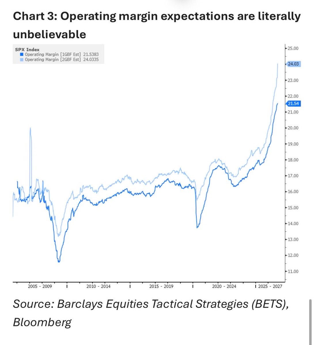
5. Profit Prophets: in the background earnings expectations continue to heat up with this exhibit showing euphoric expectations for earnings margins.
But as I have mentioned before, there is such a thing as so good it’s bad, as Barclays notes: “the risk of course would be if .. growth/eps expectations for next year are unrealistically high .... every investor should take a long hard look at the ‘E’ in SPX valuations .. if they are going to buy into the ‘stocks are cheap’ narrative.”
 |
Source: @carlquintanilla
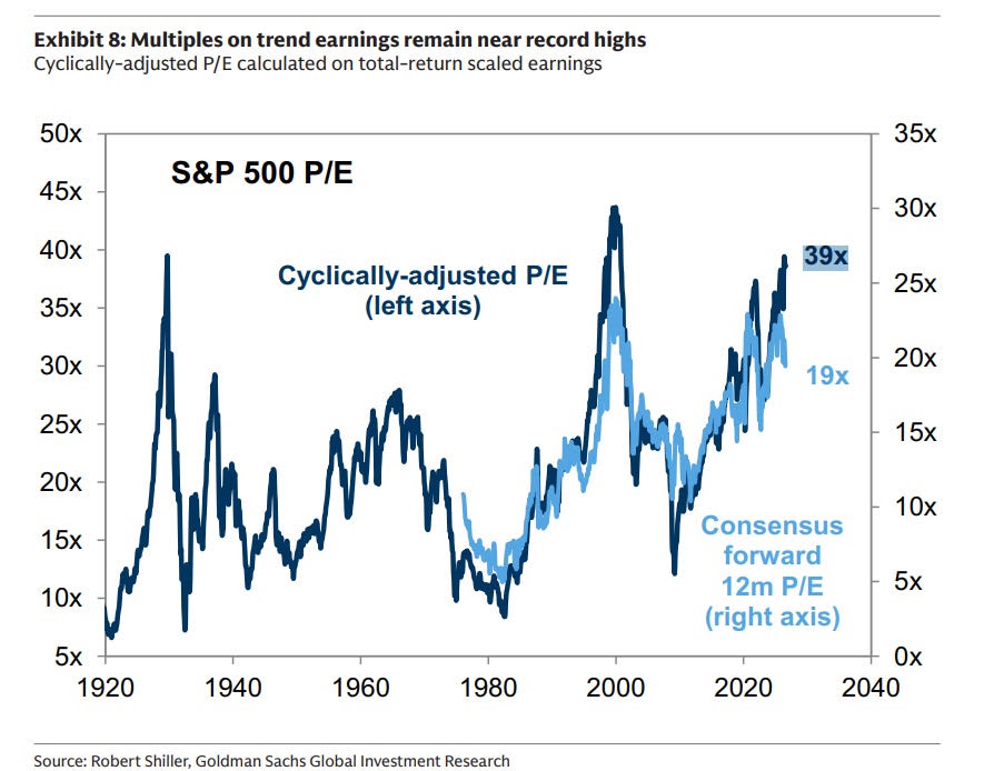
6. PE Ratios: indeed, with the CAPE ratio closing in on some of the highest readings ever, the reset in the forward PE ratio seems less enticing.
The conundrum is: if all these euphoric earnings expectations are right and the E of the PE ratio really does surge, then you could argue stocks are cheap or at least not that expensive.
But if the E is just a boom-bust-bubble thing, you could be looking at a market with a historically high PE ratio being priced off an overinflated E.
 |
Source: @MikeZaccardi
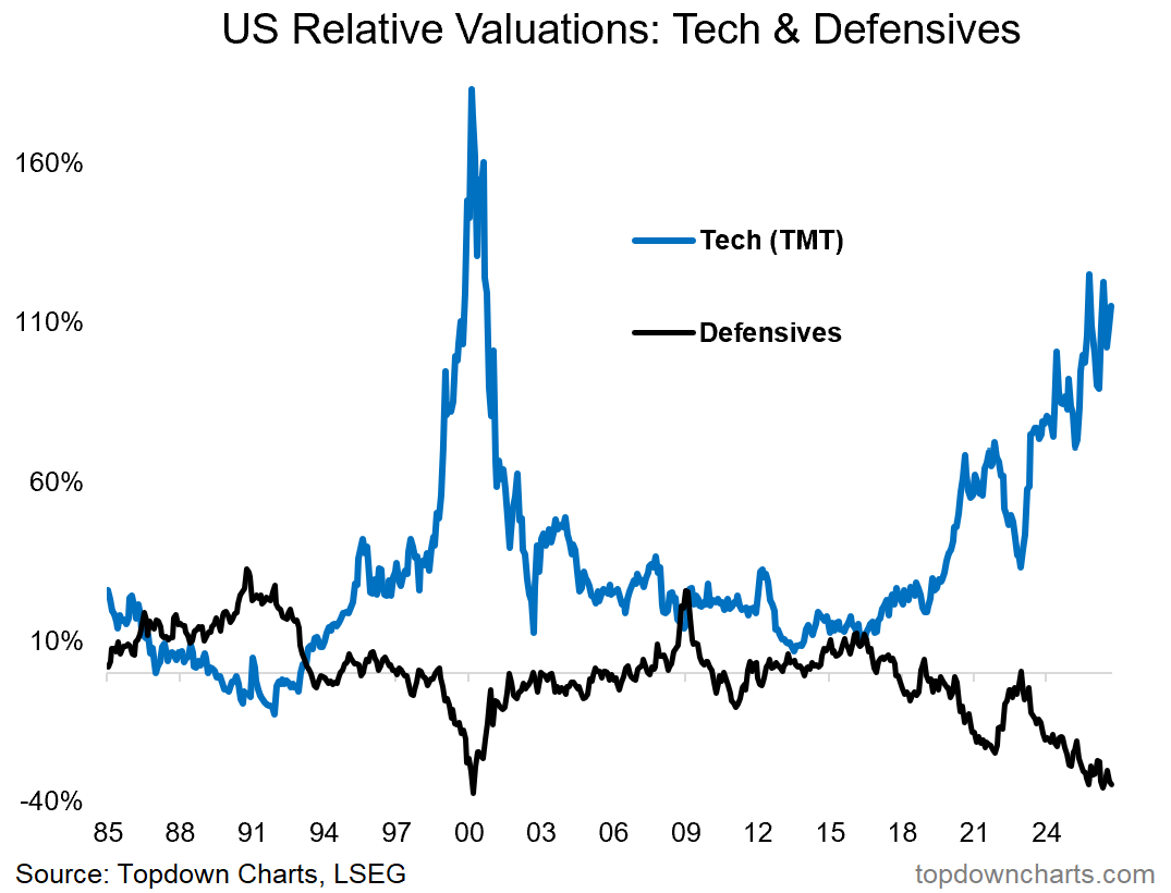
7. Relative Value Rubber Band: then you also look at the relative value rubber band chart (I call it a rubber band chart when you have two things getting stretched and that will eventually inevitable snap back when something gives).
Tech (using the wider TMT definition to recapture some of the names that got spun out of the traditional tech sector) is trading on historically elevated valuations relative to the index (using a broad suite of valuation metrics).
Meanwhile defensives [healthcare, utilities, consumer staples]; the ones that investors shun in boom times, and look to for a buffer during downturns — are as cheap as dot com on a relative value basis.
 |
Source: 10 Charts to Watch in 2026 [update]
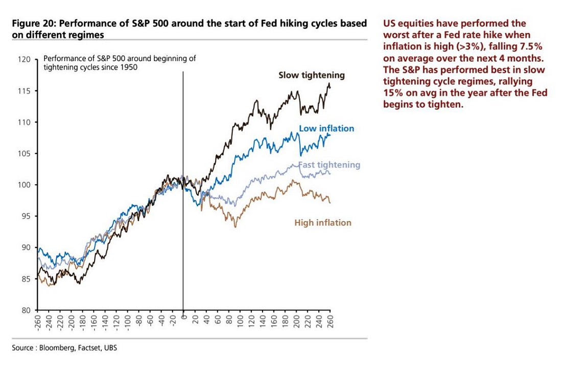
8. Fed Hike Impact: although the 16th Sep Fed rate hike now seems like ancient history, I thought this was an interesting one given inflation is high and rising and with risks skewed to the upside.
Add that to my estimates that the Fed still has a lot of work to do on the rate hike front, and it seems straightforward to argue the Fed is going to be a source of risk vs dampener of risk for the foreseeable future.
 |
Source: @Marlin_Capital
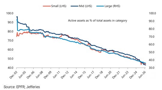
9. Demise of Active: interesting perspective and context here, the active management industry continues to get squeezed out by passive; “64% of assets in Large are managed passively, 56% in Small, and 57% in Mid”.
 |
Source: @AggieCapitalist
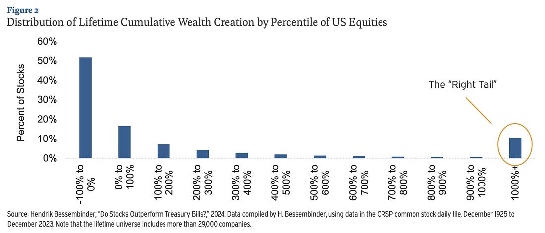
10. Wealth(creation) Inequality: depending how you look at it, this last one might be another argument in favor of passive (on the assertion that cap-weighted will downweight losers and upweight winners), or for active (on the assumption that active seeks to underweight bad stocks and pick winners).
Either way it’s almost daunting to reflect on the concentration of performance in a handful of stocks over the long-run, and the point that half of stocks will not end well: “A study of nearly a century of US equity returns found that most individual stocks did not beat one-month Treasury bills over their lifetimes, that the median stock produced a negative lifetime return, and that a small minority of companies accounted for essentially all of the net wealth the market created above the return on cash.“
 |
Source: SnippetFinance
VIDEO: The Top-down Approach to Generating Profitable Ideas
If you’re unfamiliar with my work at Topdown Charts, this video presentation is an excellent way to get a look under the hood as I explain exactly how I uncover investment ideas (pdf available). I cover the overarching philosophy, framework, concepts, idea lifecycle, practical issues, and a worked example.
This is a good intro to my work + great opportunity to learn more about investment research and market analysis. [Watch the Video]
 |
Also, as noted at the end of the presentation, the Q4 intake is now open, sign up to Topdown Charts for just US$999/year (72-off the usual rate of US$3500.00/yr).
Portfolio Strategy Notes — Geopolitical Energy
Thinking geopolitics and hedging again this week, the chatter or speculation is that with Trump rejecting the latest peace proposal from Iran that he might be just waiting to get mid-terms over and done with before making the final push. Or basically, that escalation is coming.
This leads us to the possibility of higher-for-longer oil prices.
That has direct and indirect risks for stocks and the macro outlook by raising costs and pushing up interest rates and damaging sentiment.
Global energy stocks are trading at the upper end of the valuation range of the post-2009 era… but are well below the heights of the 1996-07 period, and still trailing well behind the rest of commodity stocks and global equities.
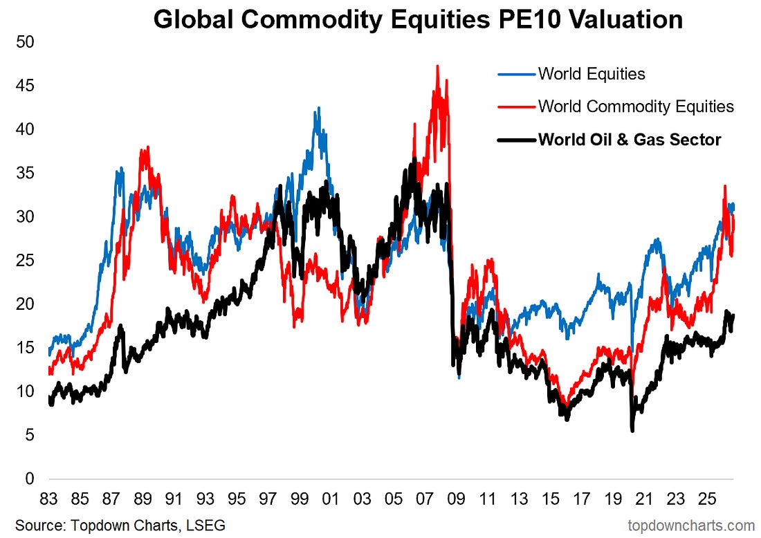 |
In other words, there is probably room to run on valuations.
Meanwhile positioning is still historically light. Investors remain skeptical on energy stocks despite all the goings on this year.
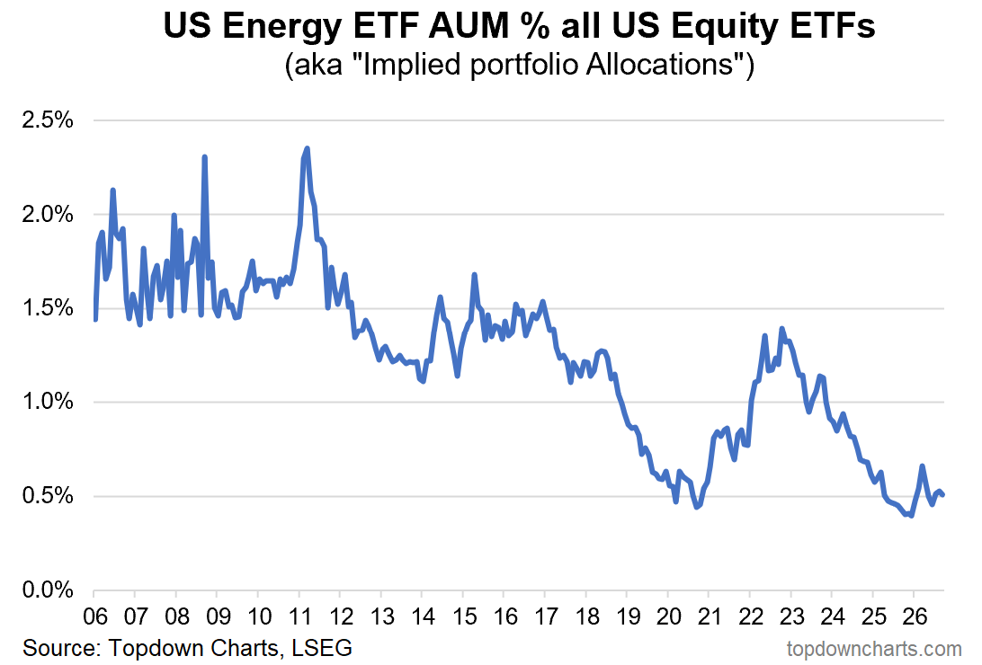 |
So energy stocks would be a natural, cheap (relative value), and underappreciated (light allocations) hedge or buffer to renewed tensions in the Middle East.
Comments
Log in or sign up to join the conversation.