

Wage growth peaked four years ago. Since 1985, it has led CPI by three to seventeen months in every single cycle. The May 4.2% inflation print is the noise. Watch the wages.
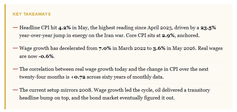
Headline CPI just printed 4.2% year-over-year for May. The highest reading since April 2023. The 10-year Treasury punched above 4.6% on the back of it, then pulled back recently. Energy ran +23.5% over the past twelve months on the Iran war, accounting for roughly 60% of the monthly all-items gain, and the doom crowd keeps pushing this is 1979 all over again with rate hikes ahead, a recession behind, and a cornered Fed. Here is why they are likely wrong.
After three decades of watching inflation cycles turn, I can tell you the variable that actually leads CPI peaks is wage growth. And wage growth peaked fifty months ago.
Wage Growth Leads. CPI Follows.
For decades, economists taught the Phillips Curve as if it were a law of physics. Tight labor markets push wages up. Higher wages push prices up. Inflation is born. That model worked through the 1970s. It hasn’t worked since.
Two things broke it. First, Paul Volcker pushed the funds rate to 19% in 1981 and held it there until the wage-price spiral snapped, and union density collapsed. COLA clauses vanished from labor contracts, globalization began pulling tradeable-goods prices toward the global marginal cost of production, and the entire institutional architecture that had transmitted wage gains into consumer prices through the 1970s came apart. By the mid-1980s, the relationship had inverted.
Second, the Fed earned credibility. Once households and firms believed the central bank would tolerate a deep recession to stop inflation, expectations re-anchored near 2%. Workers stopped pricing future inflation into today’s wage demands. I walked through the duration implications of this regime in my recent rising-rates piece, so I won’t relitigate the bond math here.
Here’s the inversion in plain terms. Before 1985, CPI ran first. Workers chased it with catch-up raises. Wages followed prices. After 1985, the causation flipped. Wage growth comes first because tight labor markets signal demand pressure before that pressure is transmitted to consumer prices. Wages aren’t reacting anymore. They’re forecasting.
That distinction sounds small, but it changes everything. It changes which indicator tells you something, and whether today’s CPI print is information or noise. It also changes how to interpret the current data, which the doom crowd is misreading.
Four Cycles, Four Times Wages Led
The chart below plots wage growth in black against CPI in red, from 1965 through May 2026. The gold-tinted section is pre-Volcker. The white section is post-1985.
Look at the pre-1985 stretch. The red line peaks first. The black line follows. In 1970, CPI peaked in February. Wages didn’t top out until May 1971, fifteen months later. In 1980, CPI peaked in March. Wages peaked in January 1981, ten months later. The 1974 oil shock is the only pre-1985 case in which wages and the CPI peaked together.
Now look at the post-1985 stretch. The pattern flips.
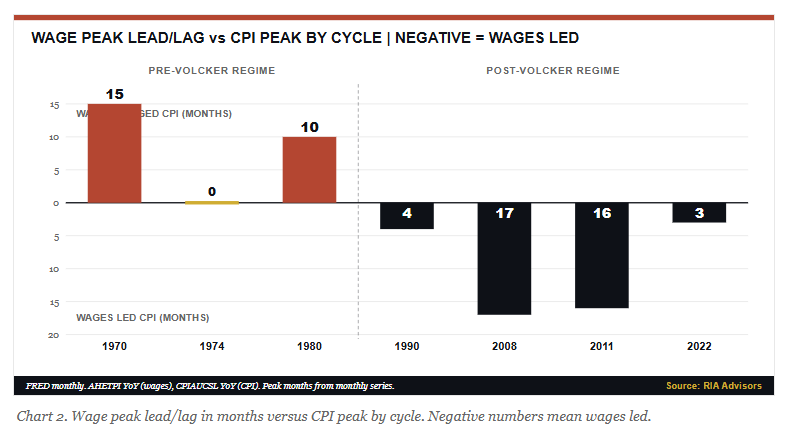
In 1990, wages peaked in June and CPI peaked in October, a four-month lead. Then, in the 2008 cycle, wages peaked in February 2007 while CPI didn’t peak until July 2008, a seventeen-month lead. In the post-Great Recession cycle, wages peaked in May 2010, and the CPI peaked sixteen months later in September 2011. And in 2022, wages peaked in March, and CPI peaked in June, a tight three-month lead driven by goods inflation transmitting quickly through broken supply chains rather than the slower wage-to-services pathway that had run the previous three cycles. Same direction every time.
Over four different cycles, wages repeatedly led. The lead ranged from three to seventeen months, and the direction never broke.
When Real Wages Compress, Inflation Dies
The lead-lag pattern is the headline finding. The deeper mechanism runs through real wages.
Real wage growth is nominal wage growth minus CPI inflation. When workers’ wages outpace prices, they spend more. They sustain demand, and inflation has room to keep running. When prices outpace wages, workers cut back. Demand falls. Inflation rolls over within about a year.
I ran the correlation across every monthly observation from January 1965 through May 2024. The correlation between today’s real wage growth and the change in CPI over the following twenty-four months is +0.72 across 713 monthly observations. That’s an extraordinarily strong relationship in macro data, where values above 0.5 are rare.
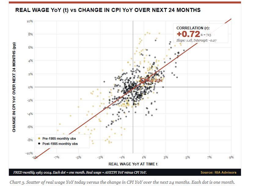
When real wages compress to negative levels, the next two years see CPI deceleration. When real wages run hot, CPI accelerates over the following two years. The relationship holds in both regimes. The gold pre-1985 dots show it. The navy post-1985 dots show it.
Now look at where we are.
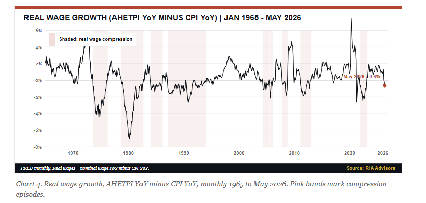
Real wage growth ran +1% to +1.5% through most of 2024. It’s now -0.6%. Workers are no longer outrunning inflation; they’re falling behind, and although this isn’t the four-percent compression of 1980 or the deep negative readings that preceded the 2008 demand collapse, the direction matters because every single time real wages have crossed below zero in the post-1985 sample, CPI has rolled over on a twelve-to-twenty-four-month lag. The pattern is clean.
2008, Re-Run
The closest parallel to the current setup isn’t 1979. It’s 2008.
In early 2007, wage growth peaked at around 4.1%. The labor market was strong. Unemployment was below 5%. Real wages were positive but compressing. Then oil prices rose from $60 to $147 in 18 months. Headline CPI followed the oil chart straight up. By July 2008, CPI was running at 5.5%, and every television commentator was warning of runaway inflation.
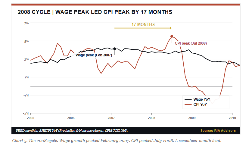
What happened next? Demand cratered. The real-wage compression had been working in the background for over a year. By the time CPI peaked, the consumer was already broken. Within twelve months, CPI was negative. The worry wasn’t inflation anymore. It was deflation.
I’m not predicting a 2008-style collapse. Bank balance sheets are stronger now, household leverage is lower, the labor market hasn’t started shedding jobs the way it did in late 2007, and the Fed has more room to act than it did when the funds rate was already at 5.25% on the eve of the financial crisis. But the inflation setup is structurally identical. We have a clean wage peak that led the cycle by years. We have an oil-driven CPI bump landing on top of decelerating wage growth. And we have a bond market still digesting, which signal matters.
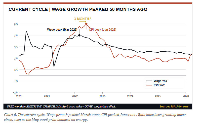
Notice in the chart above how cleanly wages turned over in March 2022. CPI followed three months later. Since then, both have fallen. The May bounce on the red line is the Iranian energy shock. Wages didn’t bounce. That divergence is the tell.
What The Doom Crowd Needs To Believe
The bear case isn’t crazy. It needs two things to be true that aren’t true yet.
First, wage growth has to re-accelerate. The story goes that tariffs and immigration restrictions tighten the labor market, wages rise again, and a second wave of inflation ratifies the headline bounce. The problem is the data. Wage growth in May was 3.56%, the lowest reading of the entire current cycle. The deceleration has been monotonic from the 7.0% peak in March 2022 through every month of the past four years, and labor market indicators from the JOLTS quits rate to the Atlanta Fed Wage Growth Tracker continue to point in the same direction. No turn yet.
Second, long-run inflation expectations have to de-anchor. That’s the 1970s playbook. It’s also where the Fed’s credibility lives. Currently, there is little risk of that as the 10-year breakeven inflation rate sits near 2.4%. The Cleveland Fed’s 5-year forward rate expectations are near 2.5%.
What This Means For Portfolios
Three implications. First, the duration sell-off looks overdone. When the 10-year is above 4.5%, it is pricing structural inflation. However, wage growth is telling you the structural force runs in the opposite direction, the breakeven curve is barely budging from its 2.4% base, and the bond market’s ten-basis-point rally on the Iran peace headline told you exactly what the marginal buyer thinks is driving the recent move. I made the broader case for owning duration into a wage-led disinflation in my recent rising-rates piece, and nothing in the May print changes the view.
Second, the trade is asymmetric. If wages keep decelerating, 10-year yields will fall meaningfully over the next 12 months. If wages re-accelerate, the monthly prints will tell you in time to adjust. The cost of being wrong is small. The cost of missing the move is high.
Third, the equity tilt favors quality compounders and long-duration growth over commodity producers. Disinflation expands multiples but compresses cyclical earnings. The 2008-2009 pattern was multiples up, EPS down. A milder version of that setup tilts the same way.
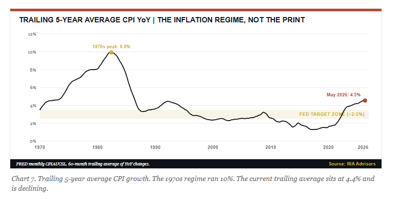
Inflation isn’t a single print. It’s a regime. Regimes are determined by what leads, not what follows.
The doom crowd is staring at a coincident indicator being pushed around by an oil shock and calling it a trend, when the actual leading indicator, the one that’s worked in every single post-Volcker cycle, the one with a +0.72 correlation against the path of CPI over the next two years, is wage growth, and wage growth peaked fifty months ago, sits at 3.6%, and is dragging real wages into compression. That setup forecasts disinflation. NOT acceleration.
I’m not saying inflation is dead. I’m saying the burden of proof has shifted. Until wages turn up and expectations de-anchor, watch the wages
Frequently Asked Questions
Why does wage growth lead CPI after 1985 but lag it before?
In the pre-Volcker era, inflation expectations were unanchored. Workers and firms priced wages today based on expected future inflation, so wages tracked CPI. After Volcker broke the wage-price spiral and the Fed established credibility, expectations stabilized. Wages now reflect labor-market tightness rather than expected inflation, meaning wage growth signals demand pressure before it shows up in consumer prices.
If wage growth peaked in March 2022, why did CPI peak only three months later?
The 2022 cycle was unusual because the CPI peak was driven heavily by goods inflation from supply-chain disruptions and the oil price spike driven by the war, which quickly translated into higher prices. In more typical cycles, such as 2008 or 2011, the lead time stretched to 16-17 months. The current setup more closely resembles 2008, where an oil shock layered on top of an already-decelerating underlying trend.
How do you measure real wage growth, and why does it matter?
Real wage growth is nominal wage growth (AHETPI YoY) minus CPI YoY. It measures whether workers are getting richer or poorer in real terms. When real wages are positive, consumers sustain demand, and inflation has room to keep running. When real wages turn negative, consumers cut back, demand falls, and inflation tends to roll over within twelve to twenty-four months. The May 2026 reading is -0.6%, the lowest of this cycle.
What would change your view on this thesis?
Two things. First, a sustained re-acceleration in wage growth, meaning the labor market is tightening again rather than slowly normalizing. Second, a meaningful rise in long-run inflation expectations, particularly the 10-year breakeven rate above 3% or the Michigan 5-10-year survey above 4%. Either would shift the probability distribution. Until then, wage growth continues to point toward disinflation.
Why is the 10-year Treasury elevated if wages are pointing to disinflation?
The bond market is reacting to the May CPI print and the renewed oil shock, both of which are coincident or backward-looking signals. The 10-year breakeven sits near 2.4%, meaning most of the yield rise reflects higher real rates and term premium rather than higher inflation expectations. That’s a different story from 1979. Yields fell roughly ten basis points the day the Iran peace headlines hit, which tells you the market knows the inflation bump is energy-driven.
Sources & Data
U.S. Bureau of Labor Statistics, Average Hourly Earnings of Production and Nonsupervisory Employees, Total Private (AHETPI). FRED. Retrieved June 14, 2026. Latest: May 2026.
U.S. Bureau of Labor Statistics, Consumer Price Index for All Urban Consumers (CPIAUCSL). FRED. Retrieved June 14, 2026. May 2026: index 333.979, +4.2% year-over-year.
BLS, Consumer Price Index Summary, May 2026 release (June 10, 2026). Energy index +3.9% month-over-month, +23.5% year-over-year. Core CPI +2.9% year-over-year.
Board of Governors of the Federal Reserve System, 10-Year Treasury Constant Maturity (DGS10). FRED. Retrieved June 14, 2026. June 13 close: 4.47%.
10-Year Breakeven Inflation Rate (T10YIE). FRED. Range 2.35% to 2.50% during the first half of June 2026.
Federal Reserve Bank of Cleveland, Inflation Expectations model.
Federal Reserve Bank of Atlanta, Wage Growth Tracker.
University of Michigan Surveys of Consumers: 5-10-Year Inflation Expectations.
BLS Employment Situation release, June 5, 2026.”
Comments
Log in or sign up to join the conversation.