


Lately, it seems like you can’t open a financial publication without stumbling across another article declaring the 60/40 portfolio dead. The pitch is everywhere: bonds are broken, the old rules no longer apply, and investors should modernize by swapping the bonds in their portfolio for Bitcoin, gold, or whatever alternative the asset management industry is currently selling.
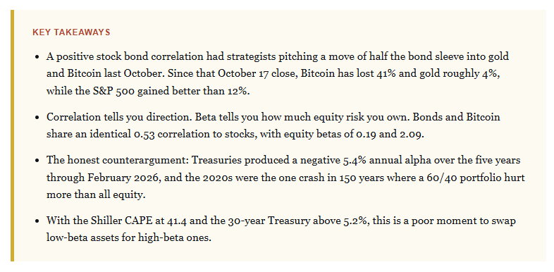
Last October, CNBC ran a story on the rise of the “60/20/20” portfolio. The pitch was simple. A positive stock bond correlation has broken diversification, so investors should take half of the bond allocation and move it into gold and Bitcoin. Several strategists lined up to endorse it.
Well, now that 9 months are in the rearview mirror, we can price in just how valuable that advice was.
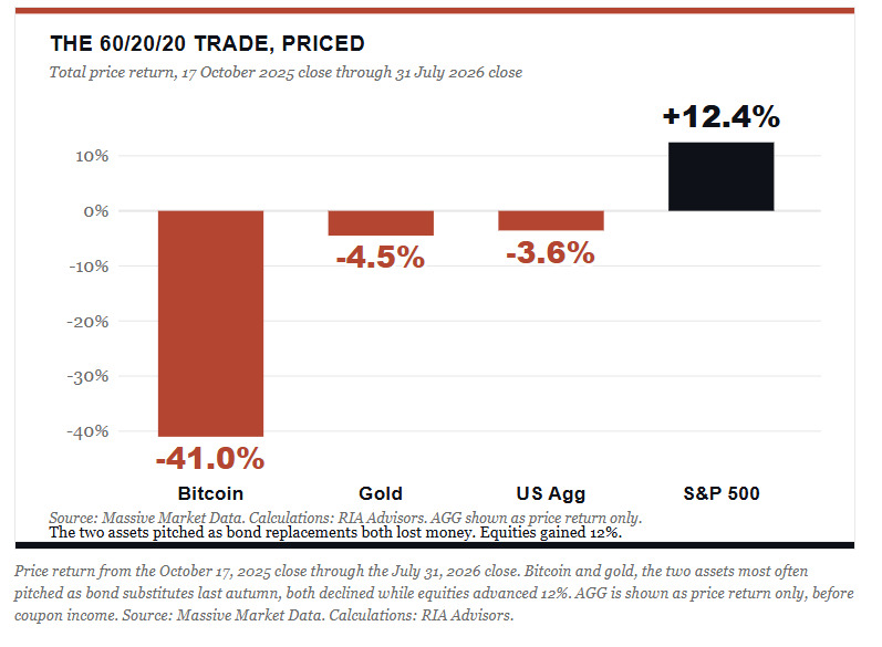
From the October 17 close through Friday, Bitcoin fell almost 41%. Gold slipped about 4%. The S&P 500, the very asset those investors were told to diversify away from, gained more than 12% over the same stretch, which means the hedge fell hard while the risk it was bought to offset went straight up. So the two “replacements” didn’t hedge anything. They just lost money.
The Argument Being Sold, And What It Costs
The case against bonds runs in four steps.
Stocks and bonds now move together.
That means bonds have stopped diversifying.
Something has to fill the gap they left.
And here, conveniently, is the product being sold to fill it.
Does that sound familiar? It should. The first step is always true; the rest just doesn’t follow.
BlackRock’s research notes that since 2020, bond returns have been negative in 17 of the 19 months when equities fell 2% or more, most recently in March 2026.1 That figure is accurate. What I will point out is that the very same firm published a separate piece in late 2025 arguing that falling inflation volatility had pushed the stock-bond correlation back toward slightly negative, which is close to the opposite conclusion, drawn from the same data, within the same twelve months.2
Bob Farrell’s Rule #9 covers this ground. When all the experts and forecasts agree, something else will happen. The “60/40 is dead” thesis is now close to unanimous across the sell side, and, for Wall Street, that narrative always arrives conveniently attached to a product they want to sell you. That combination is worth a second look before you act on it.
Correlation Tells You The Direction. Beta Tells You The Size.
In April, AQR’s Cliff Asness, Dan Villalon, and Antti Ilmanen published a note whose title does most of the work. A positive stock bond correlation, they argue, is a terrible reason to add more equity risk to a portfolio.3
Notice what they did NOT say. They didn’t say hold your bonds no matter what; rather, their claim is narrower and more useful than that: If a positive correlation has you questioning the allocation, then apply a high diversification bar to whatever you buy next.
Here’s why the distinction matters so much. Correlation tells you whether two assets move in the same direction; however, it says nothing about magnitude. Beta tells you the magnitude, and it has a plain reading. An equity beta of 0.19 means each dollar you hold carries about nineteen cents of stock market exposure.
Now look at the five years ending February 28, 2026. Bonds carried a 0.53 correlation to the S&P 500 and a 0.19 equity beta. Bitcoin carried a correlation of 0.53. Identical. Its equity beta was 2.09.
Same correlation, ten times the equity risk per dollar. The gap comes entirely from volatility. Bitcoin ran at 60.4% annualized volatility over the period, compared with 5.6% for Treasuries, so an identical directional relationship translates into a wildly different amount of risk for every dollar an investor actually commits to the position.
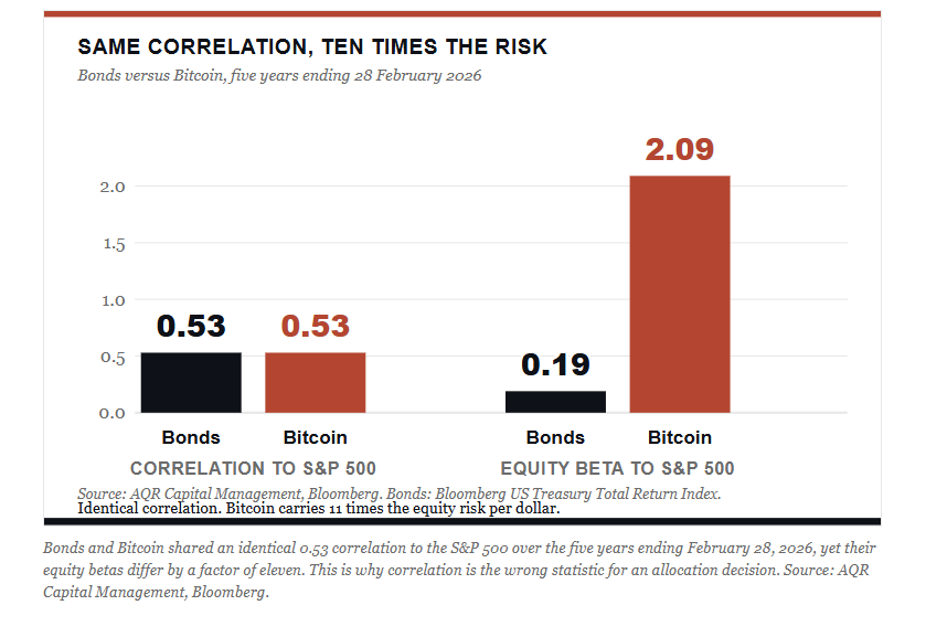
“Every dollar you move from Treasuries to Bitcoin delivers roughly ten times as much equity risk. That’s not diversification. That’s doubling down and calling it modern portfolio construction.” – RIA Advisors
What Each Bond Replacement Actually Delivered
Take a close look at the table below, which shows the relationship between various asset classes, often touted as a replacement for bonds, and the market itself.
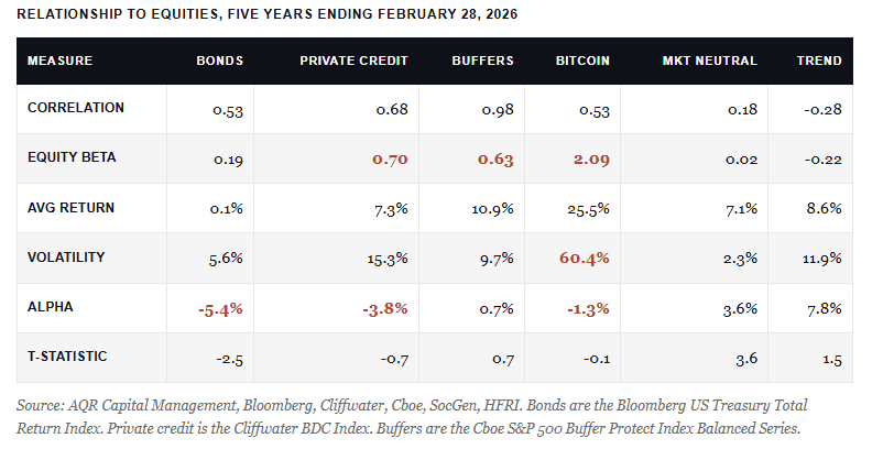
Private credit has a 0.70 equity beta, more than 3x that of bonds. AQR reaches that figure using publicly traded business development companies as a mark-to-market proxy. That sidesteps the “volatility-laundered” reporting that makes the asset class look calmer than it is. The stress is surfacing anyway. Fitch’s US private credit default rate hit a record 6.0% for the twelve months through April 2026, up from 5.7% a month earlier, and Fitch’s June update had it still pinned at that record. 4
Buffer funds show a correlation of 0.98 and a beta of 0.63. They are equity products with options attached. AQR’s work finds that they deliver less return than an equivalent-risk mix of stocks and cash, which rather defeats the purpose.
Bitcoin returned 25.5% annually over the period. That looks compelling until you adjust for the beta. Alpha came in at-1.3% with a t-statistic of -0.1, which, in plain English, means zero. In other words, you got paid for taking equity risk, but not for anything else, which is why Bitcoin doesn’t belong in the bond bucket.
A Necessary Word About Gold
Gold is not in AQR’s table. But it needs to be discussed because gold is often touted as a bond replacement. If inflation is the worry, that argues for inflation-sensitive assets rather than more equity; you are simply calling it a hedge to justify a poor rationale. I have no objection to a modest gold position, but gold pays you nothing and promises no return of principal.
Does gold belong in a portfolio? Yes, and that is an easy argument to make. However, gold belongs on the equity side of the ledger as a volatility damper, not in the bond slot.
Here’s the part almost nobody quotes from that paper. AQR names two things that cleared their bar.
Equity market-neutral strategies had a beta of 0.02, an alpha of 3.6%, and a t-statistic of 3.6.
Trend following had a negative 0.22 beta and a 7.8% alpha.
Whether you want either one is a separate discussion for another day. The point is that genuine diversifiers exist, and none of the three assets marketed as a bond replacement qualifies as one.
The Strongest Case Against Me
As a portfolio manager, I run all types of portfolios from 100% equity to fully diversified to stock/bond allocations. The reason is that every client has different needs, goals, and, most critically, psychology, so matching the right portfolio to our clients is critical.
With that said, look again at the bond column in the table above. Over the five years ending February 2026, Treasuries returned an average of just 0.1% per year, with an alpha of negative 5.4% relative to equities and a t-statistic of negative 2.5. That is the only statistically significant negative alpha in the table. Worse than private credit. Worse than Bitcoin.
“But Lance, that’s a brutal five years for the very thing you’re defending.”
You are absolutely correct. It has been, and anyone who tells you 2022 was a rounding error was not holding bonds in their portfolio at the time.
Morningstar’s 150-year stress test makes a similar point from a different angle. Across the crashes during that period, a 60/40 portfolio suffered roughly 45% less pain than all equity in aggregate. However, there was just one singular exception – the 2020s. The 2020s produced the only crash in 150 years in which the 60/40 decline was both deeper and longer than all equity, and the mix didn’t reclaim its prior high until June 2025.5
Then there is the tape in front of us. The 30-year Treasury closed the week above 5.2%, its highest since 2007. The 10-year traded at 4.73% on Friday, the highest in more than a year. An energy shock is running through the inflation data, and investors are openly questioning the Fed’s resolve on inflation.6 AQR flagged this exact risk in a footnote, allowing that an oil shock and challenges to Fed independence could keep the stock bond correlation positive for longer than their base case. We should all take that seriously.
Here is the reality. Will bonds protect you from an inflation shock? No. Inflation damages stocks and bonds together, because neither asset likes it. That has always been true, it is well documented, and it is not a new discovery that invalidates fixed income.
What bonds protect you against is a growth shock. Those are a different animal, and the next recession will be one.
Why Own Bonds In Your Portfolio
Let’s take a look at the fastest growth shock in modern history. Between February 19 and March 23, 2020, the S&P 500 fell 34.1%. Long Treasuries gained 14.1%.7 That happened not because of a favorable correlation coefficient, but because frightened capital in a genuine panic needs somewhere to go, and it goes to the deepest and most liquid market on earth.
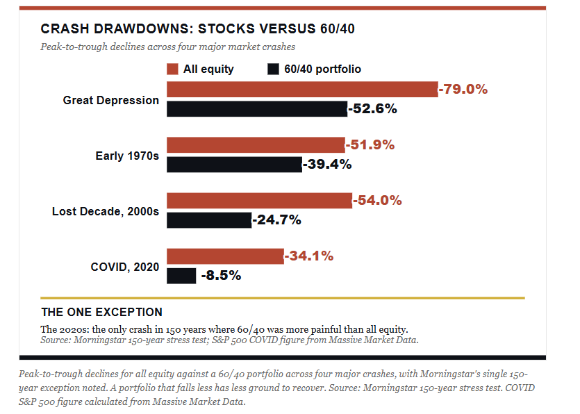
The recovery math is what investors consistently underestimate. A portfolio down 24.7% needs a 33% gain to get back to even. However, a 52.6% decline requires a 111% recovery to return to the previous level. Bonds not only reduce losses but also shorten the climb back, and that difference compounds over the years of a retirement timeline.
Here is another crucial point for owning bonds in your portfolio, particularly if nearing retirement. Income is better today than at any point in two decades. The 10-year yields 4.68%, more than three times what it paid at the end of 2021. That is contractual cash flow rather than hoped-for appreciation, which means you aren’t forced to sell equities into weakness to fund a withdrawal.
Lastly, there is the behavioral issue, which actually determines outcomes. DALBAR’s 2026 study found that the average fixed-income investor earned 2.41% in 2025, while the Bloomberg Aggregate returned 7.30%, a gap of 4.89 percentage points. Investors pulled a record 2.30% of assets out in a single month, July 2025.8 Read that again. The asset class returned more than 7%, while the people who owned it captured a third of the return. They sold into the drawdown and bought back after the recovery, which is the same behavior that the stock-bond correlation debate is now encouraging on a much larger scale.
“Bonds and Bitcoin carried the identical correlation to stocks. One gave you nineteen cents of equity risk per dollar. The other gave you two dollars and nine cents. That isn’t diversification, that is doubling down with better marketing.”– RIA Advisors
Why This Is A Poor Moment To Add Equity Risk
The Shiller CAPE closed in July at 41.4. Only one month in more than 140 years of recorded data carried a higher reading, and that was December 1999 at 44.2, which is another way of saying we sit within three points of the most expensive month in market history.9 The long-run median is near 16. We trade at better than two and a half times it.
Furthermore, market concentration compounds the issue. BlackRock’s work puts the top 10 S&P 500 names at roughly 37% of total market capitalization, up from 29% in 2020 and 19% in 2010. The “diversified” index fund most investors think they own is a concentrated wager on a dozen companies.
A high CAPE is not a timing tool. Markets stay expensive for longer than reasonable analysis suggests, and I have watched that frustrate very good analysts for three decades. But valuation sets the price of your upside. When equities are already priced for close-to-perfect outcomes, further multiple expansion has a low ceiling, while a re-rating toward the historical mean has a long floor.
AQR’s other finding lands squarely here. In 49 of the last 50 years, when the S&P 500 lost money, so did a standard 60/40 portfolio. Equity risk has always dominated portfolio outcomes. Correlation between stocks and bonds is a second-order variable by comparison. So the answer to a portfolio already saturated with equity risk cannot be to add more of it under a different label.
What This Means For Your Portfolio
For our clients, we will keep and manage the duration risk of the bond allocation. Not because bonds are exciting, and not because the past five years treated them kindly. We will keep them because they remain the cheapest insurance against the one scenario that does the most damage to a retirement plan: a deep equity drawdown that arrives early in the withdrawal phase.
If you own bonds in your portfolio, they should be sized to your circumstances rather than to a number somebody printed in 1952. Forty percent is not a law of nature. Your income needs, your time horizon, and your honest tolerance for watching a statement fall determine that figure.
Understand the limitation clearly. Duration protects you in a growth shock and hurts you in an inflation shock. If inflation is the risk that keeps you awake, the answer is inflation-sensitive assets and a shorter duration, not a 2.09 beta. I would rather own the honest hedge than the exciting one.
The positive stock bond correlation is real. It was also the norm more often than not between 1900 and 2000, which makes the current regime a return to form rather than a structural break. A positive stock bond correlation signals that inflation uncertainty currently outweighs growth uncertainty. That balance will shift again.
When it does, the investors who traded their duration for a 2.09 beta will discover what they actually bought.
Sources and Notes
BlackRock, “Rebuilding 60/40 portfolios with alternatives.” blackrock.com/us/financial-professionals/insights/60-40-portfolios-alternatives
BlackRock, “Bonds Starting to Offer More Diversification,” November 2025. blackrock.com/us/financial-professionals/insights/bonds-offer-more-diversification
Asness, Villalon and Ilmanen, “A Positive Stock-Bond Correlation Is a Terrible Reason to Add More Equity Risk to Your Portfolio,” AQR Capital Management, April 8, 2026. All correlation, beta, return, volatility, alpha and t-statistic figures in the table are measured over the five years ending February 28, 2026.
Fitch Ratings via CNBC, “Private credit defaults hit record high as interest rates soar,” May 21, 2026, and Fitch’s June 15, 2026 update.
Morningstar, “150 Years of Stock and Bond Market Crashes: How the 60/40 Portfolio Held Up.” The 45% figure is Morningstar’s aggregate measure across crashes, and the 2020s are their stated exception.
US Department of the Treasury daily yield curve, July 30, 2026, cross-checked against Friday’s close as reported by CNBC and Yahoo Finance, July 31, 2026.
Calculated by RIA Advisors from daily closes, February 19 to March 23, 2020. Long Treasuries proxied by TLT, price return. Note that a figure of roughly 18% circulates for this window and does not replicate on this basis.
DALBAR, 2026 Quantitative Analysis of Investor Behavior, released April 17, 2026.
Robert Shiller’s monthly CAPE series, July 2026 reading, cross-checked against YCharts and Multpl.
Comments
Log in or sign up to join the conversation.