

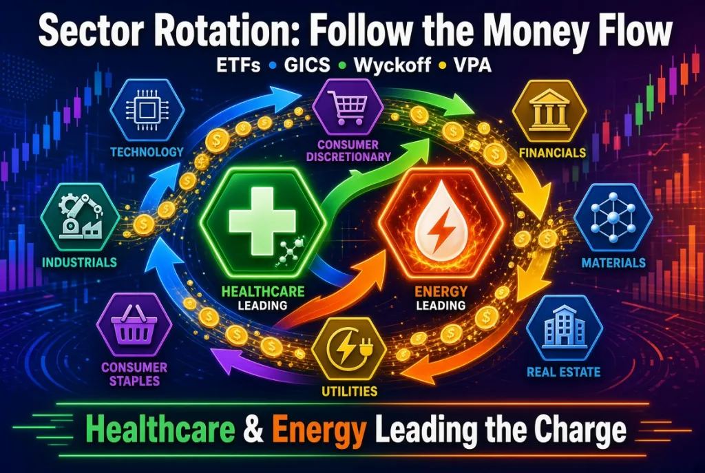
In today’s markets, capital doesn’t stay put. It rotates constantly from one group of stocks to another as economic conditions, interest rates, commodity prices, geopolitical events and investor sentiment shift; in other words, sector rotation. One of the cleanest and most practical ways to follow this movement is through sector ETFs. These funds give us a high-level, liquid view of where the “smart money” is flowing — and when combined with classic volume-price analysis (VPA) and the principles of Richard Wyckoff, they become powerful tools for both traders and longer-term investors. This post explores how sector rotation works, how the Global Industry Classification Standard (GICS) organises the market, why healthcare and energy are currently attracting attention, and how Wyckoff’s three laws, plus VPA, help us read the story behind the price charts of major sector ETFs. What Are Sector ETFs and Why Do They Matter? Exchange-traded funds that track specific market sectors — such as the State Street (STT) Select Sector SPDRs — allow investors to buy or sell an entire industry group with a single trade. Popular examples include:
XLE – Energy
XLV – Health Care
XLF – Financials
XLK – Technology
XLI – Industrials
and the other six that complete the 11 GICS sectors.
Because these ETFs hold the largest companies in their respective sectors and trade with high volume, their price action and volume profiles often reflect institutional accumulation or distribution more clearly than individual stocks. When money rotates into a sector, the corresponding ETF typically shows rising prices accompanied by expanding volume. When money leaves, we frequently see price weakness on higher volume or failed rallies.
Understanding GICS: The Map of the Market.
To analyse sectors effectively, we need a consistent framework. The Global Industry Classification Standard (GICS), developed by MSCI (MSCI) and S&P Dow Jones Indices (SPGI), provides exactly that. It is a four-tier hierarchical system used worldwide:
Sectors (11) – the broadest level
Industry Groups (25)
Industries (74)
Sub-Industries (163)
Every public company is assigned to one primary sub-industry based mainly on its revenue sources (with earnings and market perception also considered). This classification then rolls up automatically into the higher tiers. The 11 GICS sectors are:
Energy
Materials
Industrials
Consumer Discretionary
Consumer Staples
Health Care
Financials
Information Technology
Communication Services
Utilities
Real Estate
This structure lets us move seamlessly from the big picture (sector ETFs) down to finer groups or individual stocks when we want more granularity. For example, within Health Care we can look at Pharmaceuticals, Biotechnology, Health Care Equipment, or Managed Health Care. Within Energy we can distinguish Integrated Oil & Gas from Exploration & Production or Oil Equipment & Services.
Sector Rotation: How Money Flows
Sector rotation is the process by which capital moves from one group of stocks to another as the economic cycle progresses or as specific catalysts emerge. Classic models link rotation to the business cycle:
Early recovery often favours Financials, Consumer Discretionary and Industrials.
Mid-cycle expansion tends to support Technology and Communication Services.
Late-cycle and inflationary periods frequently benefit Energy, Materials, and sometimes Health Care.
Defensive phases (slowdowns or uncertainty) typically see money flow into Consumer Staples, Utilities and Health Care.
In practice, the picture is more fluid. Geopolitical shocks, commodity spikes, regulatory changes, interest-rate expectations or technological breakthroughs can accelerate or reverse flows independently of the classic cycle. The key is to observe the evidence on the charts rather than force a narrative. Sector ETFs make this observation straightforward. By comparing relative strength, absolute performance and volume behaviour across the 11 Select Sector SPDRs, we can see which areas are attracting capital and which are being abandoned.
Current Leadership: Health Care and Energy
As of mid-August 2026, two sectors stand out. Energy (XLE) has delivered strong year-to-date gains (in the region of 40%+ total return) and has shown clear technical strength. On the daily chart, it has broken out of multi-week-or-longer consolidation patterns, with price moving to new relative highs on expanding volume. This is classic evidence of demand overcoming supply. Rising oil prices, geopolitical tensions, and structural demand driven by data-centre power needs have all contributed, but the chart itself tells the story of institutional buying. Health Care (XLV) has also performed well, particularly over recent weeks and months.
It has shown steady relative strength, often ranking among the better-performing sectors on weekly or monthly measures. Attractive valuations relative to the broader market, improving earnings visibility, M&A activity and a rotation out of more crowded growth areas have supported the sector. Defensive characteristics combined with genuine growth drivers (especially in certain biotech and pharma names) make it appealing in the current environment. These are not isolated moves. When we see several related industry groups or sub-industries confirming the sector ETF’s strength, the rotation becomes more reliable.
Wyckoff’s Three Laws – The Foundation
Richard D. Wyckoff developed his method in the early 20th century by studying the behaviour of large operators (“the Composite Man”). At its core are three interlocking laws that still apply perfectly to modern sector ETFs:
The Law of Supply and Demand
Prices rise when demand exceeds supply and fall when supply exceeds demand. When the two forces are roughly balanced, price moves sideways. Volume helps us judge the intensity of each side.The Law of Cause and Effect
Significant price moves (the “effect”) are preceded by periods of preparation (the “cause”). Accumulation ranges build the cause for a markup; distribution ranges build the cause for a markdown. The longer and more intense the cause, the larger the subsequent effect tends to be.The Law of Effort versus Result
Volume is the effort; price movement is the result. When effort and result are in harmony (rising price on rising volume, or falling price on rising volume), the trend is healthy. Divergences — high volume with little price progress, or low volume on a sharp move — often signal a change in the balance of supply and demand.
These laws provide a logical framework for interpreting any chart, including sector ETFs.
Volume Price Analysis (VPA) – Putting the Laws to Work
VPA is the practical application of Wyckoff’s principles. It focuses on the relationship between price bars and the volume that accompanies them. Key observations include:
Strong advances on expanding volume suggest genuine demand.
Advances on declining volume may indicate a lack of conviction (potential weakness).
Selling climaxes or high-volume reversals can mark exhaustion.
Narrow-range days on high volume often signal absorption of supply (or demand).
Wide-range days on low volume can be less reliable.
When applied to sector ETFs, the same principles hold. Because these funds are highly liquid and widely followed by institutions, their volume spikes frequently reflect real money flow rather than retail noise. For example, in the recent Energy move, breakouts accompanied by rising volume would be interpreted as effort confirming result — demand is in control. In Health Care, steady price appreciation with supportive volume suggests accumulation rather than a short-covering spike.
Bringing It All Together – A Practical Process
Start with the 11 sector ETFs and rank them by relative strength over multiple timeframes (1 week, 1 month, 3 months).
Examine the leaders for confirmation via VPA — is volume supporting the price move?
Drill down using the GICS hierarchy for more precision (industry groups or sub-industries).
Apply Wyckoff’s laws: Is there a clear cause (trading range) that has been resolved? Does effort match result?
Monitor for signs of rotation out of the current leaders (distribution characteristics) and into new ones (accumulation).
This top-down approach keeps you aligned with the broader flow of capital while still allowing stock-specific selection when opportunities appear inside the strongest sectors.
Final Thoughts
Sector ETFs give us a transparent window into the continuous reallocation of capital across the market. By understanding the GICS framework, we know exactly what each ETF represents. By applying Wyckoff’s three laws and VPA, we can judge the quality of the moves we see. Right now, Energy’s breakout and Health Care’s relative strength offer clear examples of money in motion. Markets will keep rotating. The advantage goes to those who can read the signs early and act with the evidence rather than against it. Sector ETFs, analysed through the lens of volume and price, remain one of the most effective ways to stay on the right side of that flow.



Comments
Log in or sign up to join the conversation.