

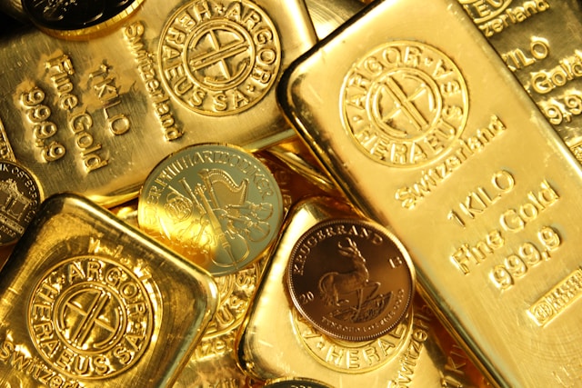
In one of our recent issues of “Thoughts,” we explained that the price of Gold had come under pressure due, among other things, to the war in Iran. Every journalist assumed that Gold would rise during a war. However, higher Oil prices fueled inflation fears and, with them, concerns about higher interest rates. Furthermore, Gold fever was still in full swing at the end of February, even though the correction was already in full force. Many investors remained heavily invested in Gold. They were forced to sell, and the Gold market first had to absorb this.
The situation in Iran has temporarily calmed down, the Oil price temporarily fell back to its original level, and the most recently published consumer price index CPI came in significantly lower than expected. Did this give the Gold price the green light to set its sights on previous highs again?
No. By then, the market had come to believe that the U.S. economy might be performing better than expected. A lower Oil price could further fuel the economy—and in turn, stoke inflation. The real market yield—that is, the yield on 10-year U.S. Treasuries minus inflation—continued to rise. For the price of Gold, this meant continued headwinds rather than a surge …
Let’s paint the following scenario on the wall, even if we aren’t really convinced of it—yet:
The war with Iran escalates once again. In addition to the Strait of Hormuz, the Houthis also block the Bab al-Mandab Strait, which controls access to the Red Sea and thus to the Suez Canal. The price of Oil shoots up again. This time, however, the price of Gold also rises sharply, summarily ignoring the potential threat of inflation.
Logical? Not necessarily. But as is well known, the market has mastered the art of flexible logic. As recently as this spring, a large portion of market participants assumed that the war with Iran would soon be resolved and thus brought to an end. Every hint from U.S. President Trump that an agreement was imminent was readily interpreted as a green light for higher stock prices. We are still near the all-time high.
However, should the market come to realize that the war will last longer and become significantly more expensive, the issue of government debt is likely to make a very rapid comeback. Yields on U.S. Treasuries have already risen significantly recently… This could be bullish for the price of Gold, as investors would once again place a higher premium on safety. Furthermore, following the sharp correction in the first half of the year, many investors are now significantly underinvested in Gold.
Journalists who, as recently as this spring, were puzzled that the Gold price did not react to the outbreak of war in Iran are likely to shake their heads in bewilderment once again…
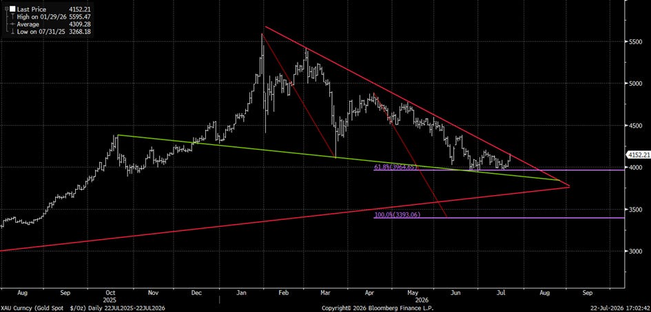
In fact, the price of Gold is on the verge of breaking out of the downtrend—which has been discussed repeatedly in recent times—sooner than expected. The corresponding chart is being closely monitored by numerous market participants. A breakout could therefore trigger a heightened self-fulfilling effect simply because of its signaling power.
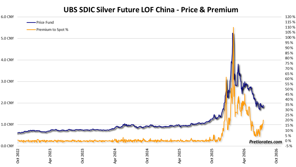
Silver could also benefit from a Gold breakout. What’s particularly interesting is that the premium on the only physically backed Silver ETF available in China has now risen again to around 20%. This is a clear indication that Chinese investors are repositioning themselves.
We are not yet fully convinced by the scenario described above. A breakout in Gold and Silver would undoubtedly be a blessing for any investor who remains invested—and indeed should remain so. However, Wall Street continues to give us cause for concern. We know from experience that as soon as the bears take control of the stock market, Gold and Silver usually come under immediate, short-term but intense selling pressure. When fear sets in on Wall Street, the magic word is “liquidity.” Selling Gold and Silver is a quick and easy way to secure it. At this point, stock positions are often already in the red—and who wants to voluntarily part with an investment at a loss?
In previous posts, we’ve shown several long-term charts that point to a more significant correction and suggest reducing the allocation to stocks. As usual, we won’t know for sure whether this correction will actually happen until after the fact. If it doesn’t materialize, you’ve missed out on nothing more than potential gains. If it does, however, the losses will be significantly smaller. It increasingly appears that we are entering a phase in which one should not chase potential gains, but rather secure one’s capital as best as possible.
Recently, several savvy market participants have warned that the market is currently underestimating economic and geopolitical risks. We agree with this assessment. In addition, the latest figures from FINRA also show that credit-financed investments by U.S. investors have continued to rise sharply. So-called margin debt has now reached a volume of 1,500 billion U.S. dollars. The chart vividly illustrates just how much speculation has surged in recent months.
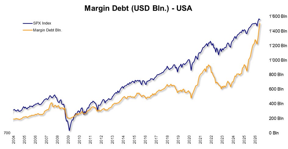
The scale of this is also evident when viewed relative to U.S. gross domestic product: Margin debt—which is ultimately nothing more than credit-financed speculation—could soon reach the 5% mark of U.S. GDP. We are already in uncharted territory.
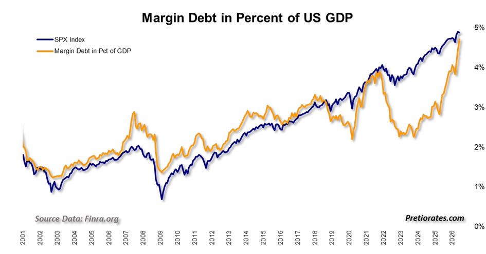
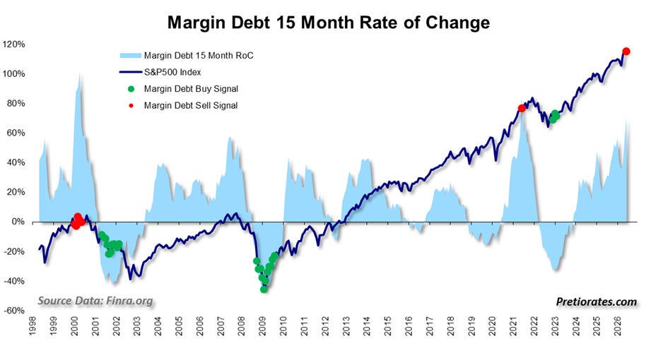
Almost more important than the absolute magnitude, however, is the speed of the increase. If the growth in outstanding margin debt continues to accelerate, this suggests that investors are increasingly driven by the fear of missing out. Then greed takes over. And greed typically emerges when a market reaches a long-term peak—just as panic does at the other end of the spectrum.
The so-called “rate of change” measures this pace of growth over a rolling 15-month period. With the new margin debt data, one of these rare sell signals has now been triggered. This happens when the rate of growth in loans becomes too high.
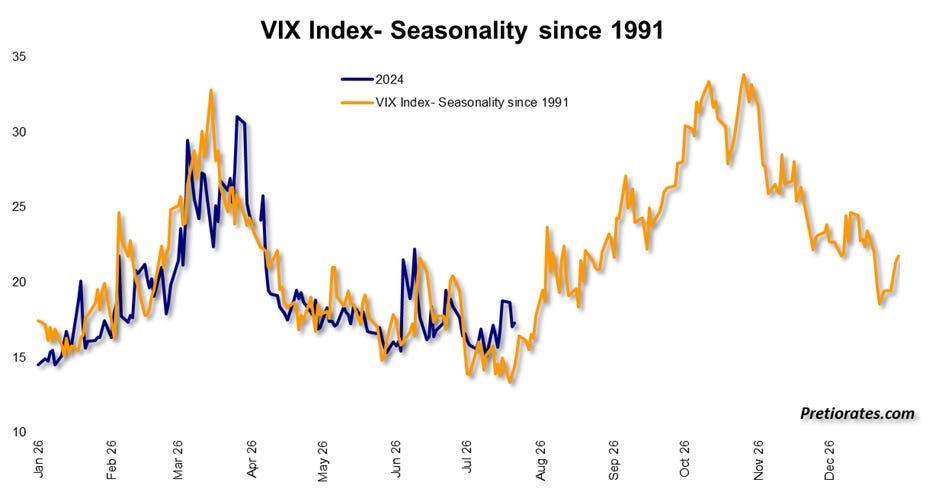
And then there is another chart that is highly interesting. The average annual trend of the volatility index since 1991—that is, over the past 35 years—shows that volatility rises significantly between August and November. Higher volatility is typically accompanied by falling stock markets. Of course, this does not mean that the coming months will necessarily follow the same script. Yet in the first half of the year, the market adhered to it with astonishing precision. That is why we view this seasonal pattern with great respect. It isn’t necessarily logical, either. But perhaps investors are best served when not only the market but they themselves think flexibly.



Comments
Log in or sign up to join the conversation.