

The good news is:
In the past 2 weeks, the market has recovered over half of its losses from earlier in the month.
The Negatives
New lows have declined from their extreme levels earlier in the month, but, remain higher than you would expect to see coming off a bottom.
New highs have not increased significantly indicating the rally has very narrow leadership.
The first chart covers the past 6 months showing the Nasdaq composite (OTC) in blue and a 10% trend (19 day EMA) of Nasdaq new highs (OTC NH) in green. Dashed vertical lines have been drawn on the 1st trading day of each month.
OTC NH continued falling as prices were recovering.
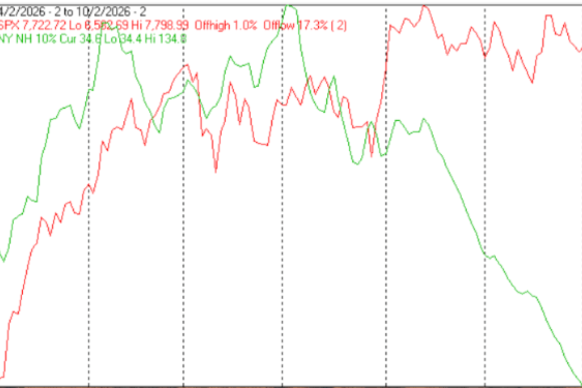
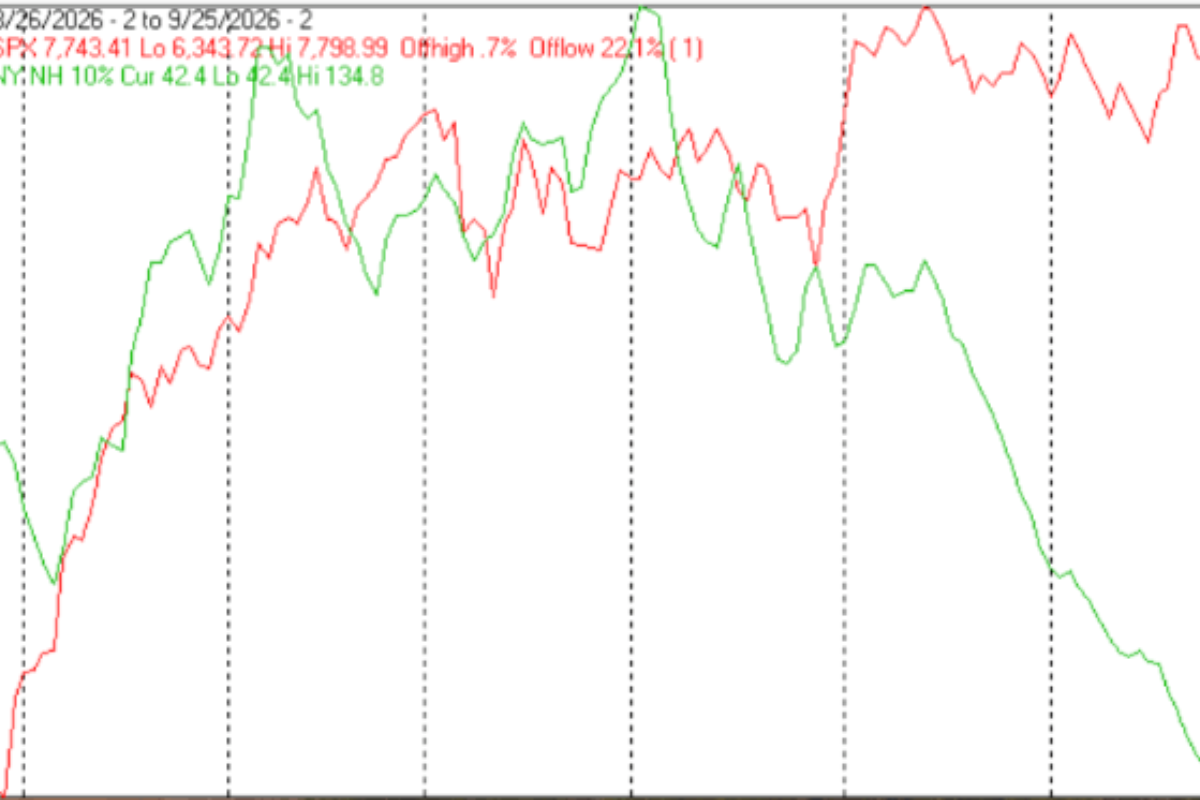
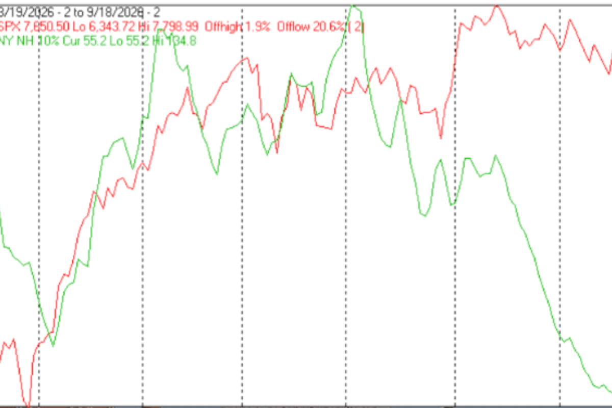
The next chart is similar to the one above one except it shows the S&P 500 (SPX) in red and NY NH, in green, has been calculated with NYSE data.
NY NH also continued to decline.
The Positives
Prices have continued to rise; however, breadth has not been reassuring.
The next chart covers the past 6 months showing the OTC in blue and a 40% trend (4 day EMA) of Nasdaq new highs divided by new highs + new lows (OTC HL Ratio), in red. Dashed horizontal lines have been drawn at 10% levels for the indicator; the line is solid at the 50%, neutral, level.
OTC HL Ratio managed to remain positive finishing the week at 58%.
The next chart is similar to the one above one except it shows the SPX in red and NY HL Ratio, in blue, has been calculated with NYSE data.
NY HL Ratio finishes the week at a neutral 50%.
Seasonality
Next week includes the last 3 trading days of February and the first 2 trading days of March during the 2nd year of the Presidential Cycle. The tables below show the daily change, on a percentage basis for that period.
OTC data covers the period from 1963 to 2016 while SPX data runs from 1928 to 2016. There are summaries for both the 2nd year of the Presidential Cycle and all years combined.
Average returns for the coming week have been positive by all measures and stronger during the 2nd year of the Presidential Cycle than other years.
Report for the last 3 days of February and first 2 days of March.
The number following the year represents its position in the Presidential Cycle.
The number following the daily return represents the day of the week;
1 = Monday, 2 = Tuesday etc.
OTC Presidential Year 2
Day3 Day2 Day1 Day1 Day2 Totals
1966-2 -0.35% 4 -0.40% 5 0.35% 1 0.22% 2 -0.54% 3 -0.72%
1970-2 -0.05% 3 0.82% 4 -0.16% 5 0.48% 1 0.13% 2 1.22%
1974-2 0.42% 2 1.02% 3 0.31% 4 -0.32% 5 -0.27% 1 1.17%
1978-2 0.53% 5 -0.47% 1 -0.73% 2 0.00% 3 0.24% 4 -0.44%
1982-2 0.61% 3 0.48% 4 -0.01% 5 0.39% 1 0.01% 2 1.49%
1986-2 0.11% 3 0.94% 4 0.26% 5 0.07% 1 0.34% 2 1.72%
1990-2 0.34% 1 0.39% 2 0.76% 3 0.32% 4 0.89% 5 2.71%
1994-2 -1.23% 4 0.56% 5 1.11% 1 -0.49% 2 -0.66% 3 -0.70%
Avg 0.07% 0.38% 0.28% 0.06% 0.16% 0.96%
1998-2 1.60% 3 0.60% 4 -0.37% 5 -0.67% 1 -0.09% 2 1.07%
2002-2 -0.17% 2 -0.85% 3 -1.16% 4 4.11% 5 3.14% 1 5.07%
2006-2 0.34% 5 0.88% 1 -1.12% 2 1.46% 3 -0.15% 4 1.41%
2010-2 1.01% 3 -0.08% 4 0.18% 5 1.58% 1 0.32% 2 3.02%
2014-2 0.10% 3 0.63% 4 -0.25% 5 -0.72% 1 1.75% 2 1.51%
Avg 0.58% 0.24% -0.54% 1.15% 0.99% 2.41%
OTC summary for Presidential Year 2 1966 - 2014
Averages 0.25% 0.35% -0.06% 0.50% 0.39% 1.42%
% Winners 69% 69% 46% 62% 62% 77%
MDD 2/28/2002 2.17% -- 2/24/1994 1.23% -- 2/28/1978 1.20%
OTC summary for all years 1963 - 2017
Averages 0.14% -0.06% -0.13% 0.26% 0.02% 0.23%
% Winners 58% 62% 45% 65% 51% 64%
MDD 3/3/2009 8.38% -- 3/2/2001 8.27% -- 3/2/2007 5.85%
SPX Presidential Year 2
Day3 Day2 Day1 Day1 Day2 Totals
1930-2 1.85% 3 -0.13% 4 0.87% 5 0.73% 6 -0.38% 1 2.93%
1934-2 -2.29% 1 1.12% 2 -0.46% 3 -0.37% 4 3.26% 5 1.27%
1938-2 0.52% 5 -0.26% 6 -1.73% 1 1.06% 2 -0.96% 3 -1.37%
1942-2 0.71% 4 0.82% 5 0.00% 6 -1.40% 1 1.53% 2 1.67%
1946-2 -0.59% 2 2.02% 3 0.76% 4 -0.41% 5 -0.64% 6 1.15%
1950-2 -0.12% 6 0.12% 1 -0.35% 2 0.12% 3 -0.06% 4 -0.29%
1954-2 0.00% 3 0.31% 4 0.93% 5 0.38% 1 0.27% 2 1.89%
Avg 0.10% 0.60% -0.08% -0.05% 0.03% 0.61%
1958-2 0.76% 3 -0.59% 4 0.39% 5 0.71% 1 0.53% 2 1.82%
1962-2 -0.57% 1 0.19% 2 0.10% 3 0.34% 4 -0.06% 5 0.00%
1966-2 -0.64% 4 0.28% 5 0.09% 1 -1.27% 2 -1.01% 3 -2.56%
1970-2 1.55% 3 -0.50% 4 0.67% 5 0.23% 1 0.58% 2 2.53%
1974-2 1.02% 2 0.42% 3 -0.19% 4 -0.72% 5 0.00% 1 0.53%
Avg 0.42% -0.04% 0.21% -0.14% 0.01% 0.46%
1978-2 0.97% 5 -0.87% 1 -0.78% 2 0.17% 3 0.15% 4 -0.35%
1982-2 1.76% 3 -0.23% 4 -0.09% 5 0.18% 1 -0.56% 2 1.06%
1986-2 0.11% 3 1.22% 4 0.07% 5 -0.66% 1 -0.46% 2 0.27%
1990-2 1.39% 1 0.48% 2 0.49% 3 0.26% 4 0.84% 5 3.47%
1994-2 -1.37% 4 0.39% 5 0.23% 1 -0.58% 2 0.08% 3 -1.24%
Avg 0.57% 0.20% -0.01% -0.13% 0.01% 0.64%
1998-2 1.19% 3 0.56% 4 0.06% 5 -0.15% 1 0.41% 2 2.06%
2002-2 0.00% 2 0.05% 3 -0.28% 4 2.26% 5 1.95% 1 3.97%
2006-2 0.13% 5 0.36% 1 -1.04% 2 0.83% 3 -0.16% 4 0.11%
2010-2 0.97% 3 -0.21% 4 0.14% 5 1.02% 1 0.23% 2 2.15%
2014-2 0.00% 3 0.49% 4 0.28% 5 -0.74% 1 1.53% 2 1.56%
Avg 0.46% 0.25% -0.17% 0.64% 0.79% 1.97%
SPX summary for Presidential Year 2 1930 - 2014
Averages 0.33% 0.27% 0.01% 0.09% 0.32% 1.03%
% Winners 64% 68% 59% 59% 55% 77%
MDD 3/2/1966 2.55% -- 2/26/1934 2.29% -- 2/28/1938 1.99%
SPX summary for all years 1928 - 2017
Averages 0.08% -0.01% 0.03% 0.19% 0.16% 0.44%
% Winners 55% 55% 55% 65% 55% 67%
MDD 3/3/2009 9.93% -- 2/27/1933 6.27% -- 3/2/2007 4.41%
Money supply (M2) and Interest Rates
The following charts were supplied by Gordon Harms.
M2 growth continued to decline from its elevated trend.
All rates have been rising; however, short-term rates have been rising faster than long-term rates, accelerating rate compression.
March
Since 1963, over all years, the OTC in March has been up 64% of the time with an average gain of 0.9%. During the 2nd year of the Presidential Cycle March has been up 54% time with an average gain of 1.1%. The best March ever for the OTC was 2009 (+10.9%), the worst 1980 (-17.1%).
The average month has 21 trading days. The chart below has been calculated by averaging the daily percentage change for each of the 1st 11 trading days and each of the last 10. In months when there were more than 21 trading days some of the days in the middle were not counted. In months when there were less than 21 trading days some of the days in the middle of the month were counted twice. Dashed vertical lines have been drawn after the 1st trading day and at 5 trading day intervals after that. The line is solid on the 11th trading day, the dividing point.
In the chart below the blue line shows the average daily performance of the OTC in March over all years since 1963 in blue, while the grey line shows the average during the 2nd year of the Presidential Cycle over the same period.
Since 1928 the SPX has been up 61% of the time in March with an average gain of 0.6%. During the 2nd year of the Presidential Cycle the SPX has been up 64% of the time with an average gain of 0.1%. The best March for the SPX was 1928 (+10.8%) the worst 1938 (-25.0%).
The chart below is similar to the one above except it shows the average daily performance over all years since 1928 for the SPX in March in red and the average daily performance during the 2nd year of the Presidential Cycle, over the same period, in grey.
Since 1979 the Russell 2000 (R2K) has been up 72% of the time in March with an average gain of 1.4%. During the 2nd year of the Presidential Cycle the R2K has been up 67% of the time with an average gain of 2.8%. The best March ever for the R2K 1979 (+9.7%), the worst 1980 (-18.5%)
The chart below is similar to those above except it shows the average daily performance of the R2K, over all years since 1979, in March in magenta and the average daily performance during the 2nd year of the Presidential Cycle in grey.
Since 1885 the Dow Jones Industrial Average (DJIA) has been up 59% of the time in March with an average gain of 0.7%. During the 2nd year of the Presidential Cycle the DJIA has been up 61% of the time in March with an average loss of -0.1%. The best March for the DJIA 1920 (+12.6%), the worst 1938 (-23.7%)
There is a substantial discrepancy between summaries above and the chart below. Prior to 1953, the market traded 6 days a week, so several days in the middle of the month would not be included in the calculations for the chart.
The chart below is similar to those above except it shows the average daily performance over all years for the DJIA in March in grey and the average performance during the 2nd year of the Presidential Cycle in black.
Conclusion
Last week the market continued its bounce, however, breadth has not been supporting the increase in prices. Leadership is narrowing.
Seasonally next week has been strong.
I expect the major averages to be higher on Friday, March 2 than they were on Friday, February 23.
Comments
Log in or sign up to join the conversation.