

The good news is:
The Dow Jones Utility index was up last week.
The Negatives
We have now had the same price pattern for 3 weeks in a row, i.e. up Monday and down the rest of the week. Time for a change.
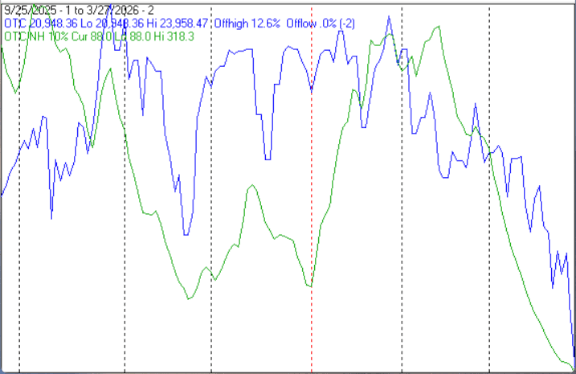
The first chart covers the past 6 months showing the Nasdaq composite (OTC) in blue and a 10% trend (19 day EMA) of Nasdaq new highs (OTC NH) in green. Dashed vertical lines have been drawn on the 1st trading day of each month.
OTC NH continued to fall last week.
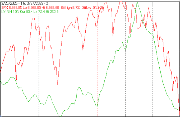
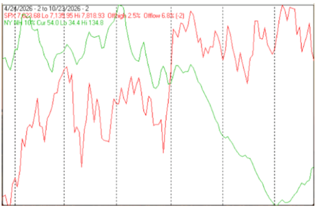
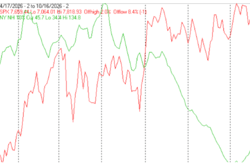
The next chart is similar to the one above except it shows the S&P 500 (SPX) in red and NY NH in green has been calculated with NYSE data.
NY NH also continued falling, although the rate of decline appears to be attenuating.
 |
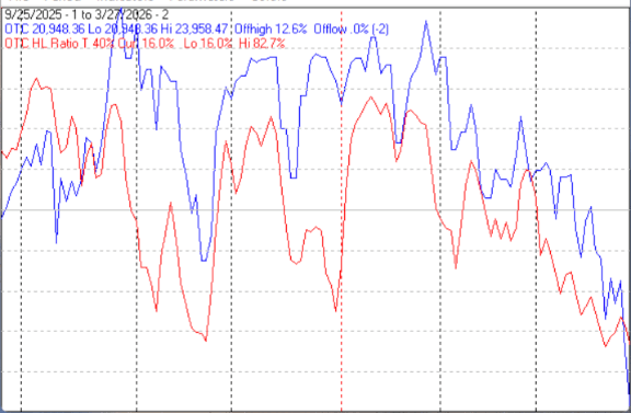
The next chart covers the past 6 months showing the OTC in blue and a 40% trend (4 day EMA) of Nasdaq new highs divided by new highs + new lows (OTC HL Ratio), in red. Dashed horizontal lines have been drawn at 10% levels for the indicator; the line is solid at the 50%, neutral level (equal numbers of new highs and new lows).
OTC HL Ratio fell further into negative territory last week.
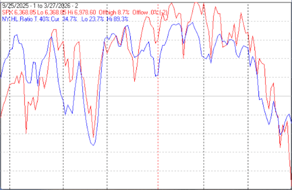
The next chart is similar to the one above except it shows the SPX in red and NY HL ratio, in blue, has been calculated with NYSE data.
NY HL Ratio rose for a few days last week, but remained in negative territory.
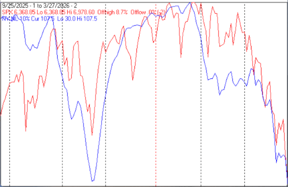
The next chart covers the past 6 months showing the SPX in red and a 10% trend (19 day EMA) of NYSE new lows (NY NL) in blue. NY NL has been plotted on an inverted Y axis so decreasing numbers of new lows move the indicator upward (up is good).
NY NL paused for a few days on its way down last week.
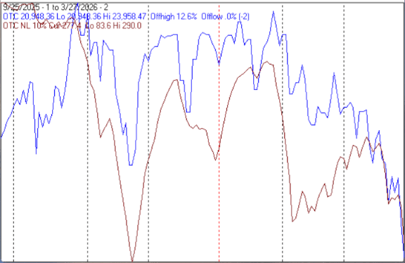
The next chart is similar to the one above except it shows the OTC in blue and OTC NL, in brown, has been calculated with NASDAQ data.
OTC NL also paused for a few days on its way down
The Positives
The market is oversold, the OTC is down 12% and the SPX is down nearly 9% in the past few weeks.
Seasonality
Next week includes the last 2 trading days of March and the first 2 trading days of April during the 2nd year of the Presidential Cycle. The tables below show the daily change, on a percentage basis, for that period. Good Friday shortens next week to 4 trading days.
OTC data covers the period from 1963 to 2025 while SPX data runs from 1928 to 2025. There are summaries for both the 2nd year of the Presidential Cycle and all years combined.
Seasonality for the coming week has been modestly positive by all measures.
Report for the last 2 days of March and the first 2 days of April.
The number following the year represents its position in the Presidential Cycle.
The number following the daily return represents the day of the week; 1 = Monday, 2 = Tuesday etc.
OTC Presidential Year 2 (PY2)
Day2 Day1 Day1 Day2 Totals
1966-2 -0.27% 3 -0.83% 4 0.41% 5 0.32% 1 -0.37%
1970-2 0.15% 1 -0.03% 2 0.52% 3 0.17% 4 0.81%
1974-2 -1.42% 4 -0.65% 5 -0.40% 1 0.14% 2 -2.33%
1978-2 0.09% 4 0.02% 5 -0.29% 1 0.29% 2 0.11%
1982-2 -0.05% 2 0.13% 3 0.95% 4 -0.42% 5 0.61%
Avg -0.30% -0.27% 0.24% 0.10% -0.23%
1986-2 0.73% 4 0.38% 1 -0.15% 2 -0.01% 3 0.95%
1990-2 -0.29% 4 0.03% 5 -0.54% 1 1.03% 2 0.23%
1994-2 -1.37% 3 -0.19% 4 -2.16% 1 3.24% 2 -0.49%
1998-2 -0.27% 1 0.93% 2 0.65% 3 0.29% 4 1.61%
2002-2 0.14% 3 1.02% 4 0.94% 1 -3.13% 2 -1.03%
Avg -0.21% 0.43% -0.25% 0.28% 0.25%
2006-2 0.13% 4 -0.04% 5 -0.13% 1 0.37% 2 0.32%
2010-2 0.26% 2 -0.53% 3 0.19% 4 1.12% 1 1.05%
2014-2 0.11% 5 1.04% 1 1.64% 2 0.20% 3 2.99%
2018-2 -0.85% 3 1.64% 4 -2.73% 1 1.03% 2 -0.90%
2022-2 -1.21% 3 -1.54% 4 0.29% 5 1.90% 1 -0.56%
Avg -0.31% 0.11% -0.15% 0.92% 0.58%
OTC summary for PY2 1966 - 2022
Averages -0.27% 0.09% -0.05% 0.44% 0.20%
% Winners 47% 53% 53% 80% 60%
MDD 4/4/1994 3.69% -- 4/2/2002 3.13% -- 3/31/2022 2.73%
OTC summary for all years 1963 - 2025
Averages -0.03% 0.18% -0.05% 0.24% 0.33%
% Winners 59% 62% 52% 66% 67%
MDD 4/4/2000 10.67% -- 4/3/2001 9.77% -- 4/2/1997 5.37%
SPX PY2
Day2 Day1 Day1 Day2 Totals
1930-2 0.80% 6 0.36% 1 0.91% 2 -1.02% 3 1.05%
1934-2 1.63% 4 1.22% 6 0.09% 1 0.74% 2 3.69%
1938-2 -1.26% 3 -1.39% 4 4.82% 5 3.93% 6 6.10%
1942-2 0.12% 1 -0.62% 2 0.50% 3 0.75% 4 0.75%
1946-2 0.61% 5 0.22% 6 -0.11% 1 0.06% 2 0.78%
1950-2 -0.80% 4 -0.06% 5 0.29% 6 1.10% 1 0.52%
1954-2 0.11% 2 0.94% 3 0.85% 4 0.15% 5 2.05%
1958-2 0.07% 5 -0.24% 1 -0.40% 2 -0.79% 3 -1.36%
1962-2 -0.04% 4 -0.66% 5 -0.26% 1 -0.81% 2 -1.77%
Avg -0.01% 0.04% 0.07% -0.06% 0.05%
1966-2 -0.55% 3 0.51% 4 0.80% 5 0.91% 1 1.67%
1970-2 -0.32% 1 0.00% 2 0.49% 3 -0.31% 4 -0.14%
1974-2 -1.83% 4 -0.89% 5 -0.78% 1 0.11% 2 -3.39%
1978-2 -0.26% 4 -0.22% 5 -0.84% 1 0.45% 2 -0.87%
1982-2 -0.03% 2 -0.28% 3 1.63% 4 1.17% 5 2.50%
Avg -0.60% -0.18% 0.26% 0.47% -0.05%
1986-2 0.70% 4 -0.03% 1 -1.57% 2 0.24% 3 -0.66%
1990-2 -0.35% 4 -0.25% 5 -0.36% 1 1.46% 2 0.49%
1994-2 -1.53% 3 0.05% 4 -1.54% 1 2.13% 2 -0.89%
1998-2 -0.17% 1 0.75% 2 0.58% 3 1.07% 4 2.23%
2002-2 0.53% 3 0.25% 4 -0.07% 1 -0.85% 2 -0.15%
Avg -0.16% 0.15% -0.59% 0.81% 0.21%
2006-2 -0.20% 4 -0.42% 5 0.23% 1 0.63% 2 0.24%
2010-2 0.00% 2 -0.33% 3 0.74% 4 0.79% 1 1.21%
2014-2 0.46% 5 0.79% 1 0.70% 2 0.29% 3 2.25%
2018-2 -0.29% 3 1.38% 4 -2.23% 1 1.26% 2 0.11%
2022-2 -0.63% 3 -1.57% 4 0.34% 5 0.81% 1 -1.04%
Avg -0.13% -0.03% -0.04% 0.75% 0.55%
SPX summary for PY2 1930 - 2022
Averages -0.13% -0.02% 0.20% 0.59% 0.64%
% Winners 42% 42% 58% 79% 63%
MDD 4/1/1974 3.46% -- 4/4/1994 3.00% -- 3/31/1938 2.63%
SPX summary for all years 1928 - 2025
Averages 0.01% -0.11% 0.12% 0.23% 0.25%
% Winners 47% 45% 62% 60% 62%
MDD 4/2/1932 8.27% -- 3/31/1939 7.89% -- 4/1/2020 5.94%
April
Historically, April has been a pivotal month during the 2nd year of the Presidential Cycle. On average the high for the year occurs in mid to late April and the low for the year usually arrives in early October.
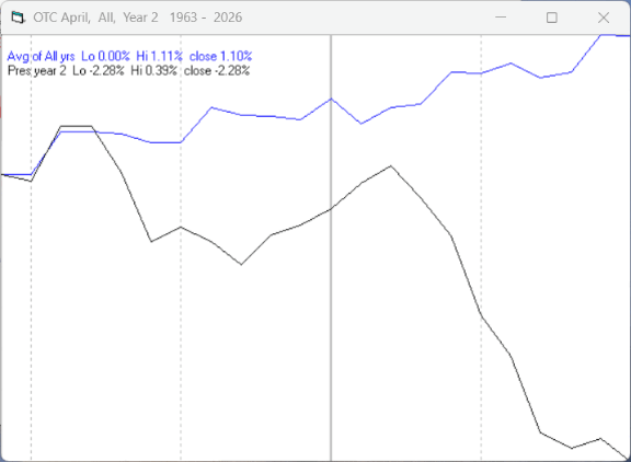
Since 1963, over all years, the OTC in April has been up 67% of the time with an average gain of 1.5%. During the 2nd year of the Presidential Cycle April has been up 40% of the time with an average loss of -2.0% (helped considerably by a 18.5% loss in 1970). The best April ever for the OTC was 2001 (+15.0%), the worst 1970 (-18.5%).
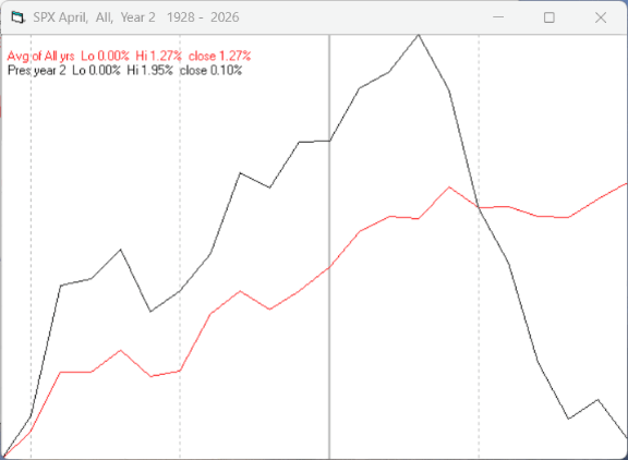
The average month has 21 trading days. The charts below have been calculated by averaging the daily percentage change for each of the 1st 11 trading days and each of the last 10. In months when there were more than 21 trading days some of the days in the middle were not counted. In months when there were less than 21 trading days some of the days in the middle of the month were counted twice. Dashed vertical lines have been drawn after the 1st trading day and at 5 trading day intervals after that. The line is solid on the 11th trading day, the dividing point.
In the chart below the blue line shows the average daily performance of the OTC in April over all years since 1963, while the black line shows the average during the 2nd year of the Presidential Cycle over the same period.
Since 1928 the SPX has been up 63% of the time in April with an average gain of 1.3%. During the 2nd year of the Presidential Cycle the SPX has been up 58% of the time with an average gain of 0.2%. The best April ever for the SPX was 1933 (+42.2%) the worst 1932 (-20.2%).
The chart below is similar to the one above except it shows the average daily average performance over all years since 1928 for the SPX in April in red and the average daily performance during the 2nd year of the Presidential Cycle, over the same period, in black.
Since 1979 the Russell 2000 (R2K) has been up 60% of the time in April with an average gain of 1.2%. During the 2nd year of the Presidential Cycle the R2K has been up 64% of the time with an average loss of -0.2 %. The best April ever for the R2K 2009 (+15.3%), the worst 2022 (-10.0%)
The chart below is similar to those above except it shows the average daily performance of the R2K, over all years since 1979, in April in magenta and the average daily performance during the 2nd year of the Presidential Cycle in black.
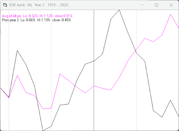
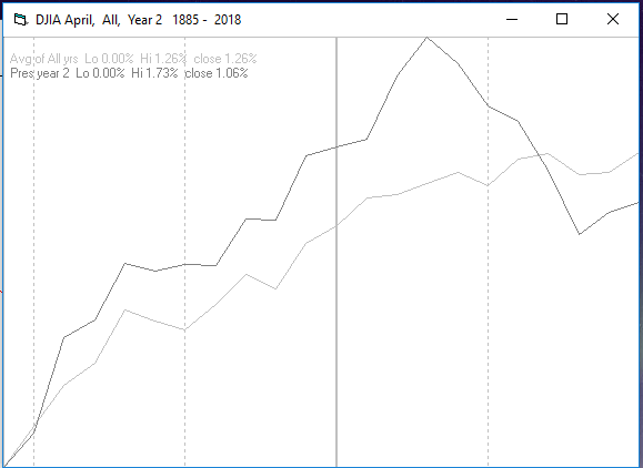
Since 1885 the Dow Jones Industrial Average (DJIA) has been up 60% of the time in April with an average gain of 1.3%. During the 2nd year of the Presidential Cycle the DJIA has been up 54% of the time in April with an average gain of 0.3%. The best April ever for the DJIA 1933 (+40.2%), the worst 1932 (-23.4%)
The chart below is similar to those above except it shows the average daily performance over all years for the DJIA in April in light grey and the average performance during the 2nd. year of the Presidential Cycle in black.
Conclusion
After 3 consecutive weeks the market is oversold and ripe for a bounce.
There has been no sigh of capitulation.
Seasonality for next week has been modestly positive by all measures.
The annual seasonal pattern calls for a rally sometime between now and late April when a cycle top is scheduled. That pattern is supported by the monthly charts shown above.
The strongest sectors last week were Energy (for the 4th week in a row) and Utilities while the weakest were Internet and Finance.
I expect the major averages to be lower on Thursday April 2 than they were on Friday March 27.
Comments
Log in or sign up to join the conversation.