
The good news is:
The S&P mid cap average closed at an all time high last Friday.
The Negatives
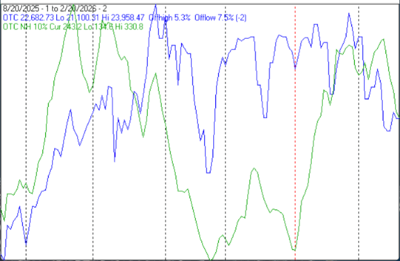
The first chart covers the last 6 months showing the NASDAQ composite (OTC) in blue and a 10% trend (19 day EMA) of NASDAQ new highs (OTC NH) in green. Dashed vertical lines have been drawn on the 1st trading day of each month.
OTC NH moved sharply downward last week.
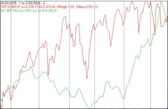
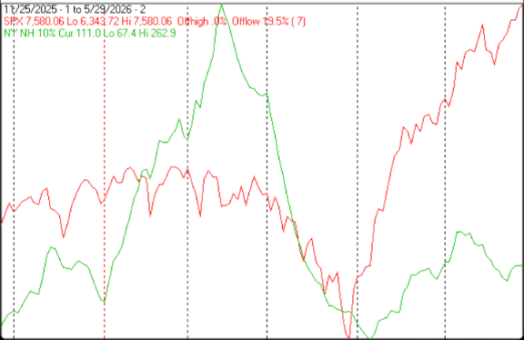
The next chart is similar to the one above except it shows the S&P 500 (SPX) in red and NY NH in green has been calculated with NYSE data.
NY NH also took a dive last week.
 |
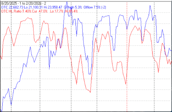
The next chart covers the past 6 months showing the OTC in blue and a 40% trend (4 day EMA) of NASDAQ new highs divided by new highs + new lows (OTC HL Ratio), in red. Dashed horizontal lines have been drawn at 10% levels for the indicator; the line is solid at the 50%, neutral level (equal numbers of new highs and new lows).
OTC HL Ratio remained below the neutral line last week.
The Positives
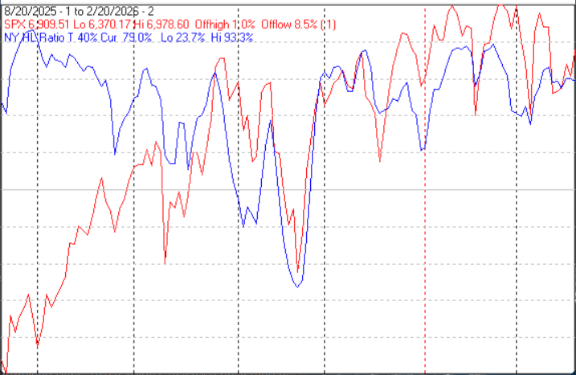
The next chart is similar to the one above except it shows the SPX in red and NY HL ratio, in blue, has been calculated with NYSE data.
NY HL Ratio was pretty much unchanged at a high level.
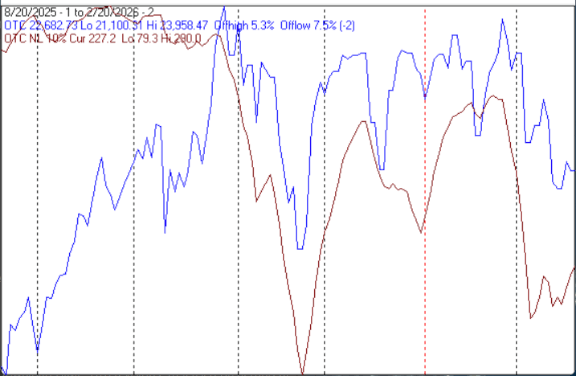
The next chart covers the past 6 months showing the OTC in blue and a 10% trend (19 day EMA) of NASDAQ new lows (OTC NL) in brown. OTC NL has been plotted on an inverted Y axis so decreasing numbers of new lows move the indicator upward (up is good).
OTC NL moved upward from a high level (low on the chart) last week.
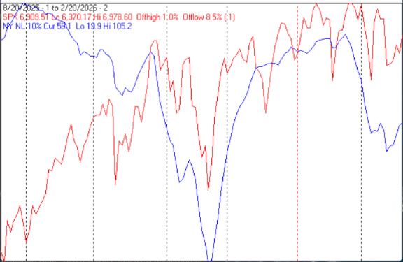
The next chart is similar to the one above except it shows the SPX in red and NY NL, in blue, has been calculated with NYSE data.
NY NL also turned upward last week.
Seasonality
Next week includes the last 5 trading days of February during the 2nd year of the Presidential Cycle. The tables below show the daily change, on a percentage basis, for that period.
OTC data covers the period from 1963 to 2025 while SPX data runs from 1953 to 2025. There are summaries for both the 2nd year of the Presidential Cycle and all years combined.
Seasonality for the coming week has been stronger during the 2nd year of the Presidential Cycle than other years.
Report for the last 5 days of February.
The number following the year represents its position in the Presidential Cycle.
The number following the daily return represents the day of the week; 1 = Monday, 2 = Tuesday etc.
OTC Presidential Year 2 (PY2)
Day5 Day4 Day3 Day2 Day1 Totals
1966-2 0.97% 1 0.03% 3 -0.35% 4 -0.40% 5 0.35% 1 0.60%
1970-2 0.02% 5 -0.31% 2 -0.05% 3 0.82% 4 -0.16% 5 0.32%
1974-2 0.82% 5 -0.23% 1 0.42% 2 1.02% 3 0.31% 4 2.35%
1978-2 0.14% 3 0.03% 4 0.53% 5 -0.47% 1 -0.73% 2 -0.51%
1982-2 -0.87% 1 -0.88% 2 0.61% 3 0.48% 4 -0.01% 5 -0.67%
Avg 0.21% -0.27% 0.23% 0.29% -0.05% 0.42%
1986-2 -0.04% 1 -0.17% 2 0.11% 3 0.94% 4 0.26% 5 1.09%
1990-2 0.29% 4 -0.76% 5 0.34% 1 0.39% 2 0.76% 3 1.02%
1994-2 0.29% 2 -0.26% 3 -1.23% 4 0.56% 5 1.11% 1 0.48%
1998-2 1.37% 1 -0.75% 2 1.60% 3 0.60% 4 -0.37% 5 2.45%
2002-2 0.48% 5 2.63% 1 -0.17% 2 -0.85% 3 -1.16% 4 0.93%
Avg 0.48% 0.14% 0.13% 0.33% 0.12% 1.20%
2006-2 0.89% 3 -0.17% 4 0.34% 5 0.88% 1 -1.12% 2 0.83%
2010-2 -0.08% 1 -1.28% 2 1.01% 3 -0.08% 4 0.18% 5 -0.24%
2014-2 0.69% 1 -0.13% 2 0.10% 3 0.63% 4 -0.25% 5 1.05%
2018-2 -0.11% 4 1.76% 5 1.14% 1 -1.22% 2 -0.78% 3 0.79%
2022-2 -1.23% 2 -2.57% 3 3.34% 4 1.64% 5 0.41% 1 1.60%
Avg 0.03% -0.48% 1.19% 0.37% -0.31% 0.80%
OTC summary for PY2 1966 - 2022
Averages 0.24% -0.20% 0.52% 0.33% -0.08% 0.81%
% Winners 67% 27% 73% 67% 47% 80%
MDD 2/23/2022 3.77% -- 2/28/2002 2.17% -- 2/28/2018 1.99%
OTC summary for all years 1963 - 2025
Averages -0.23% 0.02% 0.19% -0.22% -0.07% -0.30%
% Winners 49% 52% 60% 59% 48% 52%
MDD 2/27/2020 10.55% -- 2/28/2001 6.79% -- 2/25/2021 5.44%
SPX PY2
Day5 Day4 Day3 Day2 Day1 Totals
1930-2 -1.05% 1 0.04% 2 1.85% 3 -0.13% 4 0.87% 5 1.58%
1934-2 -2.62% 5 -1.71% 6 -2.29% 1 1.12% 2 -0.46% 3 -5.96%
1938-2 2.64% 3 -1.46% 4 0.52% 5 -0.26% 6 -1.73% 1 -0.29%
1942-2 0.24% 2 -0.70% 3 0.71% 4 0.82% 5 0.00% 6 1.06%
1946-2 2.01% 4 -4.57% 1 -0.59% 2 2.02% 3 0.76% 4 -0.37%
1950-2 0.23% 4 0.41% 5 -0.12% 6 0.12% 1 -0.35% 2 0.29%
1954-2 -0.15% 5 -0.35% 2 0.00% 3 0.31% 4 0.93% 5 0.73%
1958-2 -0.56% 1 -0.10% 2 0.76% 3 -0.59% 4 0.39% 5 -0.09%
1962-2 -0.48% 3 -0.23% 5 -0.57% 1 0.19% 2 0.10% 3 -0.99%
Avg 0.21% -0.97% -0.10% 0.41% 0.37% -0.08%
1966-2 -0.58% 1 -0.42% 3 -0.64% 4 0.28% 5 0.09% 1 -1.29%
1970-2 0.31% 5 -0.05% 2 1.55% 3 -0.50% 4 0.67% 5 1.98%
1974-2 0.72% 5 -0.38% 1 1.02% 2 0.42% 3 -0.19% 4 1.59%
1978-2 -0.03% 3 0.09% 4 0.97% 5 -0.87% 1 -0.78% 2 -0.62%
1982-2 -1.44% 1 -0.07% 2 1.76% 3 -0.23% 4 -0.09% 5 -0.07%
Avg -0.21% -0.17% 0.93% -0.18% -0.06% 0.32%
1986-2 -0.12% 1 -0.25% 2 0.11% 3 1.22% 4 0.07% 5 1.03%
1990-2 -0.60% 4 -0.48% 5 1.39% 1 0.48% 2 0.49% 3 1.29%
1994-2 0.81% 2 -0.16% 3 -1.37% 4 0.39% 5 0.23% 1 -0.10%
1998-2 0.38% 1 -0.72% 2 1.19% 3 0.56% 4 0.06% 5 1.46%
2002-2 0.82% 5 1.80% 1 0.00% 2 0.05% 3 -0.28% 4 2.38%
Avg 0.26% 0.04% 0.27% 0.54% 0.11% 1.21%
2006-2 0.75% 3 -0.38% 4 0.13% 5 0.36% 1 -1.04% 2 -0.18%
2010-2 -0.10% 1 -1.21% 2 0.97% 3 -0.21% 4 0.14% 5 -0.41%
2014-2 0.62% 1 -0.13% 2 0.00% 3 0.49% 4 0.28% 5 1.26%
2018-2 0.10% 4 1.60% 5 1.18% 1 -1.27% 2 -1.11% 3 0.50%
2022-2 -1.01% 2 -1.84% 3 1.50% 4 2.24% 5 -0.24% 1 0.63%
Avg 0.07% -0.39% 0.75% 0.32% -0.39% 0.36%
SPX summary for PY2 1930 - 2022
Averages 0.04% -0.47% 0.42% 0.29% -0.05% 0.23%
% Winners 50% 21% 67% 67% 54% 54%
MDD 2/26/1934 6.47% -- 2/26/1946 5.14% -- 2/28/1938 2.91%
SPX summary for all years 1928 - 2025
Averages -0.23% -0.10% 0.09% -0.09% 0.02% -0.29%
% Winners 45% 44% 55% 53% 53% 47%
MDD 2/28/2020 11.49% -- 2/27/1933 7.21% -- 2/26/1934 6.47%
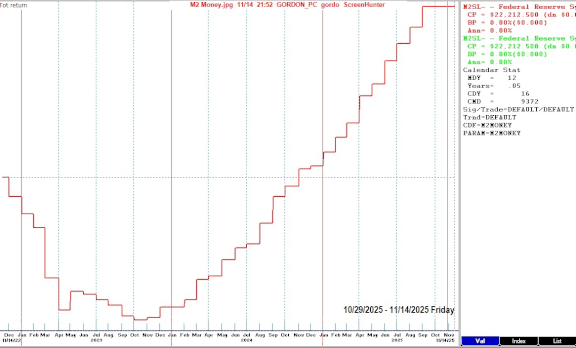
Money supply (M2) and Interest Rates
The following chart was supplied by Gordon Harms.
The chart was made with FastTrack and covers the past 3 years showing the M2 money supply in red. This chart is more granular than previous M2 charts and shows money supply has been increasing since October of 2023.
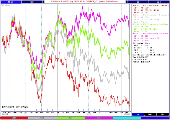
Treasury rates at their close last Friday and their changes from a couple months ago:
2yr yield 3.482% down from 3.612%
5yr yield 3.646% down from 3.734%
10yr yield 4.091% down from 4.147%
30yr yield 4.726% down from 4.751%
The next chart covers the past 2 years showing a relative comparison of US treasuries. 2 year in red, 5 year in grey, 10 year in green and 30 year in purple.
Conclusion
The breadth indicators were confusing, last week new lows diminished (good) while new highs also diminished (bad).
The strongest sectors last week were Utilities and Precious Metals (both for the 2nd week in a row) while the weakest were Internet (for the 5th week in a row and Technology.
I expect the major averages to be higher on Friday February 27 than they were on Friday February 20.
Comments
Log in or sign up to join the conversation.