

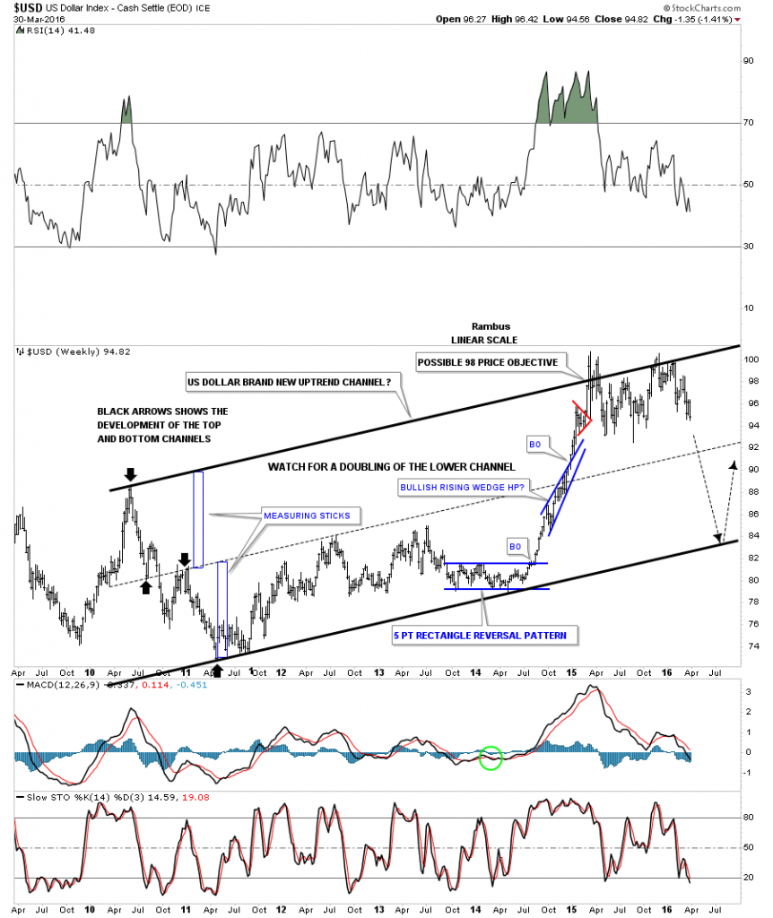
Tonight I would like to show you some charts on several of the different currencies and especially the US dollar as it has been pretty weak lately. As you know the US dollar has been consolidating that massive impulse move up that began in the Spring of 2014 chopping sideways between roughly 100 at the top and 93 or so at the bottom. There is a weekly chart I built and posted just a couple of times during that big impulse move when the US dollar was about at the halfway point of that big move.
I doubt most of you will remember this chart but it showed a possible doubling of the lower channel. This weekly linear scale chart goes back seven years and shows a top in April of 2010 and a low in April of 2011, the highest and lowest black arrows. When I first built this chart the US dollar was trading inside the blue bullish rising wedge, which at the time I viewed as a halfway pattern to the upside. Once I made that connection and where the blue rising wedge was forming, I played around with the bottom trendline and moved it up to the July high, which gave me the lower parallel channel below the center dashed trendline. I’ve seen in the past when there is a well defined channel they can sometimes double forming a much bigger channel.
The two blue measuring sticks are the exact same height, which I then used to plot out a possible top rail for a doubling of the lower channel, using the two inside black arrows for a reference point. The blue bullish rising wedge was the key to even consider doubling the bottom channel. As you can see I had a price objective for the impulse move up to the 98 area which was the new top rail of the bigger uptrend channel. The US dollar actually made it up to 100, but it could go no further creating a second high last fall.
The reason I’m showing you this chart is because the US dollar could fall to the lower trendline around the 84 area and still be in an uptrend. That would dovetail with the strength in the PM complex giving that sector a chance for a strong rally while the US dollar corrects within it’s bull market. Commodities could also benefit from this correction in the US dollar and get a decent counter trend rally. If the US dollar does indeed decline to the bottom trendline that may setup a correction phase in the PM complex as the dollar resumes its bull market. We never know with 100% certainty how the markets will move but this makes sense to me from a Chartology perspective.
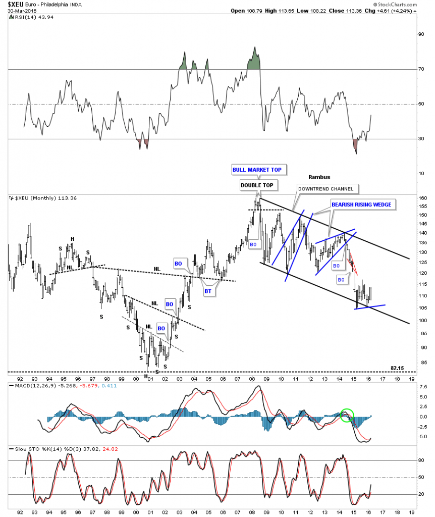
If the US dollar is entering into a bigger correction in its on going bull market the $XEU should be bottoming and getting ready for a counter trend rally within its bear market downtrend channel. The monthly chart shows the $XEU finding support on the bottom rail of its downtrend channel inversely to the US dollar.
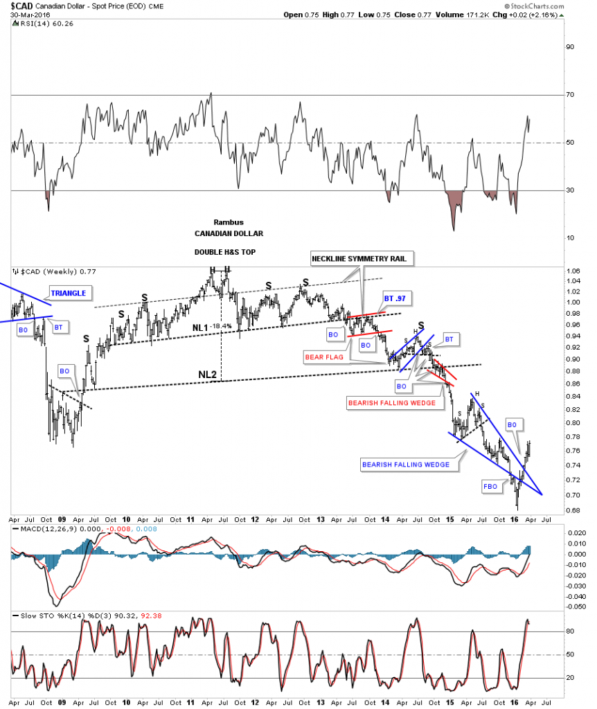
As many of the commodities indexes I follow are showing a failed falling wedge, the $CAD is also showing a failed falling wedge.
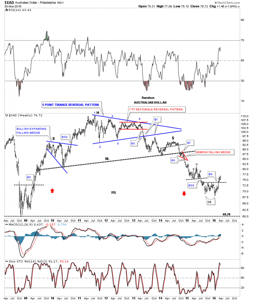
The $XAD is another commodities based currency which is showing a small double bottom and is getting a reprieve from its bear market.
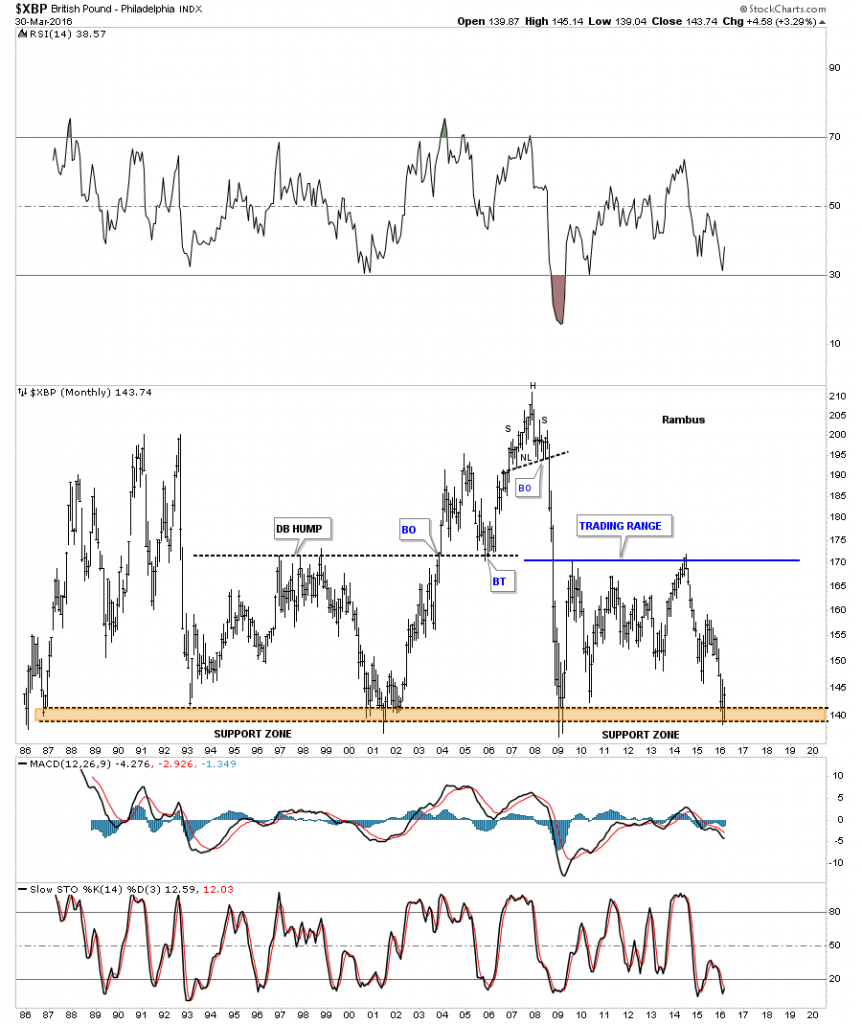
The $XBP is getting a bounce off of its 30 year support zone.
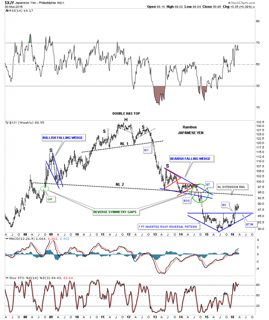
The all important $XJY built out a seven point inverted roof reversal pattern which has stemmed its bear market slide for now.
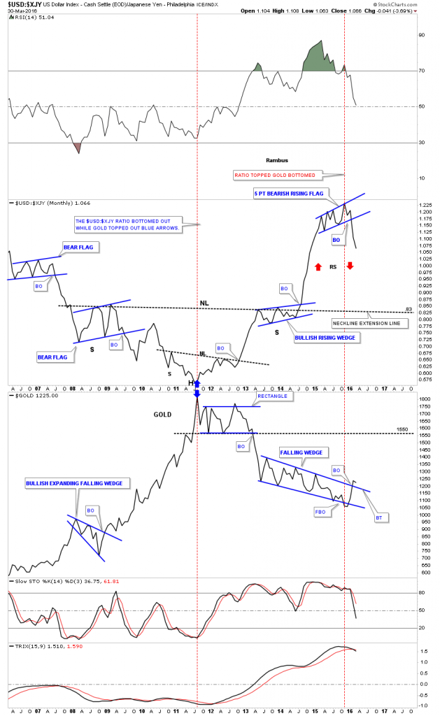
This next chart is a combo ratio chart I showed you a while back which shows the USD:XJY ratio on top and gold on the bottom. When the ratio chart is showing falling price action, the USD is weaker than the XJY, which has been the case since the ratio topped out last fall forming the blue 5 point bearish rising flag. If reverse symmetry plays out, red arrows, it looks like the US dollar is in for a rough ride vs the XJY which should be positive for gold.
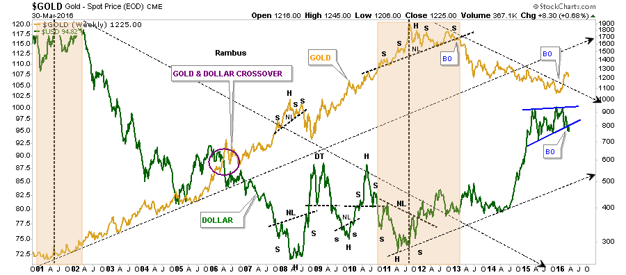
This next chart is an old combo chart in which I overlaid the US dollar on top of gold which gives you a feel for the inverse look they generally have, not always but in general. As gold is breaking above its downtrend arrow the US dollar has broken below the bottom rail of its rising wedge on this weekly line chart. Before this correction began in the US dollar I was looking for the two to cross in a similar fashion to how they did back in 2006 as shown by the purple circle. That maybe on hold for awhile.
I would now like to change it up a bit now and look at the INDU which traded above the top rail of a potential triangle consolidation pattern we touched on recently. As you can see we got the initial hit and then the small decline I was looking for. Today we got the breakout and now I’m looking for a backtest at the 17,650 area, which will let us know if that top rail is really hot. It’s very subtle right now and not drawing much attention which is good.
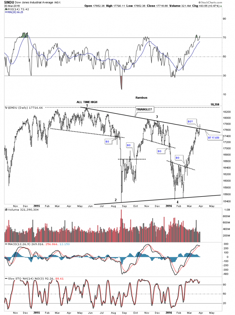
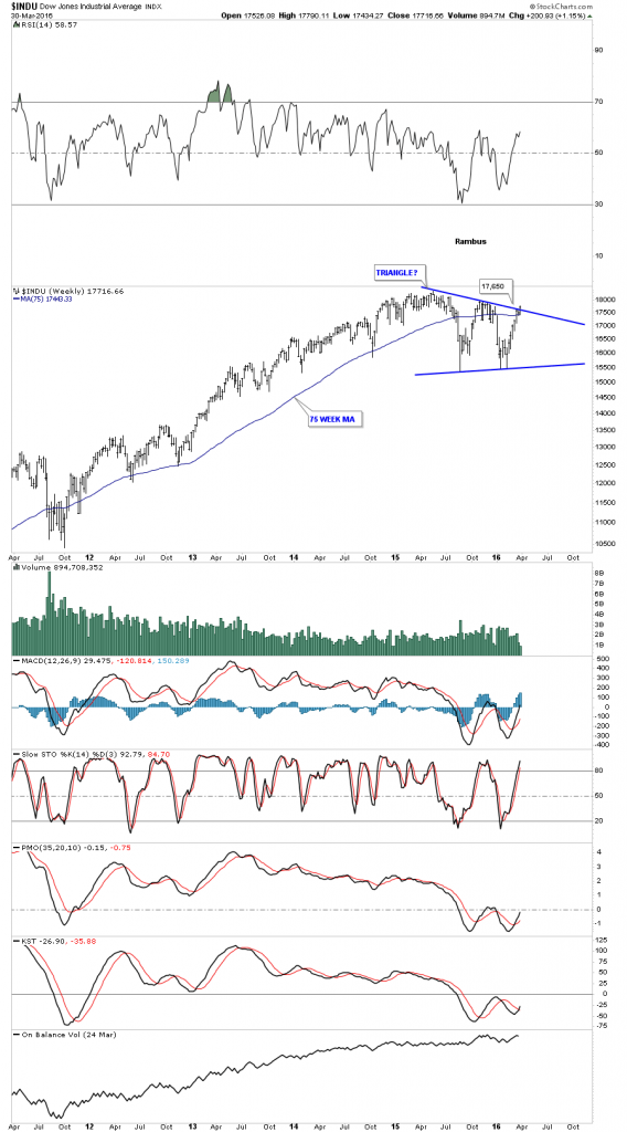
Below is a weekly chart for the INDU which shows the top rail comes through at 17,650 or so.
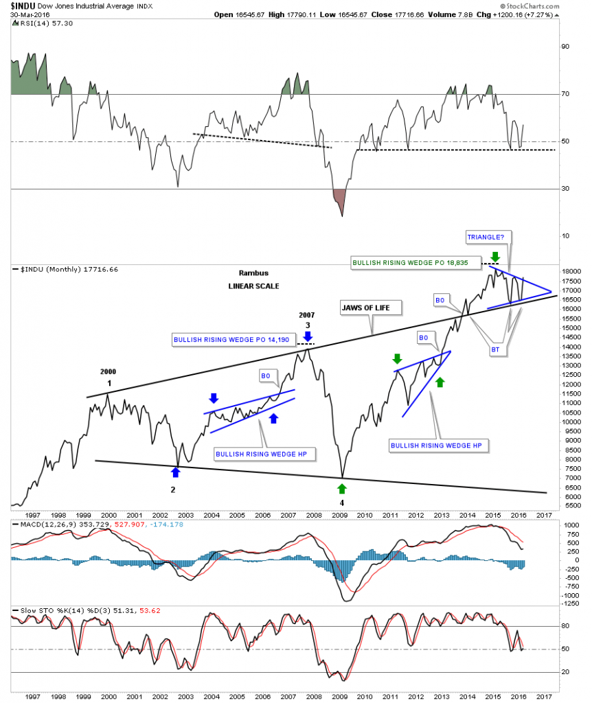
Below is a monthly line chart which shows the blue triangle forming on top of the expanding triangle. Tomorrow being the end of the month it will be interesting to see how the INDU closes out.
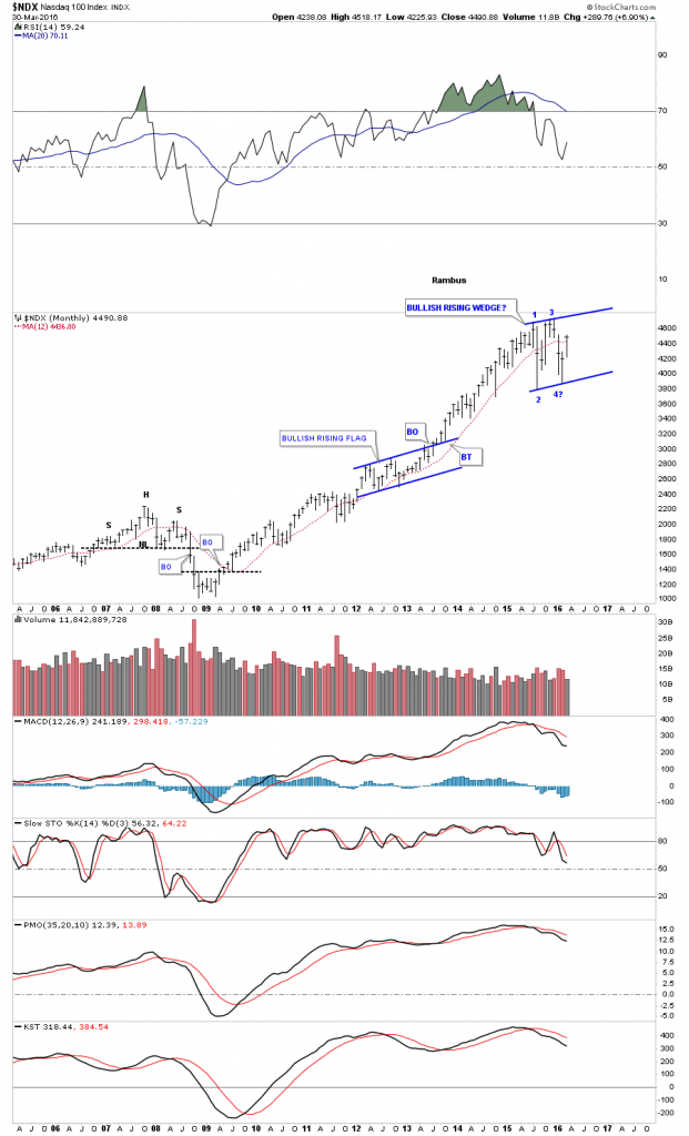
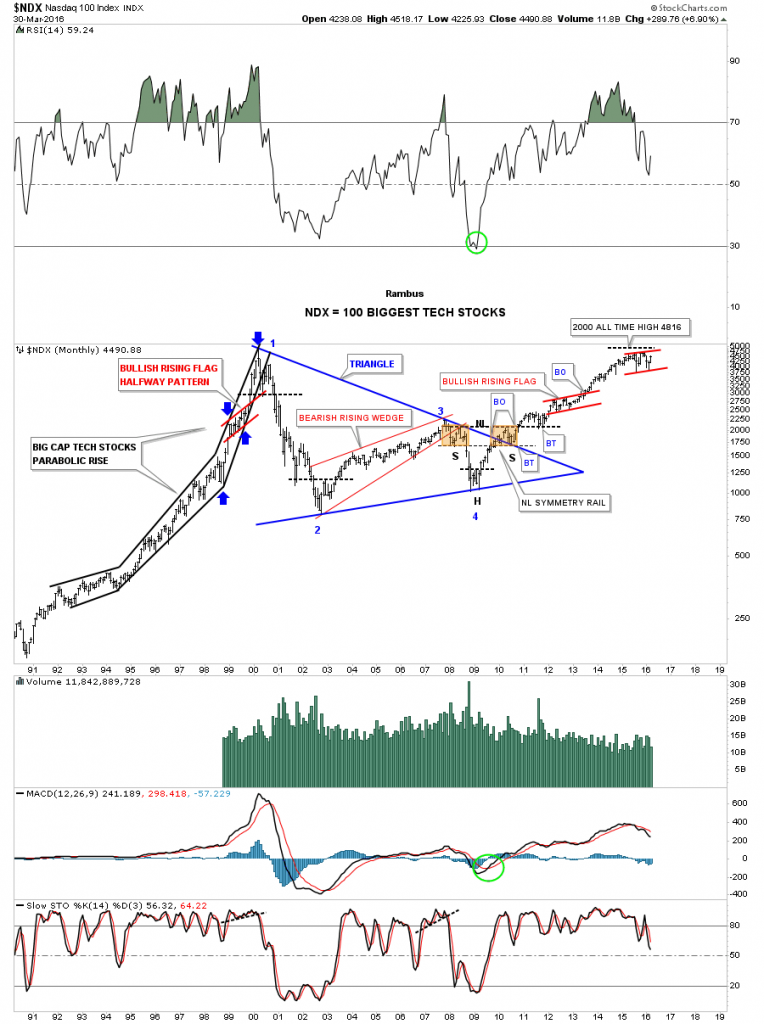
I know how hard it is for some of you to even consider the possibility that the bull market that began in March of 2009 can still move higher, which is understandable as this is a very long term bull market. The monthly chart for the NDX shows a potential bullish rising flag which would be a halfway pattern if the bull market is to continue and make new highs. Keep in mind this pattern won’t be complete until the top rail is broken to the upside.
Below is a 25 year chart for the NDX which shows it’s bull market blow off phase into the 2000 high, and our current bull market that began in 2009. I’ve shown this chart for many years as the Chartology is pretty nice. The first thing to consider is the blue 10 year triangle consolidation pattern which is responsible for our current bull market. Big patterns equals big moves. Also note the beautiful and symmetrical H&S bottom that formed in the apex of that 10 year triangle consolidation pattern with the backtest to the top rail forming the right shoulder.They say beauty is in the eye of the beholder, which for me this chart shows.
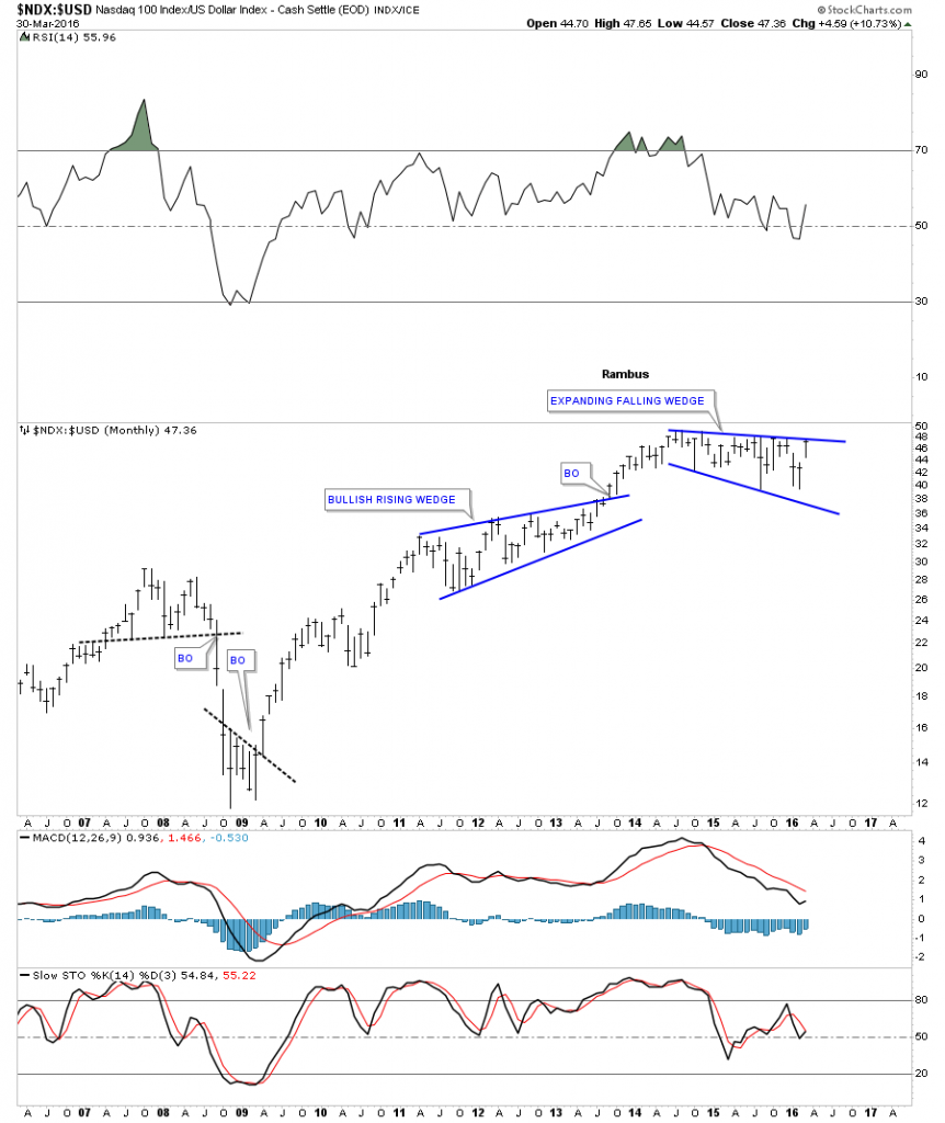
Below is a ratio chart which compares the NDX to the US dollar. When the price action is rising the NDX is outperforming the US dollar. It looks like the NDX may breakout of a possible bullish expanding falling wedge possibly another important clue that the US dollar may have a bigger correction than previously thought.
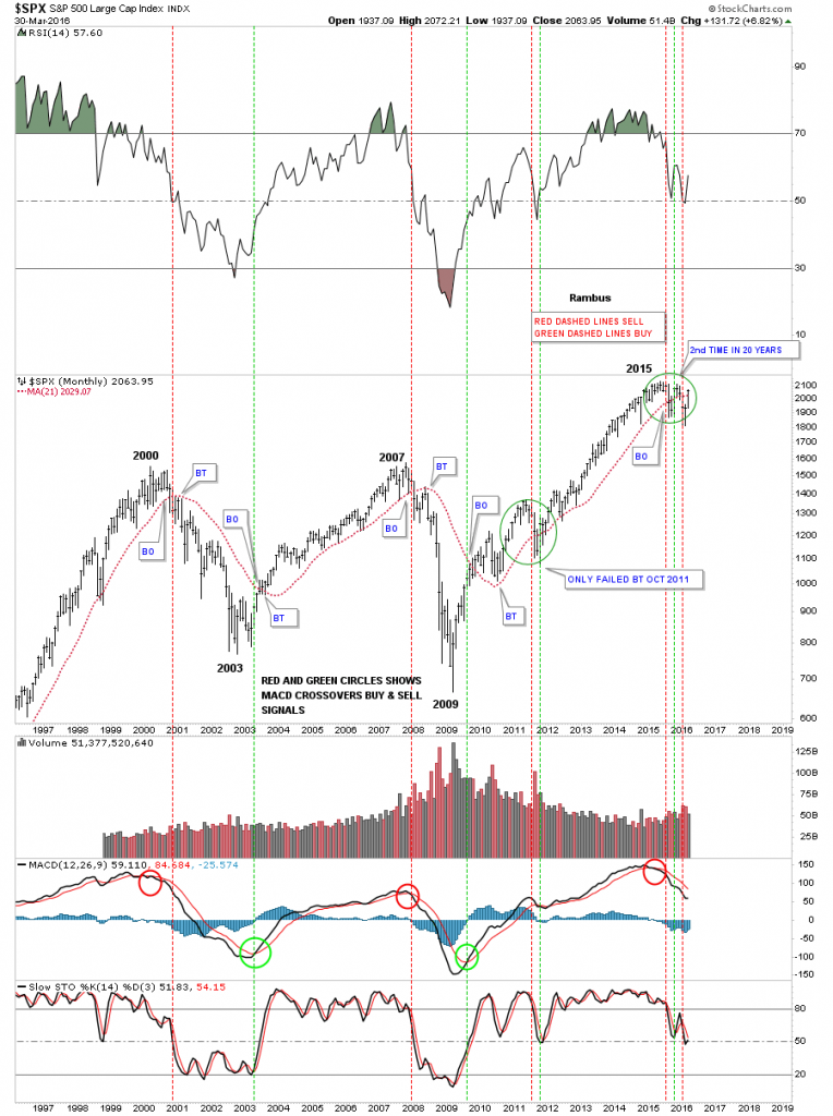
Since tomorrow is the end of the month trading I have to show you the monthly chart for the SPX, which I’ve been showing you using the 21 month simple moving average, which shows how it reverses its role from support to resistance and back again once it’s broken. Just follow the price action and the red 21 day ma to see what I mean. Looking at our current price action for this month you can see the SPX is trading above the 21 month ma average, which will be a buy signal if the SPX doesn’t’ collapse tomorrow. If the SPX can close tomorrow above the 21 month ma I will then move the vertical dashed green line to this months bar showing a buy. This would be only the 5th time in over 20 years this has occurred. Since 2015 it has been whipsaw city for the stock market, but hopefully they’ll start a brand new impulse move higher in the not to distant future.
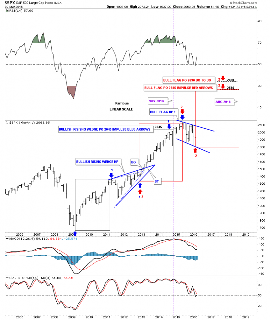
I want to apologize for this next chart for the SPX as I haven’t had time to break it down for you as it’s still in construction mode. If the SPX and the other stock markets are getting ready to enter into a new impulse leg up, the current trading range I see will bea halfway pattern. On the SPX it would be the blue bull flag with the time and price objectives at the top of the chart. Again keep in mind this won’t happen unless the top rail of the blue bull flag is broken to the upside.
Below is a post I did back on October of 26th of 2014 on what I considered at that time as the, Most Important Chart on the Planet. Just below the second paragraph there is a link to a post I did at the very beginning of 2013 in which I described what I was seeing in regards to the stock markets. Checkout what those chart patterns looked like back then and compare the same patterns to the current time frame over three years later. It is what it is until it isn’t.



Comments
Log in or sign up to join the conversation.