

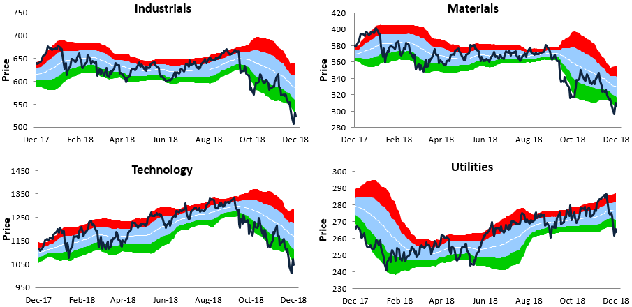
Below is an updated look at our trading range charts for the S&P 500 and ten sectors. It’s not a pretty sight.
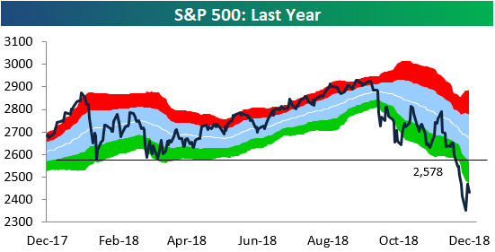
In each chart, the red shading represents overbought territory, while the green shading represents oversold territory.Investors certainly don’t have to worry about overbought levels right now!In fact, the S&P and all ten sectors are trading roughly 2 or more standard deviations below their 50-day moving averages even after yesterday’s big rally.
For the S&P 500, you shouldn’t even start to get excited until the index can re-take 2,578, which we point out in the first chart below. That level is now a big resistance point.Unfortunately, it will take a rally of 7.2% to get there! The bulls certainly have their work cut out for them.
(Click on image to enlarge)

(Click on image to enlarge)



Comments
Log in or sign up to join the conversation.