

Another short-term uptrend began on Monday, June 21, after a very brief short-term downtrend. The PMO indicator shown below has become less and less useful as a trend timing tool because the major market sectors are so split between those that are hurt by the movement in rates and those that are helped.
As a result of the sectors being so out of sync, the PMO indicator is unable to move to the high or low of its range where the best market timing signals occur. With that in mind, this most recent uptrend may not produce the kind of strong short-term tailwind for stocks that we have grown accustomed to in the past.

In order to declare a new uptrend, I think you have to at least have the SPX close above its five-day average, and we saw that on Monday in a very bullish-looking sharp reversal of the selling on the prior Friday.

I received another nice note last week from someone who asked me to start using this chart again. The April to June period of the stochastic has this odd, choppy look that occurs when the market breaks from its regular clean stair-stepping pattern. This period extended the short-term rally without the usual pullback in price and threw off the stochastic.
Maybe the lack of a price pullback in April helps explain the extended sideways behavior of the market that started early May. But now, based on this chart, it may be that the market has formed a nice new multi-week, double-bottom base out of which we'll get a significant summer rally. I'm not counting on it (or predicting it), but this chart certainly opens up the possibility.

The chart above shows a nice clean buy signal for the market, but the chart below doesn't. So we need to use some judgment and apply our personal experience when we trade stocks next week.
A few weeks ago, the 10-day call/put ratio gave us a very nice early warning of the most recent market selloff. Now, this indicator is lagging a bit and may turn higher a week after the most recent rally began. This is another example of an indicator thrown off by out-of-sync sectors that are responding differently to rising interest rates.
Also, the turn higher off the low of this indicator shown in May looked like a solid buy signal, but the buy signal that we may get in the indicator next week will probably be far less reliable because the market turned up so quickly and didn't spend much time carving out a bottom.

The chart below is another look at the short-term trend. The institutional index hasn't closed below its 20-day average since mid-May so you could (and probably should) say that the trend for the big institutional stocks has been higher since then. I highlighted the brief period where the PMO indicated a downtrend, and it's barely a blip. In fact, this chart has the very bullish look of a cup-and-handle between mid-April and mid-June.

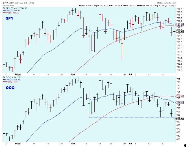
I think that is enough said about the short-term trend. We all get what is going on as the market seems to struggle on a daily basis. But then when you step back a bit, you see that it continues to push higher and higher. The real question is what sectors to own, and on that question, I'm as confused and whipsawed as everyone else.
Outlook Summary
- The short-term trend is up for stock prices as of June 21.
- Contrarian sentiment is unfavorable for stock prices as of Nov. 14.
- The economy is in expansion as of Sept. 19.
- The medium-term trend is up for treasury bond prices as of June 11 (prices higher, rates lower).


Comments
Log in or sign up to join the conversation.