

How money works and the dollar in the real economy
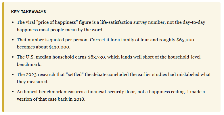
The viral “price of happiness” number prices a survey answer, not the thing you feel, and it’s quoted per person.
The “price of happiness” chart came around again recently, and the number attached to it was as confident as ever. One widely shared version, built from a Remitly analysis, ranked 50 countries. The measure: how close the average wage gets to the income where happiness supposedly “plateaus.” Slovenia was the only country where wages cleared the bar.
In the U.S., the figure landed at 55.8%, with a “price of happiness” pegged at $134,827, precise to the dollar. The trouble is that the figure doesn’t measure happiness at all, and I can show you that using the exact study the chart is built on.
What the “Price of Happiness” Chart Actually Claims
Let’s start by stripping away the design and see what the chart is actually telling us. The chart compares each country’s average wage against an estimated “satiation point.” The approach attempts to identify the income level beyond which self-reported well-being no longer improves.
The idea of the “satiation point” traces back to a 2018 Purdue University study, published in Nature Human Behavior. It mined the Gallup World Poll across 164 countries. The Remitly version took that research, scaled it to each country, and adjusted for local prices and currency.
So far, this seems perfectly reasonable, and the vast majority of readers have taken it as gospel. However, here is where the poll goes sideways. The chart borrows one survey-based estimate and staples the word “happiness” to it. Then it treats the result as if someone had actually measured whether people in Slovenia feel better about their Tuesdays than people in Houston. Nobody measured that. What got measured was a very specific thing, and it isn’t what you think you’re reading.
The Word “Happiness” Is Doing a Lot of Work
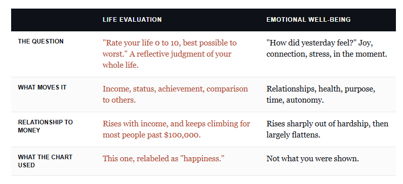
The Purdue researchers didn’t ask people, “Are you happy?” They pulled two different measures from the Gallup data, and the two behave nothing alike with respect to income.
The first is life evaluation. That’s the “Cantril ladder” question. Picture a ladder from zero to ten, where the top rung is your best possible life, and tell us where you stand. Sit with what that question drags out of a person. It says “best possible life,” so people answer with the scorecard stuff: income, house, job title, whether they’re keeping up with the neighbors. However, therein lies the tell. Ask someone to grade their whole life, and they reach for the things that show up on a balance sheet, which is exactly why income tracks it. Globally, life evaluation kept rising to about $95,000 per person.
It also swings by geography, and that swing gives the game away. If a “price of happiness” were a fixed human need, it wouldn’t triple from one region to the next. But it does. The study’s own satiation points for life evaluation run from $35,000 in Latin America to $125,000 in Australia.
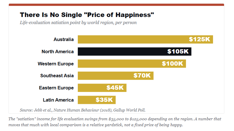
The second measure is “emotional well-being.” This is the actual texture of your days and whether you laughed, felt joy, or felt connected. That one flattened out globally somewhere in the $60,000 to $75,000 range per person. And that flavor of happiness barely moves with money once you’re past real hardship. It runs on relationships, health, purpose, and time. ALL of those things either come or can be achieved, without a price tag.
This is the inherent problem with the “Price of Happiness” chart: it quietly used the life-evaluation number and “called” it happiness. In other words, it drew a clean line between dollars and a life-scoring judgment that already had dollars baked into it. Asking that chart what income level buys happiness is like stepping on a bathroom scale to find out. You’ll get a precise number; it just isn’t measuring what you asked about.
The Correction I Made to This Same Chart in 2018
I’ve written about this before, and it wasn’t hypothetical. When the Purdue study first hit the headlines, I pulled apart the same reporting everyone is repeating now. The media grabbed the round number and ran. Almost none of them read far enough to catch the fine print.
To wit, from that 2018 piece titled “Sex, Money & Happiness:”
That correction comes straight from the study itself, not from me. Run the math, and the story changes completely. Take an individual figure of roughly $65,000 and apply the square root of a four-person household. You land near $130,000 a year for a family of four. That is a very different message from “the typical worker is almost there.”
Here is my point using the latest official data. The Census Bureau recently reported that the “real,” inflation-adjusted, median household income was $83,730 for 2024. If we then compare that to the household-adjusted figure, that leaves the typical American family sitting roughly $46,000 below the “happiness” line.
“See, everybody is unhappy.” Hold on. The gap shown in the viral graphic isn’t a happiness gap. It is a wage-and-cost gap, which is wider than the per-person framing suggests.
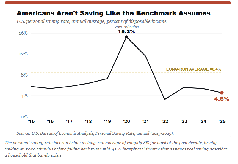
The pullquote’s arithmetic also hides a second problem. That benchmark assumes a family can save, and most can’t manage much. Americans have spent most of the last decade saving below their own long-run norm.
“But the Chart Still Shows a Real Gap”
Yes, the chart is capturing something very real. Wages haven’t kept pace with the cost of a middle-class standard of living, families are stretched thin, and the certainly graphic puts a vivid number on that squeeze. Using that very narrow reading, it works.
However, the problem is the label, rather than the data. Furthermore, the researchers themselves have since done some cleanup. In 2023, Daniel Kahneman and Matthew Killingsworth ran what’s called an “adversarial collaboration,” wherein they pooled their contradictory findings on money and happiness with a neutral referee.
Their conclusion clarified the original error. In their own words, the earlier work involved a “mislabeling of the dependent variable.” In other words, the famous plateau, they found, mostly described an already-unhappy minority. For most people, life evaluation keeps climbing with income, and the happiest group even accelerates.
Such is the trouble with pricing a feeling. There is no clean “price of happiness” line to draw, because the thing being priced was never happiness in the everyday sense. It was a life-scoring survey answer, and money moves it precisely because the question invites people to add up their money.
There’s a deeper reason that a single dollar figure doesn’t hold up. Much of what the ladder captures is relative rather than absolute. The same $90,000 income can feel like plenty in one zip code and falling behind three towns over. I have worked with thousands of people in all financial brackets over nearly four decades. What I can tell you is that I have talked with very unhappy rich people and very happy people who are “just getting by.”
In reality, people grade their lives against the neighbors, not against a survey average. Unfortunately, social media now has us comparing ourselves to “neighbors” we have never met, living across the entire world. However, while economists have chewed on this since Richard Easterlin’s work in the 1970s, the reality is that a fixed national “price of happiness” quietly assumes away the comparison that actually drives the number.
What a Useful Benchmark Would Actually Measure
If we want a useful benchmark, we need to drop the word “happiness.” Once you do that, the exercise gets focused quickly.
The only thing that money genuinely governs is financial security, and that is something we can measure without pretending to price joy. Therefore, a defensible benchmark would have three components measuring if a household can:
Cover incoming bills, without tapping into savings or adding to debt.
Maintain a sufficient savings rate to reach financial goals, and
Keep something back for a life outside of just grinding for necessity.
Notice that those three components are not arbitrary. Each maps onto the three channels where money actually touches well-being.
Covering incoming bills is a way to escape financial hardship. That is the steepest and most reliable part of the whole curve.
Saving for the future is a form of security. That is the quiet absence of dread about a car repair becoming a catastrophe.
Having some bandwidth for a vacation or a dinner out. That is the difference between surviving and having a life.
That benchmark measures the floor of financial stress, not the ceiling of happiness.
So what does that cost in real dollars? We can build a model using actual data rather than a survey. We can start with the Economic Policy Institute’s family budget. It prices a “modest yet adequate” basket of necessities, housing, food, transportation, child care, health care, and taxes, for a two-parent, two-child household.
Even in the country’s cheapest metropolitan area, that floor runs $82,005 a year, and it leaves out saving and fun by design. Add a 15% savings rate and a little slack, and an honest security benchmark clears $109,000 before you ever leave the least expensive corner of America.
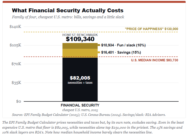
Now set that number against what the typical household actually earns. At $83,730, the median family barely covers the bare necessities in the cheapest metro, with almost nothing left to save or enjoy. That is the real gap the “happiness” chart was clumsily attempting to define; however, it has nothing to do with “joy.” It is the distance between what a family brings home and what a secure life costs.
Conclusion
There is one caveat, since it runs counter to the tidy conclusions on both sides. The raw link between income and well-being overstates how much money alone would close the overall gap.
When researchers run actual cash transfers, rather than surveys, the effect on well-being shows up smaller than the correlation implies. Money helps. However, it helps less than a straight-line reading of the chart suggests, because health, work, and relationships are tangled up in the same numbers.
This is why, at RIA Advisors, we don’t build financial plans around a magic income number. We build them around cash-flow security and a funded savings buffer. The reason is that those are the levers that remove the money-shaped sources of stress from a household.
That planning work starts with the client’s entire financial picture, not a headline figure lifted from a survey. Yes, having more money and income can clear the obstacles between you and a good life. However, once you are past that, it’s the family dinners, time with friends, meaningful work, and maintaining our health that does the heavy lifting. There is NO chart that can put a dollar sign on those.
Let me conclude with this. The next time a graphic tells you happiness costs exactly $134,827, precisely, you should ask the only question that really matters.
“The cost of what part of my happiness, and measured exactly how?”
That number is real. The label is marketing.
Most importantly, don’t let a survey that has nothing actually to do with you and your life make you feel unhappy. Focus on the things that actually create happiness (love, family, children, friends, religion, and meaningful work) and stop comparing yourself to “social media benchmarks.”
As we discussed in “What’s More Important,”
“Comparison is the root cause of more unhappiness in the world than anything else.”
Remember that the next time a survey tells you that you are unhappy.
Sources & Notes
Jebb, A. T., Tay, L., Diener, E., & Oishi, S. (2018). “Happiness, income satiation, and turning points around the world.” Nature Human Behavior. nature.com/articles/s41562-017-0277-0
Killingsworth, M. A., Kahneman, D., & Mellers, B. (2023). “Income and emotional well-being: A conflict resolved.” PNAS. pnas.org/doi/10.1073/pnas.2208661120
U.S. Census Bureau (2025). “Income in the United States: 2024.” Real median household income, $83,730.
Economic Policy Institute (2025). Family Budget Calculator, two-parent, two-child household. Necessities plus taxes range from $82,005 (the least expensive metro) to $231,305 (the most expensive). The calculator excludes savings by design. The 15% savings and 10% discretionary layers are RIA assumptions, not EPI figures.
U.S. Bureau of Economic Analysis, Personal Saving Rate (annual), 2015 to 2025. 2025 average 4.6%, long-run average near 8%. Two aggregators reported the long-run figure as 8.4% and 8.88% on different windows; the chart uses the more conservative 8.4%.
Roberts, L. (2018). “Sex, Money & Happiness.” Newsmax Finance. Household square-root correction replicated from the Jebb study directly per source 1.
Remitly / Visual Capitalist (2026). “Ranked: The Income Needed to Be Happy Around the World.”


Comments
Log in or sign up to join the conversation.