

Today I would like to go over some of the precious metals charts we haven’t looked at in a while. There has been so much going on in the many different areas of the markets that It’s hard to keep you updated on many of the charts we looked at several months ago when the PM complex was bottoming.
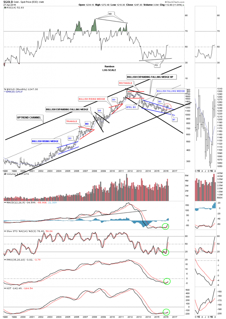
This first chart is a long term monthly chart for gold which shows the bull market uptrend channel that began to form back in 2000 or so. The bear market that started in September of 2011 took on the formation of a potential bullish expanding falling wedge halfway pattern. This big pattern won’t be complete until the top black rail is broken to the upside, but gold is moving in the right direction. If gold can close this month out above the top rail of the blue bullish falling wedge it will mark the third month of the breakout move, red circle. Note the smaller version of the black expanding falling wedge which formed at the 2008 crash low. Also note how each consolidation pattern, which formed during the bull market years, formed about in the middle of each impulse move. That was a classic bull market. All the indicators are bullish with the 10 month ema now pointing up. It will be interesting to see what this chart will look like in one year, five years or even ten years. Will the current bottom stand out like a sore thumb?
(Click on image to enlarge)
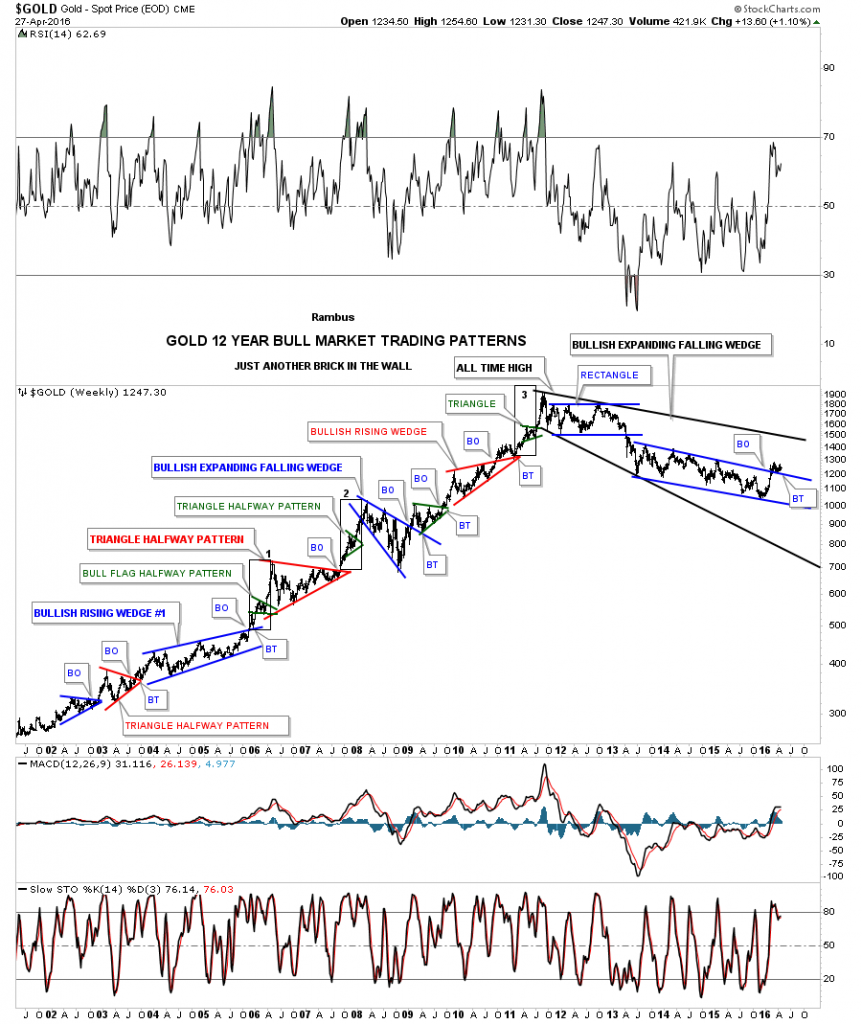
Below is basically the same monthly chart which I’ve been posting for many years which I call, JUST ANOTHER BRICK IN THE WALL. This chart shows every consolidation pattern that formed during the bull market years, even the little green triangles that formed as halfway patterns in the middle of the impulse moves. I always said they would talk about the bull market in gold years from now like we still talk about the 1929 stock market crash. From a Chartology perspective this chart has it all.
(Click on image to enlarge)
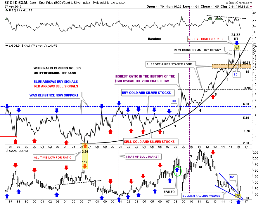
I’ve been showing you this next chart quite regularly because of its importance in understanding what is taking place in the PM complex. This is the ratio combo chart which has the GOLD:XAU on top and the XAU on the bottom, which tells the story of how the XAU has under performed gold for close to 20 years. If you recall I showed you this chart when the little double top was put in place, as shown by the yellow shaded area at the top of the chart. I mentioned that it was likely that we would see some reverse symmetry to the downside as the move into the double top was so vertical. The ratio chart on top not only broke below the double top hump and moved down in a vertical move, but it has also broken the parabolic arc to the downside. This chart shows you what most folks don’t see. When something has been in a parabolic move up, the move down can be just as fast or even faster than the move up.
The ratio chart on top is at an interesting juncture right here, as it’s trading at the bottom of the brown shaded S&R zone between 15 and 15.75. It’s possible we could see a little backing and filling in this general area before prices move lower, but the parabolic move down has begun. This means that the XAU is going to outperform gold in a big way going forward. Note the XAU chart at the bottom which shows how the ratio topped out and the XAU bottomed out at the same time. This is exactly what we wanted to see happen when the double top emerged on the GOLD:XAU ratio chart. Most folks are looking for an eminent correction, but this ratio chart shows the price action may go further before the inevitable correction begins in earnest, which will happen.The bottom line is that the ratio chart has some serious catching up to do to get down to normal levels which is still a long ways down.
(Click on image to enlarge)
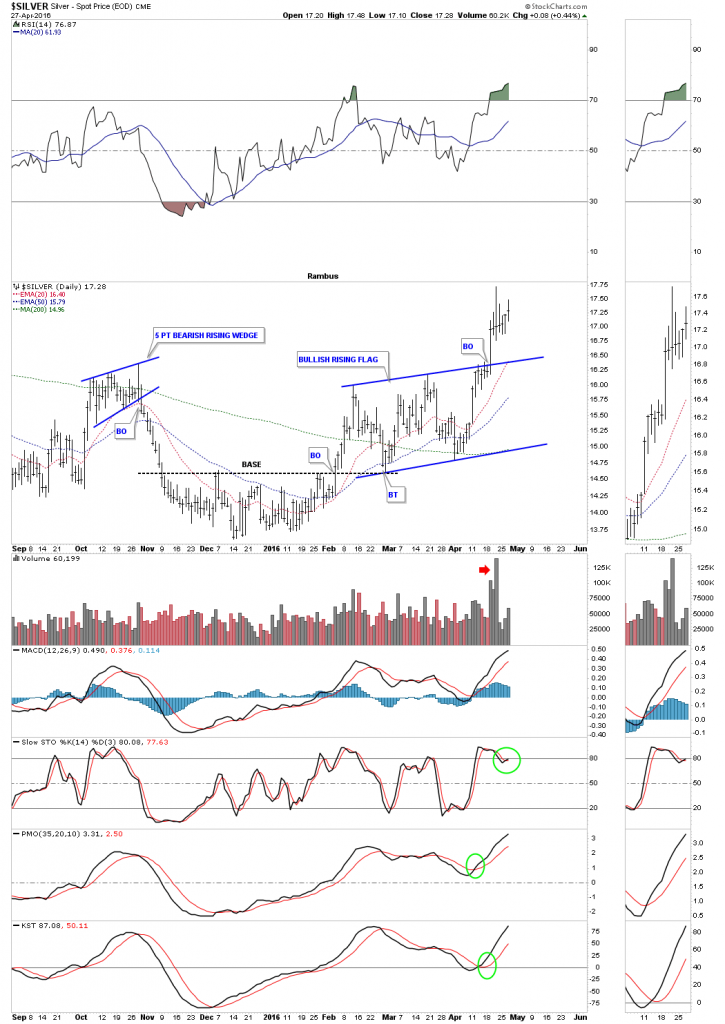
Lets now look at silver as it has finally joined the party. Below is a short term daily chart which shows the nice little base which was silver’s bear market bottom. After breaking above the S&R line, silver rallied and then backtested it one last time creating the bullish rising flag consolidation pattern. Note the big increase in volume on the breakout move from the blue bullish rising flag.
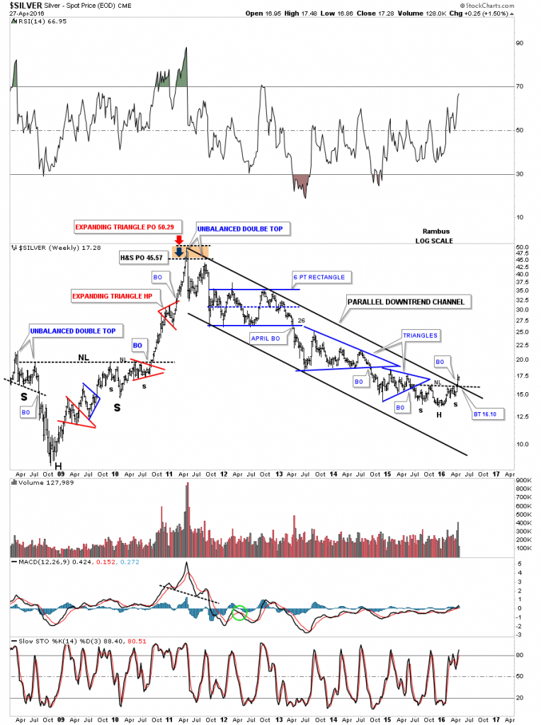
Below is a weekly chart for silver which shows its bear market parallel downtrend channel with an inverse H&S at the bottom. Also note how silver took out the neckline and the top rail of the downtrend channel in one big move. That’s how you takeout overhead resistance. Back in 2008 silver built out the very large H&S consolidation pattern which launched its last leg up to its bull market high at 50. The brown shaded area at the top in 2011 shows the price objectives I was looking for, based on the red expanding triangle consolidation pattern being a halfway pattern.
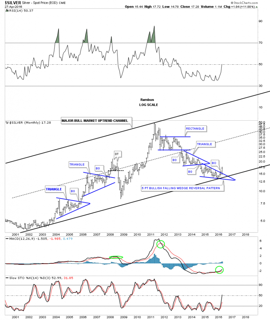
This last chart for today shows the major bull market uptrend channel for silver going back to the 2001 low. The bear market that started in April of 2011 came to a close in January of 2016, and created three separate consolidation patterns. Again, what will this January bottom look like in one year, five years or ten years down the road? If this is the major bear market low you will be able tell everyone you know that you bought in at the very bottom which few investors ever have the privilege to do. As this week marks the end of the month I’ll have a lot of charts to post this weekend showing what some of the PM stock have done for the month of April. All the best…Rambus



Comments
Log in or sign up to join the conversation.