

If you don’t believe me, take a look at this time series plot of available US GDP per capita.
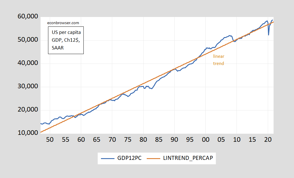
Figure 1: GDP per capita, in Ch.2012$ SAAR (blue); Linear trend (brown). Source: BEA via FRED, and author’s calculations.
Linear regression yields t-stat on time trend of about 60 using robust standard errors. GDP per capita is rising about 40 Ch2012$ per quarter.
Or, one might think to plot on a log scale.
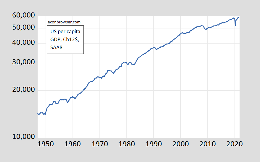
Figure 2: GDP per capita, in Ch.2012$ SAAR (blue, on log scale). Source: BEA via FRED, and author’s calculations.
Which one is misleading? One reader thinks:
In general, log scales are to be avoided for all but professional audiences, notably when exponential growth rates are involved. I would almost never use one in a commercial setting or for a general audience, because they are so easy to misinterpret.
Well, I think one could better characterize this series as exhibiting exponential growth (with unit root) than unit growth.

Comments
Log in or sign up to join the conversation.