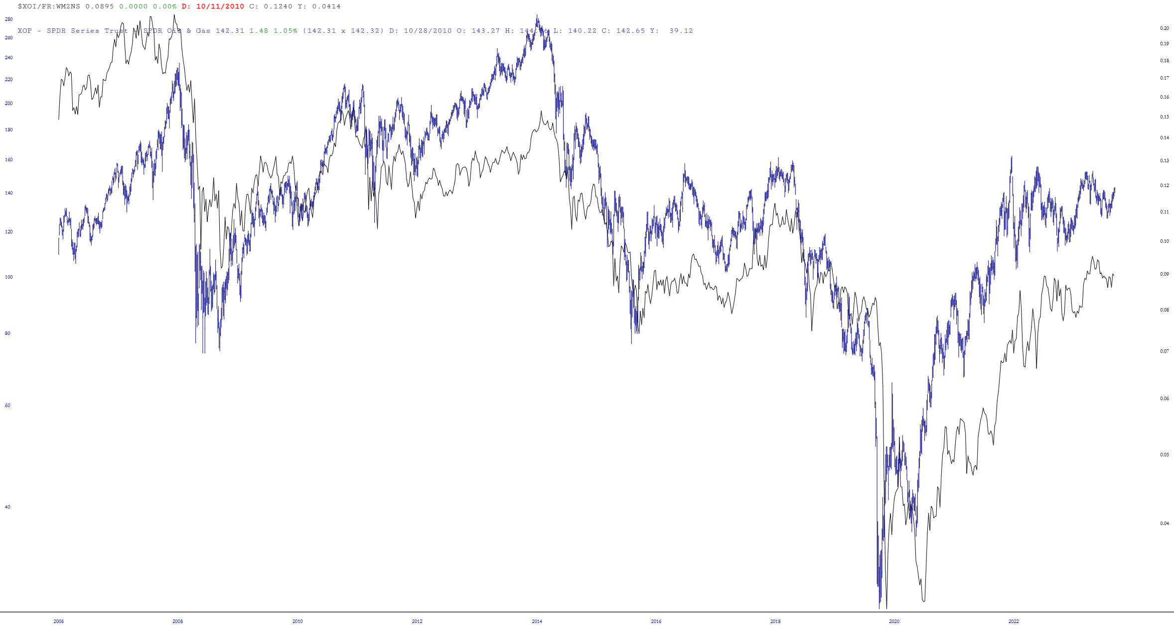
Using the Layered Mode feature, I placed the ETF symbol XOP on top of it, and I’d say the odds of energy stocks being much lower a year from now than they are right now is pretty strong.
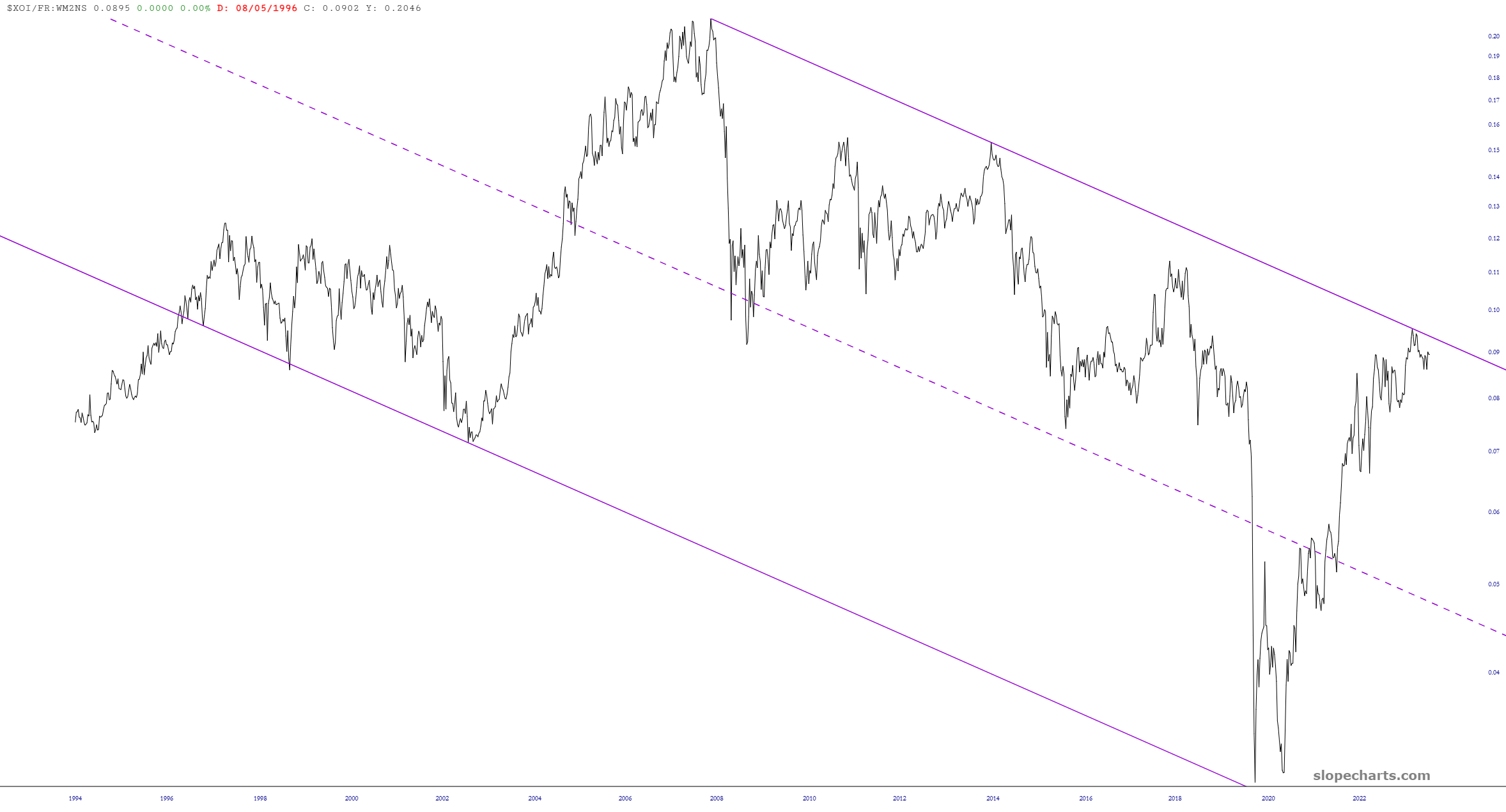
Here’s an interesting chart of the XOI oil index divided by the money supply, illustrating the very consistent pattern of this market over a period of decades. As you can see, we rammed against resistance.
Using the Layered Mode feature, I placed the ETF symbol XOPon top of it, and I’d say the odds of energy stocks being much lower a year from now than they are right now is pretty strong.
I tilt to the bearish side. Slope of Hope is not, and has never been, a provider of investment advice. So I take absolutely no responsibility for the losses – – or any credit for the gains – – you may or may not make from reading this forum. Whether you lose your life savings or make a fortune is entirely up to you and your own skills/luck/fate.


Comments
Log in or sign up to join the conversation.