


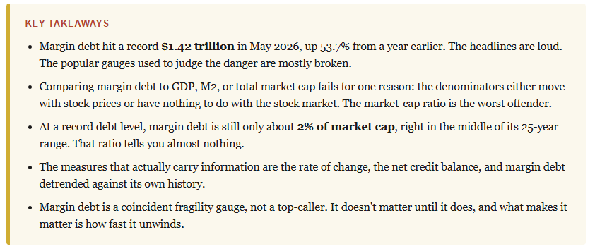
Margin debt just set another record. In May 2026, investors owed their brokers a combined $1.42 trillion, the highest in history and a 53.7% jump from the prior year.1 Every time this number prints a new high, the same charts circulate: margin debt against GDP, against M2, against the total value of the market. They look authoritative. The trouble is that most of them can’t measure margin debt risk in any way that helps you manage a portfolio, and the most popular one is the least useful of the bunch.
I want to take these apart in order.
Why do the three favorite ratios misstate margin debt risk?
Then the handful of measures that actually tell you something.
Finally, I will build a cleaner gauge out of the defensible pieces, and close with the part that matters most: what to watch, and why leverage is a problem you can ignore right up until the week you can’t.
However, before that, let’s discuss a little background.
Why Margin Debt Risk is back in the Conversation
The recent surge in the market has certainly concerned some corners of the investing world. Stocks have run hard, confidence is high, and borrowing against portfolios has exploded. Margin debt crossed $1 trillion for the first time in mid-2025 and hasn’t looked back, climbing 8.5% in May alone.1 As I wrote earlier this year in Margin Debt Sets Records: Should We Be Concerned?, leverage tends to peak right alongside the market because the same euphoria drives both.
However, here is the mechanism that many people get wrong. They assume margin debt drives prices higher, that borrowed money is the fuel under the rally. In aggregate, that channel is small because reported margin debt is only about 2% of total market value.
The dominant arrow runs the other way. Rising prices increase the value of collateral in every margin account, which automatically increases how much each investor can borrow under Reg T. Debt rises BECAUSE the market rose, not the reverse. That single fact is what breaks the ratios we’re about to examine, and it lies at the core of why margin debt risk is so often misjudged.
Okay, so let’s get into the misleading ratios that are popular on the “interwebs.”
The Ratios that Mislead on Margin Debt Risk
Start with the worst gauge of margin debt risk, the comparison that gets shared the most.
Margin Debt to Market Capitalization
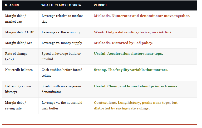
This measure of margin debt risk is built on a logical error. Margin debt sits in the numerator, and total market capitalization sits in the denominator, but those two numbers are not independent. When prices rise, market cap rises, and borrowing capacity rises with it. Both sides of the fraction move together, so the ratio washes out the very signal you’re trying to find. The result is a line that has barely moved in six decades.
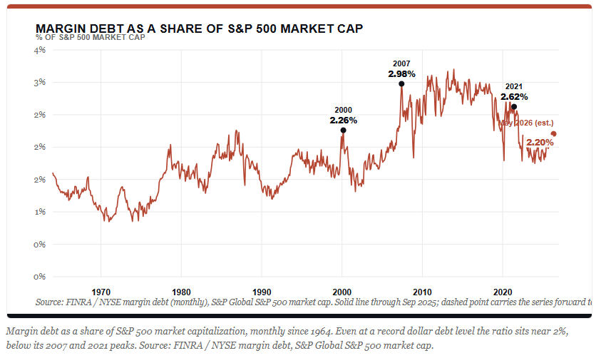
If you look closely at what that chart is telling you, you should notice the problem. At the 2000 peak, the ratio reached about 2.3%. In 2007, it hit roughly 3.0%, the highest in the series. At the 2021 blowoff, it ran to 2.6%.2 And even with margin debt at a record $1.42 trillion in May 2026, the reading is only about 2.2%, still below both of the last two cycle peaks.
For sixty years, it has oscillated between roughly 1% and 3%, and a record dollar level barely registers. When a gauge reads lower at a record high than it did at the prior two tops, it isn’t a gauge. It’s noise dressed up as analysis.
Margin Debt to GDP
As a read on margin debt risk, this one is less broken, but for a reason most people misstate. GDP is a flow of real economic output. It has no transmission line to equity leverage. So why divide by it at all? The only honest defense is that it detrends the data. Nominal margin debt grows with everything over time, and dividing by a growing aggregate lets you compare 1999 to 2007 to today on a common footing. That’s all it does.
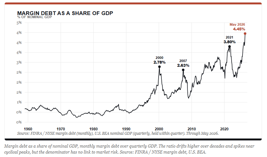
Once again, you can see the cyclical peaks near 2.8% in 2000, 2.6% in 2007, and 3.8% in 2021, with the ratio now at a record near 4.5%. That pattern is real, and it’s why the GDP ratio is the least bad of the three. But notice the upward drift baked into the whole series.
The ratio rises over time mostly because margin debt grows faster than the economy, which is a statement about credit expansion, not about how close the market is to a forced unwind.
It answers a question. Just not the one you asked.
Margin Debt to M2
M2 is a monetary aggregate. Comparing it to margin debt risk is like comparing two things that share almost nothing in common. Worse, M2 is whipsawed by Federal Reserve policy in ways unrelated to investor positioning, and that distortion actively corrupts the ratio.
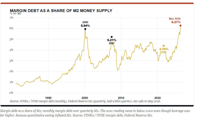
The chart makes the flaw obvious. In 2021, with leverage at what was then a record level, the margin-to-M2 ratio was about 4.4%, well below the 5.9% it hit in 2000. Did investors carry less risk in 2021? Of course not. M2 had simply ballooned from years of quantitative easing, so the denominator swallowed the signal.
When a ratio tells you a record-leverage year was tamer than a prior one because the Fed printed money, the ratio is measuring the Fed, not the market.
So, what measures of margin debt risk SHOULD we pay closer attention to?
The Measures Of That Matter
Throw out the contaminated denominators, and three honest measures remain. None of them tries to turn margin debt into a valuation ratio. Each one looks at the debt itself, how fast it’s growing, what cushion lies behind it, and how stretched it is relative to its own history.
The Rate of Change (ROC)
The level of margin debt is range-bound and noisy. The rate of change is where the real information about margin debt risk lives. Sharp acceleration in borrowing has clustered near every major top, and violent contraction has confirmed every forced unwind.
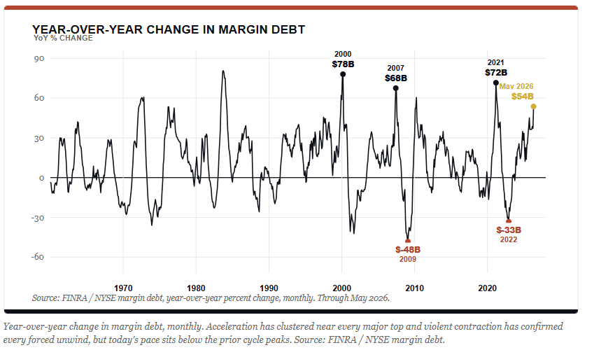
The twelve-month change reached 53.7% in May, the steepest since the 2021 spike. Brisk by any measure. But put it next to the prior tops, and the picture is calmer than the headline suggests. The annual surge ran close to 78% into the 2000 peak, 68% into 2007, and 72% into 2021. Today’s acceleration is real, and it still sits below all three. Bob Farrell’s Rule #4 is worth remembering here: rapidly rising markets and the leverage riding on top of them rarely correct by going sideways.
Borrowing that climbs this fast doesn’t drift back down gently. It snaps, and the snap is what hurts.
The Net Credit Balance
This is the measure of margin debt risk I keep coming back to, because it gets at fragility directly. Take all the cash sitting in investor accounts, the free credit balances, and subtract the margin debt. When the number is positive, investors hold more cash than debt. When it’s negative, they owe more than they have on hand, which means a decline forces them to sell rather than buy.
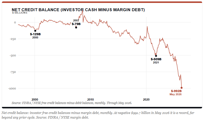
The net credit balance fell to a record negative $991.7 billion in May, a record and deepening by the month.3 Run the comparisons.
In 2000, the top investors were underwater on cash by about $130 billion.
Then, in 2007, the top was roughly $80 billion.
At the 2021 peak, around $510 billion.
Today it’s nearly a $1 trillion.
This is the cushion that stands between a normal pullback and a cascade of margin calls, and it has never been thinner relative to what investors owe. Make no mistake, that is the number I’d put on the wall.
Detrending The Debt Against Itself
This is the cleanest answer to the denominator problem in measuring margin debt risk. Instead of dividing by GDP, M2, or market cap, fit a trend to margin debt’s own history and measure how far above or below that trend the current level sits. No exogenous aggregate, no contamination, just the debt compared to its own path.
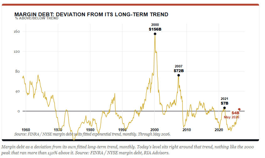
Here’s where intellectual honesty matters, and it cuts against the scary headline. When margin debt is detrended against its own six-decade path, the level today is just a few percentage points above its trend. That is not a stretched reading. Now, let’s compare it.
In the 2000 dot-com peak, it ran more than 150% above the trend.
Then, in 2007, it ran roughly 70% above.
Lastly, the 2021 blowoff was only modestly above the trend.
So the cleanest, contamination-free measure says the record dollar level is not the historical outlier the headline implies. Margin debt has grown roughly in line with its own long-term compounding. That doesn’t make the risk zero. It means that the record number by itself is not the signal. The thin cash cushion behind it is.
The Thin Cash Cushion Behind The Leverage
There’s a cleaner way to bring the saving rate into this than another contaminated denominator. Take the margin debt and divide it by the personal saving rate. The line asks one blunt question:
“How much have investors borrowed against how little they are setting aside?“
When debt runs high and savings run low, it climbs. We have the monthly data back to 1959, so we can watch how it behaved around every major top.
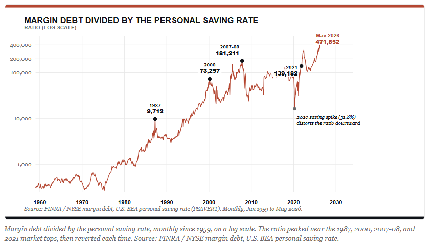
Look at the peaks. The line ran up into the 1987 top, the 2000 dot-com peak, the 2007 high, and the 2021 high, the same four tops that every honest leverage measure flags. Then it reverted, and not gently.
After 1987, margin debt fell 23% in four months, and the ratio gave back more than half. After 2000, borrowing collapsed 53% into the 2002 low, and the line dropped roughly 70%. The 2007 reading unwound the hardest of all, with margin debt down 55% into early 2009 as households retrenched and savings jumped, and the ratio surrendered by more than 80%.
Leverage peaks near tops. Then it mean-reverts violently because the unwind forces the selling.
The 2021 episode is the one where you have to be careful, and it’s why I won’t hand you this line as a clean signal. Leverage did revert. Margin debt fell 35% into the 2022 bear market. But the ratio itself did not drop in 2022; it spiked higher, north of 310,000 by that summer, because the saving rate collapsed to 2.2% faster than borrowing came down.
The denominator drove that move, NOT leverage. You can see the same distortion at the 2020 notch, where a stimulus-driven saving-rate spike to 31.8% made the line crater while borrowing was actually rebuilding. Even the ranking is contaminated. The 2007 peak prints above 2021 only because savings fell to 1.9% that November, not because 2007 carried more leverage. It carried less than half.
So read the line for what it is. Today it sits at a record 471,852, and for the textbook reason: a record pile of debt resting on a 3% saving rate. The cash buffer behind the leverage has never been thinner across 67 years of data. I’d take that as confirmation of fragility, the same message the net credit balance sends, rather than as a dated sell signal.
“The peaks tell you where leverage got stretched. The reversions tell you it always unwinds. Neither one tells you the week it starts.”
That’s why I still anchor my read on margin debt risk on the cleaner measures. The fragility composite, blending the rate of change, the net credit cushion scaled to income, and the detrend, sits near its 2000 level and well above 2021. The system is fragile. It is not a calendar. Anyone selling you a margin-debt top-caller, on this ratio or any other, is overreaching.
What Investors Should Actually Watch
So where does this leave you? The honest read on margin debt risk doesn’t come from staring at a margin-to-GDP chart waiting for a number to ring a bell. Margin debt is a coincident indicator of risk appetite, meaning it tells you the crowd is greedy at exactly the moment it is. That’s useful context. It is not a sell signal.
Watch three things instead. First, the rate of change, because acceleration above 40% to 50% year over year is the company you keep near the top. Second, the net credit balance, because that nearly trillion-dollar cash deficit is the fuel for forced selling if the tape rolls over. Third, the direction of travel, because the single most reliable thing margin debt does is confirm a deleveraging once it has started. When margin debt turns down hard, leverage is being unwound, and that unwind feeds on itself.
This is the heart of it. Margin debt doesn’t matter until it does. It can sit at a record for months, even years, while the market grinds higher, and every bear pointing at the level looks foolish the whole way up. Howard Marks has made this point about risk for decades: the riskiest moment is the one that feels safest, when leverage is highest, and the cushion is thinnest, and nobody can see why it would ever unwind. Then prices fall, accounts breach maintenance, brokers force sales, those sales push prices lower, and more accounts breach.
The level was never THE danger. The speed of the reversal is.
That asymmetry is the whole game. Leveraged buyers add slowly as the price rises, one collateral-funded tranche at a time. Forced sellers hit all at once on the way down. A record net credit deficit doesn’t predict the reversal date. It tells you how violent the reversal will be when something finally lights the match. Position for that, not for a calendar.
How We Manage The Risk
None of this means selling everything and hiding. It means respecting the setup. We stay invested because trends in motion tend to stay in motion, and the leverage built can run further than anyone expects. But we manage the downside deliberately by:
Sizing positions so a forced-selling cascade doesn’t dictate our decisions,
Holding a cash buffer that lets us be the buyer rather than the seller when others get the call, and
Watching the net credit balance and the rate of change far more closely than any ratio against GDP.
When the rate of change rolls over and the unwind starts, the discipline is already in place. You don’t build the lifeboat in the storm. The record on the screen isn’t the warning. The thin cushion underneath it is. And cushions get tested when you least expect.
Frequently Asked Questions
Is record margin debt a reason to sell stocks?
No. Margin debt risk is best understood as a coincident measure of risk appetite, not a timing signal. It can stay at record levels for a long time while markets rise. The useful question is not the level but the rate of change and the cash cushion behind it.
Why is margin debt to market cap a poor measure?
Because the numerator and denominator move together. Rising prices lift market cap and expand borrowing capacity, so the ratio remains range-bound near 2% regardless of how much absolute risk has accumulated.
What is the net credit balance?
It’s investor cash, the free credit balances in accounts, minus margin debt. A negative reading means investors owe more than they hold in cash. In May 2026, it reached a record negative $991.7 billion, the thinnest cushion against forced selling on record.
What should investors watch instead of the ratios?
The year-over-year rate of change in margin debt, the net credit balance, and margin debt detrended against its own history. Those three capture margin debt risk by measuring the debt itself rather than dividing it by an unrelated aggregate.
Sources & Notes
FINRA, Margin Statistics (debit balances in customers’ securities margin accounts), May 2026 reference month; AdvisorPerspectives, “Margin Debt Jumps 8.5% in May to New Record High,” June 24, 2026.
S&P 500 market capitalization, S&P Global (S&P Dow Jones Indices), as maintained in RIA Advisors’ margin-debt workbook; ratios computed against FINRA / NYSE margin debt.
FINRA / NYSE free credit balances (cash and margin accounts) less debit balances in margin accounts; workbook data through April 2026, May 2026 net credit balance (negative $991.7 billion) per FINRA via Advisor Perspectives.
U.S. Bureau of Economic Analysis, Personal Saving Rate (NIPA Table 2.6); FRED series PSAVERT, through May 2026.
U.S. Bureau of Economic Analysis, Personal Income and Outlays, March 2026 (saving rate 3.6%).
Data pulled and cross-checked in June 2026. Market and economic figures are time-sensitive and subject to revision. This article is for informational purposes only and is not investment advice.


Comments
Log in or sign up to join the conversation.