


The average S&P 500 (SPY) stock gained 35% in the year leading up to the index's most recent all-time closing high made last Thursday (5/14). Since then, we've seen the biggest winners in the last year finally experience some gravity, while beaten-down stocks have shown signs of life.
The tables below show the most extreme moves in the index in the year leading up to May 14th along with performance in the two and a half trading days since then.
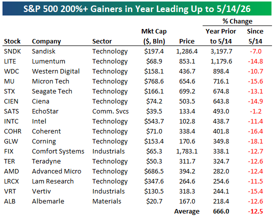
Sixteen S&P 500 stocks gained more than 200% year-over-year through 5/14. As shown in the first table below, every one of these stocks has fallen since 5/14 for an average decline of 12.5%.
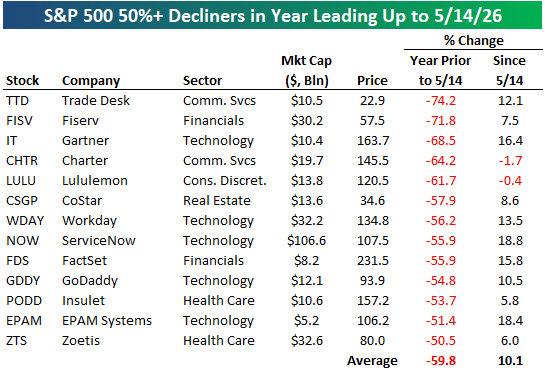
On the flip side, 13 S&P 500 stocks were more than cut in half (down 50%+) in the year leading up to 5/14. Since then, they've averaged a gain of 10.1%!
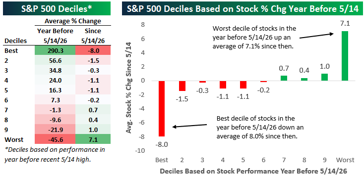
Below we've broken the S&P 500 into deciles (10 groups of 50 stocks each) based on year-over-year share-price performance through last Thursday (5/14). For each decile, we've calculated the average percentage change since 5/14.
As shown, the decile of the best performing stocks y/y through 5/14 is down an average of 8% since then, while the decile of the worst performing stocks y/y through 5/14 is up 7.1%.
Last March 24th, we highlighted the 25-year anniversary of the Dot Com Bubble peak in a Chart of the Day for members.
The year leading up to the March 24th, 2000 peak saw similar but more extreme moves within the S&P 500. As shown below, the best performing decile of stocks in the year leading up to 3/24/2000 gained 438.9% over that period, while the worst performing decile of stocks fell an average of 49.3%.
In the year after the 3/24/2000 peak, the decile of best performers y/y at the Dot Com peak averaged a decline of 50%! The decile of worst performers in the year leading up to 3/24/2000 averaged a gain of 33.4% over the following year.
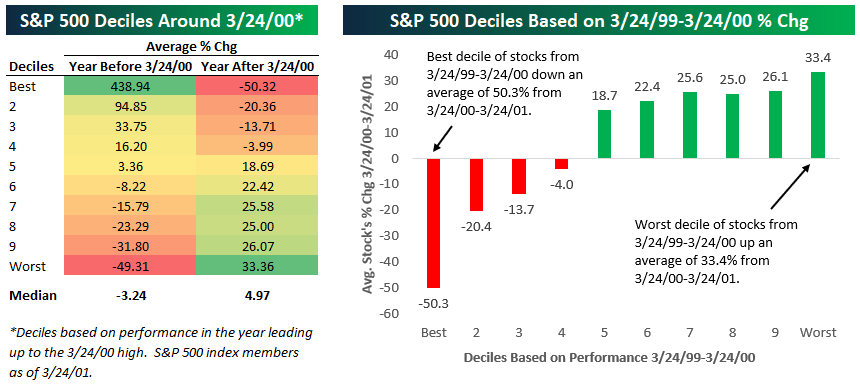
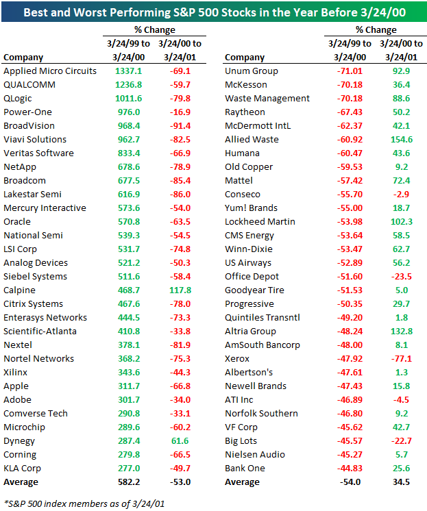
Below is a table showing the best and worst performing stocks in the year leading up to the Dot Com peak and how they did in the year after.
As you can see, it was an absolute bloodbath for the biggest Dot Com winners in the year after the peak, while the losers during the Dot Com run-up that were the furthest thing possible from the Internet space saw an epic recovery.
While the timing of the ultimate peak for any boom/bubble is as unpredictable as the love life of characters in a Taylor Swift song, the arc of the story has been repeated as frequently as her songs. When sentiment towards the market’s most loved stocks shifts, it happens fast. The names that the market is on cloud nine with today will eventually find themselves out in the cold, experiencing a sell-off by a thousand cuts, while the market 'frogs' turn into the new princes.



Comments
Log in or sign up to join the conversation.