

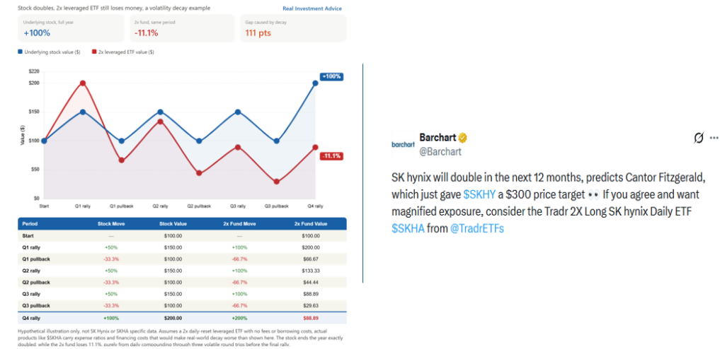
The Tweet on the right below irresponsibly suggests that if SK Hynix shares double, as Cantor Fitzgerald’s $300 target implies, a 2x leveraged fund like SKHA offers “magnified exposure” to that outcome. Assuming the stock doubles, the leveraged trade ETF sounds like easy money. However, even if Cantor is right and the stock doubles, the math behind leveraged ETFs does not guarantee the holder will earn 200%. In fact, it doesn’t even guarantee positive returns.
2x Leveraged ETFs deliver twice the daily return of the underlying stock, not twice the annual return. Over time, the daily resets compound and produce a different result than a simple doubling. Consider a stock that goes up on day one and down on day two to end up flat. A 2x leveraged fund moves twice as much every day, so its bigger up days and bigger down days don’t cancel out evenly. In this case, the leveraged ETF ends up losing a little money even though the stock went nowhere. Essentially, volatility chips away at the value of leveraged funds. The graphic on the left shows how extreme volatility over the course of a year creates a massive return differential between the underlying stock and the leveraged ETF. In this example, the stock doubles over the course of the year, but the 2x leveraged fund ends down 11.1%.
The more a stock chops sideways versus trending, the worse the outcome for a leveraged ETF holder. Given that SK Hynix has already logged multiple double-digit single-day price swings this year, that volatility tax we describe is not hypothetical.
What To Watch Today
Earnings

Economy

Market Trading Update
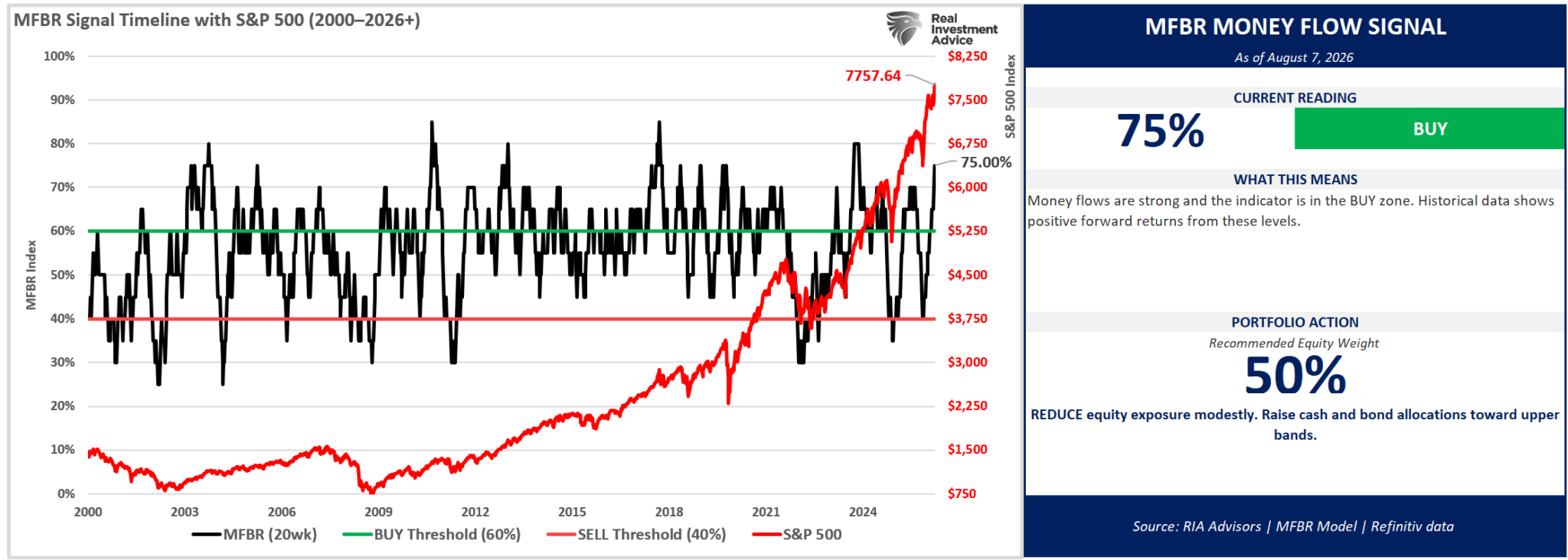
Yesterday, we reviewed the market’s technical backdrop heading into this week, along with market performance statistics following a consolidation breakout. However, in Saturday’s #BullBearReport, I discussed that the Moneyflow and Breadth Indicator had triggered a warning. To wit:
“As of August 7, 2026, with the S&P 500 at 7,757.64, the Money Flow Breadth Ratio (MFBR) stands at 75% and rising, versus 70% the prior week – a 10 percentage-point increase over the trailing four weeks. This places the indicator in extreme overbought territory (75% or higher). The raw breadth signal still reads BUY, but the MFBR is a contrarian indicator at extremes: readings this stretched have historically been followed by below-average forward returns, so the model treats this as a caution flag rather than a green light to add risk.
The model currently recommends reducing equity exposure to a target weight of 50%. Against your current equity weight of 63%, that implies reducing equity exposure by roughly 13 percentage points. The trim is driven by the contrarian grid rather than by weak breadth – the model takes profits into strength when participation reaches extremes.
Breadth this stretched is a profit-taking signal, not a chase signal. The model’s message is to sell into strength, move down to the target weight, and reassess next week.”
On Monday, we followed those instructions across both the Equity 60/40 Portfolio and the Dividend Growth Model. We took profits in some of the recent winners, like MSFT, and swapped out or added to positions that have seen decent corrections. We also rebalanced several of the Thematic Models (AI, Future Growth Focused, Crypto, Dividend, and Infrastructure). You can see all the specific trades made in the Portfolio/Model/Transaction tab for each portfolio.
While the MFBR indicator is triggering a warning, it does not mean that you should immediately reduce overall equity exposure to the market. When the indicator reverses, that will be the signal to reduce exposure more aggressively and raise cash accordingly.
The S&P 500 Is The “Sector” Of Choice
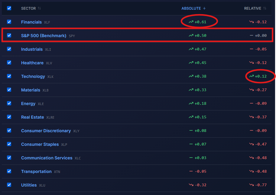
This week’s rotation analysis presented a rarity in the absolute and relative scores of the S&P 500 sectors. As we circle, Financial stocks are the only sector with an absolute score higher than the S&P 500, and Technology stocks are the only sector with a positive relative score.
Essentially, the SimpleVisor analysis means the S&P 500 itself is the strongest “sector” in the set. Such a setup usually shows up in a couple of related ways:
Leadership is extremely narrow. In this case, a handful of mega-cap names and some other technology stocks are carrying the index’s return, while the other nine or ten sectors can’t keep pace on a relative basis.
Breadth is deteriorating. Similar to the prior bullet point, this would entail that few large stocks are leading the market. However, if we look at the dispersion of the absolute and relative scores, there is not much of a difference between the out- and underperformers; thus, breadth is fine despite the absolute and relative scores.
The decent breadth, along with new record highs, suggests the market is not necessarily about to fall, but that the rally has less structural support underneath it than the index level alone would suggest. It also likely means that rotation opportunities are scarce, so the S&P 500 is the easiest and least risky way to play the market on a relative basis until a sector or sectors start to outperform or underperform.
Earnings Drive Both Bull & Bear Markets
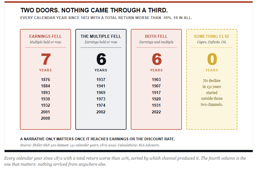
A stock is a claim on future cash flows, and its price is that claim divided by a discount rate. So there are exactly two ways to knock the market down hard. Either the expected cash flows fall, or the discount rate rises. That’s the whole list. Capex, deficits, and oil only matter to the extent they eventually show up inside one of those two variables, and most of the time they don’t show up in either with enough force to matter.
Tweet of the Day



Comments
Log in or sign up to join the conversation.