
I have posted this graph before. Here is updated data.
The graph plots labor share (left) against the unemployment rate (bottom) since 1948 to 2ndQ 2016. (data at FRED)
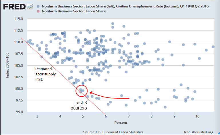
The data points suggest a labor supply limit shown by the down-sloping red line.As labor share drops, unemployment tends to bottom out at higher levels.
The last 3 quarters are circled. Recent data is rising up the supply limit line.
If the limit holds, further declines in quarterly unemployment will call for more labor share.


Comments
Log in or sign up to join the conversation.