
Inflation is still raging, and the Fed’s tapering clock is slowly ticking. It seems as if gold is stuck in no man’s land and has nowhere to hide.
Dry as a Bone
With the U.S. Federal Reserve’s (Fed) daily reverse repurchase agreements surging to a new all-time high on Jun. 30, the former wetland is undergoing a severe drought. Case in point: with 90 counterparties draining nearly $992 billion of liquidity from the U.S. financial system, QE is suffering a slow and painful death. And while investors focus all of their attention on what Fed officials say, in reality, the taper has already begun.
Please see below:
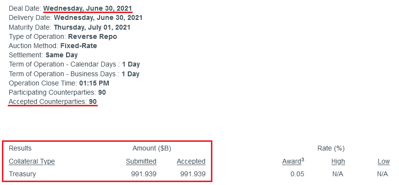
Source: New York Fed
To explain, a reverse repurchase agreement (repo) occurs when an institution offloads cash to the Fed in exchange for a Treasury security (on an overnight or short-term basis). And with U.S. financial institutions currently flooded with excess liquidity, they’re shipping cash to the Fed at an alarming rate.
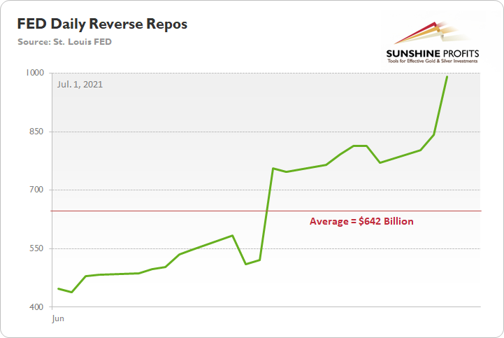
More importantly, though, the Fed aims to purchase a combined $120 billion worth of Treasuries and mortgage-backed securities per month. However, with daily reverse repos averaging $642 billion in June, the Fed has essentially negated 5.35 months’ worth of QE in the last month alone.
Please see below:
On top of that, while rising U.S. nonfarm payrolls remain the missing link for an official announcement, Dallas Fed President Robert Kaplan told Bloomberg on Jun. 30 that “these [QE] purchases are very adept at stimulating demand, but we’ve got plenty of demand … and these purchases are not very effective when you’ve got a supply issue.”
And regarding a potential taper, he added:
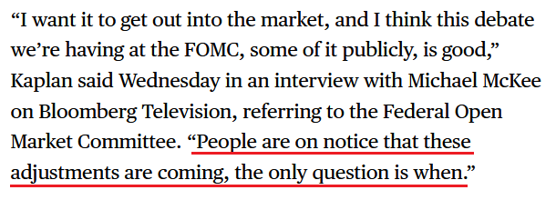
Source: Bloomberg
Headlining the anxiety, the inflation story has gained further momentum. For example, the Institute for Supply Management (ISM) released its Chicago Business Barometer on Jun. 30. And while the index fell to a four-month low and “New Orders languished markedly,” activity remains at the high-end of its historical range.
Please see below:
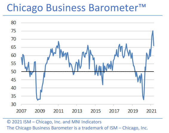
More importantly, though, the report revealed another inflationary surge:
“Prices paid at the factory gate surged to the highest level since December 1979. Companies noted higher prices due to material shortages. Across Q2, prices rose to 90.6, also a near 41-year high.”
Furthermore, even amid the up-and-down performance, manufacturing and non-manufacturing firms in the Chicago area remain concerned about the impacts of inflation.
Please see below:
Source: ISM
The Danger of Rent Inflation
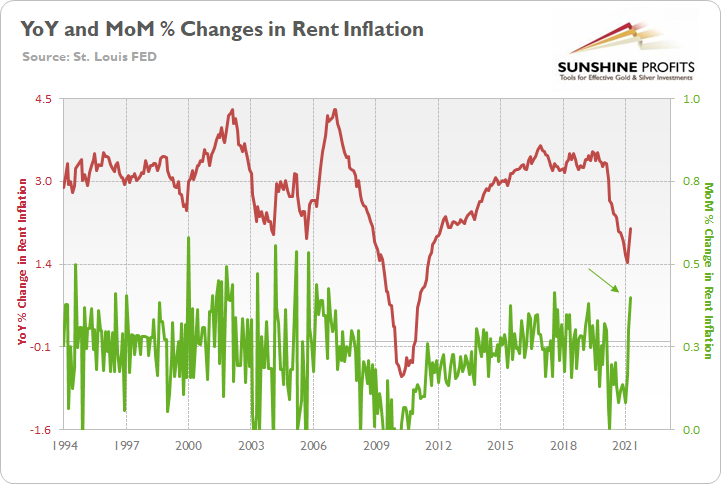
Adding more fuel to the fire, I warned on Jun. 3 that rent inflation could put major upward pressure on the headline Consumer Price Index (CPI) in the coming months. For context, the Shelter CPI accounts for more than 30% of the movement of the headline CPI.
I wrote:
The red line above tracks the year-over-year (YoY) percentage change in the Shelter CPI, while the green line above tracks the MoM percentage change in the Shelter CPI. If you analyze their behavior, you can see that the YoY figure has only moved slightly higher. However, with MoM rents rising at a torrent pace (follow the green arrow), the COVID-19 grace period is officially over. And with rising rents likely to put upward pressure on the CPI in the coming months, taper-talk should grow even louder over the summer.
To that point, American Homes 4 Rent – a publicly-traded real estate investment trust (REIT) that owns 53,984 properties across 22 states (as of Mar. 31) – revealed in its first-quarter regulatory filing that the firm achieved “10.0% rental rate growth on new leases” in Q1 and “11% rental rate growth on new leases” in the month of April.
Please see below:
Source: American Homes 4 Rent 8-K
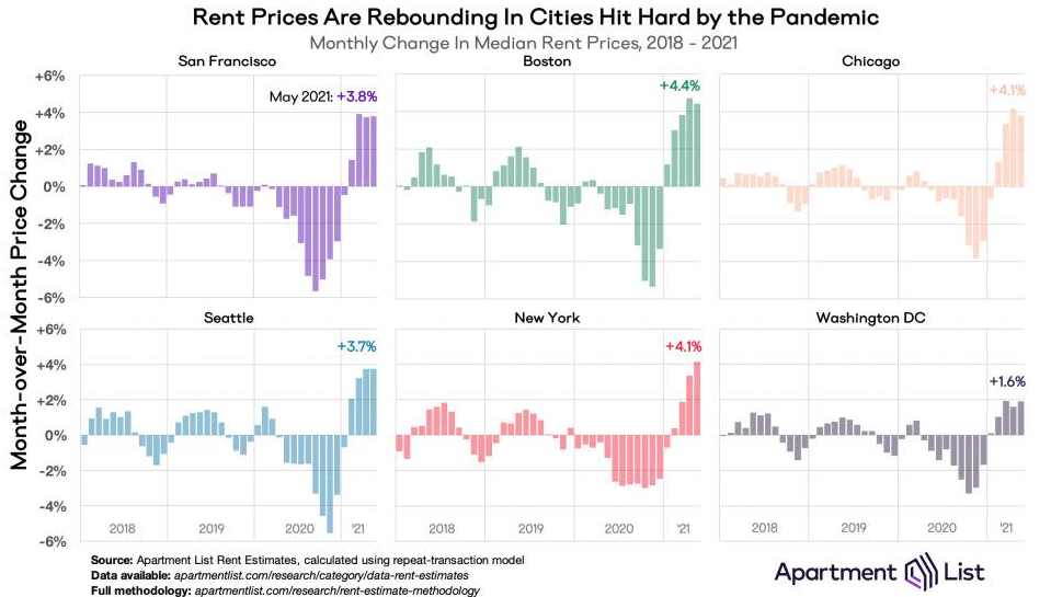
If that wasn’t enough, the U.S. cities that were hurt the most during the pandemic now have rents rising at a much faster pace MoM than the Shelter CPI.
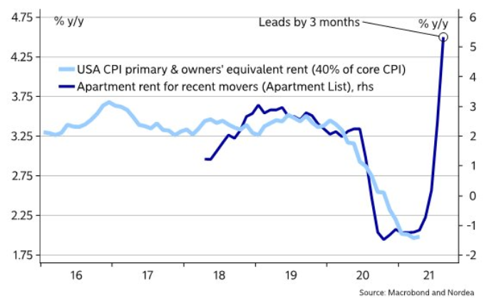
Furthermore, providing an appetizing update, Nordea found that Apartment List data (the chart above) often leads the Shelter CPI by three months.
Please see below:
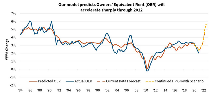
Piecing it all together, The Federal National Mortgage Association (Fannie Mae) forecasted the following:
“Lagged effects from the past year's house price appreciation and more recent rent recovery could begin to flow into inflation measures as soon as the May readings. House price gains to date suggest an eventual acceleration in shelter inflation from the current rate of 2.0%annualized to about 4.5%. If house price growth continues at the current pace, shelter inflation would likely move even higher.
Timing lags suggest [that] increasing shelter inflation will last through at least 2022, meaning ‘transitory’ increases to the rate of overall inflation may be more prolonged than many are expecting. Due to the heavyweight given to shelter, housing could contribute more than 2 percentage points to core CPI inflation by the end of 2022 and about 1 percentage point to the core PCE. Both would be the strongest contributions since 1990.”
Please see below:
Source: Fannie Mae
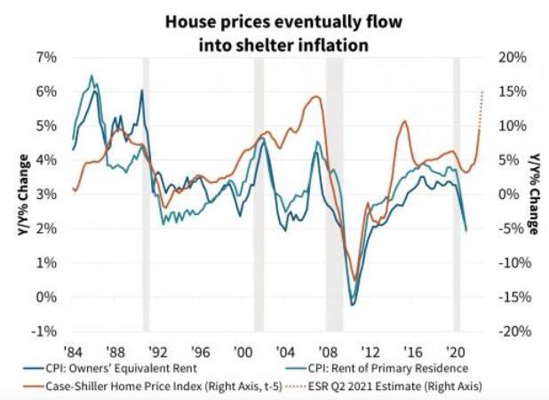
To explain, the blue and teal bars above track the YoY percentage change in the rent components of the headline CPI, while the brown line above tracks the YoY percentage change in the S&P/Case-Shiller U.S. National Home Price Index (NHPI). If you analyze the right side of the chart, you can see that the NHPI has completely decoupled from its shelter CPI counterparts. Moreover, I wrote on Jun. 30 that the NHPI hit a new all-time high on Jun. 29, with Craig J. Lazzara, Managing Director and Global Head of Index Investment Strategy at S&P DJI, providing the following context:
“April’s performance was truly extraordinary. The 14.6% gain in the National Composite is literally the highest reading in more than 30 years of S&P CoreLogic Case-Shiller data.”
The bottom line? With Fannie Mae’s forecast supporting our projection, there could be plenty of fireworks in September.
Source: Fannie Mae
What Can the S&P500 Tell Us?
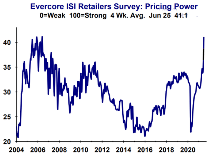
As another source of inflationary evidence, Evercore ISI’s gauge of retailers’ pricing power has risen once again. For context, from Jun. 8 to Jun. 25, the metric has increased from 37.9 to 41.1.
Please see below:
If that wasn’t enough, while commodities speculation has driven the inflationary surge, the Fed’s recent ‘dot plot’ helped calm some of the fervor. However, with investors now shrugging off the hawkish shift (speculation is more fun than prudence), the S&P Goldman Sachs Commodity Index (S&P GSCI) closed at a new 2021 high on Jun. 30. For context, the S&P GSCI contains 24 commodities from all sectors: six energy products, five industrial metals, eight agricultural products, three livestock products and two precious metals.
Please see below:
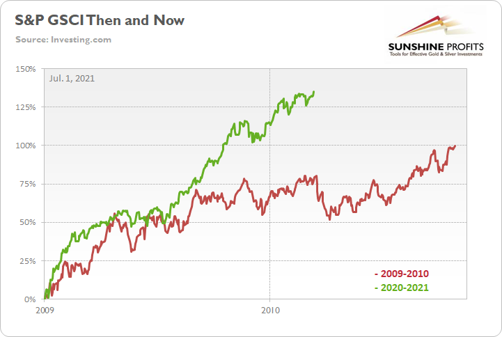
To explain, the green line above tracks the S&P GSCI’s current rally off the bottom, while the red line above tracks the S&P GSCI’s rally off the bottom in 2009-2010 (following the Global Financial Crisis). If you analyze the middle of the chart, you can see that the S&P GSCI has completely run away from the 2009-2010 analog. For example, at this point in 2009-2010, the S&P GSCI rallied by 77% off the bottom. However, as of the Jun. 30 close, the S&P GSCI rallied by 135% off the April 2020 bottom.
In addition, the weighting of the S&P GSCI is of immense importance. With energy accounting for roughly 54% of the index’s movement (the red box below), oil prices could be make-or-break for the cost-push inflation future impact.
Please see below:
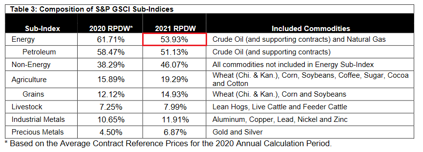
Source: S&P Global
Covid-19 Impact on the Oil Market
To that point, the U.S. Energy Information Administration (EIA) revealed on Jun. 30 that COVID-19 has depleted oil inventories. As a result, lagging supply could put further upward pressure on prices.
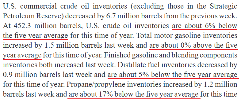 Source: EIA
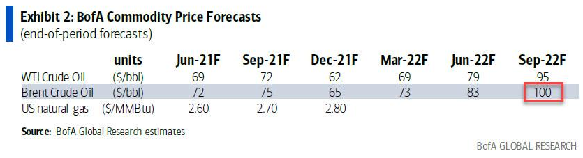
If that wasn’t enough, Francisco Blanch, head of global commodities and derivatives at Bank of America, told clients on Jun. 21 that “We believe that the robust global oil demand recovery will outpace supply growth over the next 18 months, further draining inventories and setting the stage for higher oil prices.” As such, "a combo of factors could push oil to $100/bbl.” For context, Brent is projected to hit $100 and WTI is projected to hit $95.
Please see below:
Conversely, while Blanch’s projection is more of a long-term issue and the Fed has the power to dampen commodities’ mood, it’s important to remember that the frenzy won’t ease on its own. However, with market-implied futures rates turning hawkish, investors’ perception of a dovish Fed is quickly evaporating.
Please see below:
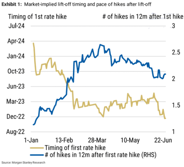
To explain, the gold line above tracks the expected timing of the Fed’s first rate hike, while the blue line above tracks the number of rate hikes expected in the 12 months thereafter. Currently, investors expect a liftoff in November 2022, with roughly two rate hikes in the 12 months thereafter. However, on Jan. 1, investors weren’t expecting a liftoff until roughly March 2024. Thus, not only is the Fed’s timeline moving closer and closer, but the inaccuracy of investors’ projections implies even more volatility should the inflationary pressures persist.
What About the Employment Issue?
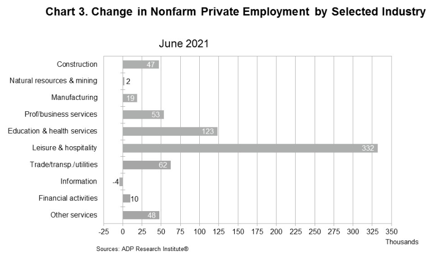
As for the U.S. labor market, I warned previously that U.S. nonfarm payrolls may not capture the momentum until August or September. And while ADP’s private payrolls came in above consensus on Jun. 30 – rising by 692,000 vs. 600,000 expected – it’s often a poor predictor of U.S. nonfarm payrolls (as we witnessed last month).
However, Nela Richardson, chief economist at ADP, had this to say:
“The labor market recovery remains robust, with June closing out a strong second quarter of jobs growth. While payrolls are still nearly 7 million short of pre-COVID-19 levels, job gains have totaled about 3 million since the beginning of 2021. Service providers, the hardest hit sector, continue to do the heavy lifting, with leisure and hospitality posting the strongest gain as businesses begin to reopen to full capacity across the country.”
Please see below:
On the flip side, Indeed’s latest Job Seeker Survey (released on Jun. 29) found that “many job seekers don’t express a sense of urgency about finding a new job, but say they are likely to pick up the search for work in the months ahead.” And surprise, surprise, “UI payments also appear to reduce urgency more among those without degrees.”
Please see below:
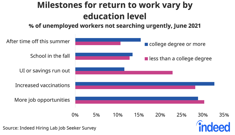
To explain, the blue (“college degree or more”) and purple (“less than a college degree”) bars above depict the necessary milestones to encourage unemployed respondents to reenter the workforce. If you analyze the third row (“UI or savings run out”), you can see that nearly 25% of non-college-educated U.S. citizens are waiting for enhanced unemployment benefits to end. In addition, while “Increased vaccinations” are also cited as an important factor, “More job opportunities” contradict the fact that U.S. job openings are at an all-time high.
More importantly, though, with Indeed also updating individuals’ job search activity on Jun. 29, states that have eliminated enhanced unemployment benefits (or will) are showing further progress.
Please see below:
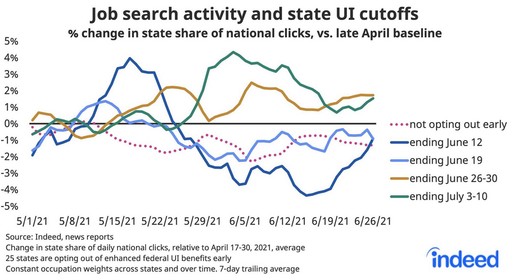
To explain, the solid lines above track job search activity across states where enhanced unemployment benefits have or will expire. If you analyze the right side of the chart, you can see that the dark blue line (Jun. 12), the gold line (Jun. 26-30), and the green line (Jul. 3-10) are showing signs of life. Moreover, while the light blue line (Jun. 19) remains surprisingly stagnant, it has still demonstrated some recent strength. The bottom line? With momentum likely to accelerate in August and September, rising U.S. employment will likely put the final nail in QE’s coffin.
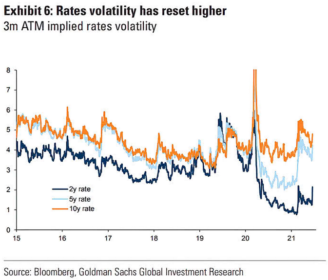
Finally, while the U.S. 10-Year Treasury yield has been rather subdued in recent weeks, the Fed’s June surprise reignited volatility across the U.S. yield curve. If you analyze the chart below, you can see that U.S. 2-year, 5-year, and 10-year (to a lesser extent) three-month at-the-money (ATM) interest rate options expect more volatility ahead. And with prior spikes upending the PMs, they could suffer more selling pressure in the coming months.
In conclusion, the PMs are stuck in no man’s land, as the strong U.S. recovery threatens to uplift the USD Index and U.S. Treasury yields. Moreover, even if a weak U.S. nonfarm payrolls print hits the wire on Jul. 2, it will likely be a speed bump in the latter’s inevitable uprising. Likewise, with the U.S. labor force poised to accelerate in the coming months and inflation still raging, the Fed’s clock is slowly ticking towards midnight. And with investors eager to front-run the eventual announcement, history implies that they will position accordingly long before the bell rings.

Comments
Log in or sign up to join the conversation.