

The Bureau of Economic Analysis announced today that U.S. real GDP grew at a 2.3% annual rate in the second quarter. You can’t describe the new data as favorable, but I’m still hopeful about what comes next.
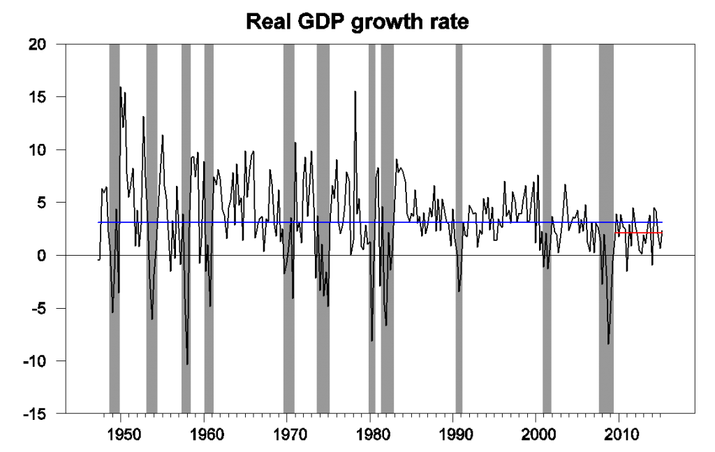
U.S. real GDP growth at an annual rate, 1947:Q2-2015:Q2, historical average rate (3.1%), and average since 2009:Q3 (2.1%).
GDP growth since the end of the Great Recession in 2009:Q2 has averaged 2.1% per year, a full percentage point below the average over the entire 1947-2015 period. And that 3.1% includes both recessions and expansions. Moreover, the benchmark revision of the last three years of data that accompanied today’s report didn’t help. Although the new data revise the weak numbers for the first quarters of 2015 and 2014 up a bit, the BEA now estimates that annual GDP growth averaged 1.9% (logarithmically) over 2012:Q1-2015:Q1, down 0.3% from the 2.2% that had initially been reported for that period. Jason Furman attributes much of the downward revision to “a new methodology for calculating the price of financial services spending and revisions to source data on services.” In any case, the bottom line is that the post-2009 expansion, which we already knew was very weak by historical standards, now appears to have been even weaker.
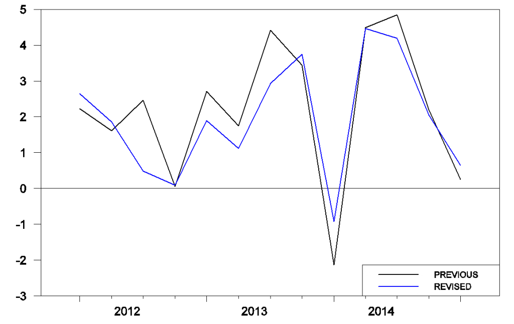
Real GDP growth at an annual rate as reported on April 29 and July 30.
The recent weakness has brought the Econbrowser Recession Indicator Index up to 13.3%. The index has now shown a modest spike up with each of the last three weak winters. The index uses today’s data release to form a picture of where the economy stood as of the end of 2015:Q1.
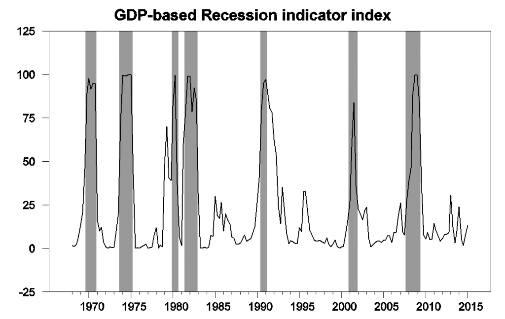
GDP-based recession indicator index. The plotted value for each date is based solely on information as it would have been publicly available and reported as of one quarter after the indicated date, with 2015:Q1 the last date shown on the graph. Shaded regions represent the NBER’s dates for recessions, which dates were not used in any way in constructing the index, and which were sometimes not reported until two years after the date.
In terms of the drivers of the 2.3% Q2 growth, there’s really only one story– consumer spending. While exports made a technical contribution to the change from Q1, this was only a partial rebound from the exceptionally low Q1 exports, which had been temporarily reduced as a result of Q1 work disruptions at west coast ports.
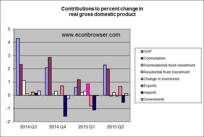
It’s interesting to speculate on the role of oil prices in the recent GDP numbers. The fall in oil prices since last summer was of course a boon for oil consumers and a bane for oil producers. Usually consumers respond pretty quickly to windfalls in spending power, whereas oil producers take significantly longer to cut back their investments. But this time the consumer response was more subdued, while the lead times for adjusting modern fracking drilling are much shorter than for conventional oil. Lower investment in the oil patch may be having an effect on the GDP aggregates.
So where are the grounds for optimism in any of this? I continue to believe that the next two graphs are very important to keep track of, which show expenditures on motor vehicles and parts and residential construction as percentages of GDP. These are two of the most important cyclical variables, accounting for a disproportionate share of the growth during booms and disproportionate share of the loss during busts. Both remain quite low today relative to their historical averages. When they return closer to historical levels (and I believe they will), that will give some boost to GDP growth. We haven’t seen it so far because the overhang from the burst of the housing bubble and associated debt problems was so big, it’s taken this long to work out from under it.
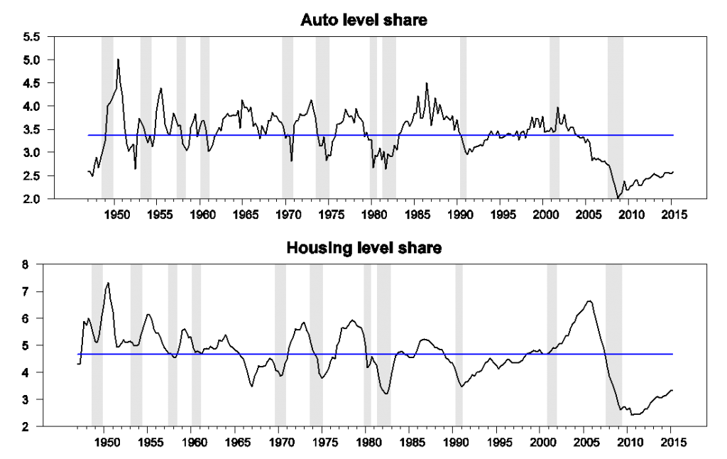
Contributions to the level of GDP, 1947:Q1 to 2015:Q2. Top panel: nominal spending on motor vehicles and parts as a percentage of nominal GDP. Bottom panel: residential fixed investment as a percentage of nominal GDP. Blue lines represent historical averages. Data source: BEA Table 1.5.5.
And once housing rebounds, the added income and sales will help bring other investment up with it. As Bill McBride has long been emphasizing:
In the graph, red is residential [investment], green is equipment and software, and blue is investment in non-residential structures. So the usual pattern– both into and out of recessions is– red, green, blue.
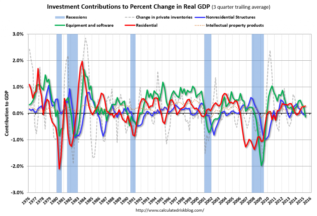
Source: Calculated Risk.
None of this is to claim that the U.S. can expect to average 3.1% growth again on a long-term basis. With slower growth of the working-age population, that won’t happen. But we nevertheless should expect a positive cyclical contribution when housing regains its traction.
I guess we’ll just have to wait a little longer.
Comments
Log in or sign up to join the conversation.