
If you have been following my previous articles about COVID-19 you will be interested to know there is another possible reason for the improved corona performance: According to The Wall Street Journal, "Covid-19 patients who received transfusions of blood plasma rich with antibodies from recovered patients, reduced their mortality rate by about 50%."
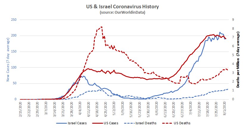
It is possible the US death curve is following the positive test curve but much later and at much less magnitude than the first time around. The test curve isn't very reliable (simple volume of testing will pick up more asymptomatic tests), so it should be taken with a grain of salt. (That little US hump around June 26th is prior deaths being added in).
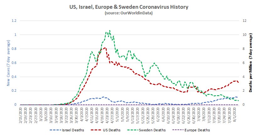
Sweden continues to fall, supporting the concept of community immunity (as they never locked down) combining with better treatment and/or a weakened virus.
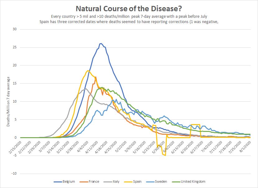
I charted the hardest hit countries that peaked prior to July. These had a 7-day average that peaked above 10/million and have more than 5 million in population. The trends are very similar to Sweden's (which got hit hard). This doesn't really tell us much because the *other* five countries could have a drop due to restrictions. Nonetheless, it is interesting that the paths are so similar.
The weird Spanish values are due to three single-day data points (including one that was negative) that seemed to be correcting for earlier numbers.
The US may be like multiple countries - with the northeast getting lots of infections in 'round one' and then other places following. But because those other places have the benefit of the northeast's example/practice they aren't suffering anywhere near the same death rates. This suggests the northeastern experience won't be repeated and we shouldn't react like it will.
All of the worst death rates in the US are 'round one' states: NJ (1,780 deaths/million), NY (1,680), MA (1,250), CT (1,240) etc....
'Round two' states are much further down the list: AZ (520), GA (260), Florida (330), Texas (240), California (240).
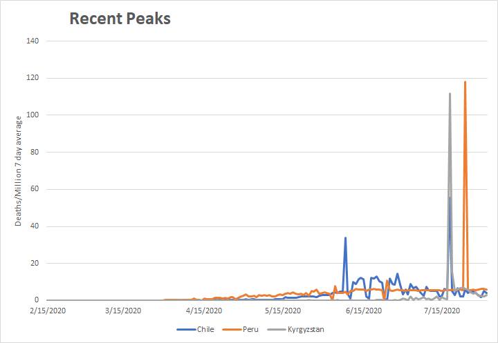
According to the data, Chile, Peru and Kyrgystan all peaked in July. All three seem to have peaked then due to data fixing. You can see that in this chart - prior deaths were added in.
That said, all of these countries peaked later than the big 6. Despite this, their overall death rates are in the same range. This could be because:
1) They lack the resources of the big 6 (to take advantage of what has been learned),
2) Because the drops among the big 6 are due to some sort of community immunity and these countries haven't achieved that
3) Because of more effective lockdown measures in the big six (except with Sweden)
4) Or because they have a different strain of the virus than 'round 2' in the rest of the world.
5) Some other reason I don't yet follow...


Comments
Log in or sign up to join the conversation.