
For my macro lectures next week:
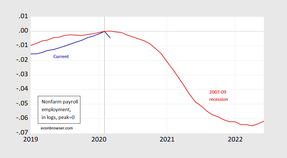
Figure 1: Nonfarm payroll employment, in logs, normalized 2020M02=0 (blue), lagged and normalized 2007M12=0 (red). Source: BLS.
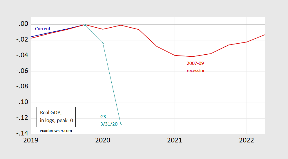
Figure 2: Real GDP, in logs, normalized to 2019Q4=0 (blue), Goldman Sachs 3/31 forecast (teal triangles), lagged and normalized to 2007Q4=0 (red). Source: BEA and Goldman Sachs.


Comments
Log in or sign up to join the conversation.