

City-by-city home price data was released for January by S&P/Case Shiller earlier this week. Below we provide our regularly updated charts and tables covering the release.
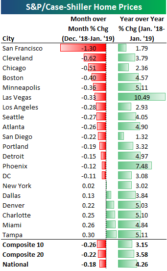
The 10-city and 20-city composite indices that cover home prices across the country showed month-over-month declines to the tune of 20-25 basis points. San Francisco was by far the biggest standout with a month-over-month decline of 1.3%. The next closest city was Cleveland at less than half that with a decline of 0.62%. Other cities that saw decent-sized month-over-month drops in home prices include Chicago, Boston, Minneapolis, and Las Vegas.
Six cities saw increases in home prices from December 2018 to January 2019. Two Florida cities were up the most as the no-income-tax state continues to benefit from the sharp drop in state and local income tax (SALT) deductions that took place with Trump’s tax reform package. Miami was up 0.26% month-over-month while Tampa was up 0.30%.
Every city has still seen home prices increase on a year-over-year basis, but the rate of change is getting smaller and smaller.
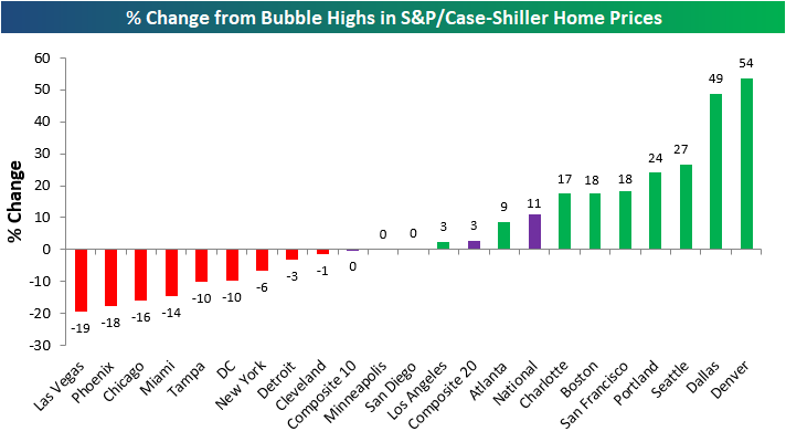
Below we show where home prices currently stand compared to each city’s peak price level at the highs during the mid-2000s housing bubble. The National index is now 11% above its prior highs. Denver and Dallas are up by far the most above their prior highs at ~50%. Las Vegas, Phoenix, and Chicago are the furthest below their prior highs. Las Vegas prices are still 19% below levels seen at the peak of the mid-2000s bubble.
The next chart shows how much prices are up compared to their low points after the housing bubble burst. Most cities saw home prices bottom in 2011-2012. As shown, San Francisco has seen the biggest bounce off of its lows at +119%. And while Las Vegas is still 19% below its prior highs, prices are up 111% off of their lows!
At the national level, home prices are up roughly 55% off of their lows, while New York and Cleveland have seen the smallest bounces off of their lows.New York home prices are up just 28% off of their lows.

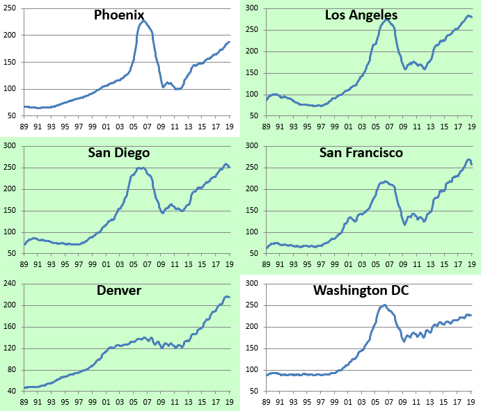
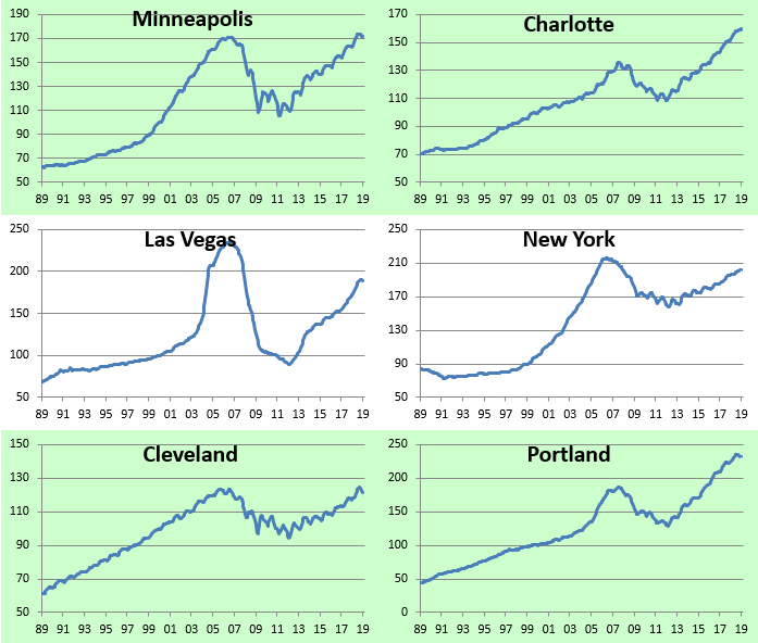
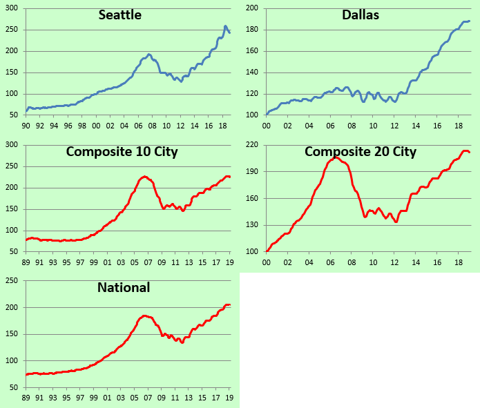
Below we show home price levels for each city tracked by S&P/Case Shiller. Cities shaded in green have managed to eclipse their prior housing bubble highs, while those that aren’t shaded green still have a ways to go. You’ll notice in the charts that prices in a lot of cities have pulled back a bit recently, but so far it doesn’t look like we’ve reached a tipping point. For now, the drops can still be categorized as regular ebb and flow inside of an expansion.




Comments
Log in or sign up to join the conversation.